The network for creativity
Join 1.25M professional creatives like you
Connect with clients, get discovered, and run your business 100% commission-free
Creatives on Contra have earned over $150M and we are just getting started


The network for creativity
Join 1.25M professional creatives like you
Connect with clients, get discovered, and run your business 100% commission-free
Creatives on Contra have earned over $150M and we are just getting started








Related posts

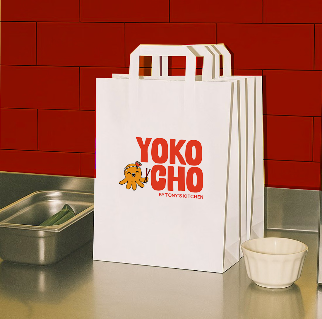
Inspired by the Japanese word "Yokocho (横丁)", meaning the lively side streets lined with small eateries and hidden food spots, this identity was designed to capture the warmth, energy, and charm of Asian street food culture.
The visual identity combines bold typography, a playful octopus mascot with a ramen bowl hat, and vibrant colors to create a brand that's approachable, memorable, and full of personality.
Every element was crafted to make Yokocho feel like more than just a place to eat, it's an experience that brings people together over comforting food and bold flavors.



Top work!!

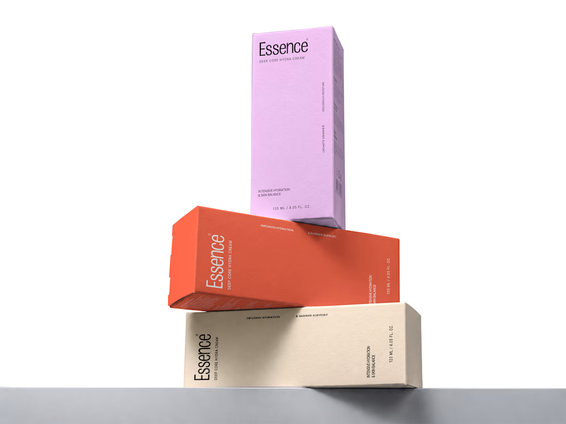
Essence - Cosmetics Brand Packaging

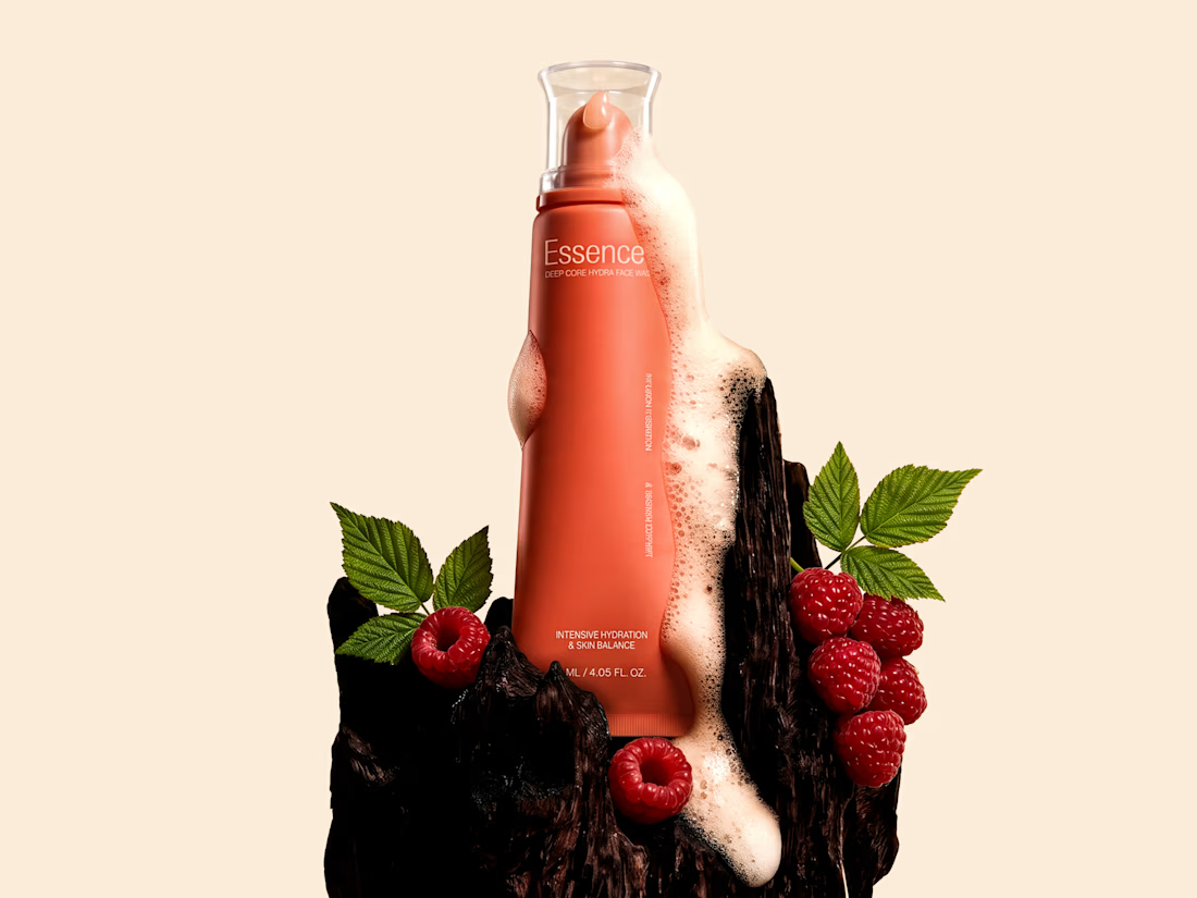
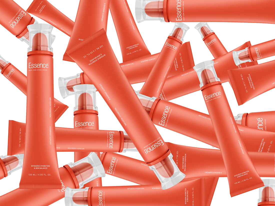

the pile of tubes shot is sick. did you model them or use a mockup?

Business company wanted two variations for the same video. 1st was the style their brand followed and the second one was the style I preferred for their brand. Both looked good to them. But, if it were you which version would you choose?


Clean work—follow Business company wanted two variations for the same video. 1st was the style the…