The network for creativity
Join 1.25M professional creatives like you
Connect with clients, get discovered, and run your business 100% commission-free
Creatives on Contra have earned over $150M and we are just getting started
Back to feedPost

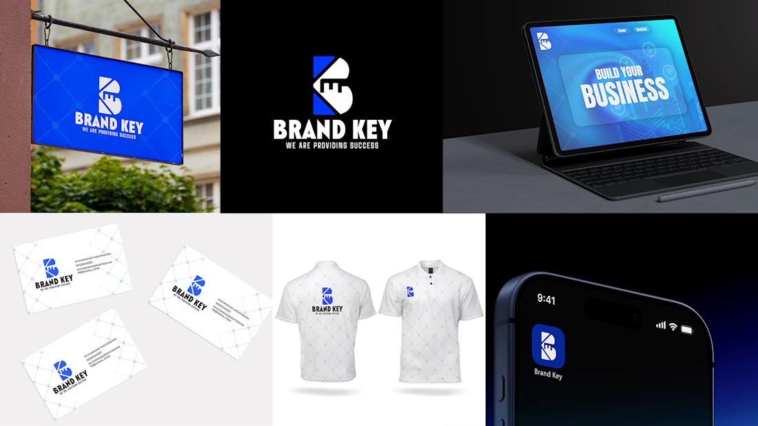
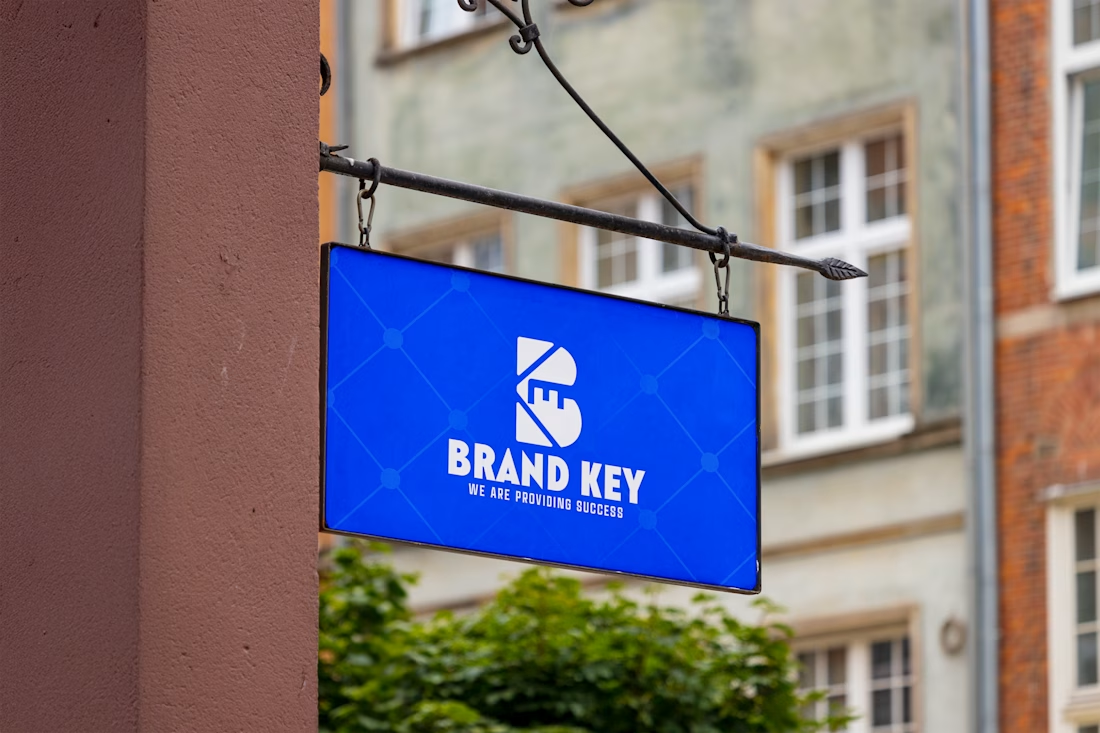
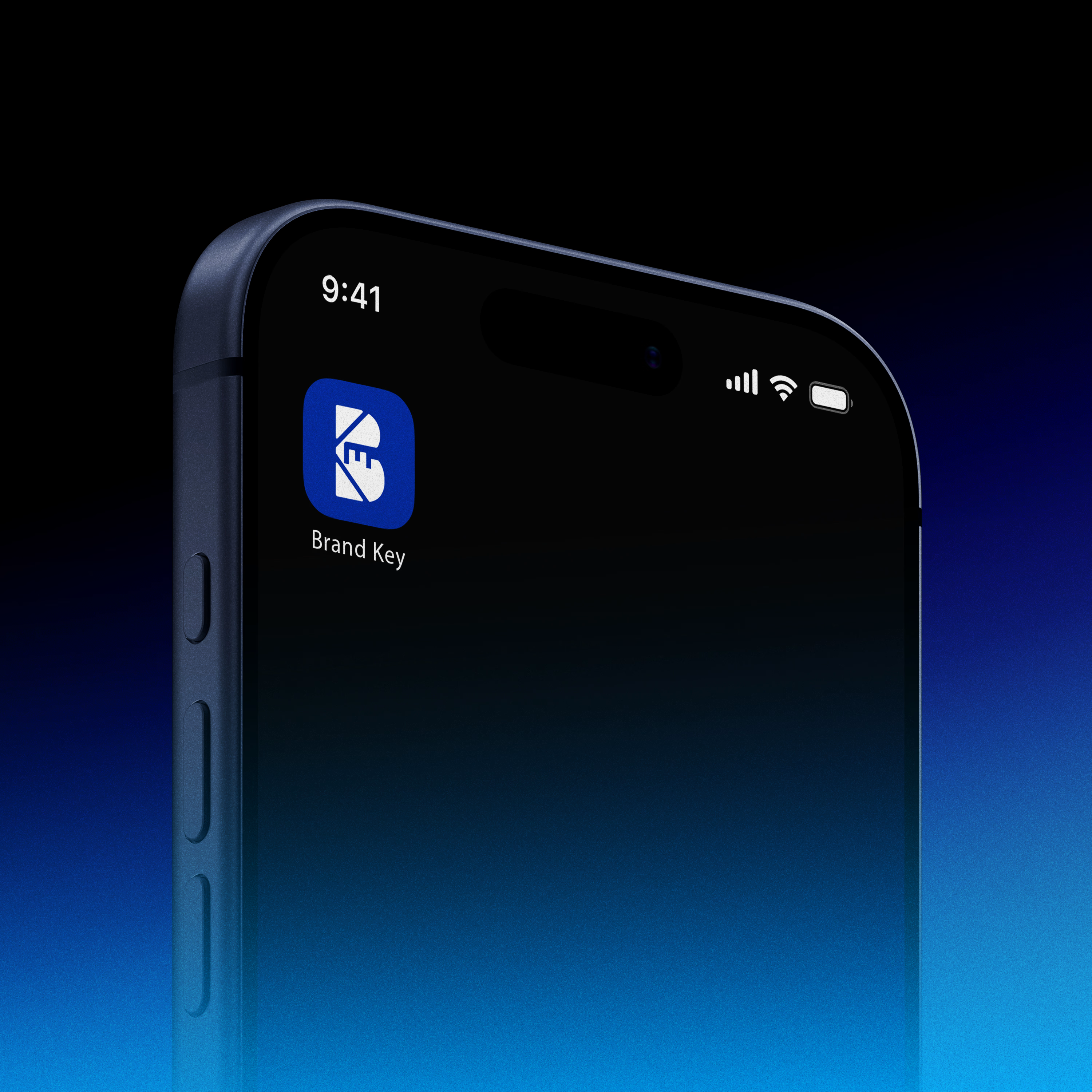
This logo for BRAND KEY is a modern, minimalistic identity built around the concept of “unlocking success.”
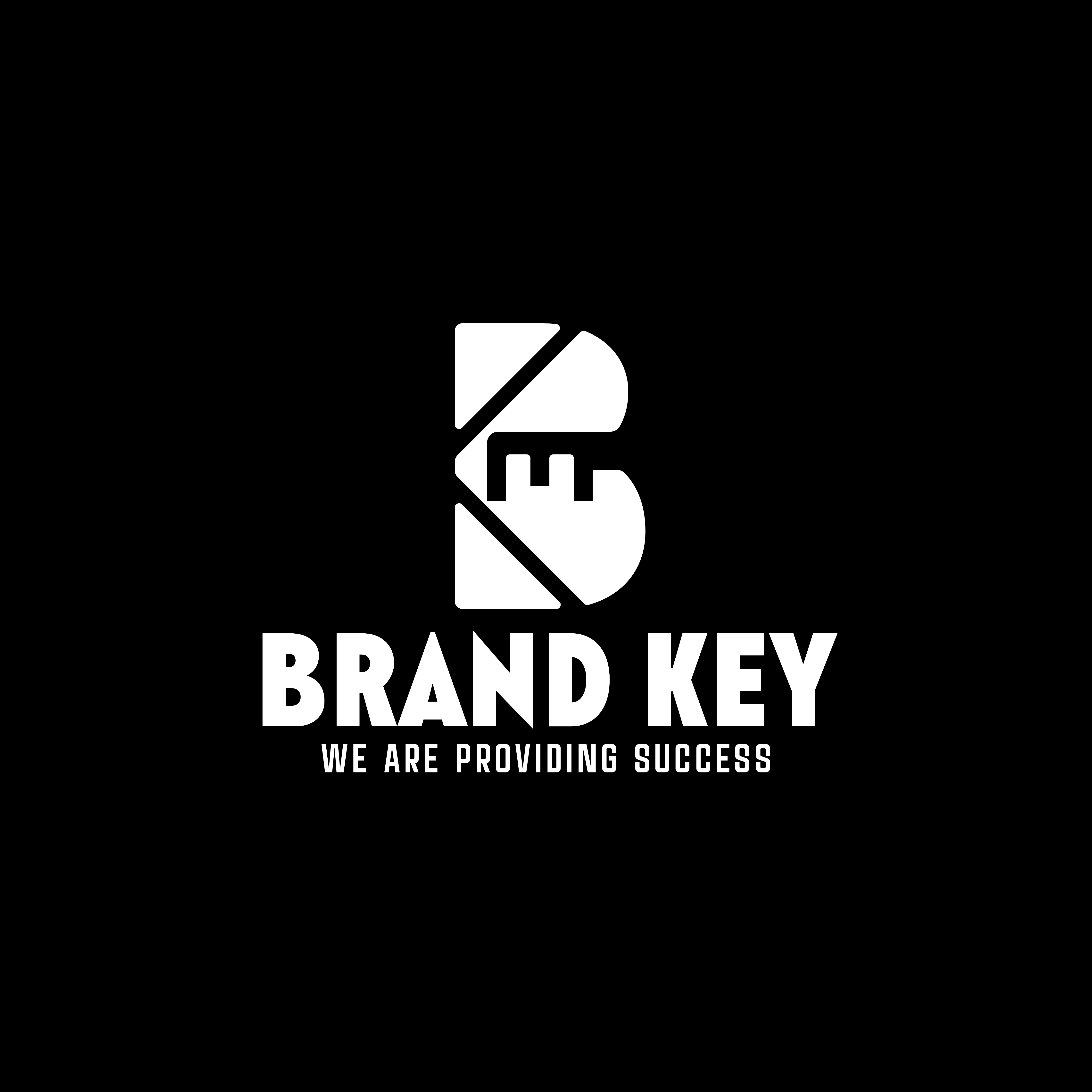
The central symbol forms a stylized “B”, representing the brand itself. Within its structure, geometric precision is used to construct the letter through clean negative space and solid forms, giving it a strong and professional presence.
Two diagonal cuts run through the design, subtly shaping the impression of a key while also forming the visual essence of the letter “K”. These intersecting angles reinforce the idea of access, unlocking potential, and opening pathways to success.
Overall, the mark combines symbolism and typography into a single unified concept, where the “B” stands for Brand, the “K” for Key, and the entire structure communicates the core message: unlocking success through strategic branding.


The network for creativity
Join 1.25M professional creatives like you
Connect with clients, get discovered, and run your business 100% commission-free
Creatives on Contra have earned over $150M and we are just getting started
Related posts

Two years ago, I started my very first personal branding project.
The idea was called City Compass a concept for my hometown, Veliko Tarnovo, one of Bulgaria's most historic cities.
The vision was bigger than just a logo. I wanted to create something that could help the city grow but I quickly realized the vision was much bigger than I was ready for at the time, so I left it for the future.
Looking back, I still love where it began.
Curious to know what you think.😊
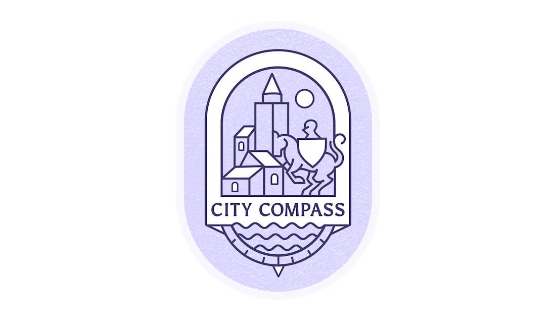

First, your city will be proud of you. You have successfully managed to combine many elements in 1 icon in the most elegant way ever. A castle, a knight on horseback, a compass, a river. Everything blends in harmony and composition! Only with 2 colors!!!


Recent Brand Work ⚡️
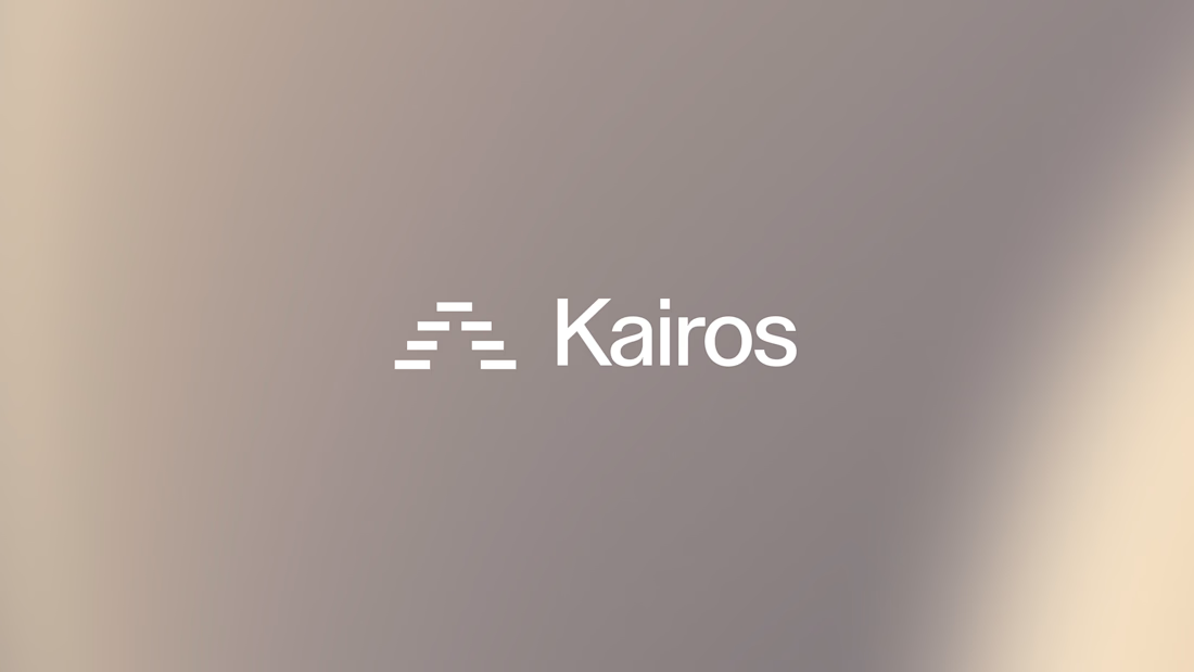
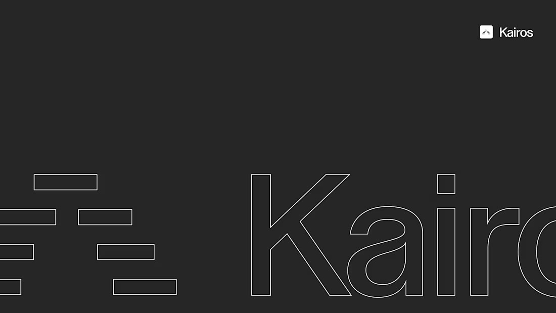
Kairos is a high-end sales platform helping brands work through AI-engineering their RFP's and get a competitive advantage over other manually filled out RFPs. ☁️
Client sourced via @Contra HQ - been a great collaboration so far! ✅

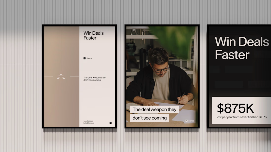
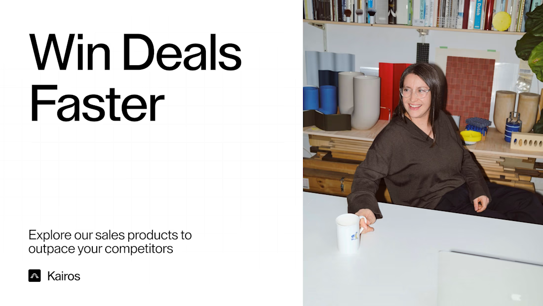

Like the logo and vibe in general! Cozy office style

Happy to finally share my latest brand identity project i was working on, it was such a fun project, a creative media production studio led by an awesome team, Excited to see your feedback on the Logo Mark and color system, the logo mark was inspired from the shape of a sea spiral ! for reasons that matches the brand massaging and values.
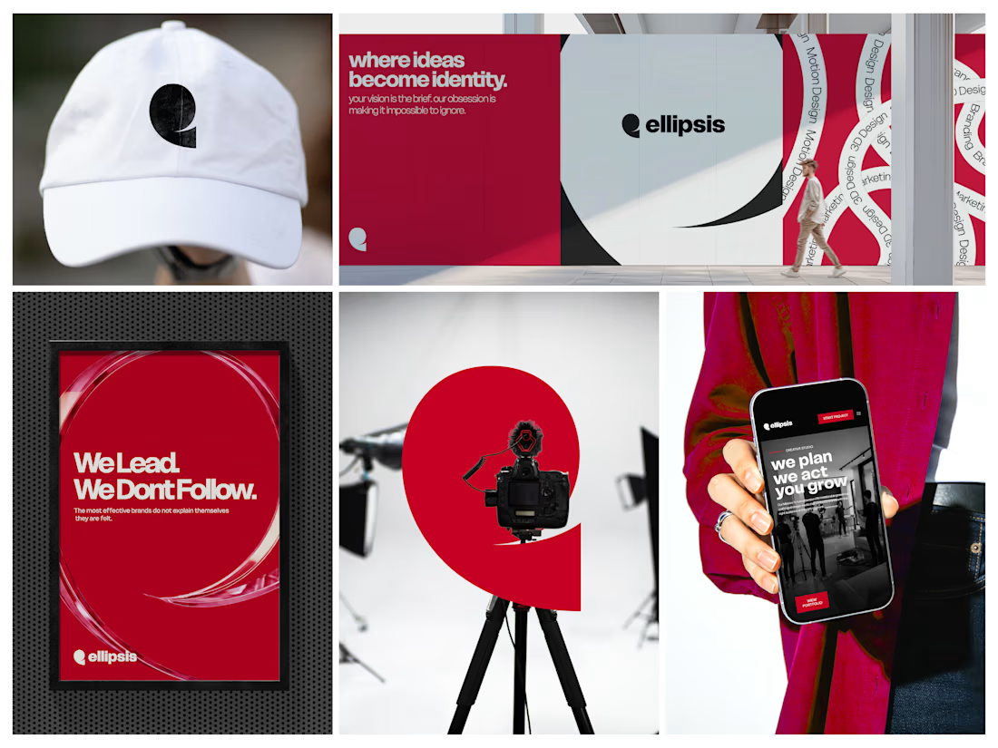

Stunning work!








Trending

Claude
Claude has entered the design space. How are you using Claude Design?

Contra University
Learn from expert creatives how to earn more using next-gen AI tools.
fifaworldcup2026
The World Cup is here and the whole world's watching. How are you designing for the world stage?
creativeaiflow
Creative AI workflows are evolving. What tools do you use, and what are their strengths and weaknesses?
freelancerlife
Freelancer life is wins, pivots, and everything in between. What’s yours right now?