The network for creativity
Join 1.25M professional creatives like you
Connect with clients, get discovered, and run your business 100% commission-free
Creatives on Contra have earned over $150M and we are just getting started
Back to feedPost

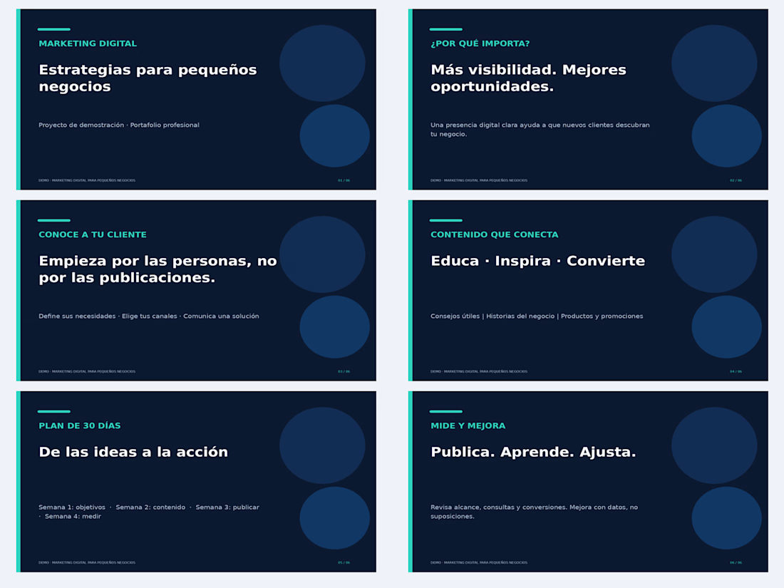
📊 Professional PowerPoint Presentation | Digital Marketing
A six-slide presentation created as a portfolio demonstration project for small businesses.
The presentation covers digital marketing strategies, target audiences, social media content, a 30-day action plan, and performance measurement.
Skills showcased:
Presentation Design
Visual Communication
Content Organization
Microsoft PowerPoint
Personal demonstration project, not commissioned by a client.

The network for creativity
Join 1.25M professional creatives like you
Connect with clients, get discovered, and run your business 100% commission-free
Creatives on Contra have earned over $150M and we are just getting started

Challenges
View all


Related posts

A Mercedes presentation built in PowerPoint, with advanced Morph transitions adding movement between slides.
#PresentationDesign #PowerPoint #MorphTransition #MercedesBenz


Burying your traction on slide 28 is the fastest way to lose a venture partner.
Most founders assume volume equals expertise. They drop a massive rock of information onto venture partners, hoping the investor will dig through it to find a reason to write a check.
But reality works differently. Venture partners review materials on their phones in the back of a cab or between meetings.
If your core growth metric is hidden under a solid wall of text, nobody is going to see it. You lose their attention before they even understand your business model.
Your presentation should be a scalpel, not a sledgehammer.
Cut your deck in half. Leave empty space so your most critical numbers can actually breathe. One clean layout proving your unit economics closes rounds much faster than ten pages of technical documentation and product features.
Open your current pitch deck. How many slides can you delete today without losing the core narrative?



The phone-in-a-cab test is a good one. A quick way to check it is to shrink each slide to thumbnail size: if the key number still reads there, it will survive a phone screen. Do you set a minimum size for metric callouts in your decks?

PROJECT TYPE
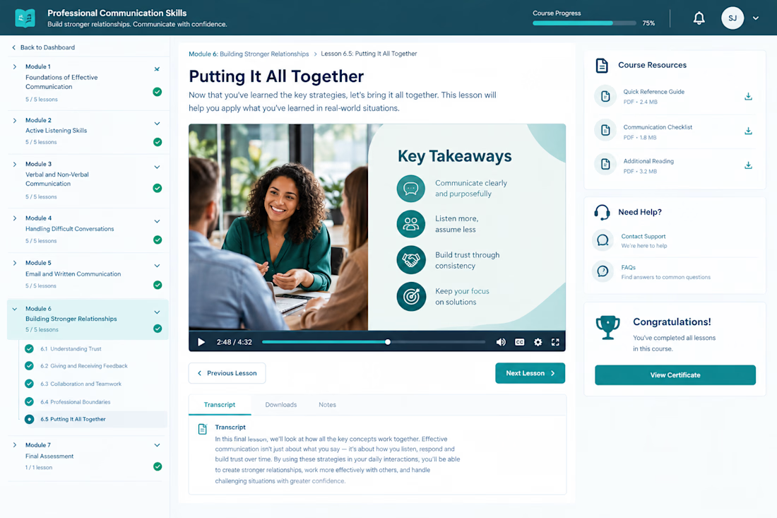
Self paced eLearning course design and development concept based on an existing 250 slide professional training presentation.
CLIENT PROBLEM / BUSINESS CHALLENGE
The organization had a substantial PowerPoint presentation containing the core training material, but the content needed to become more than a collection of presentation slides.
A successful eLearning experience needed to organize the material into a clear learning journey that could support approximately four hours of self paced learning while keeping learners engaged and helping them apply the information.
The challenge was therefore not simply transferring slides into an LMS. The content needed instructional structure, learner focused navigation, multimedia, activities, assessments, resources, and a consistent digital learning experience.
WHAT I DID
I approached the project as an instructional design and eLearning development workflow, restructuring the existing content around the learner experience.
The course concept includes:
• Clear modules and lesson progression
• Structured learning objectives and content flow
• Learner focused navigation
• Multimedia based lesson presentation
• Practical learning activities and application points
• Assessment and knowledge check opportunities
• Progress tracking throughout the course
• Downloadable learning resources
• Transcript support for lesson content
• Clear previous and next lesson navigation
• Completion recognition and certificate access
• Consistent visual treatment across the learning experience
The course interface was designed to make a large amount of professional training content feel easier to navigate and consume independently, while maintaining a polished corporate learning standard.
RESULT / OUTCOME
The completed concept demonstrates how an existing presentation can be transformed into a structured self paced eLearning experience rather than simply reproduced as slides.
The final experience provides learners with a clear course structure, visible progress, interactive lesson elements, supporting resources, assessment opportunities, and a consistent path through the training.