The network for creativity
Join 1.25M professional creatives like you
Connect with clients, get discovered, and run your business 100% commission-free
Creatives on Contra have earned over $150M and we are just getting started
Back to feedPost
Urban farming is one of the fastest-growing segments in agritech — and most brands in the space look exactly the same. Stock photography, generic green palettes, and messaging that sounds like a sustainability report.
Rootline was a personal project to challenge that.
The brief I set for myself: build a brand that lives at the intersection of agriculture and urban culture. Not a farmers market aesthetic. Not a corporate ESG deck. Something that could sit next to a streetwear drop and still communicate food systems, local impact, and smart farming.
Here's what the system covers:
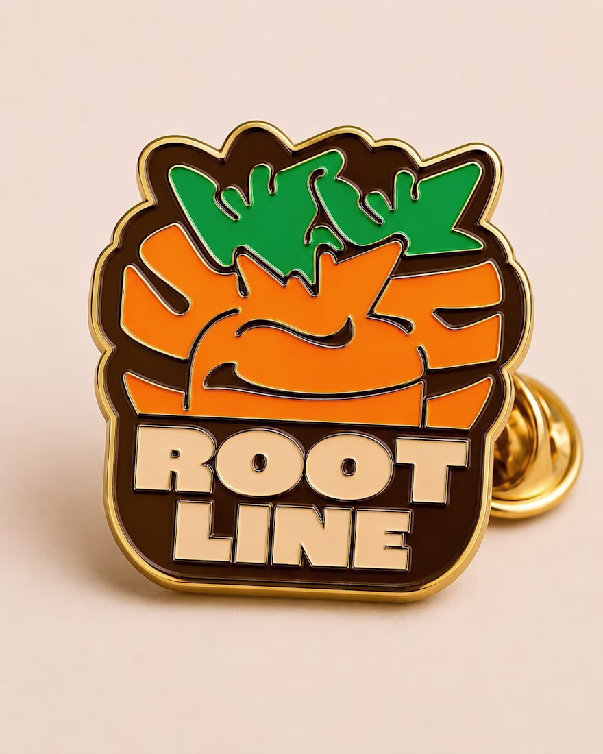
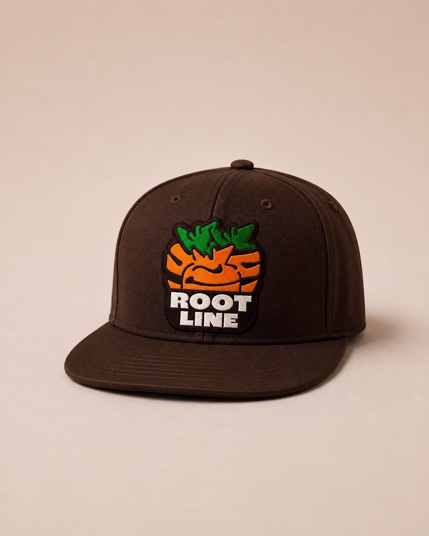
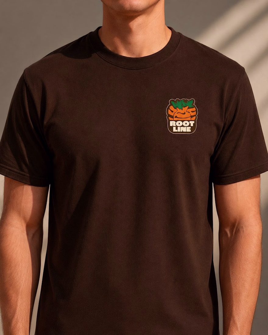
Logo and mascot mark built around a carrot cluster icon
Apparel and merch (tee, snapback, enamel pin)
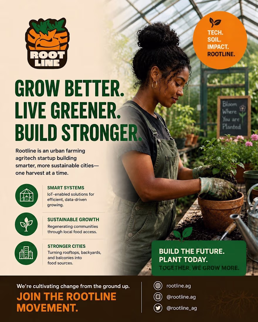
Website homepage with full messaging architecture
Business cards and brand poster
The design decisions were intentional. Earthy browns, harvest oranges, deep greens — not because they're "on trend" but because they reflect what the brand actually does. The streetwear application (snapback, pin, tee) was a test: can this identity hold up outside of a screen? It does.
The bigger challenge wasn't visual. It was messaging. Most agritech brands lead with data and lose the human. Rootline needed to feel like a movement, not a white paper. "Rooted in the city. Growing the future." became the anchor.
Brand design only works when the system is consistent across every touchpoint. That's the standard I held this project to.
The network for creativity
Join 1.25M professional creatives like you
Connect with clients, get discovered, and run your business 100% commission-free
Creatives on Contra have earned over $150M and we are just getting started
Related posts
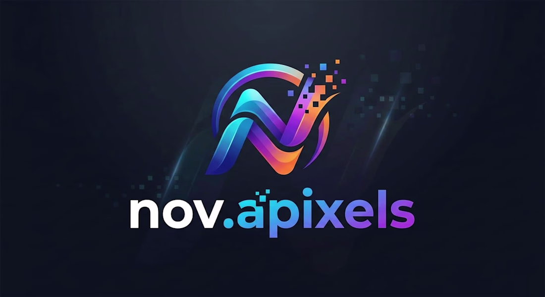
Title: nov.apixels: Visual Identity & Digital Signature Design
Project Description: This project covers the visual identity development for "nov.apixels," my personal brand as a multi-disciplinary digital content creator and designer. The name combines "Nova" (symbolizing a new star/innovation) with "Pixels" (the fundamental building blocks of my digital world). The logo represents the process of transforming creativity into digital forms and reflects a vision that bridges art and technology.
Design Approach & Symbolism
Emblem Design: The stylized "N" is crafted with a dynamic perspective. The pixel particles disintegrating from the top right signify the transition from static ideas to fluid motion and digital life.
Color Theory (Cosmic Gradient): The gradient transition from deep navy to vibrant magenta and cyan represents the vastness of the digital universe and aligns with cutting-edge design trends.
Typography: The choice of a modern, sans-serif, lowercase font for "nov.apixels" establishes a brand voice that is approachable and friendly yet remains tech-centric and professional.
Skills Utilized: Personal Branding, Logo Design, Typography, Vector Illustration, Color Theory Development.
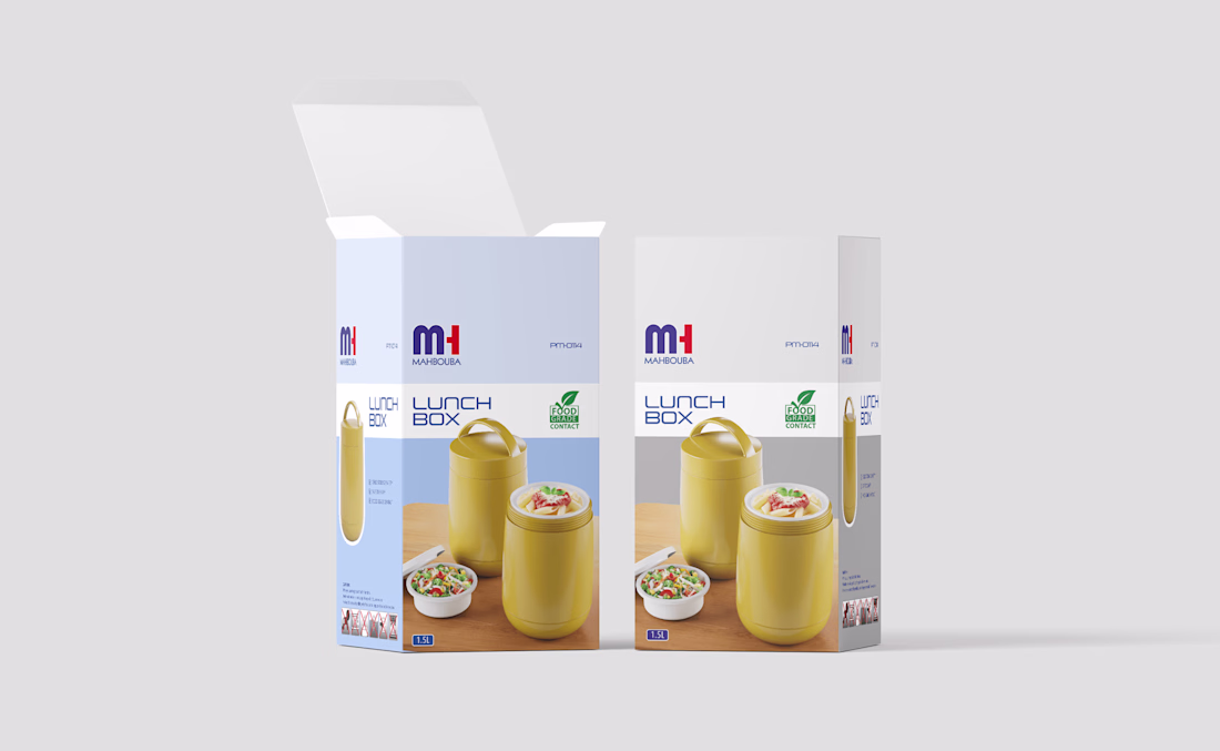
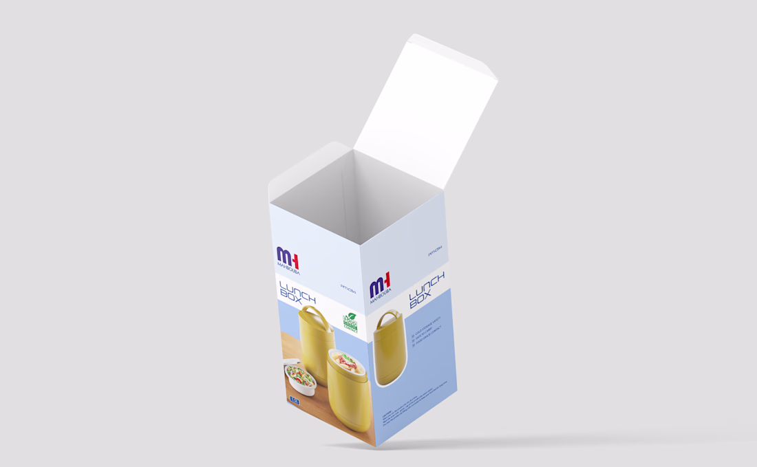
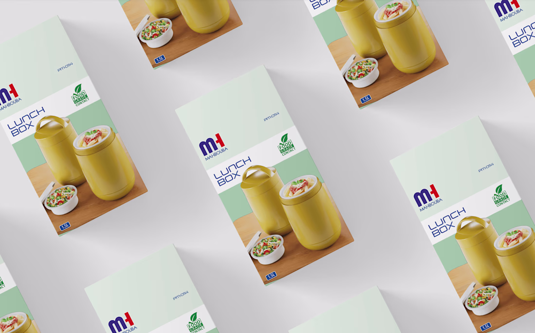
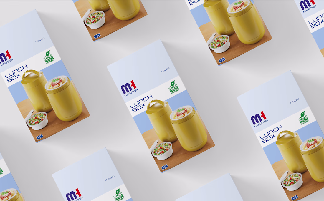
Lunchbox packaging design 🍱
Clean, modern, and functional visuals crafted to enhance both brand identity and customer experience.
#PackagingDesign #LunchboxDesign #Branding #GraphicDesign
Packaging DesignAdobe Creative CloudAdobe PhotoshopAdobe Illustratorpackagingbrandingpackagingdesign
Agriculture products are becoming smarter.
Their interfaces should evolve too.
Olayard is an AI farming motion design concept built around clarity, sustainability, and intelligent decision-making.
The experience combines:
• Dynamic crop tracking
• Smart weather insights
• Pest & disease detection
• Sustainable farming analytics
Instead of overwhelming users with complex systems, the focus was creating an experience that feels intuitive, modern, and actionable.
This is where agritech meets product-focused UI UX.
Currently available for AI dashboards, SaaS platforms, agritech systems, and motion-driven product experiences.
Let’s build a product users actually understand and enjoy using. DM us on Contra.
Trending
Claude
Claude has entered the design space. How are you using Claude Design?
Contra University
Learn from expert creatives how to earn more using next-gen AI tools.
creativeaiflow
Creative AI workflows are evolving. What tools do you use, and what are their strengths and weaknesses?
portfolioreview
The best portfolios tell a story, not just show a grid. Share yours for feedback.
freelancerlife
Freelancer life is wins, pivots, and everything in between. What’s yours right now?