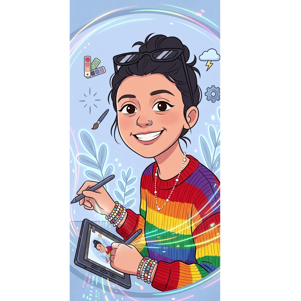
Biğçe Eylül AŞIk
- Web developer building responsive and modern websites.
New to Contra
Biğçe Eylül is ready for their next project!
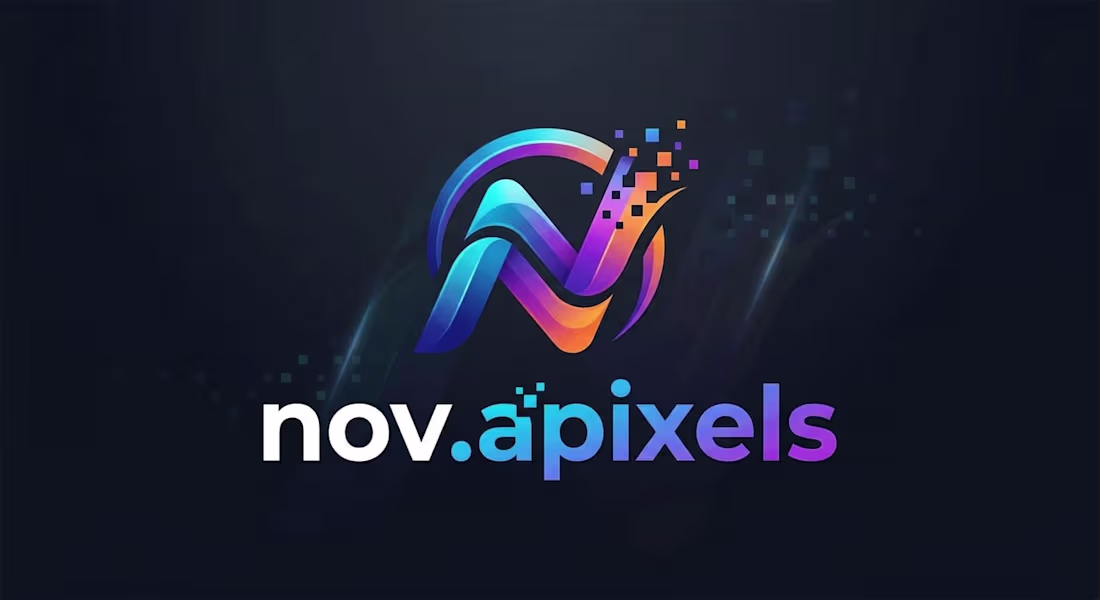
Title: nov.apixels: Visual Identity & Digital Signature Design
Project Description: This project covers the visual identity development for "nov.apixels," my personal brand as a multi-disciplinary digital content creator and designer. The name combines "Nova" (symbolizing a new star/innovation) with "Pixels" (the fundamental building blocks of my digital world). The logo represents the process of transforming creativity into digital forms and reflects a vision that bridges art and technology.
Design Approach & Symbolism
Emblem Design: The stylized "N" is crafted with a dynamic perspective. The pixel particles disintegrating from the top right signify the transition from static ideas to fluid motion and digital life.
Color Theory (Cosmic Gradient): The gradient transition from deep navy to vibrant magenta and cyan represents the vastness of the digital universe and aligns with cutting-edge design trends.
Typography: The choice of a modern, sans-serif, lowercase font for "nov.apixels" establishes a brand voice that is approachable and friendly yet remains tech-centric and professional.
Skills Utilized: Personal Branding, Logo Design, Typography, Vector Illustration, Color Theory Development.
1
8
Title: Motion Graphics: Dynamic Visual Narrative & Cinematic Editing
Project Description: This project is a fusion of high-engagement motion design and cinematic editing techniques tailored for digital media platforms. The primary objective was to leverage the power of movement to transform concepts into captivating visual experiences that command attention from the very first frame. This piece serves as a demonstration of how design evolves through time, rhythm, and motion.
Technical Details & Approach:Layered Composition: Advanced multi-layer compositing techniques were employed to enhance the sense of depth and dimension within the visuals.
Rhythm & Synchronization: Visual transitions and motion elements were meticulously synchronized to a specific rhythm to create a fluid and seamless viewing experience.
Light & Color Manipulation: Dramatic lighting effects and professional color grading were applied to amplify the atmospheric quality and visual impact of the content.
Skills Utilized: Motion Design, Video Post-Production, Cinematic Editing, Visual Effects (VFX), Digital Storytelling.
1
35
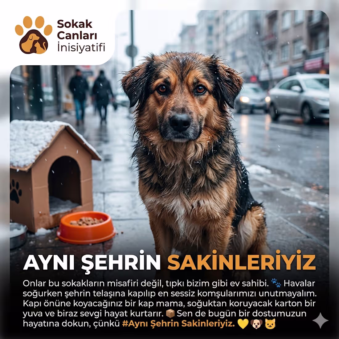
Title: Street Paws Initiative: "We Share the Same City" Digital Awareness Campaign
Project Description: This concept project for the animal rights advocacy group "Street Paws Initiative" aims to highlight the challenges faced by stray animals in urban environments. Designed as a social media awareness campaign, the project features a striking visual language and content strategy engineered to evoke empathy and encourage immediate community action.
Design Approach:Visual Communication: Emotion-driven animal portraits with direct eye contact were utilized to establish an immediate, poignant connection with the audience and deliver the message powerfully.
Color Psychology: A deliberate contrast was created using cold gray/blue tones (symbolizing the harshness of the streets) against warm yellow/orange hues (symbolizing hope, warmth, and solidarity).
Typography & Hierarchy: Bold, modern sans-serif typography was chosen to ensure the core message remains prominent, highly readable, and free from visual clutter.
Skills Utilized: Advocacy & Purpose-Driven Design, Social Media Design, Typography, Color Psychology, Copywriting, Emotional Design.
1
37
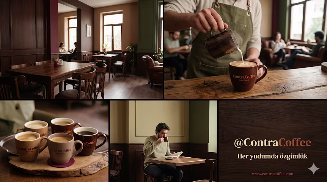
Title: @ContraCoffee: Visual Identity & Content Strategy for a Boutique Coffee Brand
Project Description: This project aims to construct a comprehensive visual ecosystem for "@ContraCoffee," a conceptual boutique coffee brand, and deliver it through a cohesive content strategy. To reflect the brand's core values of "authenticity" and "craftsmanship," a visual language blending traditional and modern elements was developed. The scope of the project includes logo design, color palette creation, typography selection, and content drafts that translate this identity across both physical and digital touchpoints.
Design Approach:
Color Palette: Dark wood textures and a gradient of coffee tones form the foundational palette, emphasizing a warm and inviting atmosphere. Mature, sophisticated secondary colors like burgundy and khaki green were introduced to provide a grounded contrast.
Typography: A modern yet timeless serif font was selected to reinforce the premium, "boutique" feel.
Visual Storytelling: Social media content concepts focus on capturing the shop's ambiance, the artisanal coffee-making process, and the authentic customer experience.
Mockups: Conceptual designs for physical assets were created, including branded ceramic coffee mugs and wooden table setups.
Skills Utilized: Brand Identity Design, Visual Storytelling, Social Media Content Strategy, Color Theory, Typography, Photo Editing & Manipulation.
1
48