The network for creativity
Join 1.25M professional creatives like you
Connect with clients, get discovered, and run your business 100% commission-free
Creatives on Contra have earned over $150M and we are just getting started
Back to feedPost

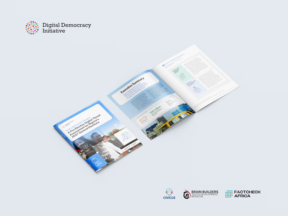
I designed a comprehensive editorial report for Brain Builders Youth Development Initiative, funded by Digital Democracy Initiative (DDI) and CIVICUS, presenting research on digital threats and information integrity ahead of Nigeria's 2027 General Elections.
The challenge was to transform extensive research into a publication that was visually engaging, easy to navigate, and suitable for policymakers, researchers, civil society organizations, and development partners.
The design focused on creating a clean editorial system using strong typography, consistent grids, thoughtful use of white space, custom infographics, and visual storytelling to make complex information more accessible.

The network for creativity
Join 1.25M professional creatives like you
Connect with clients, get discovered, and run your business 100% commission-free
Creatives on Contra have earned over $150M and we are just getting started







Related posts


Built the StupidFish Design System from the ground up and covering everything from color, typography, spacing, and components to comprehensive documentation.
Designed and documented for both web and mobile, creating a consistent, scalable foundation that makes product design and development faster and more cohesive.
Check out the full case study here →


Really thorough system, nice job


This is fire 🔥

Our latest case study is live! 🌿
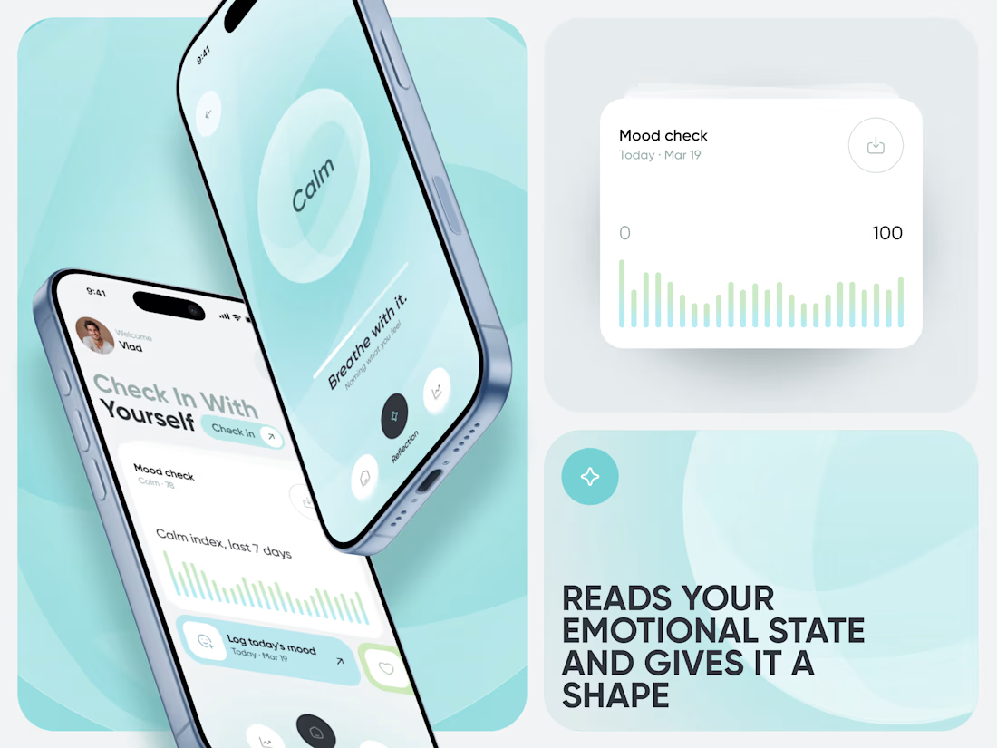
Meet Calm, an AI-powered wellness app designed to make mood tracking, emotional insights, and healthier daily habits feel simple and approachable.


That's great case study that's really a great job 🎉🎉🔥🔥