The network for creativity
Join 1.25M professional creatives like you
Connect with clients, get discovered, and run your business 100% commission-free
Creatives on Contra have earned over $150M and we are just getting started
Back to feedPost
Taste Test

Good Job

Thank you Rasel 😊

Option 1 all day! The purple flame on white pops more. Love the Duolingo-for-couples concept too 🔥
Thank you Stephaine. Planning to work on it for the Makeathon, will share more updates sooon 😊

u mean logo? 😂

Option 1!!
The network for creativity
Join 1.25M professional creatives like you
Connect with clients, get discovered, and run your business 100% commission-free
Creatives on Contra have earned over $150M and we are just getting started





Related posts

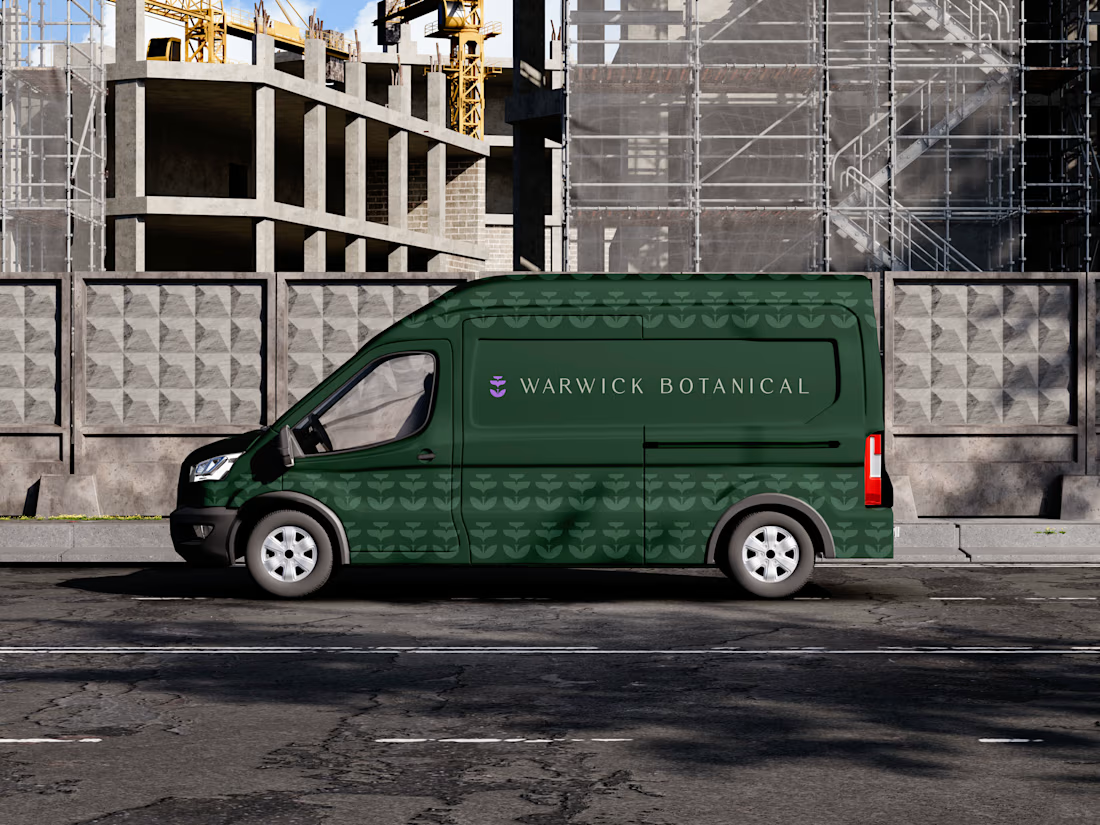
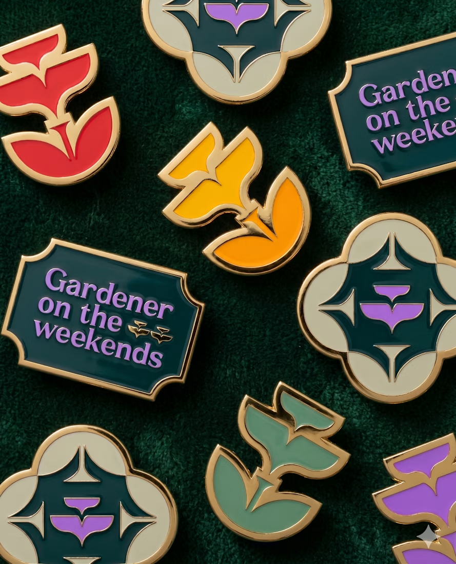
POLIDO’s brand identity brings the wordmark, typography and color into one visual system. The video shows it through application mockups.
What has changed in your business that your brand still needs to reflect?


The handwritten polido wordmark on that muted green has real warmth. Hot take: your closing question about what has changed in the business is stronger than the logo reveal, because it speaks straight to a buyer. I would open every case study with it.

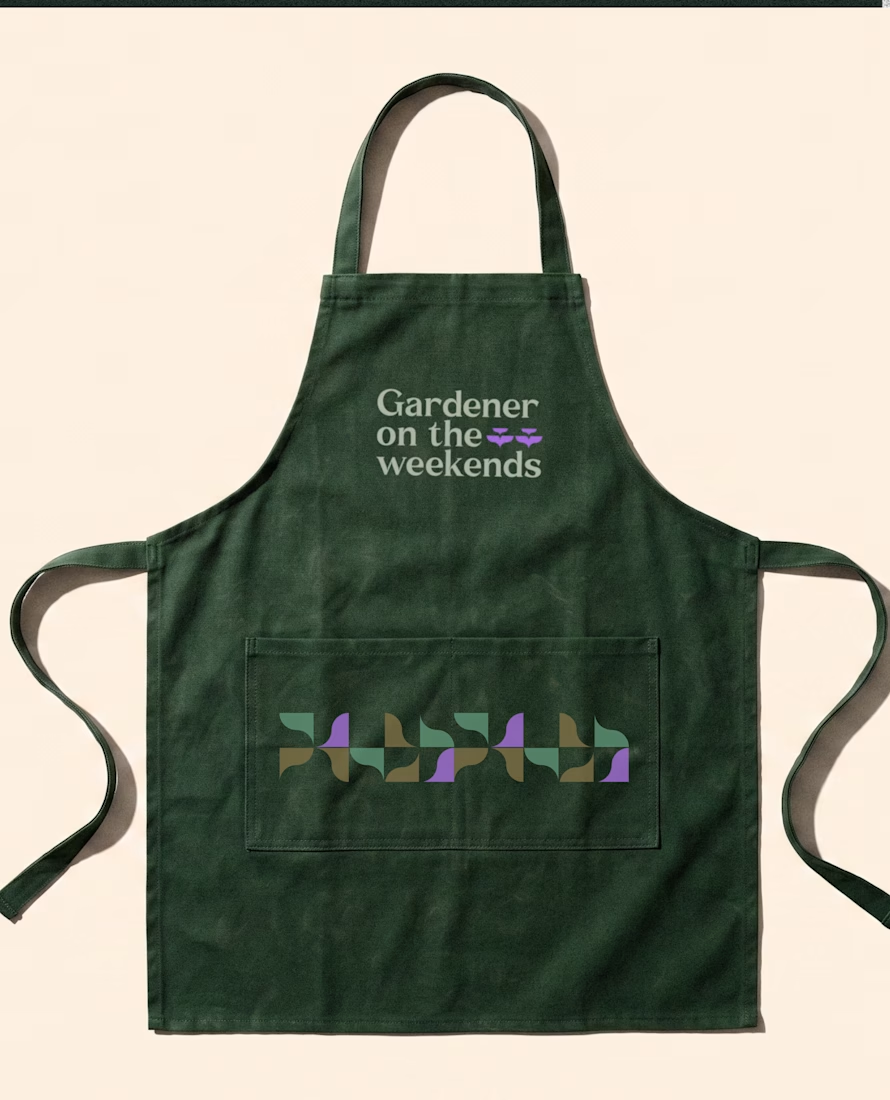
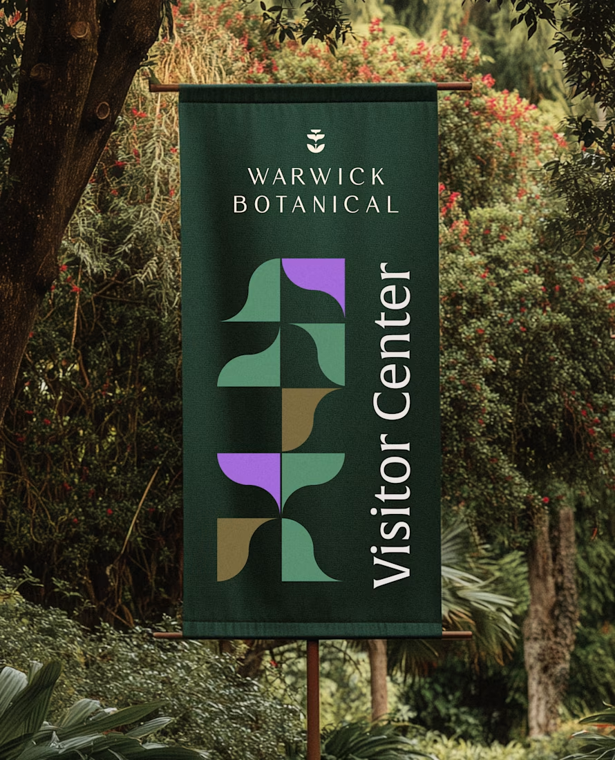
For brand identity, I like to show mockups to test of the identity system: the logo, pattern, and color palette all needed to work at a much larger scale without feeling overdesigned.
That’s where a flexible brand system really starts to prove itself.

Product content that feels natural, not like a traditional advertisement.
An AI UGC concept created with a creator focused presentation, natural product interaction, and short form pacing designed for social media.
Built for brands that want engaging content for TikTok, Instagram Reels, and ecommerce campaigns.
AI UGC | Product Content | Social Media Video | Ecommerce

