The network for creativity
Join 1.25M professional creatives like you
Connect with clients, get discovered, and run your business 100% commission-free
Creatives on Contra have earned over $150M and we are just getting started
Back to feedPost

✨ Building Better Digital Experiences with UI/UX Design
Hi everyone 👋
I'm currently building my journey as a UI/UX Designer, creating clean, modern, and user-friendly digital experiences using Figma.
💻 What I work on:
🎨 Website UI/UX Design
📱 Mobile App Design
📊 SaaS & Analytics Dashboards
🧩 Wireframes & Interactive Prototypes
I enjoy turning ideas into meaningful digital experiences with a focus on usability, visual hierarchy, and clean design.
I'm excited to connect with founders, startups, and businesses looking to bring their digital product ideas to life. 🚀
If you're working on a website, app, or dashboard project, let's connect
#UIDesign #UXDesign #Figma #WebDesign #FreelanceDesigner
The network for creativity
Join 1.25M professional creatives like you
Connect with clients, get discovered, and run your business 100% commission-free
Creatives on Contra have earned over $150M and we are just getting started








Related posts

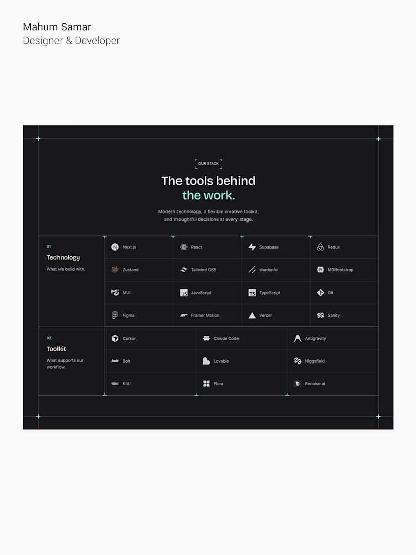
Designed a tech stack and toolkit section for a web design and development agency.
The goal was to present the technologies and creative tools behind the agency's work in a clean, structured, and easy-to-explore layout.
A clear visual hierarchy, grid-based layout, subtle dividers, and teal accents keep everything consistent with the overall brand identity.
For agencies and SaaS founders, a website should do more than look good. It should communicate expertise, build trust, and make it easy for potential clients to understand what you offer.
That's the thinking I bring to every design.
Designed in Figma.


The grid dividers keep the tool list easy to scan. Nice restraint with the teal.

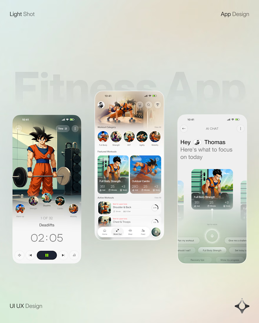
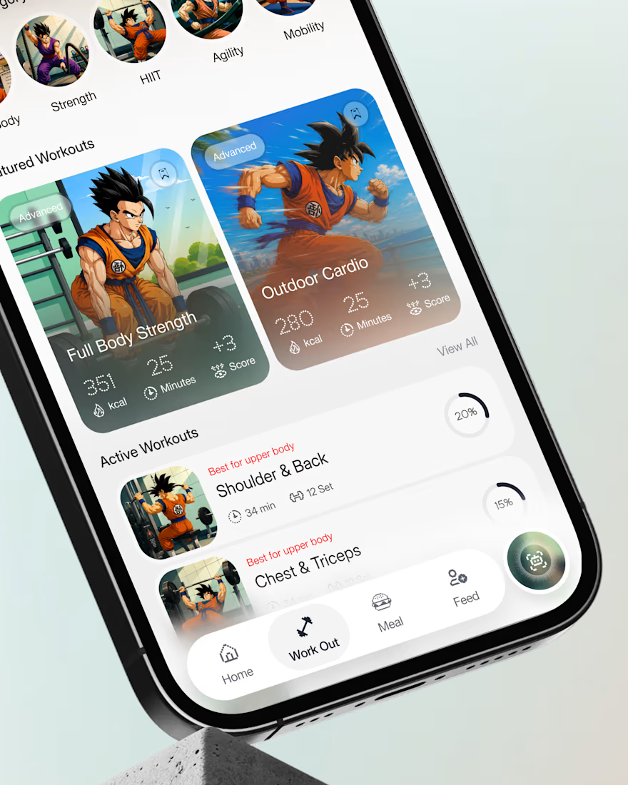
What if your fitness app felt like having a personal trainer in your pocket?
Meet your new workout companion. A bold fitness app concept combining personalized workouts, AI coaching, and a seamless mobile experience to make every session count.
Would you use this to level up your fitness journey?


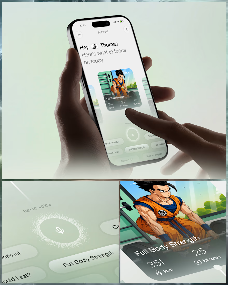
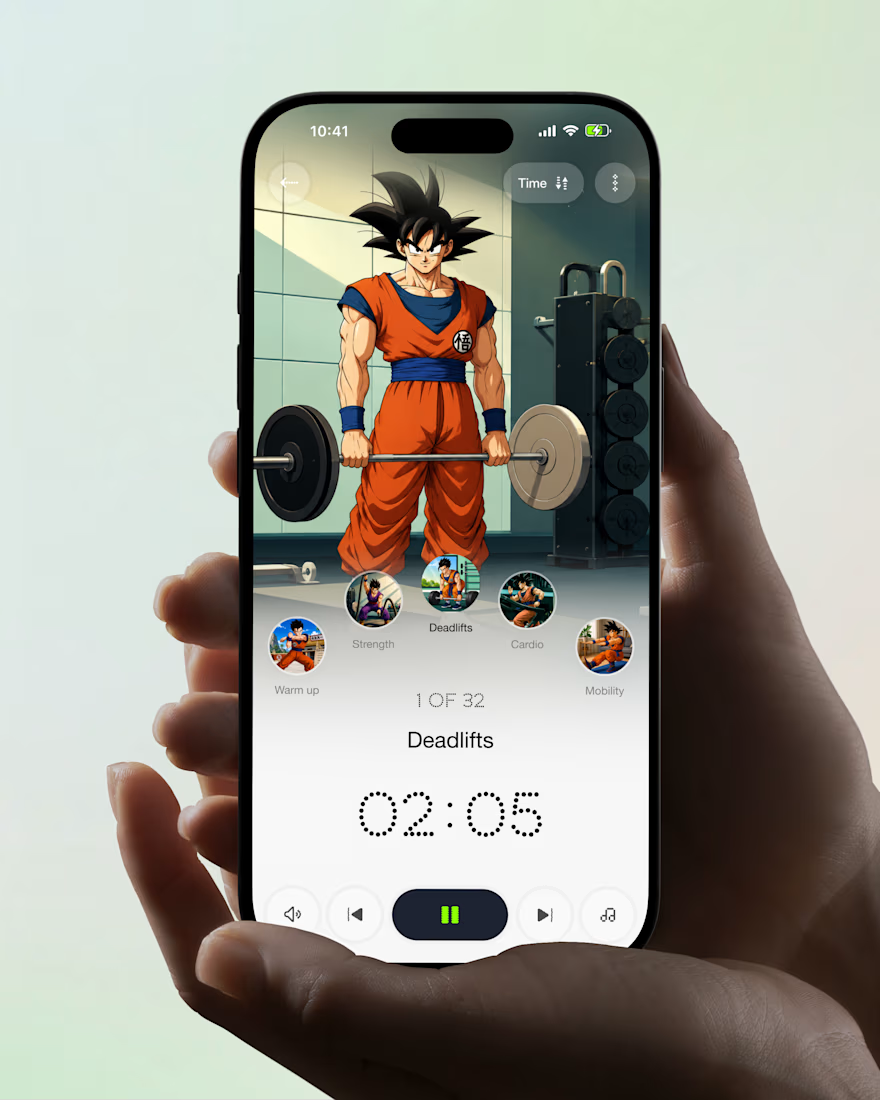

Ye le Jani Juice Lab wali post ke liye copy-ready:
Love this concept Juice Lab! A fitness app that feels like a personal trainer in your pocket is exactly what's needed — combining personalized workouts with AI coaching and a seamless mobile experience is a great approach. The...

Working on a SaaS dashboard concept in Figma. 🚀
The goal is to make complex business data easier to scan and understand through clear visual hierarchy, structured analytics cards, and organized navigation.
Still refining the details and exploring ways to make the experience more intuitive.
What matters more to you in a dashboard: clean visuals or faster access to insightful?
#Ui designs #Ux design #Saas design #Figma
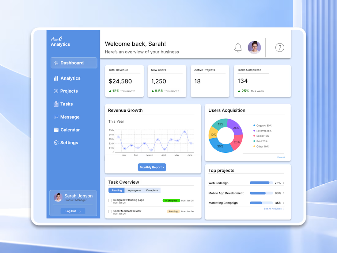

For a dashboard like this, I’d test whether the key action stays visible when the cards are filled with real, uneven data—not just placeholder numbers. What kind of business data are you designing the first view around?