The network for creativity
Join 1.25M professional creatives like you
Connect with clients, get discovered, and run your business 100% commission-free
Creatives on Contra have earned over $150M and we are just getting started
Back to feedPost

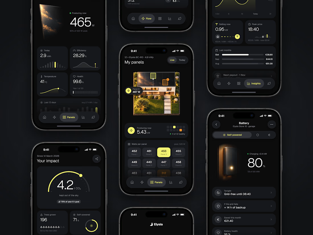
Everything about your home energy in one app: production, panels, battery, earnings and impact, each screen answering one question.
Branding, UI/UX, 3D and motion.
The network for creativity
Join 1.25M professional creatives like you
Connect with clients, get discovered, and run your business 100% commission-free
Creatives on Contra have earned over $150M and we are just getting started



Related posts

Many tries for one effect. That's the honest story of the Inward headline
Inward is a concept landing page I made for noise-cancelling headphones. I wanted the words NOISE TO FOCUS to react to the cursor
Particles came first. Glitch with doubled letters broke reading. Grain was next, then crumbs, which felt dirty. Halftone was too graphic
I went back to particles, made them gentler and kept them only under the cursor. That one stayed
The video shows every version, one after another
None of the dropped versions were wasted. Each one showed what the product didn't want
Which version would you have shipped?

Super cool!


what do u collect?
i'm currently travelling the southern hemisphere, so I've been picking up loads of beautiful boarding passes, tickets and receipts from everywhere I've been.
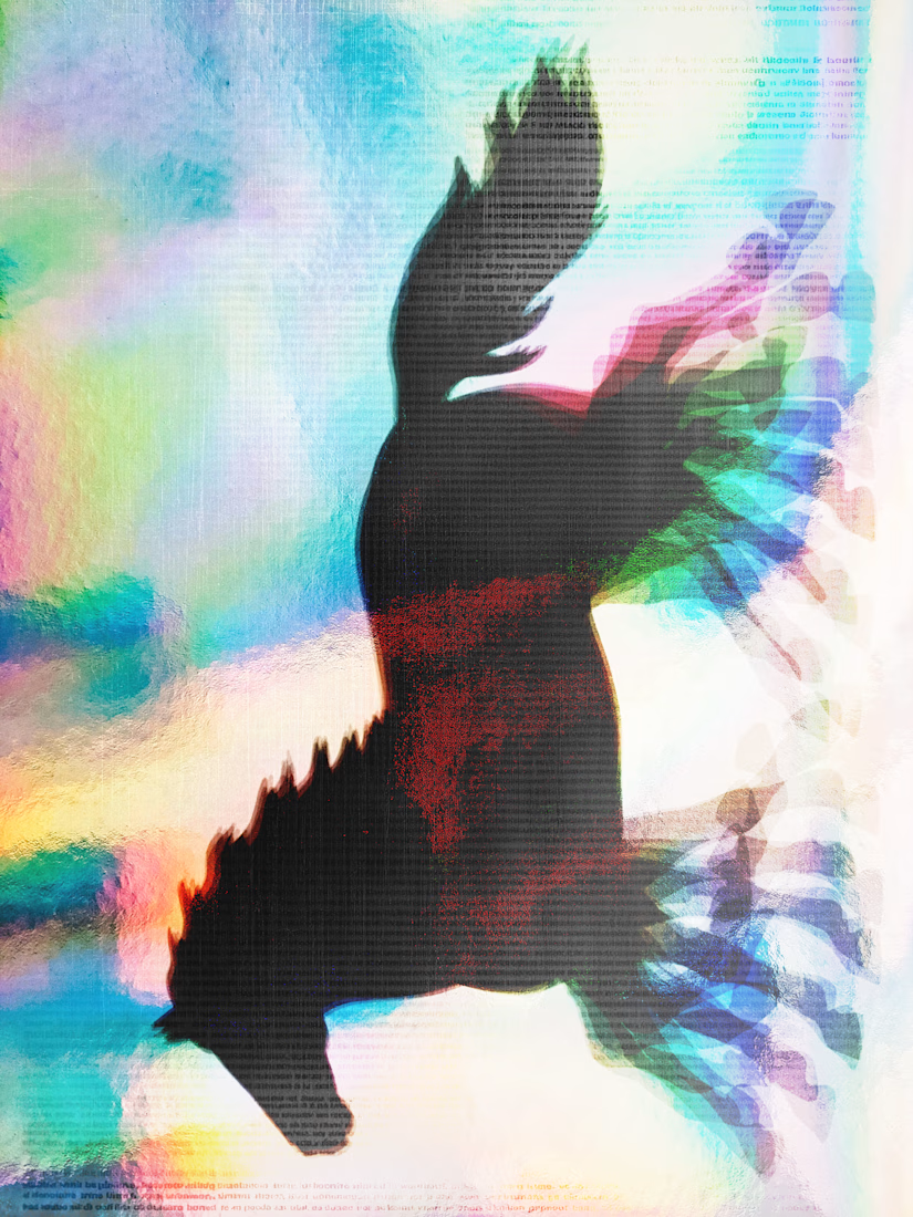
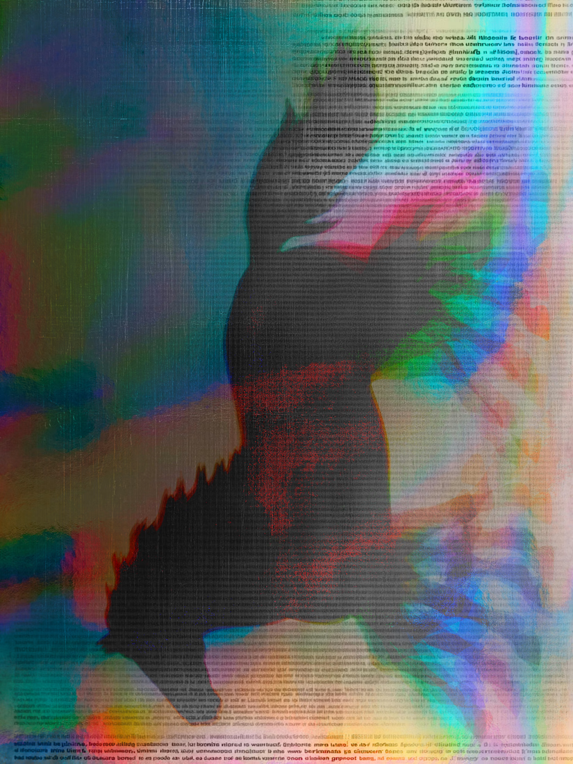
this morning i worked on these collaged animations in photoshop, inspired by the collection of receipts growing in my wallet + by this lovely holographic ticket animation by SHIROTA.
lots of texture + type always make for the prettiest animations.

Very nice
Two things most solar owners want to know after sunset: will the battery last the night, and what did the extra sun earn? These screens answer both.