The network for creativity
Join 1.25M professional creatives like you
Connect with clients, get discovered, and run your business 100% commission-free
Creatives on Contra have earned over $150M and we are just getting started
Back to feedPost

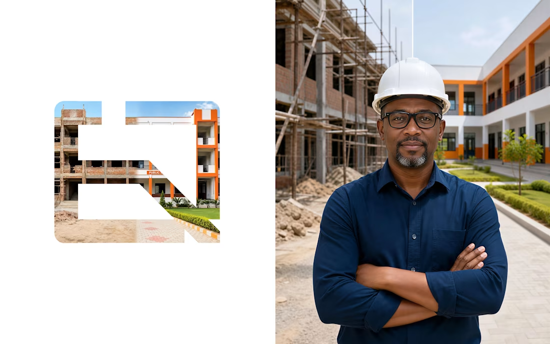
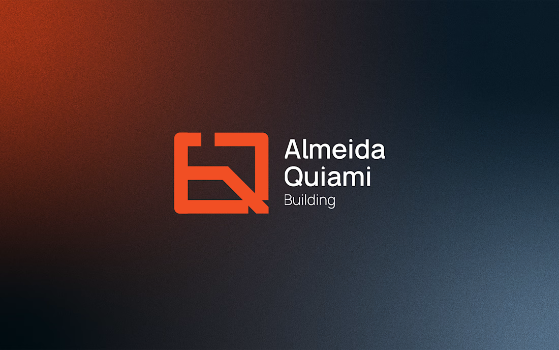
Almeida Quiami is a large-scale construction company, he already existed — it had history, structure, and accumulated experience. What was missing was an image that matched its ambitions.
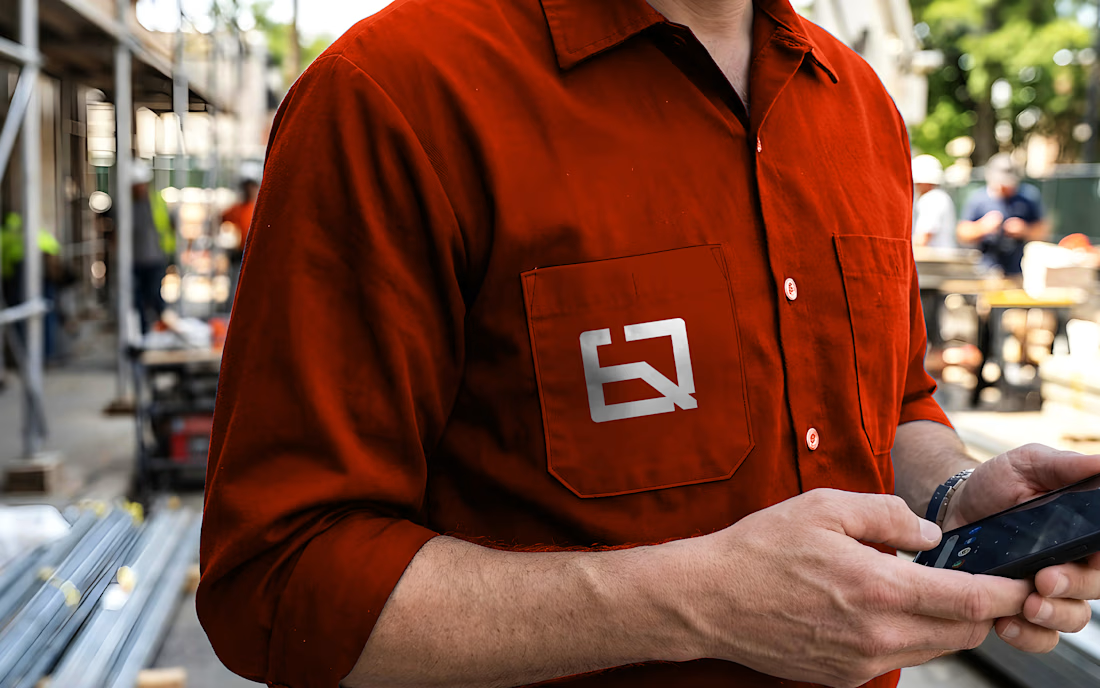
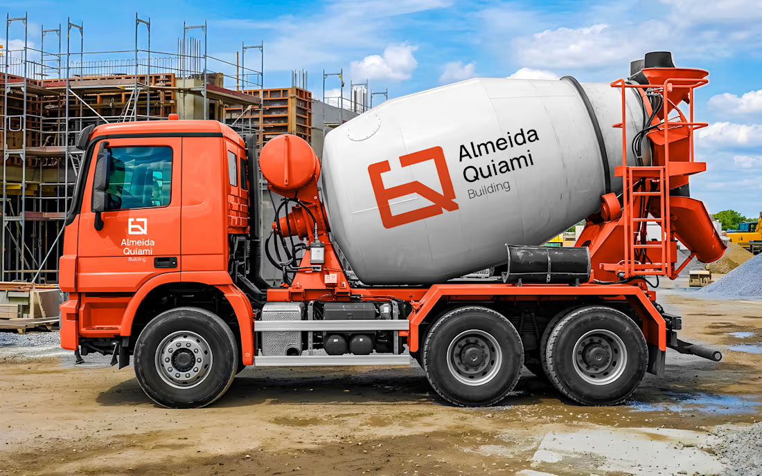
The icon is built from the initials "AQ," abstracted into angular geometric shapes that evoke engineering structures and floor plans. The diagonal cutting through the symbol introduces dynamism and direction, conveying a company in motion with a vision for the future.
The bold, uppercase wordmark reinforces the institutional presence. Everything communicates structure, precision, and modernity. No ornaments. No noise.


The network for creativity
Join 1.25M professional creatives like you
Connect with clients, get discovered, and run your business 100% commission-free
Creatives on Contra have earned over $150M and we are just getting started
Trending
retrofuturism
Share your favorite designs from the past exploring the distant future. Or your own take on the aesthetic 🚀
halftone
Dots. Texture. Grain. Let's see your designs using the halftone technique.

Midjourney
Creatives are showing off what they're making with Midjourney.
colorgrade
Video editors sound off: How do you enhance the mood of your video in color grading?





Related posts


A playful sparkling fruit drink built around bold flavour, bright colours, and a personality that refuses to take itself too seriously. Every element is designed to feel energetic, juicy, and instantly recognizable.

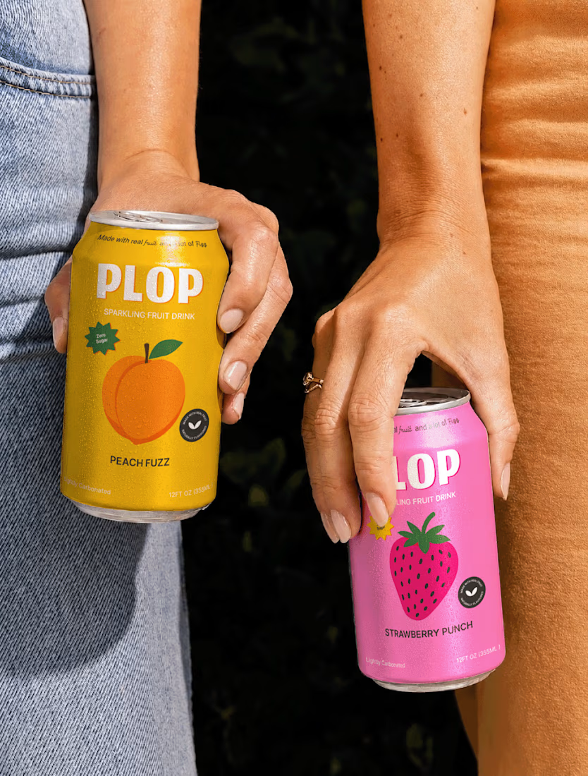
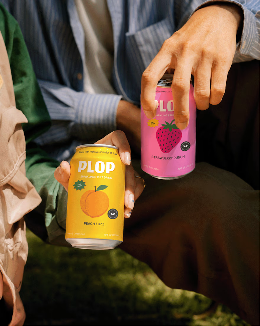
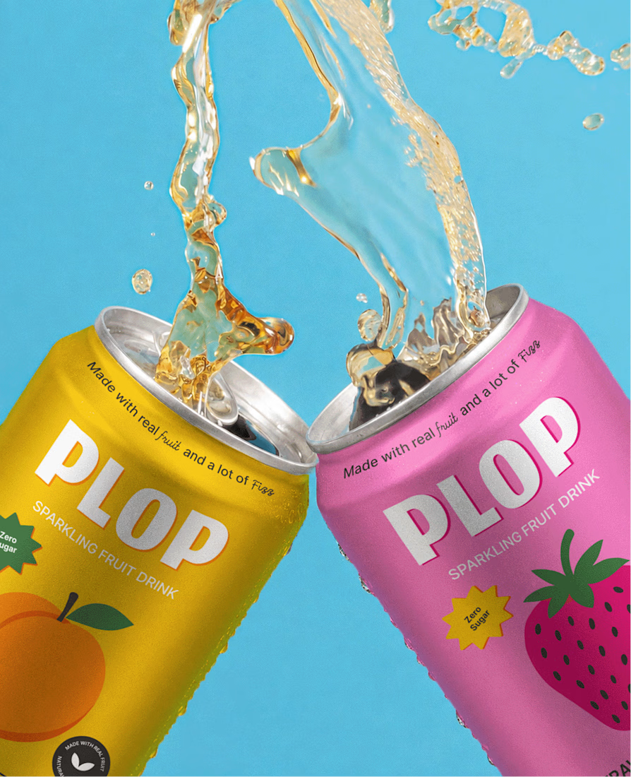
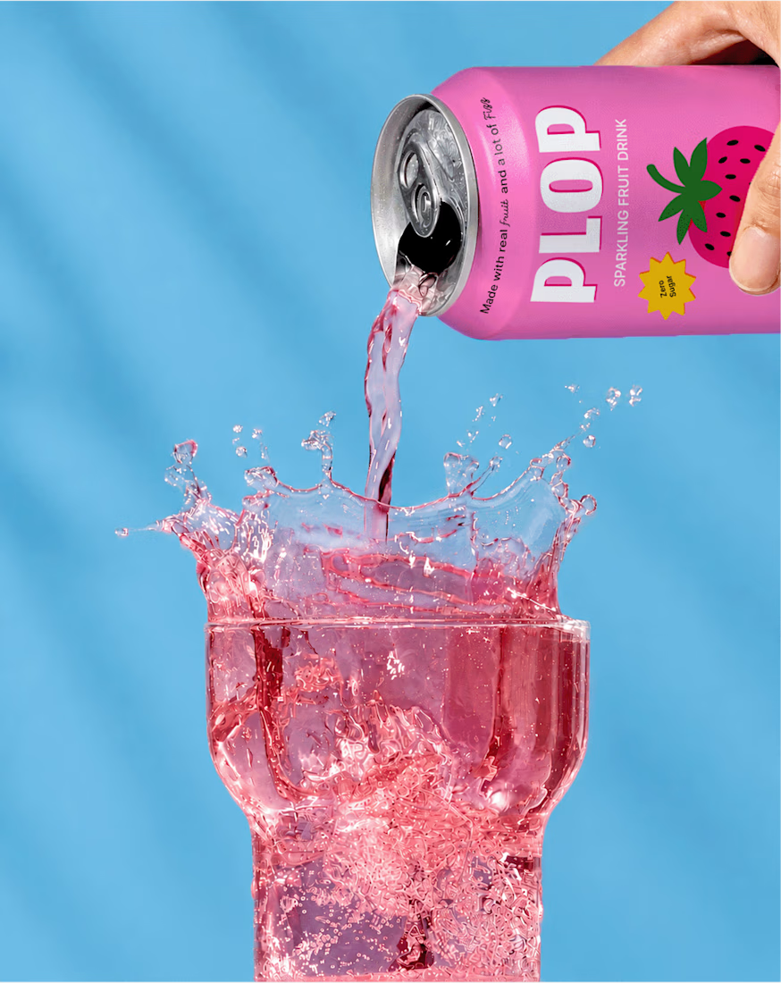

If I walk into a store I will definitely make a buying decision before even checking the content of this drink. The color and branding is eye catching

✨ New here on Contra — and it happens to be my birthday! 🎂
I thought there was no better day to introduce myself.
Hi Contra Family👋 I’m a Logo & Branding Designer, Graphic Designer, and Web/UI Designer with years of experience helping businesses turn ideas into brands that look professional, memorable, and ready to grow.
Over the years, I’ve worked on everything from:
🎨 Logo & Brand Identity
📦 Packaging & Product Design
📱 Social Media & Marketing Graphics
💻 Website & UI/UX Design
🖥️ WordPress Websites
✨ AI-powered Visual Content
I’ve had the opportunity to work with 500+ happy clients, collaborate with teams, manage projects, and help businesses bring their ideas from a rough concept to a polished final product.
But today, I’m not here to talk too much about work.
Today is also a little personal. ❤️
I’m celebrating another year of life, growth, lessons, and new beginnings — and joining Contra feels like part of that new chapter.
So, hello all! 👋
If you’re a designer, founder, creative, marketer, or business owner, I’d love to connect.
Tell me what you do in the comments; let’s get to know each other. 🤝
And if you’re celebrating something today too, let me know! 🎉

You’re welcome here, Moona
Nice to meet you

Presenting branding projects in a Bento grid is something only a real brand designer can understand 😄