The network for creativity
Join 1.25M professional creatives like you
Connect with clients, get discovered, and run your business 100% commission-free
Creatives on Contra have earned over $150M and we are just getting started
Back to feedPost

AI Platform Landing Page Design & Development


The network for creativity
Join 1.25M professional creatives like you
Connect with clients, get discovered, and run your business 100% commission-free
Creatives on Contra have earned over $150M and we are just getting started





Related posts


Very nice


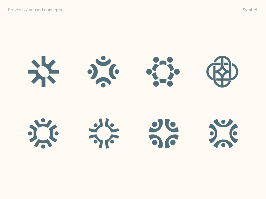
Rejected logo concepts exploring collaboration, shared expertise & working side by side

Most creative brands try to say everything at once.
More colour.
More shapes.
More visual noise.
But for this identity exploration, the idea was simpler:
Make creativity feel meaningful.
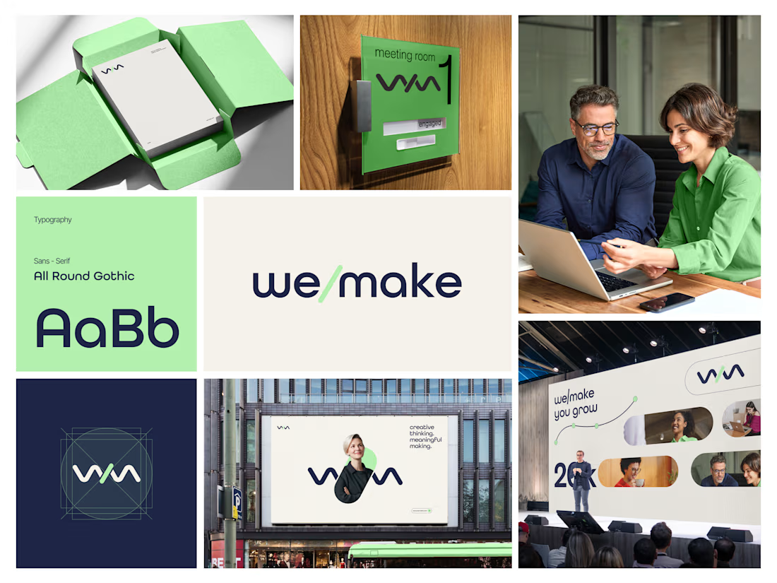
Introducing we/make, a bold, human-centred visual identity built around collaboration, growth, and purposeful making.
The mark is designed as a flexible expression of “we” and “make” coming together.
It represents:
• Ideas turning into action
• People creating together
• Growth through meaningful work
• A creative process that stays clear, warm, and confident
The visual system pairs a deep navy foundation with a fresh green accent, bringing together trust, focus, energy, and optimism.
Rounded typography and soft graphic elements keep the brand approachable, while the structured layouts give it a modern, professional feel.
From stationery and meeting-room signage to campaigns, billboards, and event spaces, the identity is built to work wherever creativity needs to show up.
Creative thinking. Meaningful making.
Would love to hear your thoughts on the visual direction.
What stands out to you first, the logo, colour palette, or overall brand feel?
#BrandIdentity #BrandDesign #CreativeDirection #VisualIdentity #GraphicDesign #LogoDesign