The network for creativity
Join 1.25M professional creatives like you
Connect with clients, get discovered, and run your business 100% commission-free
Creatives on Contra have earned over $150M and we are just getting started
Back to feedPost

I recently watched a founder defend a $15M valuation using a raw Excel screenshot as his main slide.
He assumed the dense grid proved his analytical rigor.
It actually proved he did not know what his core metrics were.
When you paste an unformatted spreadsheet into your pitch deck, you force the investor to do the analysis for you. Excel is a tool for calculation. PowerPoint is a tool for communication. They require completely different approaches.
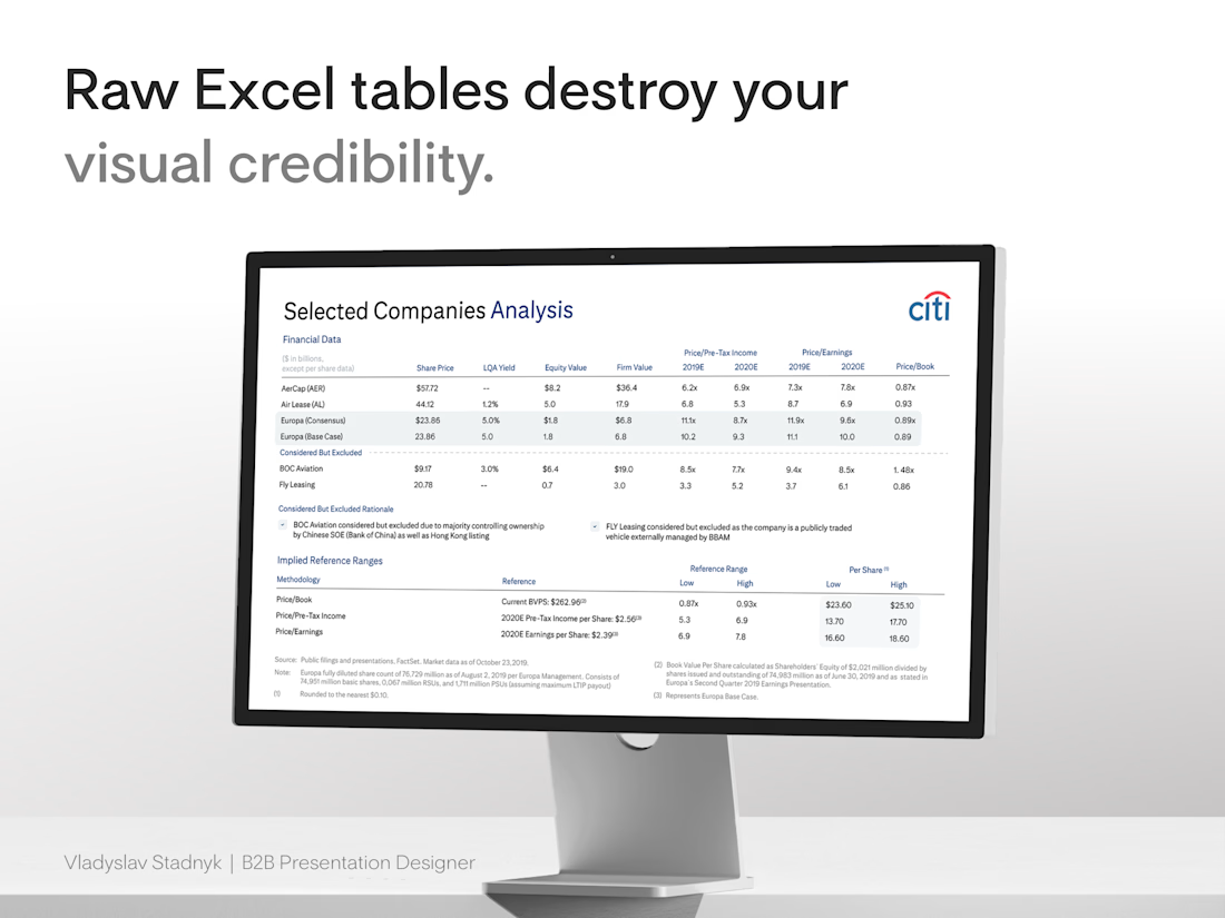
I handled a similar problem when designing a selected companies analysis for Citi. The initial draft was a wall of default borders and tiny numbers. The data was accurate, but the narrative was completely buried.
We threw out the screenshot and used The Frictionless Data Method.
First, we killed the gridlines. Heavy borders add unnecessary visual noise. We let whitespace separate the columns naturally 📐
Then we fixed the alignment. Left-align the text categories. Right-align the financial numbers. This creates a sharp visual edge the human eye processes instantly ⚡
Finally, we anchored the insight. We applied a subtle background fill to the one specific column that justified the valuation. We made the conclusion impossible to miss 🎯
Start here: open your deck and find your densest financial table.
Delete the lazy image import. Rebuild it natively, strip away the borders, and highlight the single number that drives your deal.


The network for creativity
Join 1.25M professional creatives like you
Connect with clients, get discovered, and run your business 100% commission-free
Creatives on Contra have earned over $150M and we are just getting started




Related posts


PrettyClever designed the Maximize website and hired me to build it 1:1 in Framer. Check it out below.


the maximize site in framer looks so good. how long was the 1:1?


Experimenting with avatar animation using Figma + Motion ✨
Honestly, I never thought Figma Motion could generate motion this smooth, it’s starting to feel surprisingly close to what I’d normally achieve in After Effects.
Figma Motion is definitely making motion exploration much more accessible for product designers. 👀

This is getting surprisingly close to AE for quick motion exploration. Curious how well it holds up once the animations get more complex.

Working on the hardest project of my life. Our own website! So much done and so much more still to do!
All built with codex and Framer
aperios-design.co.uk


