The network for creativity
Join 1.25M professional creatives like you
Connect with clients, get discovered, and run your business 100% commission-free
Creatives on Contra have earned over $150M and we are just getting started
Back to feedPost

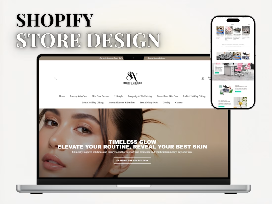
HIGH-CONVERTING SHOPIFY STORE DESIGN
I built a complete Shopify store for dropshipping and affiliate products that are simple to use, easy to manage, and designed to help customers buy without confusion.
The main goal was to create a clean store that looks good, works well on mobile, and makes it easy for visitors to go from seeing a product to buying it.
What I did:
-Created the Shopify store from scratch
-Designed a simple and clean layout
-Added and organized products into collections
-Wrote and arranged product pages in a way that is easy to understand
-Set up navigation so customers can find products quickly
-Made sure the store works well on mobile phones
-Added basic trust elements to make the store look reliable
-Set up a simple checkout process to avoid drop-offs
-Structured the store for both dropshipping and affiliate products
Result:
A clean and easy-to-use Shopify store that is ready for traffic and built to help turn visitors into customers.


The network for creativity
Join 1.25M professional creatives like you
Connect with clients, get discovered, and run your business 100% commission-free
Creatives on Contra have earned over $150M and we are just getting started
Challenges
View all


Related posts

Went deeper on the case study layout in STUDIO HRSE, strategy, visuals, and a scroll transition straight into the next project, so nobody hits a dead end.
This is the page I'd want a potential client to actually read start to finish.
Free template, live on Framer.
https://www.framer.com/marketplace/templates/studio-hrse/


So cool!

What should a platform for tokenized private equity look like?
Probably not like another traditional bank.
For ICME, the client wanted a visual direction that felt modern, disruptive, and native to a new kind of financial market.
The challenge was finding the balance: make the experience bold enough to feel different, while keeping a complex product understandable and credible.
I developed a digital-brutalist direction with retrofuturist touches - oversized typography, hard contrast, pixel textures, raw layouts, blue gradients, and controlled motion.
I worked with Arash Attar and the ICME team across the landing page and parts of the wider product interface. This video focuses specifically on the landing-page experience.
The goal was to:
— Explain tokenized private-company equity more clearly
— Create a memorable visual identity for the product
— Speak to both investors and founders
— Make financial technology feel ambitious rather than conventional
Would this visual direction make you want to explore the product - or should financial platforms feel more restrained?


This is amazing, man.
Good job!

Premium E Commerce Website Design A visually immersive fashion storefront combining editorial imagery, intuitive navigation, curated product presentation, and a refined shopping experience.
Course DeveloperResponsive DesignGo High LevelKajabiPodiakajabiexpertcoursedesignwebdesignWeb Design


Nice Design Keemie


