The network for creativity
Join 1.25M professional creatives like you
Connect with clients, get discovered, and run your business 100% commission-free
Creatives on Contra have earned over $150M and we are just getting started
Back to feedPost

Excited to take part in the Mobbin Challenge on Contra! After spending quite some time exploring UI/UX design, I’m excited to finally put my research and inspirations into action.

The network for creativity
Join 1.25M professional creatives like you
Connect with clients, get discovered, and run your business 100% commission-free
Creatives on Contra have earned over $150M and we are just getting started





Related posts

👋 I'm new to Contra and I did my first post without realizing I hadn't even introduced myself!
Hey I'm Katya, I'm an AI Systems Architect, marketer and yoga teacher.
I build AI systems that bring in business and handle the work behind it. A voice agent that calls new leads back within seconds and books the appointment. A pipeline that traced 16,900+ leads to the ads that brought them. Listing videos made from the photos a real estate agent already has.
The marketing side came first. I built the multi-channel campaign for Jay Shetty's launch (22 million followers). After that I discovered the tech world and when AI came along, I realized I'm a builder at heart and never looked back! Building is so much fun 🤍
Here's what I've shared:
My first post: on building a fully AI-made YouTube video, end to end, because I'm camera shy 🙈 https://contra.com/community/MP9mFRuT-im-building-my-first-fully-ai-made
Last thing, if you're building with AI video or automation, I'd like to see what you're working on
And if you're hiring: I may be new to Contra but definitely not new to this work. Reach out for AI agent builds, apps, websites or anything in between.
P.s The video below is my AI avatar. My profile video is the real me :)
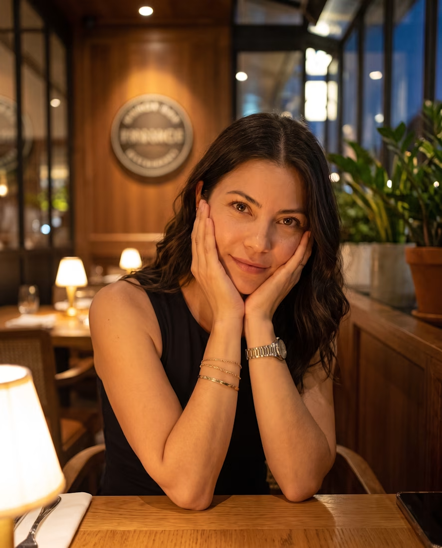

Nice Portrait....Has everything from a great pose, great composition and lighting and perfect environment setting.


