The network for creativity
Join 1.25M professional creatives like you
Connect with clients, get discovered, and run your business 100% commission-free
Creatives on Contra have earned over $150M and we are just getting started
Back to feedPost

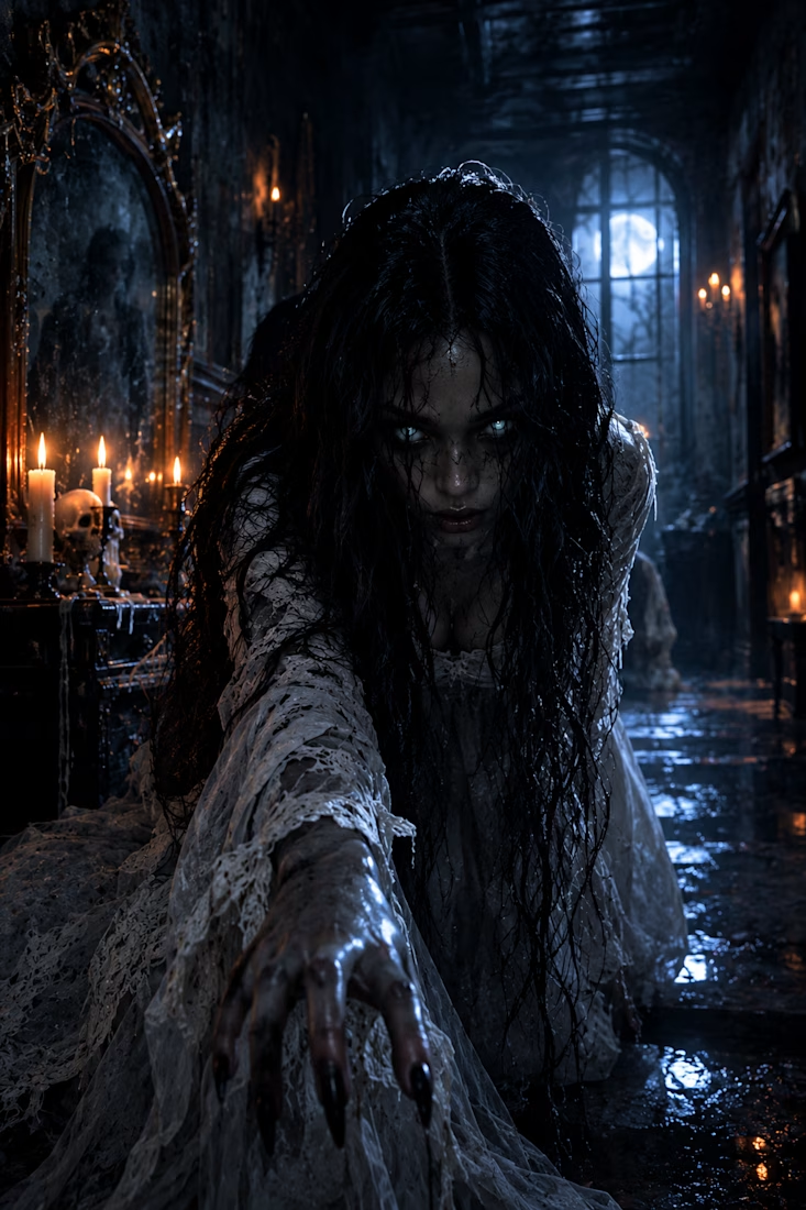
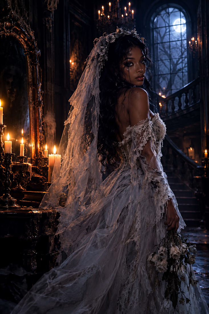
She looked beautiful walking down the aisle…
but something happened before the wedding that changed her forever. 🕯️
👰🏽♀️💀 WOULD YOU SAY “I DO” TO THIS BRIDE… IF YOU KNEW WHAT HAPPENED TO HER BEFORE THE WEDDING?
The network for creativity
Join 1.25M professional creatives like you
Connect with clients, get discovered, and run your business 100% commission-free
Creatives on Contra have earned over $150M and we are just getting started



Related posts

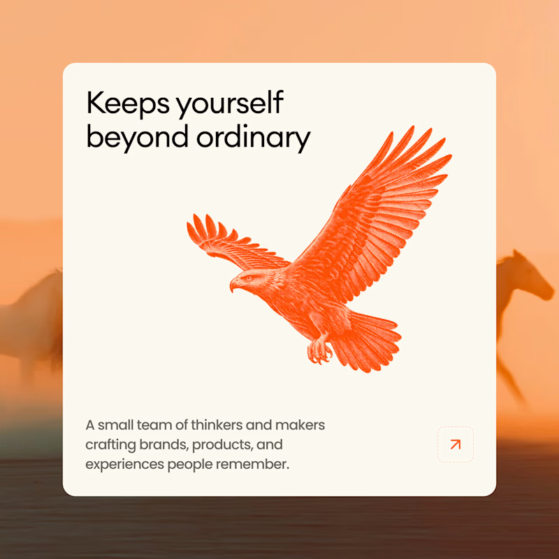
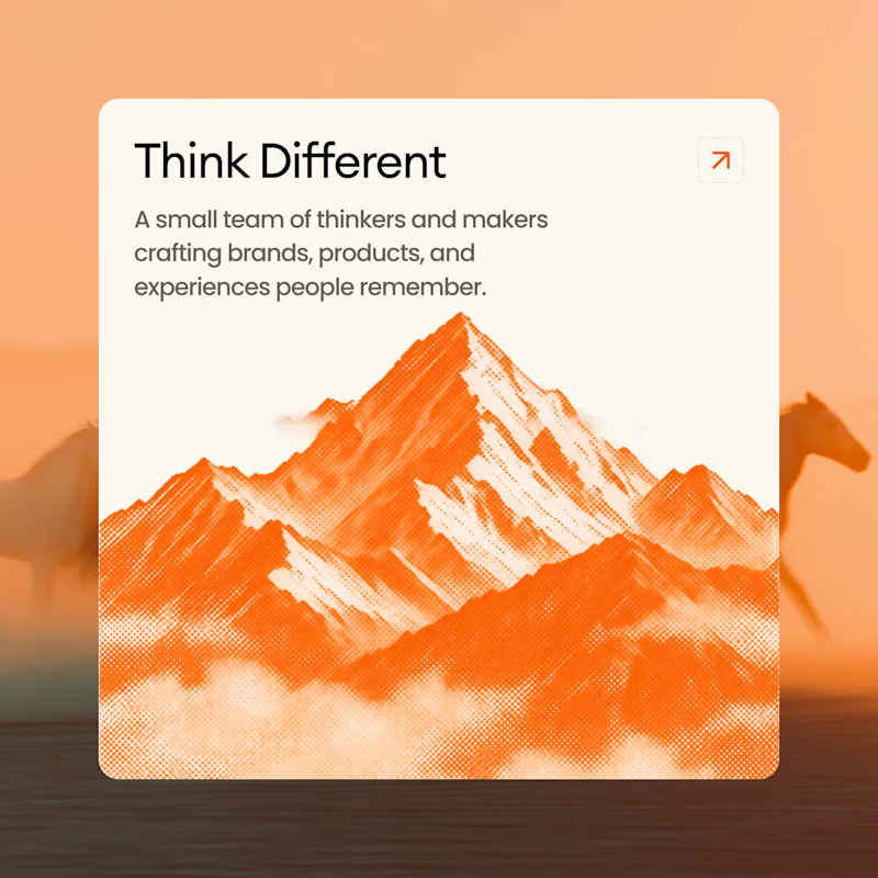
A or B? 🥭
10 voted
38%
16 voted
62%
26 votes
Closed

B all the way! Keeps yourself beyond ordinary with that bold orange eagle - super striking! That color contrast + message hits hard! Option 2 feels more memorable!


What if Altoids dropped a limited Halloween edition?
For this week's challenge, I gave one of the most iconic tins on the shelf a fall and spooky makeover with two seasonal flavors: 🎃 Pumpkin Spice and 🦇 Black Peppermint.
👻 What stayed recognizable:
The classic rectangular metal tin, the off-white parchment label, the stepped Victorian frame, and the bold serif wordmark with "The Original Celebrated" and "Curiously Strong Mints" locked in their exact spots.
🪦 What I twisted:
Swapped the classic red and green tins for burnt pumpkin orange and midnight matte black, traded the vintage apothecary crest for autumn foliage on one and gnarled trees with flying bats on the other, and lit the whole shot by lantern light.
Which one would you grab?
#brandincostume
17 voted
47%
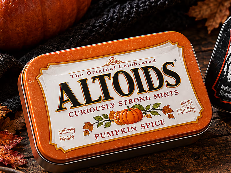
19 voted
53%
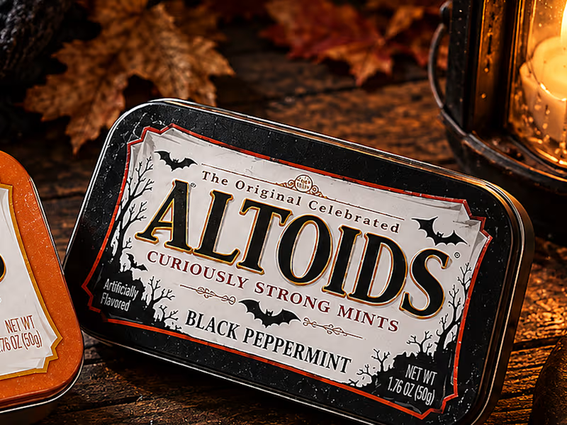
36 votes
Closed
This is brilliant Agustin! 🎃 Love how you kept the classic Altoids tin recognizable but made it so seasonal. Pumpkin Spice + Black Peppermint is such a bold combo - the orange tin with that tiny pumpkin illustration is chef's kiss 👌 Would totally grab this off the shelf!

I'm building MorningAI — an AI automation platform designed to help businesses save time and work smarter.
I'm deciding on the website's visual direction, and I'd love your opinion!
🅰️ Design A: Light, clean & professional
🅱️ Design B: Dark, futuristic & premium
Which design should I choose for MorningAI — A or B?
Drop your choice in the comments! 👇
4 voted
57%
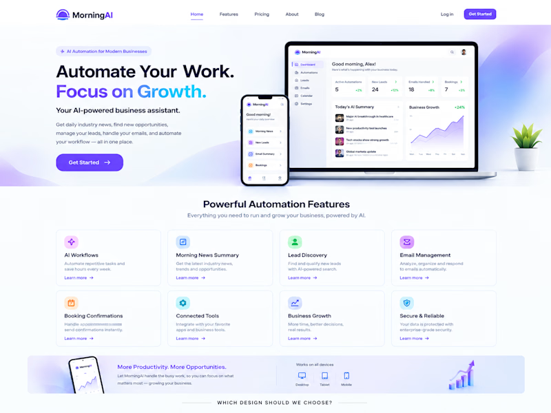
3 voted
43%
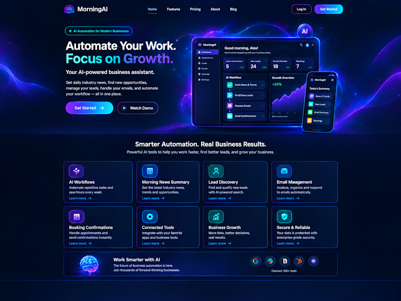
7 votes
Closed