The network for creativity
Join 1.25M professional creatives like you
Connect with clients, get discovered, and run your business 100% commission-free
Creatives on Contra have earned over $150M and we are just getting started
Back to feedPost
Project Title
Stitch Playground
Created by:
Diana D. (UX/UI Designer)
Intro
I created "Stitch Playground" an interactive learning experience that helps Stitch users turn your rough interface ideas into clearer more useful prompts.
This project is designed for people who have an idea for an interface but are not sure how to get started in Stitch. Instead of simply telling users to “Write me better prompts,” Stitch Playground shows them how a vague request can become a stronger design brief by adding the right context: What the interface is, who it is for, how it should feel, what sections it needs, and what visual styles Stitch should follow.
The goal of my project was to make prompt writing feel easier, more approachable, and fun for Stitch users.
What I Built:
I built Stitch Playground in Stitch as a clean interactive experience that helps Stitch users get started easily.
What it includes:
A bold clean interactive landing page introducing Stitch Playground
Motion design in the hero and footer (new Stitch features)
A prompt-learning interactive component based on clearer design direction (Inspired by Vincent's Stitch prompting blog post)
A before-and-after comparison showing how vague prompts become stronger Stitch prompts
An interactive prompt builder for turning rough ideas into more complete prompt structures
A prompt deconstructor concept for understanding what makes a prompt more useful
A starter library of reusable prompt examples for dashboards, blogs, entertainment experiences, and portfolios
How I Used Stitch:
I used Stitch as a creative partner to explore, shape, and refine the experience and ideas from a rough concept into a polished finalized experience.
The starting idea was simple: create a guide that helps people prompt Stitch better. From there, I used the Stitch workflow to think through the page structure, content sections, visual style, and interactive learning moments. The project became both a prototype and a teaching tool: it demonstrates how stronger prompting can lead to clearer interface direction.
I focused on the same process the experience teaches: starting with a broad idea, then refining the design by adding clearer context, visual direction, specific sections, and more intentional interface details.
How This Connects to the Stitch Workflow:
Stitch Playground is built around the idea that better prompts create better starting points.
The experience encourages users to move beyond one-line requests like “make a landing page” and instead describe the product goal, audience, style, layout, content modules, and interaction patterns. This makes the design process feel less random and more collaborative.
I also wanted the project to reflect how Stitch can fit naturally into a real creative workflow: ideating, refining, comparing versions, and turning prompt structure into interface structure.
Stitch Features / Workflow Highlighted:
This project highlights Stitch as an (amazing) interface builder that helps users move from idea to interactive product faster. It also emphasizes prompt-based iteration, structured design direction, and using Stitch as a collaborative design partner.
I used new features presented on Stitch's X last week, such as motion and experimented with the Netify connection, Figma export and Google Studio import. I also added a restriction of 4 prompts per day to ensure my webpage does not get abused.
Feedback on Stitch:
Stitch is incredibly POWERFUL, not just for developers but for designers too. You can easily get started with a simple prompt in Stitch to create something truly amazing.
Why I Built It:
I wanted to make something helpful for the Stitch community. Thank you team. I am so happy to have found this product.
Start Playing in your Stitch Playground >
- Diana


Video Walkthrough: https://www.loom.com/share/e08d582c35a841db9bf682d0bfd22926

I would def play around with this, love the idea!

Genius!
I started making AI videos and AI images a month ago so I'm just busy building my portfolio and Linked in profile! (and Contra!) Would love to get my first client soon 😊


This is really great! Nice work Diana! Love that you built something to help the community.
Thank you @Dylan Siegel.🙏 I enjoy helping others.

Wow, just visited it. Loved it. I'm learning a lot from it. Thanks!

This is a clever idea. Most people jump straight into generating screens, but learning how to write better prompts probably has a bigger impact on the final result than any feature inside the tool.
I've been experimenting with Stitch quite a bit too:
https://on.contra.com/pnfJBQ
...

on.contra.com
Introducing Voya: Revolutionize Your Travel Planning Experience
Connect with next-gen talent and tools to get work underway. Hire more independents. Start more projects. Get more creative.

Chef’s kiss to every part of this piece.

This is highly impressive work. Thank you for sharing.

Perfect!


Amazing to see the Build, Keep up the good
The network for creativity
Join 1.25M professional creatives like you
Connect with clients, get discovered, and run your business 100% commission-free
Creatives on Contra have earned over $150M and we are just getting started

Challenges
View all


Related posts



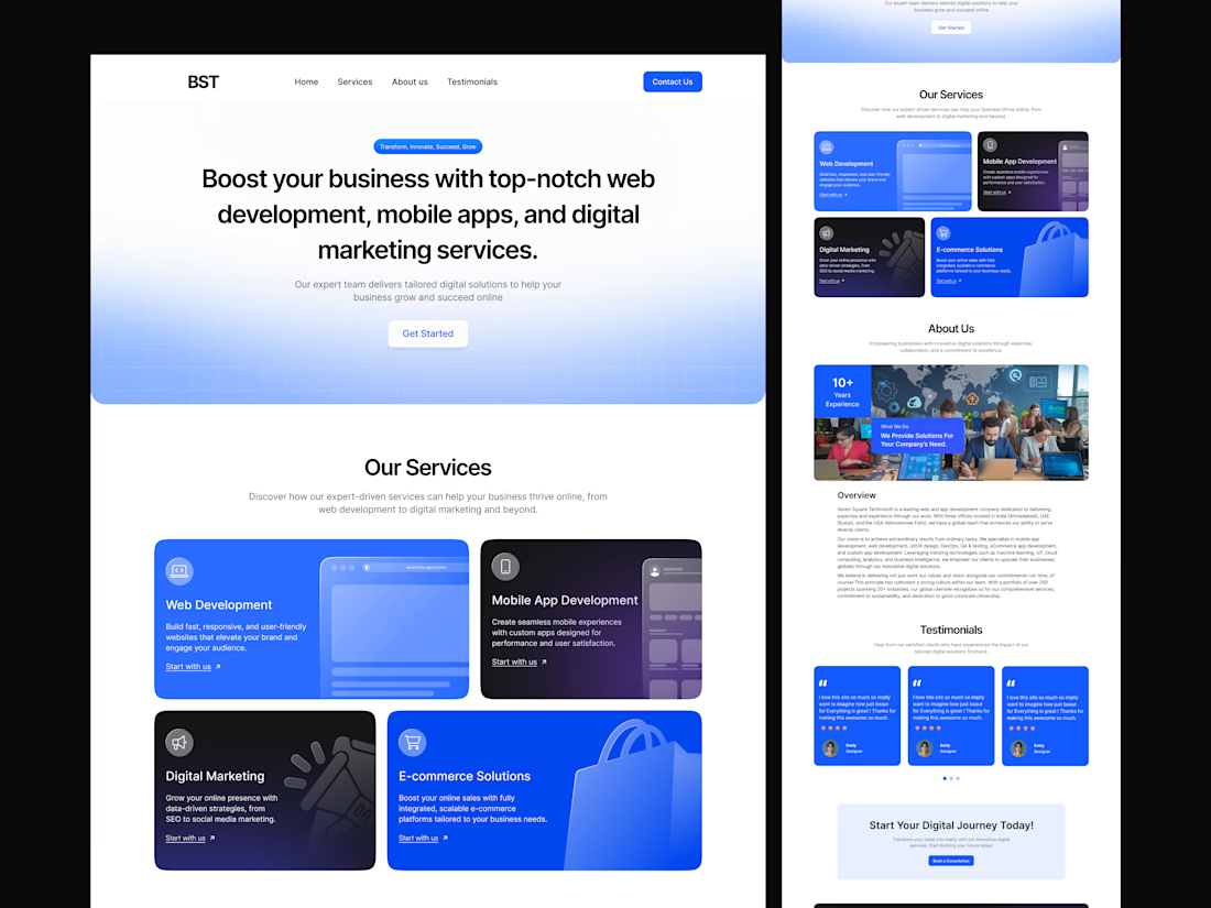
Modern Digital Solutions & Web Development Website.
A clean, modern website design for a digital solutions company offering web development, mobile app development, digital marketing, and e-commerce solutions. The landing page highlights the company’s services, experience, overview, client testimonials, and a strong call-to-action for potential clients.

Looks good!

The 404 was treated as a proper page rather than a fallback state.
The number is constructed as an architectural drawing. The 4 and the 0 are formed from walls at true thickness, with furniture laid out inside the resulting rooms and dimension strings running along both edges. It sits inside the same drafting system as the rest of the site rather than borrowing a display typeface.
The error message then repeats. Instead of a single dialog, identical windows cascade back across the canvas, each one carrying the same 404 notice. It reads as a system throwing an unresolved warning over and over, which is the exact behaviour Heron is built to prevent inside a model.
Error pages are never in the brief. They're a good measure of whether a team understood the product or just styled it.


Treating a 404 as an actual page instead of a dead end is such a good instinct, where did the architectural drawing idea come from, personal interest bleeding into the work?