The network for creativity
Join 1.25M professional creatives like you
Connect with clients, get discovered, and run your business 100% commission-free
Creatives on Contra have earned over $150M and we are just getting started
Back to feedPost


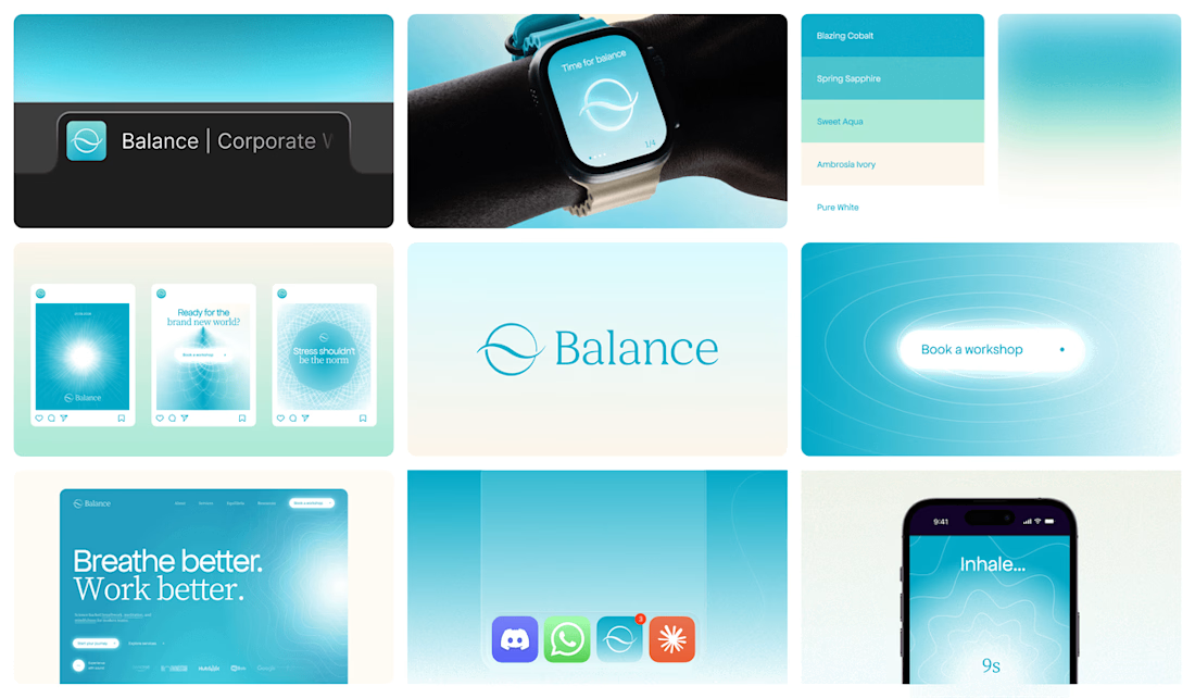
Brand exploration for Balance, a science-backed mindfulness platform for modern teams

Sooo fresh Aryna, love it!! 🎉

That teal-to-white gradient across the watch face, phone screens, and the Balance wordmark all feels so cohesive, especially with "breathe better, work better" anchoring it. Did the messaging app integrations (Discord, WhatsApp, Slack) come from the client's brief, or was that...

This feels so calm and cohesive. Love the whole visual language🔥

Amazing work


Great work🔥👏👏

Love it!

This looks incredibly refined.

I love the color so much!

So cool!! Really like how airy it feels 🤩


Well done !

Nice one 👍

The color is nice 👍

Super Cool!!

nice color


Nice color selection 😜


that blue is so calm

This is amazing.
Really clean work!


the watch and phone screens match well. how long did this take?

Clean work

That's great🔥

Such a strong presentation! 💥


This deserves more than just liking, this deserves to be featured! 🏆 That calming teal gradient creates such an inviting visual ecosystem for a health platform.
The network for creativity
Join 1.25M professional creatives like you
Connect with clients, get discovered, and run your business 100% commission-free
Creatives on Contra have earned over $150M and we are just getting started











Related posts

This is wild to me!
I have worked so hard to build this profile and it just goes to show that you really do get out what you put in. Work has really picked up since I worked on my discovery score and the right clients seem to be finding their way to me. Couldn't be happier.

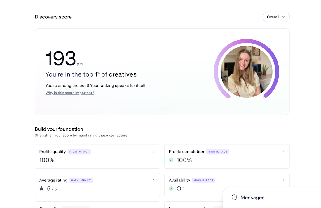

Congrats on Top 1% — that's huge! 193 is wild. If you don't mind sharing, what moved the needle most for your discovery score? Was it profile completion, case studies, or just consistent posting? Trying to build mine from scratch right now.

Brand Expressions -- Olivir




Thats so crazy!!!!!! Seeing this I feel we humans are still far better than AI

Most early-stage brands play it safe and disappear after a while. For Drylendar, I did the opposite.
3 weeks from brief to full identity: logo, illustration system, app visuals, collectible cards and even merch.
AI makes things cheaper. Personality makes brands memorable.
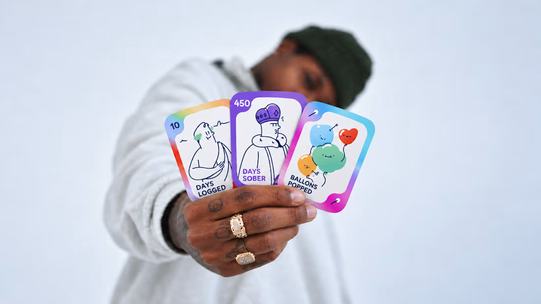
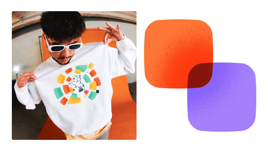
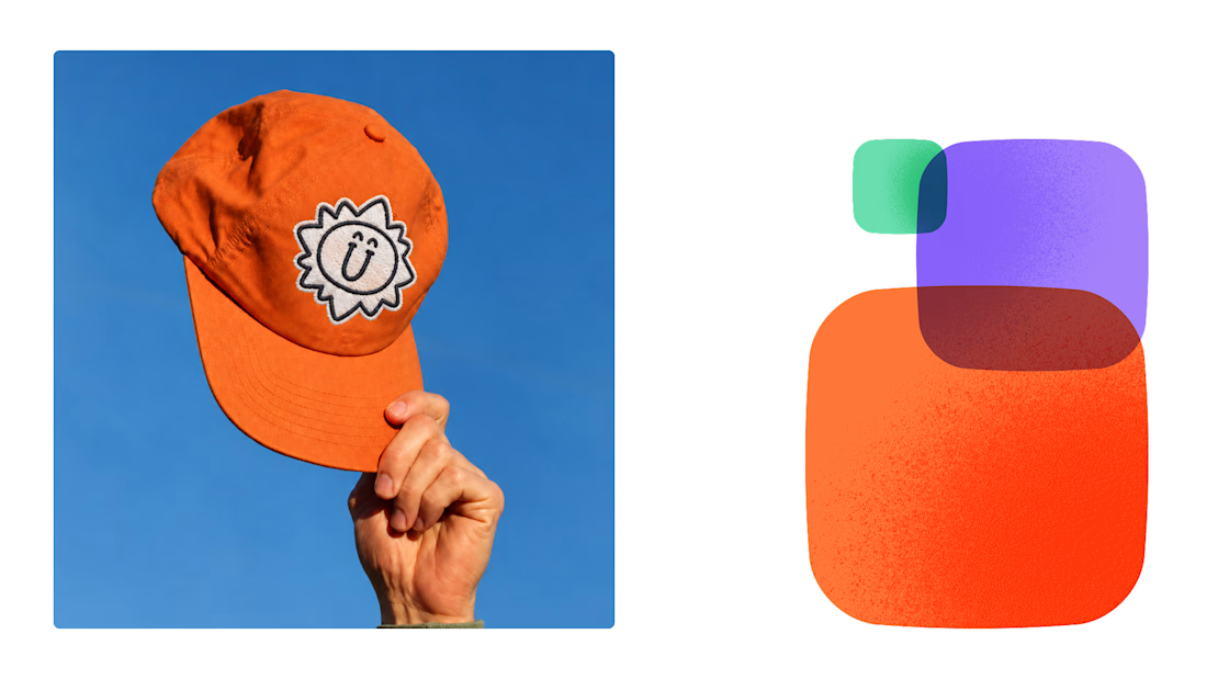
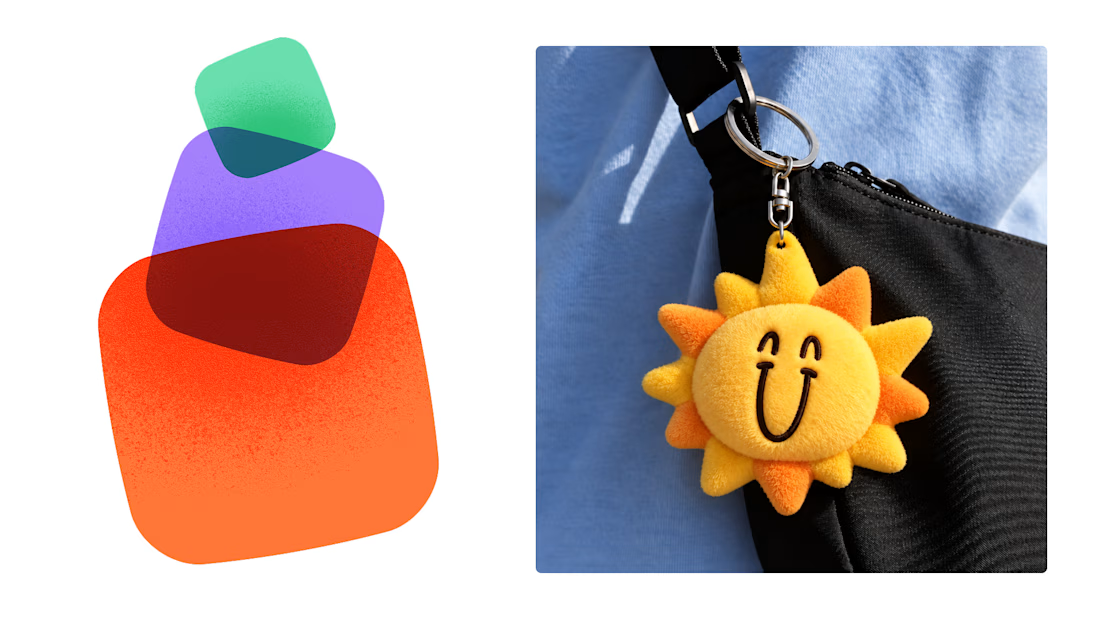

This is exactly what branding should be! 🔥 3 weeks for full identity, merch, cards - you really built personality, not just a logo. Love the Drylendar vibe. AI makes it cheap, but this makes it memorable - so true!