The network for creativity
Join 1.25M professional creatives like you
Connect with clients, get discovered, and run your business 100% commission-free
Creatives on Contra have earned over $150M and we are just getting started
Back to feedPost

White space isn't empty space. It's the most powerful element on your canvas.
Most designers (especially early on) try to fill every pixel. More elements, more colors, more "stuff." But the projects that actually convert, the ones clients come back and say "this feels premium," they all have one thing in common: room to breathe.
Next time you're designing a landing page, a brand identity, or even a social post, try this:
Finish your first draft
Remove 30% of the elements
Increase padding by 20%
Look at it again
9 times out of 10, the stripped-back version hits harder.
The real skill in design isn't adding. It's knowing what to take away.
Drop your hottest "less is more" example below. I want to see the work that proves this right (or wrong).

Amazing
The network for creativity
Join 1.25M professional creatives like you
Connect with clients, get discovered, and run your business 100% commission-free
Creatives on Contra have earned over $150M and we are just getting started











Related posts

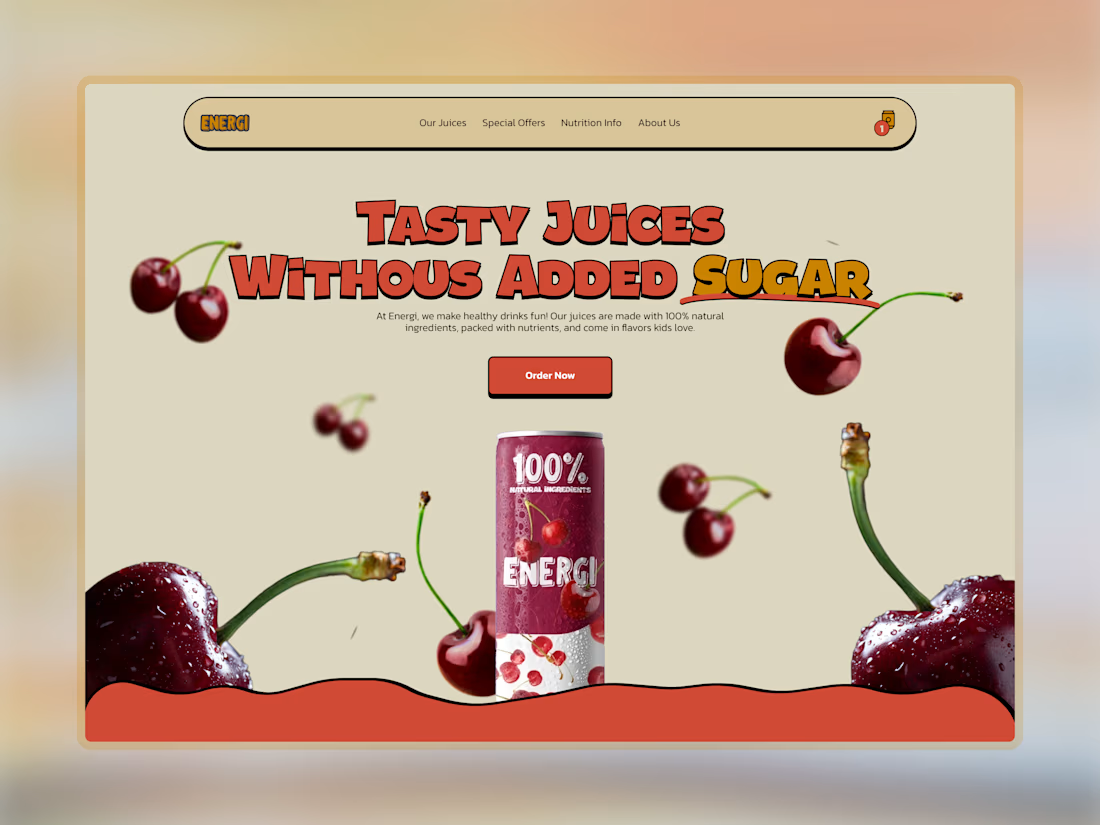
Wow, I just found one of my first projects ever in Figma.
This was a brief from a web design course I took when I was just starting out.
I don’t think I’ve done much playful design since this one. I’m still a bigger fan of minimal and editorial style.
What do you think about this? Keep in mind that this was maybe the second or third design I ever made 😊

I love product websites

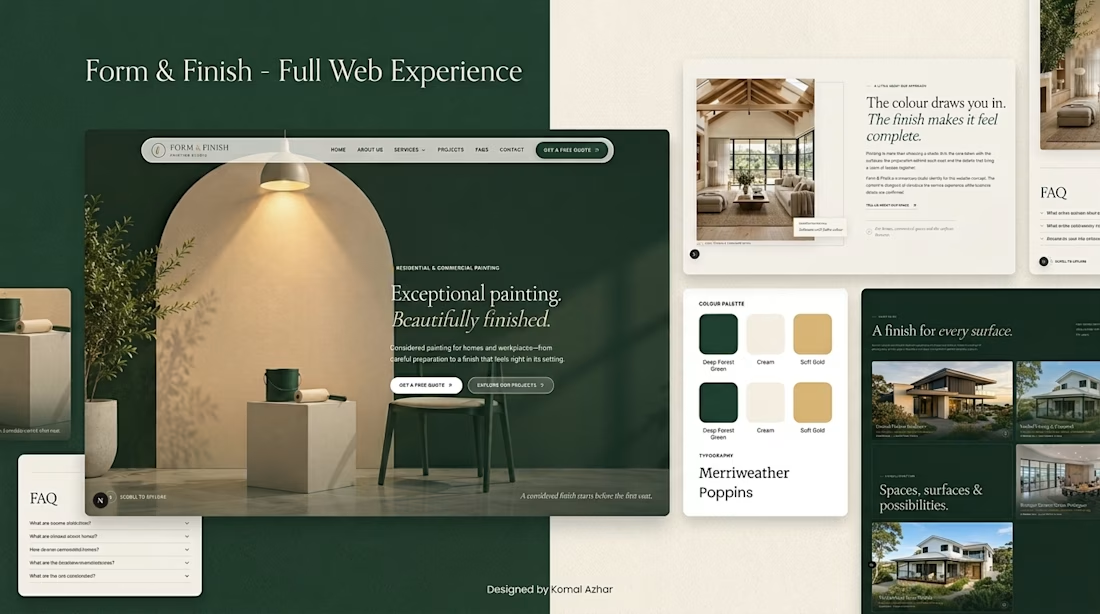
Form & Finish — A Premium Web Design Experience
Introducing my latest website UI design, featuring an elegant aesthetic, deep forest-green tones, warm neutral colors, and a sophisticated layout.
From the immersive hero section to the beautifully designed service showcases and project gallery, every detail focuses on creating a seamless and engaging user experience.
Key Highlights:
Premium UI/UX Design
Modern Website Development
Smooth Animations and Scrolling
Responsive Design
Elegant Business Website Experience
As a Web Developer, I specialize in creating modern, visually appealing websites that help businesses build a strong online presence, showcase their services, and attract potential customers.
Need a professional website for your business?
Whether you're launching a new business, upgrading an outdated website, or looking to turn your idea into a powerful online presence, I can help you bring your vision to life.
Let's discuss your project. Send me a message today to get started!
I'm open to freelance projects, client collaborations, and new opportunities. Your feedback and suggestions are always welcome.
#WebDeveloper #WebDesign #UIDesign #FrontendDevelopment #FreelanceWebDeveloper #NextJS #ReactJS #WebsiteDesign



Hi, Designers!🫶🏻

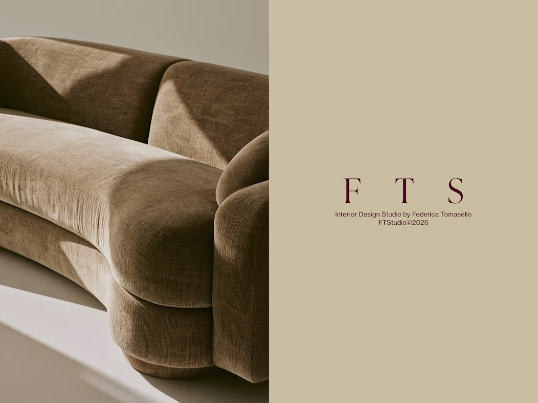
In recent days I published a new Branding project for an Interior Design studio, FT Studio, led by Federica Tomasello, a young and talented Italian Interior Designer.
The concept I worked on was the use of space, which is what she actually deals with every day. Her approach to interior design is built on listening to her clients and getting to know them in depth. This allows her to shape spaces around the people who will occupy them.
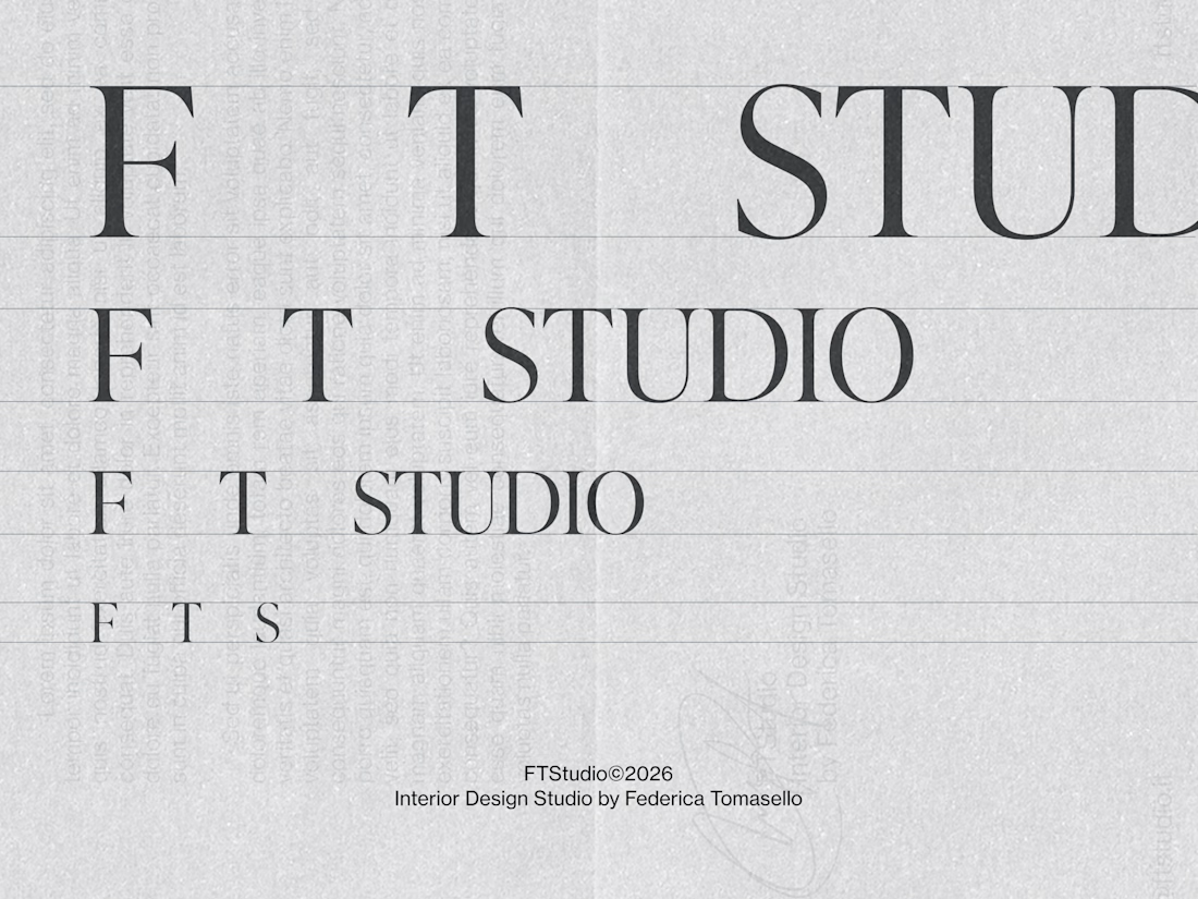
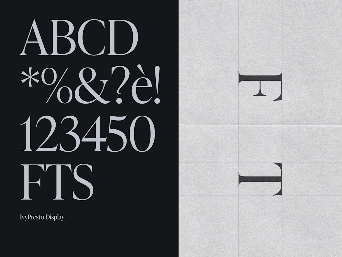
In the visual language, the concept translated into the construction of spaces between the letters F, T, and S. In this way, space becomes an integral part of the logotype. As for the typeface, we chose a serif, IvyPresto Display, to convey elegance, in line with the projects Federica produces. We paired it with a contrasting sans serif, in all its modernity.
The logo variants include a contracted version using only the first three letters, FTS.
I hope you found the design and the concept both pleasing and functional. Updates on all the other elements of the brand identity will follow. But if you're curious to see the whole project, it's already online on my profile: FT Studio, Interior Design Studio Brand Identity
Thank you for your attention, and happy designing to you all!😊


Great typography