The network for creativity
Join 1.25M professional creatives like you
Connect with clients, get discovered, and run your business 100% commission-free
Creatives on Contra have earned over $150M and we are just getting started
Back to feedPost

Hi, Designers!🫶🏻
In recent days I published a new Branding project for an Interior Design studio, FT Studio, led by Federica Tomasello, a young and talented Italian Interior Designer.
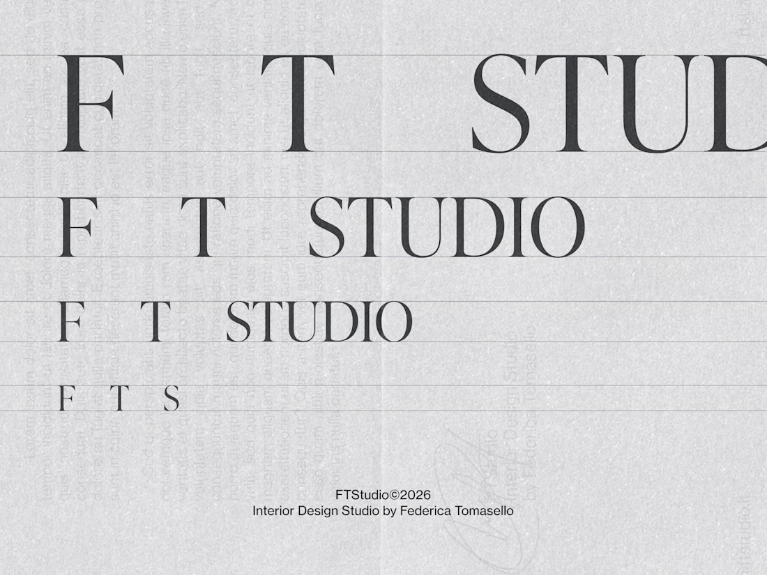
The concept I worked on was the use of space, which is what she actually deals with every day. Her approach to interior design is built on listening to her clients and getting to know them in depth. This allows her to shape spaces around the people who will occupy them.
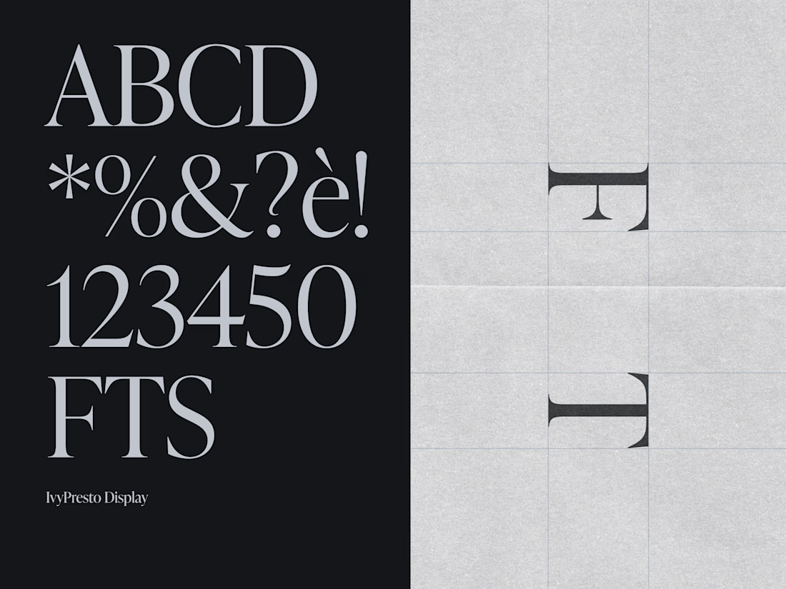
In the visual language, the concept translated into the construction of spaces between the letters F, T, and S. In this way, space becomes an integral part of the logotype. As for the typeface, we chose a serif, IvyPresto Display, to convey elegance, in line with the projects Federica produces. We paired it with a contrasting sans serif, in all its modernity.
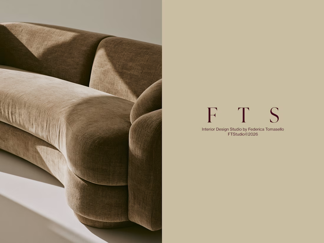
The logo variants include a contracted version using only the first three letters, FTS.
I hope you found the design and the concept both pleasing and functional. Updates on all the other elements of the brand identity will follow. But if you're curious to see the whole project, it's already online on my profile: FT Studio, Interior Design Studio Brand Identity
Thank you for your attention, and happy designing to you all!😊

The network for creativity
Join 1.25M professional creatives like you
Connect with clients, get discovered, and run your business 100% commission-free
Creatives on Contra have earned over $150M and we are just getting started











Related posts

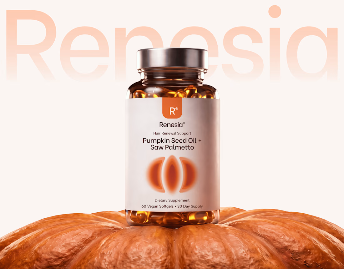
Here we go, check the full case study, I think you will love it! 🎃


Love this! 🎃 The pumpkin concept for Renesia is super creative - perfectly matches the Pumpkin Seed Oil story. Clean work in Illustrator & Figma!


Lovely cohesive work, Alex. The motion is spot on!

Have you ever designed packaging for a brand that never launched? 👀
Surprisingly, it’s happened to me more times than I expected.
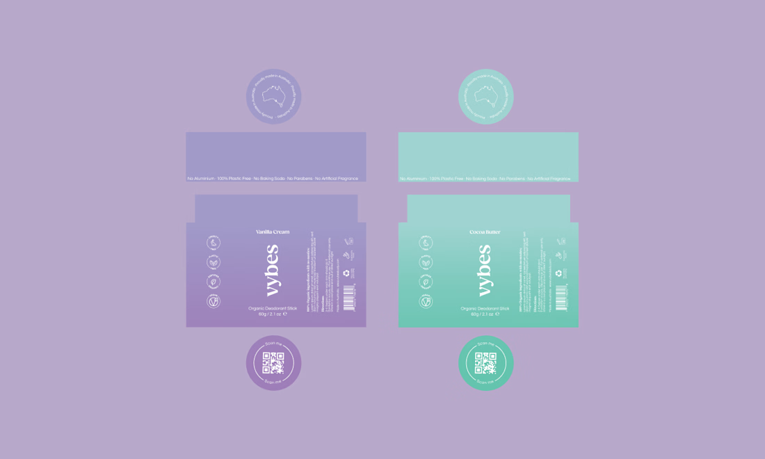
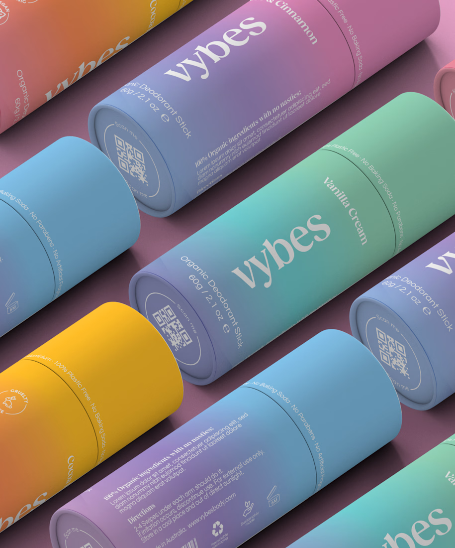
Vybes was an organic deodorant brand from Australia I worked on, designing packaging for a product that, in the end, never made it to market.
It’s a weird feeling putting so much thought into packaging for a product that people will never see on a shelf.
How many unreleased projects are hiding in your folders? 😂