The network for creativity
Join 1.25M professional creatives like you
Connect with clients, get discovered, and run your business 100% commission-free
Creatives on Contra have earned over $150M and we are just getting started
Back to feedPost

PixelPulse is a fully interactive front-end e-commerce experience built with HTML, CSS (Tailwind), and vanilla JavaScript — designed to feel like a modern, production-grade shopping platform.
Key Features:
Dynamic Storefront — Hero banners adapt based on time of day (e.g. "Fresh Morning Deals" vs "Midnight Madness Offers"), giving the store a living, context-aware feel.
Live Category Filtering — Instant product filtering across Tech, Fashion, Accessories, and Sports & Gym without page reloads.
Dark / Light Mode — Seamless theme toggle that persists across the entire shopping journey.
Real-Time Cart Management — Add-to-cart updates the cart counter instantly, with quantity controls on the cart page.
Smart Checkout Flow — Payment method selection dynamically reveals the relevant fields (e.g. card details only appear when "Credit Card" is selected).
Fully Responsive UI — Clean grid layouts, product cards with ratings/discounts, and a polished multi-page navigation (Home, Shop, Categories, Deals, Cart, Checkout, Contact).
This project showcases front-end architecture for state-driven UI (cart state, theme state, filter state) entirely on the client side, with attention to micro-interactions and real-world e-commerce UX patterns.
Tech Stack: HTML5, Tailwind CSS, JavaScript (Vanilla)


The network for creativity
Join 1.25M professional creatives like you
Connect with clients, get discovered, and run your business 100% commission-free
Creatives on Contra have earned over $150M and we are just getting started




Related posts

Meriot Netherlands-based product designer portfolio
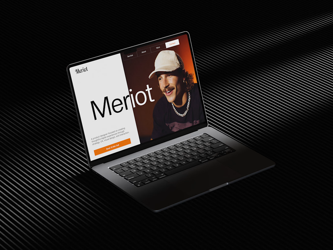
I explored a portfolio website for Meriot, a product designer based in the Netherlands who wanted a digital presence that felt more personal, editorial, and design-focused.
The challenge was to avoid the typical portfolio formula and create something that communicates personality within the first few seconds.
The direction
→ Bold editorial typography
→ Strong personal photography
→ Minimal black-and-white foundation
→ Warm orange accent for CTAs
→ Simple, structured navigation
→ Clear positioning as a product designer
→ A portfolio experience that feels like a personal brand
The idea was to make the website feel confident without being complicated.
Rather than leading with a long introduction, the hero immediately communicates who Meriot is, what he does, and where the visitor should go next.



Nice design broooo

I created 3D component, this is playful 3D tooth for dentists website, I designed two variations and I'm confused which one to choose, please help me. Here is live preview: https://dentalone.framer.ai/
7 voted
54%
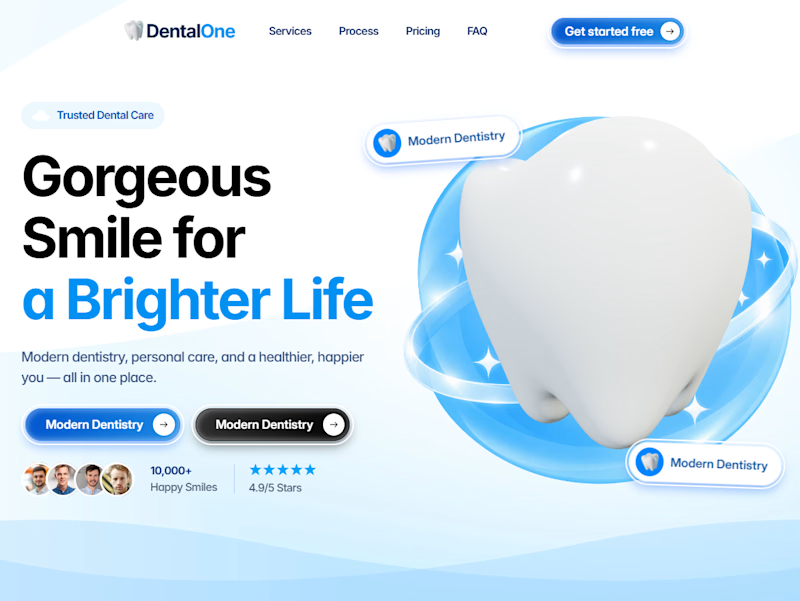
6 voted
46%
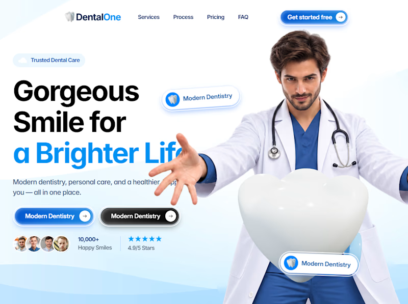
13 votes
Closed

Ye to dono Ai vibe de rahe hai

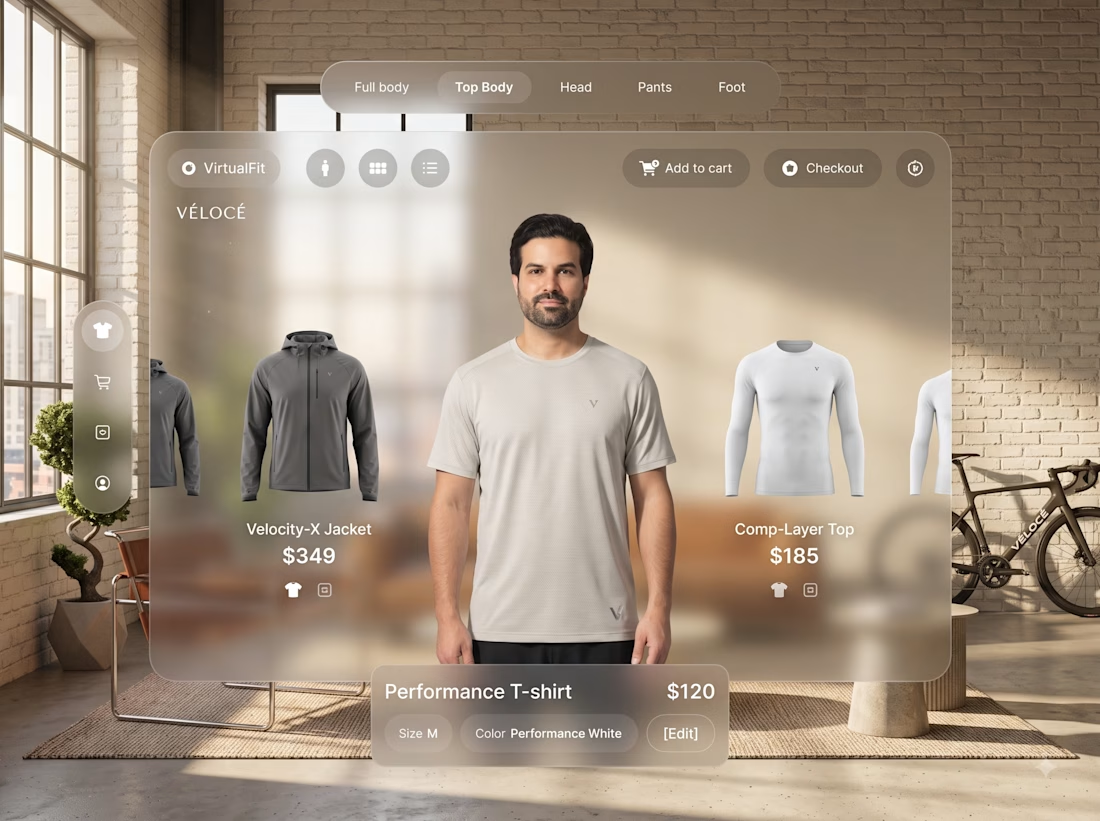
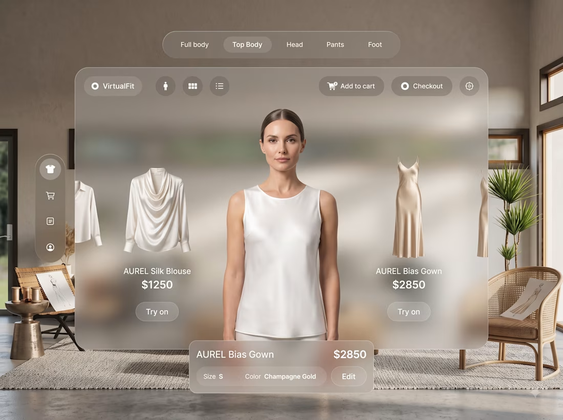
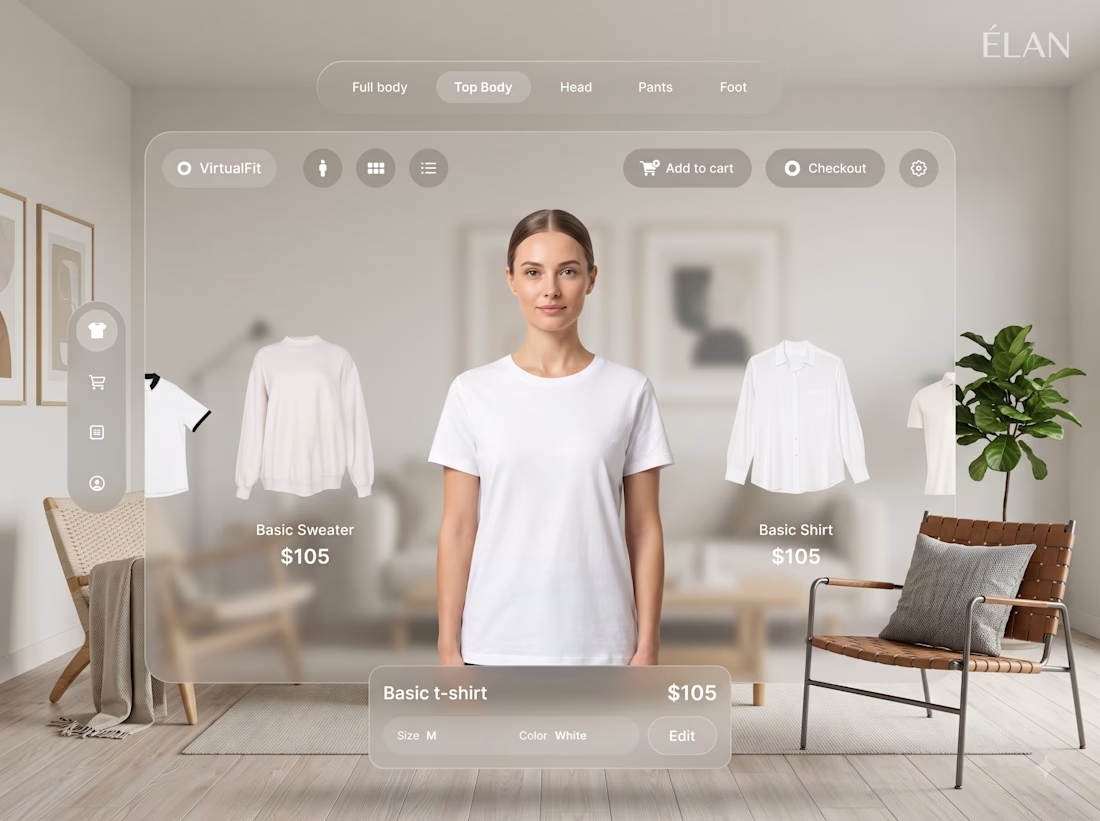
THE FUTURE OF SHOPPING IS PERSONAL.
A modern fashion e-commerce experience designed around personalization, product discovery, and a seamless shopping journey.
UI/UX • E-commerce • Web Design • Interactive Experience
#webdesign #uidesign #uxdesign #ecommerce #fashiontech #webdesigner #digitaldesign #websolutions