The network for creativity
Join 1.25M professional creatives like you
Connect with clients, get discovered, and run your business 100% commission-free
Creatives on Contra have earned over $150M and we are just getting started
Back to feedPost

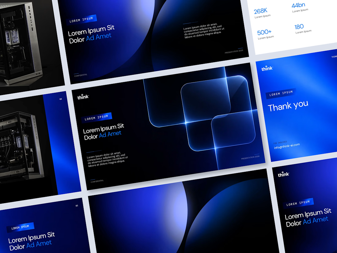
Think AI makes physical AI computing hardware the kind you can photograph from every angle, with liquid cooling loops and precision-machined enclosures that look as engineered as they are. The presentation template had to match that.
The brief was a reusable system rather than a single deck: slide masters, consistent layouts, and a visual register that works whether the slide is carrying a product shot, a metrics grid, or a full-bleed transition.
The system runs on two states. Dark slides use near-black grounds with large-format gradient spheres deep cobalt forms that create depth without illustration. Light slides flip to white with the blue accent pulled forward, giving the metrics and data slides room to breathe. Both states use the same type hierarchy and the same section label pill, so switching between them feels like the same deck rather than two different ones.


The network for creativity
Join 1.25M professional creatives like you
Connect with clients, get discovered, and run your business 100% commission-free
Creatives on Contra have earned over $150M and we are just getting started




Related posts

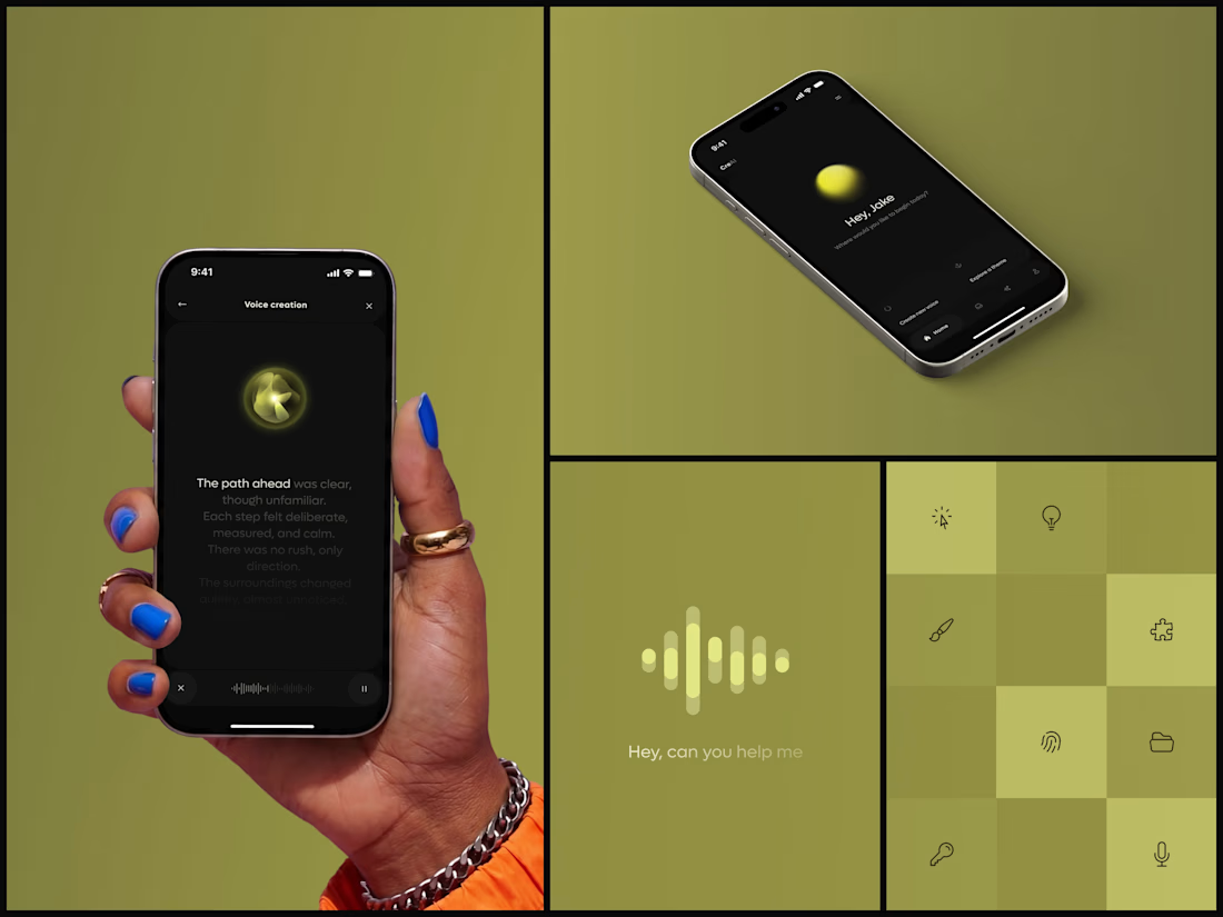
AI Voice Generator App
You can follow the voice with your eyes.
Designed by the Hue & Machine team.


A few months ago I got to work with Coderhouse, one of the leading education brands in Argentina, and the place where I took several courses myself.
So this one feels like a full circle. A brand that shaped my career and helped me grow as a designer, and now I got to design for it.
The funny part is Chris had no idea I was a former student when he reached out. I was really happy when that message came in.
I built a visual system for their 60+ course covers, made so their team can keep producing them on their own. Today it lives across their app, website and Meta ads.
Thanks Chris for trusting my work and for the opportunity 🧡 And thanks @Contra HQ for making connections like this one possible.


This looks great

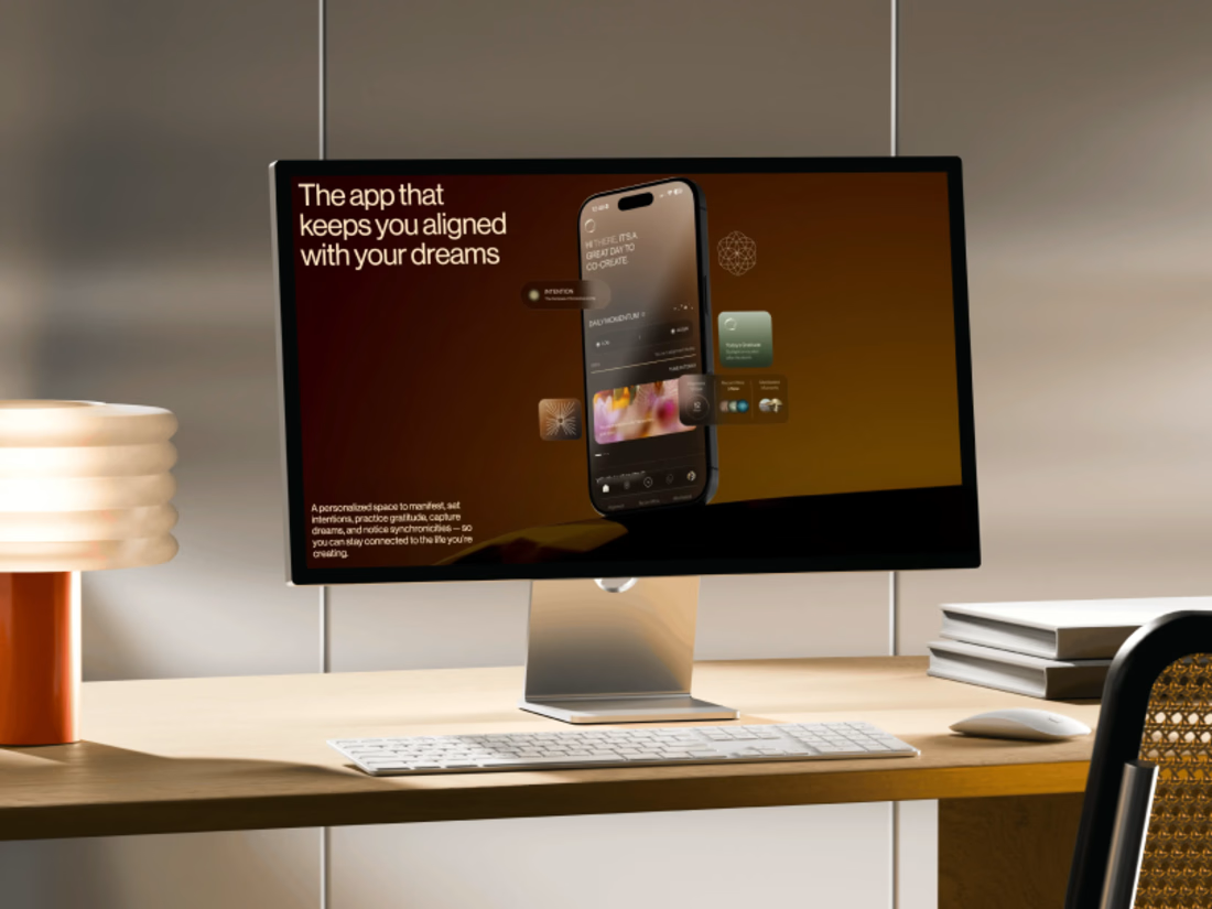
Promo video for a manifestation and wellness app. 48 seconds of kinetic type, UI motion and warm footage that show what the app does.


The warm footage really suits a wellness app, it keeps the kinetic type from feeling too techy. Lovely pacing for 48 seconds