The network for creativity
Join 1.25M professional creatives like you
Connect with clients, get discovered, and run your business 100% commission-free
Creatives on Contra have earned over $150M and we are just getting started
Back to feedPost

great design work, what an invigorating energy you bring to the page!

Thank you so much, really glad it came through!


Clean and perfect execution bro
Thank you!
The network for creativity
Join 1.25M professional creatives like you
Connect with clients, get discovered, and run your business 100% commission-free
Creatives on Contra have earned over $150M and we are just getting started











Related posts


Same brand. Same palette. Two completely different proposals for a real estate developer.
A: An isotype built from blocks. Geometric, precise, the language of construction. It says we build.
B: Custom lettering with movement. Warmer, more editorial. It says we build places you’d want to live in.
36 voted
51%

35 voted
49%

71 votes
Closed

My vote is B, Milagros. Custom lettering with movement has real editorial warmth, which suits a developer selling places people actually want to live in.

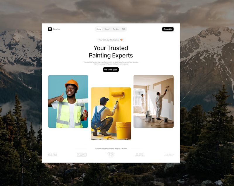
Work in Progress: Renova 🎨
Every great website starts with a strong first impression.
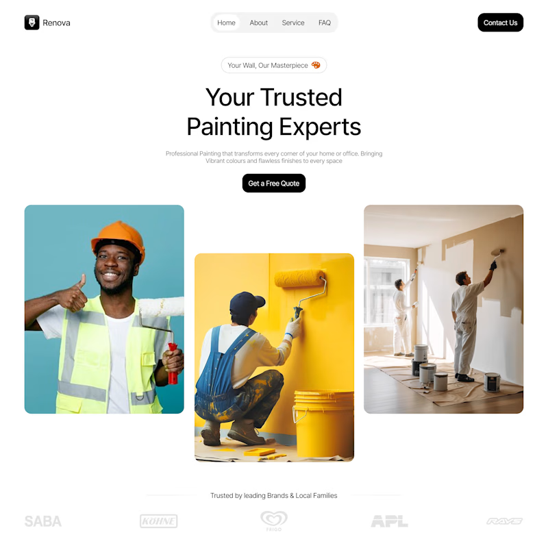
I'm currently designing the hero section for Renova, a painting service brand, with a focus on clean visual hierarchy, bold typography, balanced spacing, and imagery that communicates the brand's service at a glance.
The goal is simple: create a welcoming, professional experience that builds trust and encourages potential customers to take action.
This is still a work in progress, and I'm excited to keep refining the details as the design develops.
Looking for a UI/UX designer to bring your website idea to life?
I design thoughtful digital experiences for businesses that want to stand out, communicate clearly, and turn visitors into customers.
Let's work together.

0 voted
0%
1 voted
100%
1 vote
Closed


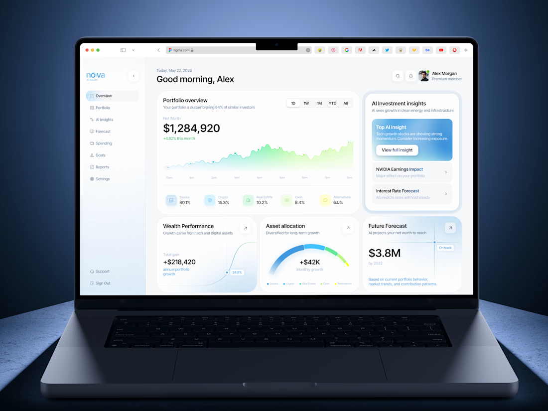
Insanely smooth and elegant dashboard concept! Love the color palette and typography. Outstanding work!