The network for creativity
Join 1.25M professional creatives like you
Connect with clients, get discovered, and run your business 100% commission-free
Creatives on Contra have earned over $150M and we are just getting started
Back to feedPost

Quick update: I shared the demo with a few students in my city, and the reaction has basically been: “WAIT, when is this going live? I need this now.”
Hearing that in real life is kind of surreal. It’s proof that this isn’t just a pretty UI, it’s a flow that actually hits a real trust problem students have when they send their thesis off to be bound.
#base44giveitaglowchallenge

DCafé did not have a service problem. It had a trust problem at the point of submission.
When I tried to order my own thesis binding, the existing form submitted before I had finished. I was left uncertain about the final request and what it would cost: exactly the wrong feeling...
The network for creativity
Join 1.25M professional creatives like you
Connect with clients, get discovered, and run your business 100% commission-free
Creatives on Contra have earned over $150M and we are just getting started

Challenges
View all


Related posts


A client shouldn’t have to learn Webflow just to publish their next case study.
On a recent build, I spent a lot of time on the CMS: setting up reusable blocks and the logic that lets the team update content without rebuilding pages.
The tricky part is deciding how much control to give them. Too little, and every update becomes a request. Too much, and they’re suddenly responsible for the layout.
I want them to open the CMS, know what to do, and get on with their day. There’s a fair amount of work behind making that feel simple.


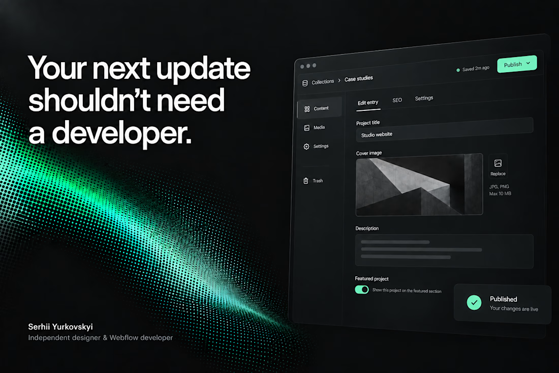

The CMS thinking here is spot on: the best handoff is the one that gives a client confidence without exposing all the complexity underneath.

Forms is live — and it’s free.
An editorial Framer template I designed for interior designers, interior architects & creative studios.
Bold typography, immersive project pages, CMS-powered works + journal, and plenty of space for the work to speak for itself.
Built in Framer. Free to remix. ✦
https://framer.link/MG0s5kl
Oh, and if you need a hand personalising it, just reach out — I’m only a message away :)


Love this!

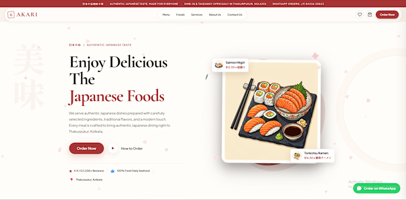
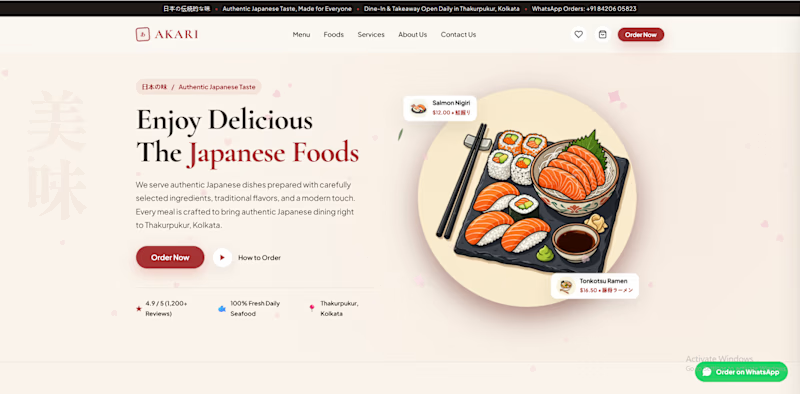
Which AKARI Design Looks Better? 🍣
I’ve been working on AKARI (あかり) — a Japanese food restaurant website that I’m building both as a real-shop-ready concept and as a showcase of my web design & development work.
I’ve made two different versions of the design, and I want the Contra community to decide which direction looks better.
🅰️ Option A
Design 1 — More bold, structured and brand-focused.
🅱️ Option B
Design 2 — More minimal, clean and modern.
🅲️ Option C
Neither? 😅
Tell me what you would change, add, or completely redesign. I’m open to ideas!
👇 Vote A, B, or C in the comments.
Which one would you choose for a Japanese restaurant?
🍣 AKARI — あかり
Authentic Japanese Taste, Made for Everyone.


6 voted
46%
7 voted
54%
13 votes
Closed
I’d lean toward Design A—the bolder structure gives the restaurant a clearer point of view, while the centered dish still keeps the page inviting. The restrained palette and generous whitespace make the food do the talking.