The network for creativity
Join 1.25M professional creatives like you
Connect with clients, get discovered, and run your business 100% commission-free
Creatives on Contra have earned over $150M and we are just getting started
Back to feedPost

What do a tornado, a heart and an arrow have in common?
Somehow, they all fit into this logo.
An unused concept built around movement, emotion and direction.


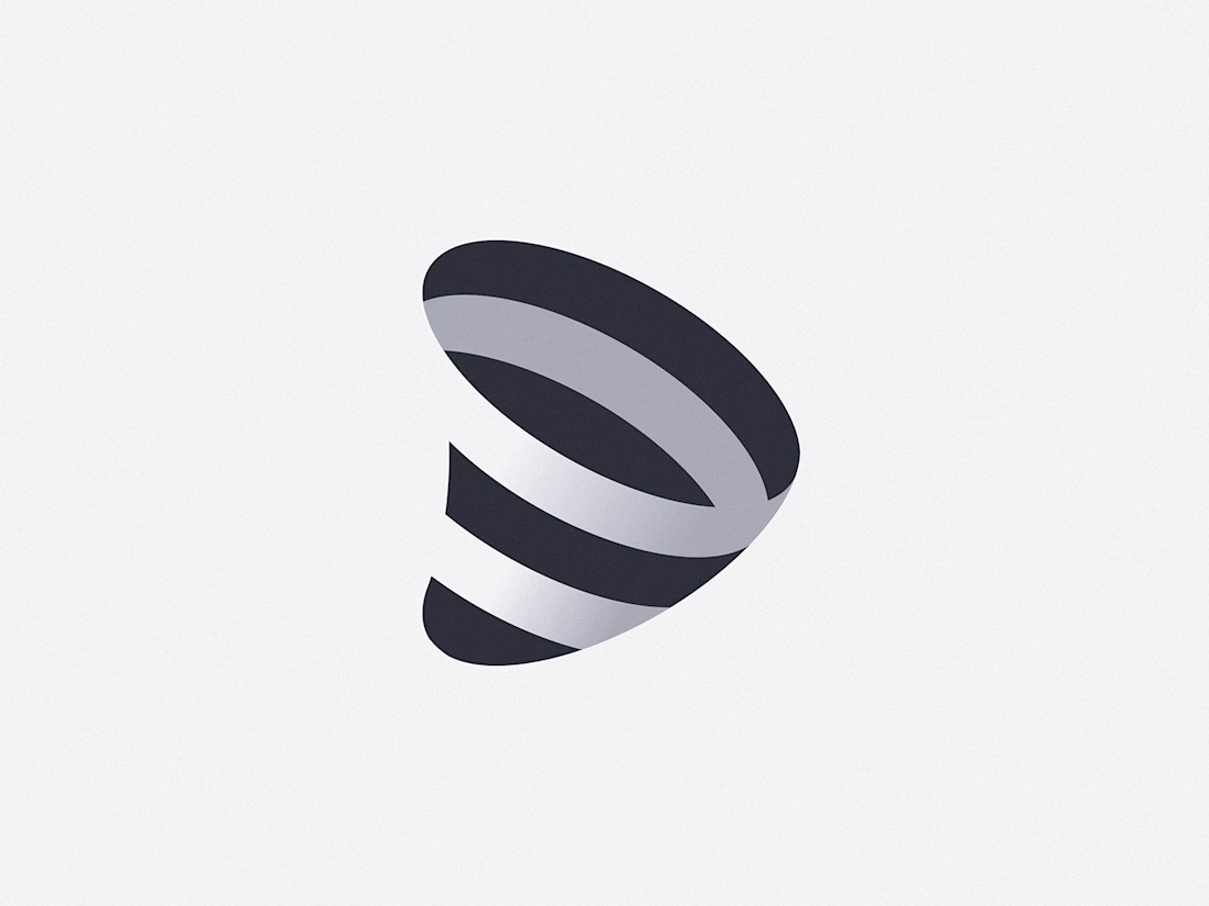


the black and gray bands make this pop

I first only noticed the tornado. But after seeing a heart and an arrow, what a brilliant idea and perfect execution.

Took a second look before I saw the heart in the negative space between the ribbons. Surprised this got shelved, that kind of multi-read mark usually takes way more iteration than a single-meaning logo. What made the client pass on it?

Reading it cold I got the vortex first, the arrow second, and the heart only once I went looking - which is probably the right order for a mark about movement. Is it one continuous ribbon, or separate bands you kept nudging until the negative space behaved?

That layered spiral form pulls off all three concepts really cleanly. The tornado motion, the heart roundness, and the arrow directionality all live in the same shape without fighting each other. Shame it's unused.
The network for creativity
Join 1.25M professional creatives like you
Connect with clients, get discovered, and run your business 100% commission-free
Creatives on Contra have earned over $150M and we are just getting started









Related posts



Aryna, that golden symbol pops so nicely against the plum background ✨

Finally a Contra Top Independent!
Been part of this community for a few years now, sharing my work, joining challenges, meeting some great people, and even picking up a few wins along the way.
I've genuinely enjoyed being part of Contra and seeing how much the platform has grown.
This one means a lot. Big thanks to the Contra team for the recognition!
More to come!


Behind the scenes of the Treal Studio brand film.
Built in one week, from creative direction to sound design.


Love the overall feel, looks amazing 👌🏼