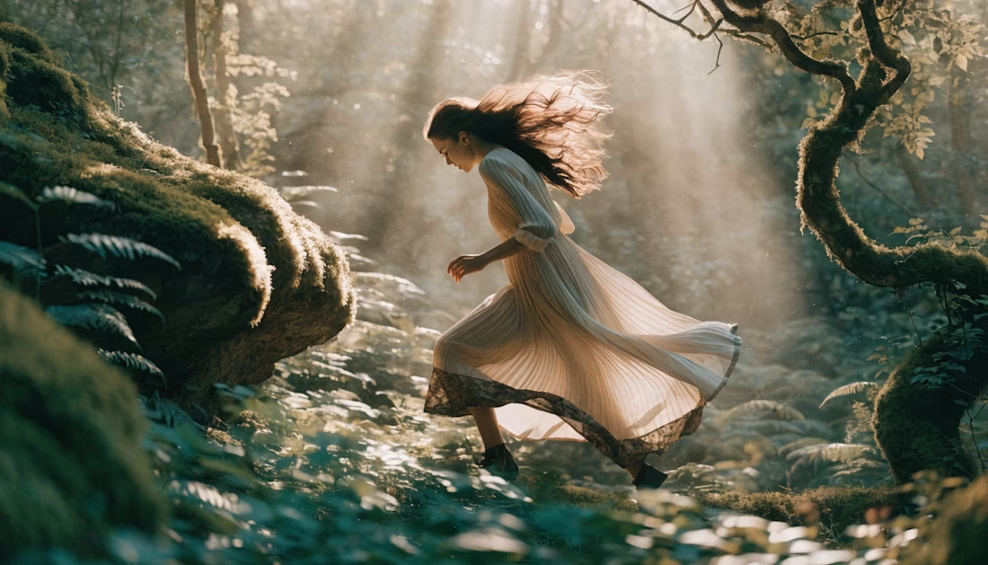
The network for creativity
Join 1.25M professional creatives like you
Connect with clients, get discovered, and run your business 100% commission-free
Creatives on Contra have earned over $150M and we are just getting started
Back to feedPost
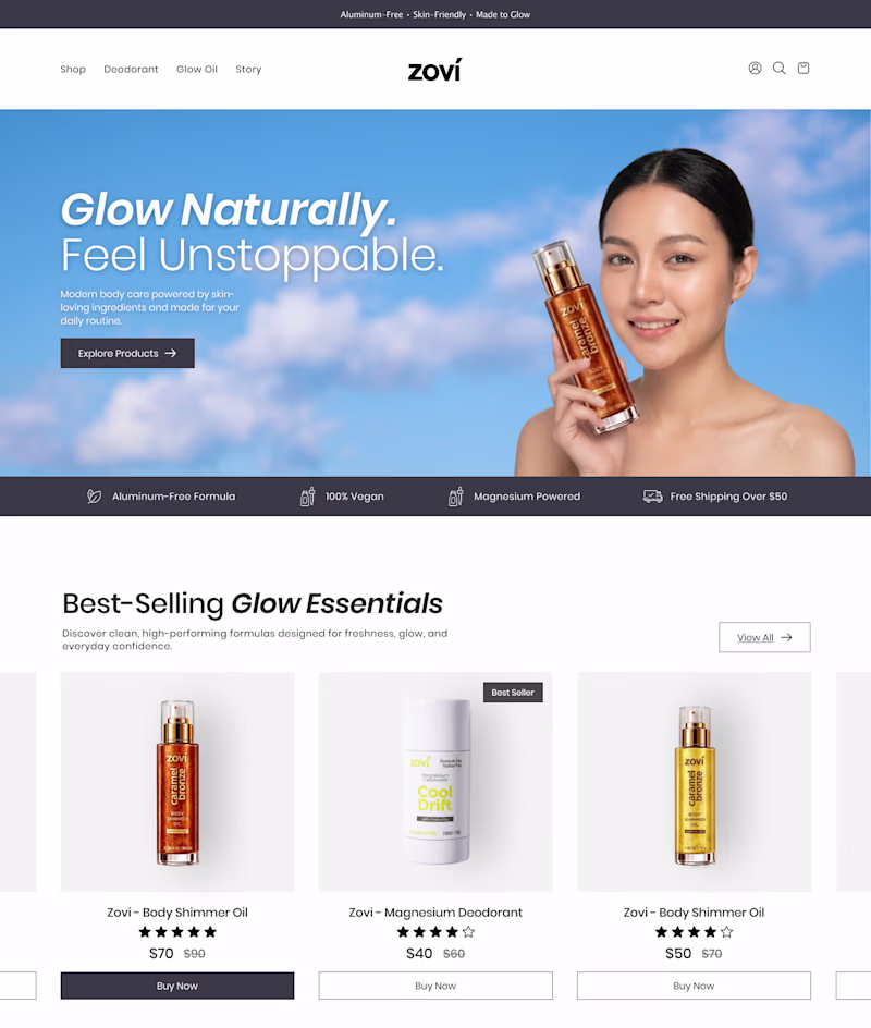
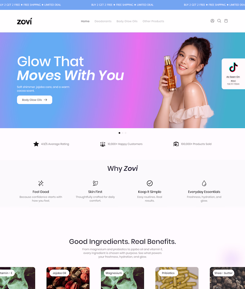
Taste Test
Working on a new website homepage and I'm stuck between two design concepts.
The client wants a homepage that feels colorful while still giving off a luxury, premium vibe, and I'm finding it challenging to strike the right balance.
Which direction would you pursue?
24 voted
77%
7 voted
23%
31 votes
Closed
Premium Wellness
This is lit 🔥
Thanks Victor.
here is the thing, ask the main targeted USERS then you will know what to build to avoid brand stagnation
i think premium ver. Looks stunning
2nd one. Immediate access to best selling products after hero that cleaning showing the product. Love it.
Gradient version is looking cheap tbh, you can find a lot better gradients online.
Beautiful visual hierarchy. 👏
Outstanding design 🔥
Great design !
The hero section on the right is beautiful the gradient is really modern and captivating. That said, the rest of the page feels far more sophisticated and expensive in the premium version on the left. I'd suggest a hybrid approach.
Premium Wellness is giving a premium and luxury vibe.
Amazing work
The network for creativity
Join 1.25M professional creatives like you
Connect with clients, get discovered, and run your business 100% commission-free
Creatives on Contra have earned over $150M and we are just getting started
Related posts
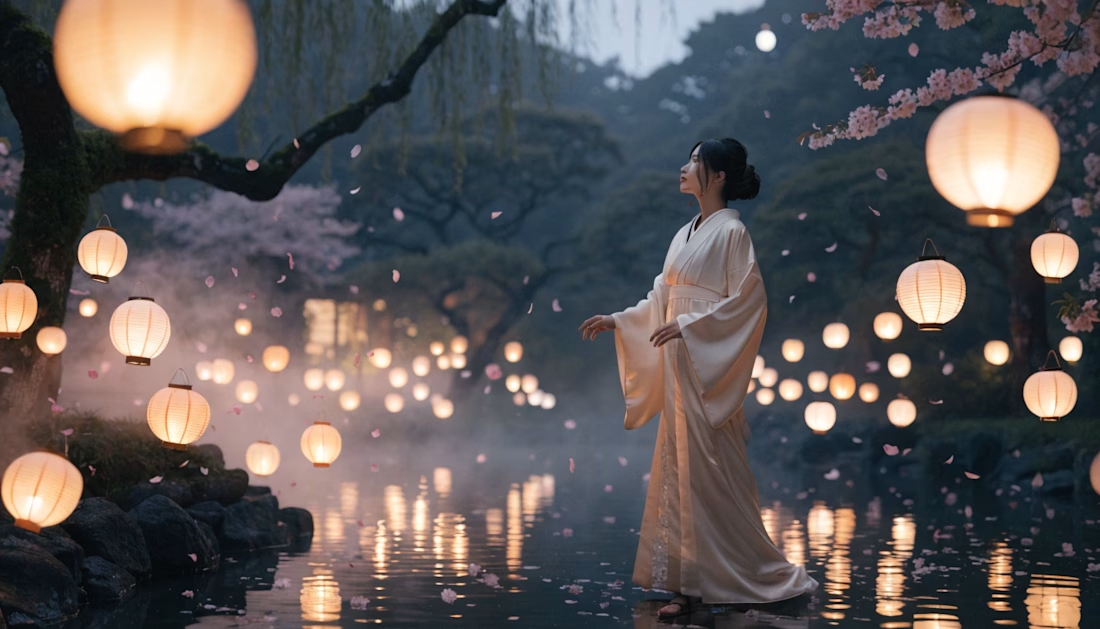
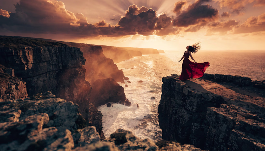
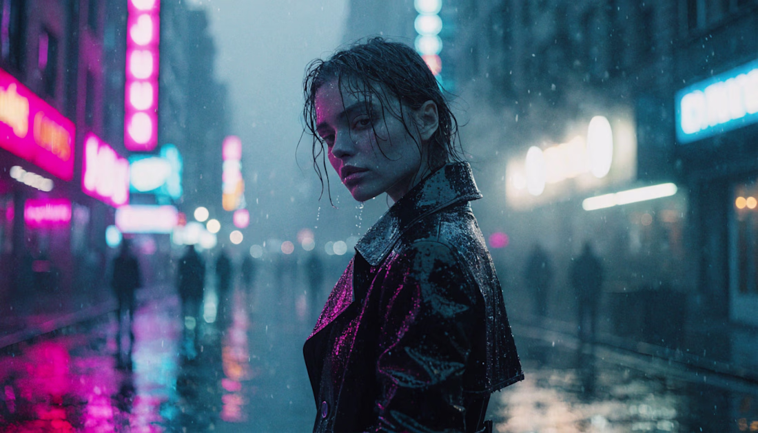
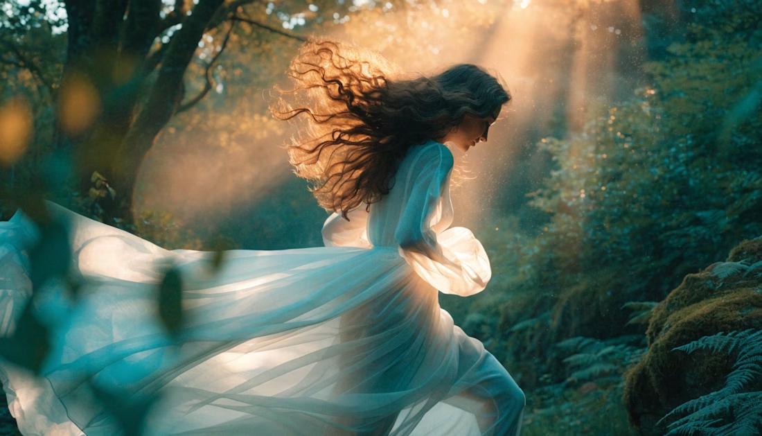
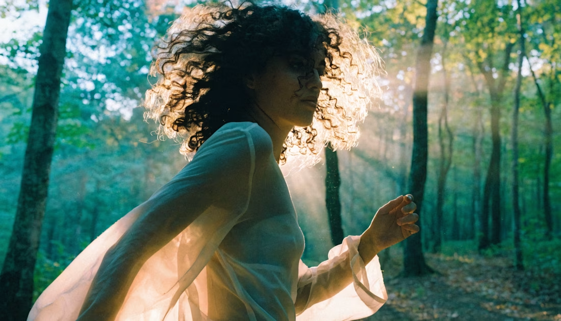
Just completed another creative experiment with Recraft AI!
It's incredible how AI is transforming the creative process—from a simple idea to a cinematic visual experience in just minutes. This project challenged me to explore storytelling, composition, lighting, and prompt engineering to achieve a polished final result.
Every project is an opportunity to learn, refine, and push creative boundaries. Excited to keep experimenting with AI-powered design and video creation!
I'd love to hear your thoughts—what's your favorite part of this creation? 👇
#RecraftAI #GenerativeAI #AIVideo #AIArt #PromptEngineering #CreativeAI #ContentCreation #DigitalCreativity #Design #Innovation
Recraft AI is powerful, and you've showcased it really well.
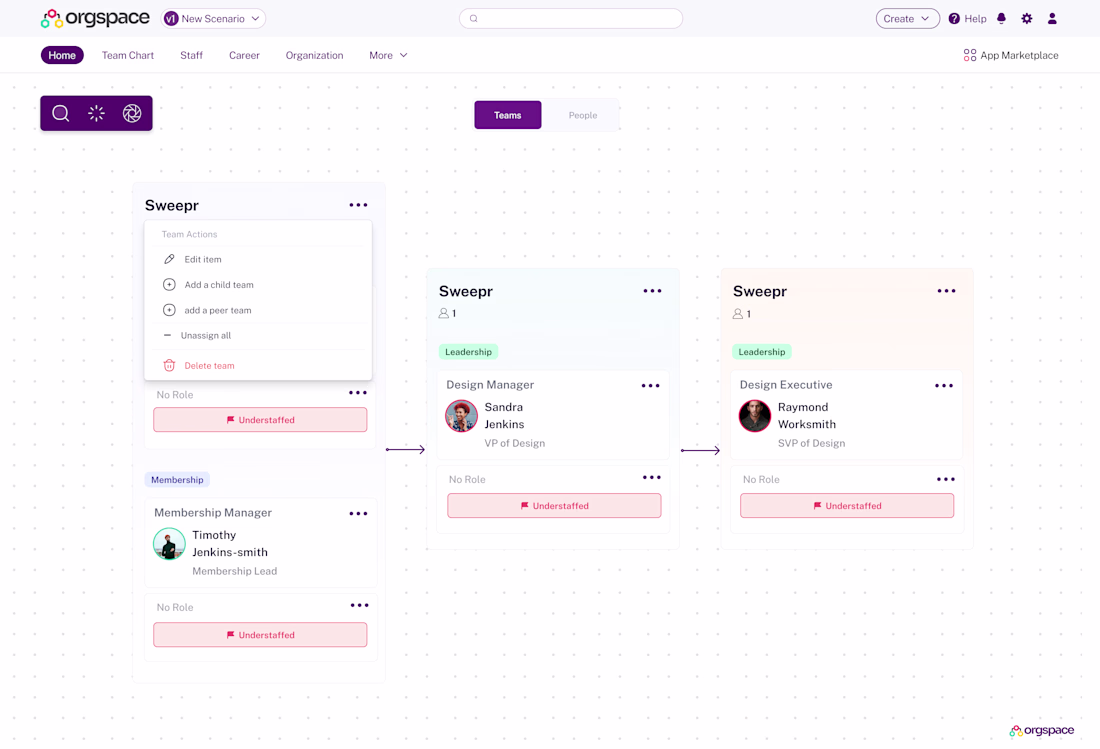
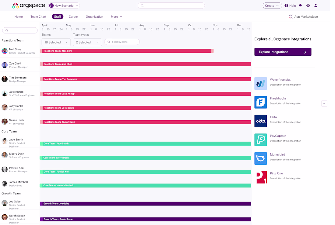
Enterprise and B2B software design has helped keep the lights on.
Here's some more screens from a project I worked on for Orgspace that helped them land $10M in funding.
Nice!
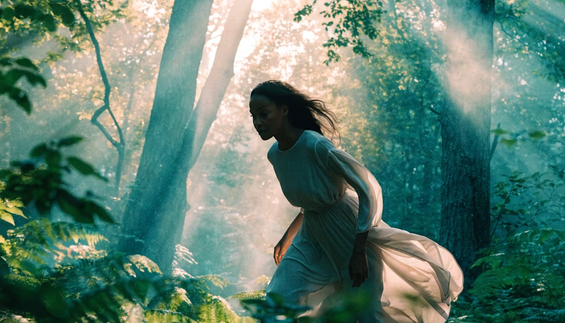
🎬Created this entirely with Recraft AI.
It's amazing how quickly an idea can turn into a cinematic visual with the right AI tools. I explored creative storytelling, dynamic visuals, and a polished aesthetic—all generated with AI.
Always experimenting, always learning, and always pushing creative boundaries.
What do you think? Feedback is welcome!
#RecraftAI #AIArt #AIVideo #GenerativeAI #CreativeAI #ContentCreation #DigitalArt #MotionDesign #AICreators #Innovation
The cinematic quality is impressive. Great job!
Trending
Claude
Claude has entered the design space. How are you using Claude Design?
Contra University
Learn from expert creatives how to earn more using next-gen AI tools.
MagicPath
The canvas is infinite, and exploration is becoming the workflow. How are you using MagicPath?
creativeaiflow
Creative AI workflows are evolving. What tools do you use, and what are their strengths and weaknesses?
freelancerlife
Freelancer life is wins, pivots, and everything in between. What’s yours right now?