The network for creativity
Join 1.25M professional creatives like you
Connect with clients, get discovered, and run your business 100% commission-free
Creatives on Contra have earned over $150M and we are just getting started
Back to feedPost

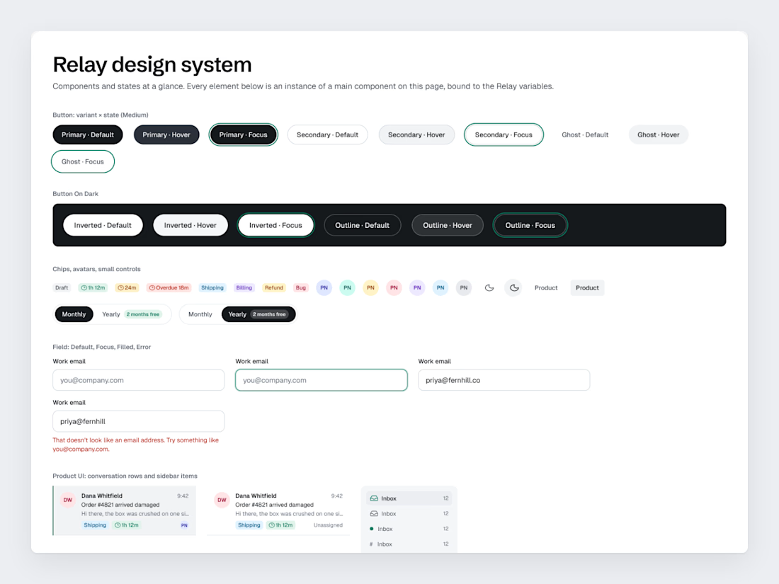
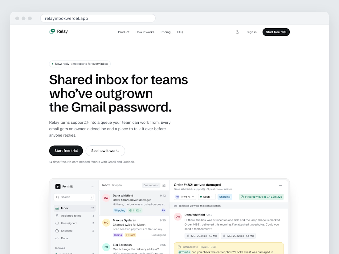
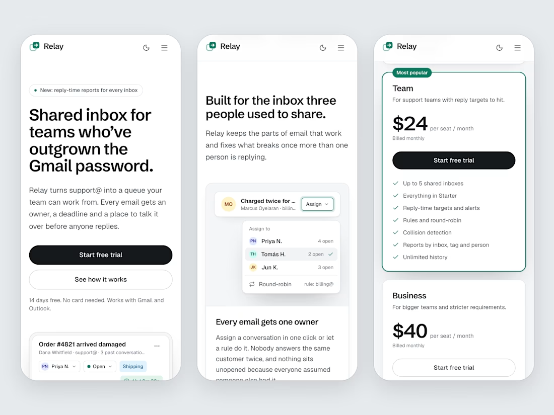
Relay is a concept project, a made-up shared inbox for support teams. Its landing page exists twice: as a Figma file and as a live site. Side by side, they show what a frame can't hand over to the browser.
The widths in between. The file has 1440 and 390; the browser has every width from one to the other. Without balanced wrapping on the headings (text-wrap: balance in CSS), Relay's headline would end on "password." alone at most of them.
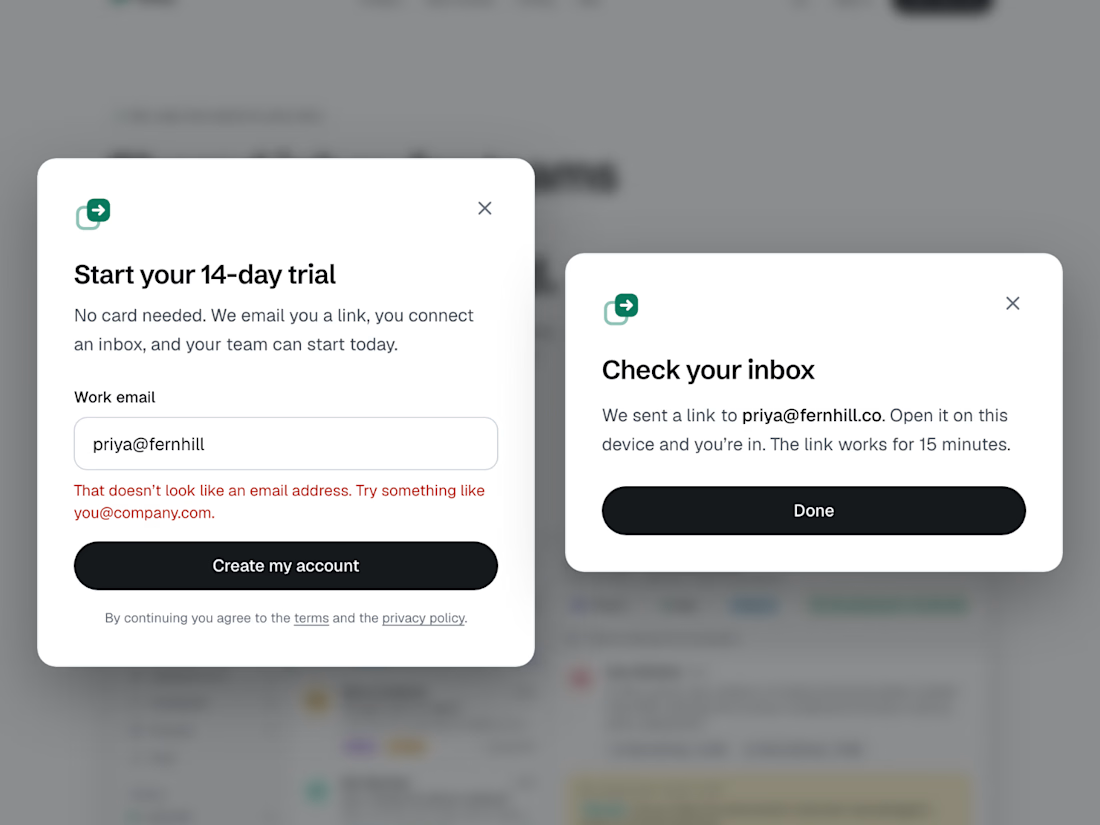
States. A frame shows a state. It doesn't say when it shows up. Live, the nav picks up a border and a blur after 8 px of scroll, and the trial form switches to an error or to "Check your inbox" when you submit. Someone decides those triggers; better if it's the designer.
Then there's the visitor's side. The browser knows if they use dark mode or asked for less motion. Relay follows the system theme until you pick one, and drops its scroll animations when reduced motion is on.
Live page: https://relayinbox.vercel.app. The Figma file is view-only and opens without an account.
The two free builds from Wednesday's post are still open: your Figma page made live, or a one-page portfolio.
The network for creativity
Join 1.25M professional creatives like you
Connect with clients, get discovered, and run your business 100% commission-free
Creatives on Contra have earned over $150M and we are just getting started



Related posts

Many tries for one effect. That's the honest story of the Inward headline
Inward is a concept landing page I made for noise-cancelling headphones. I wanted the words NOISE TO FOCUS to react to the cursor
Particles came first. Glitch with doubled letters broke reading. Grain was next, then crumbs, which felt dirty. Halftone was too graphic
I went back to particles, made them gentler and kept them only under the cursor. That one stayed
The video shows every version, one after another
None of the dropped versions were wasted. Each one showed what the product didn't want
Which version would you have shipped?

Super cool!


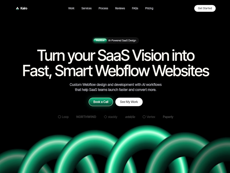
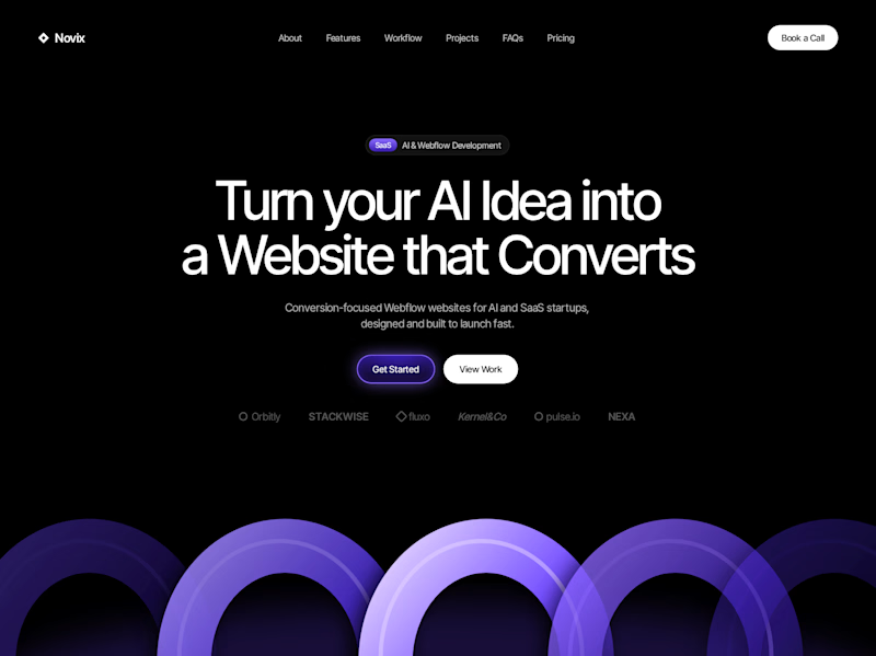

Both look great, but Violet & Black gets my vote! The purple accents give it a more modern, premium feel while keeping the design clean and focused on conversions. Amazing how a color change can create such a different brand personality. Have you tested which version performs better with visitors?


These stickers are clickable on kaisle13.framer.website they link to each individual artists profile page and each sticker custom designed for that artist.


So cool!!