The network for creativity
Join 1.25M professional creatives like you
Connect with clients, get discovered, and run your business 100% commission-free
Creatives on Contra have earned over $150M and we are just getting started
Back to feedPost

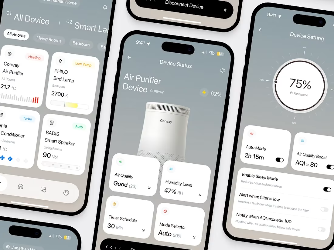
A great smart home experience starts with intuitive design. A well-crafted IoT mobile app lets users control devices, automate routines, and monitor their homes effortlessly—all from a single, seamless interface.
#IoT #SmartHome #MobileAppDesign
The network for creativity
Join 1.25M professional creatives like you
Connect with clients, get discovered, and run your business 100% commission-free
Creatives on Contra have earned over $150M and we are just getting started





Related posts

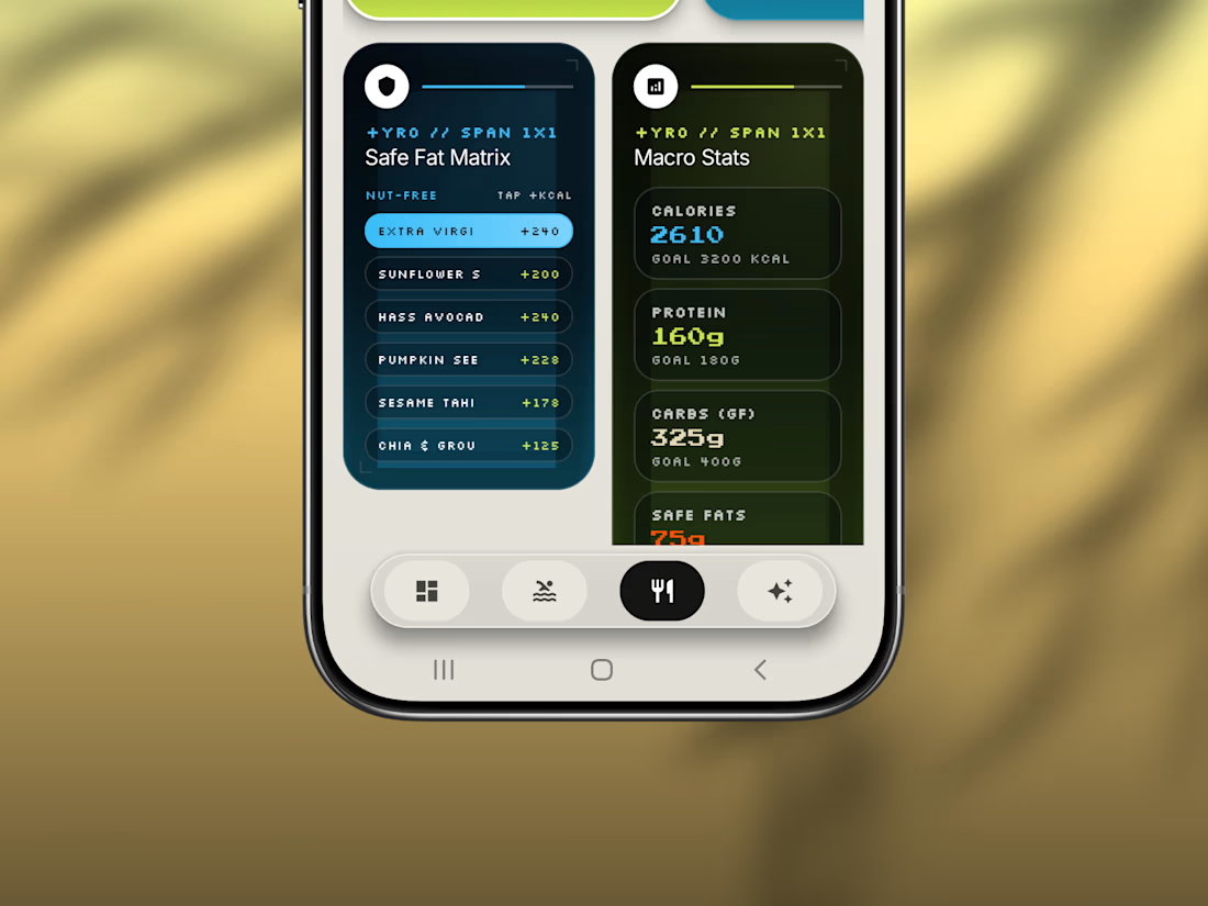
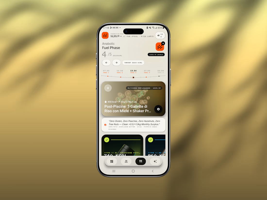
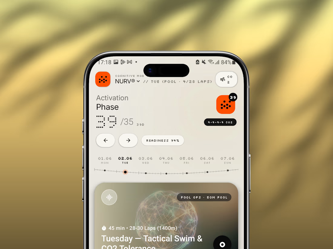
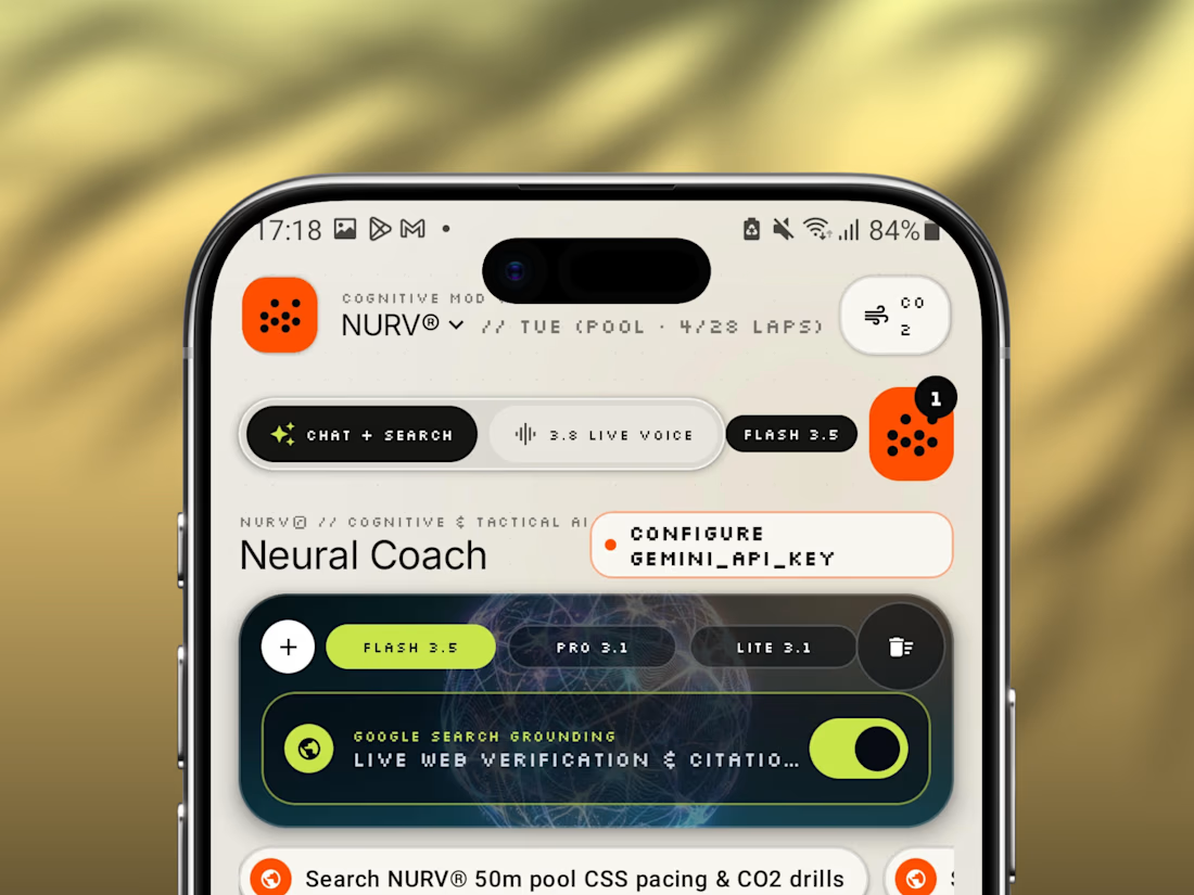
Friday app: NURV® 🟠
Swim training, nutrition and AI coaching in one Android app.
Dot-matrix numerals, a cream canvas, one hot orange accent. Built to feel like a lab instrument, not a fitness tracker.
Pool ops, fuel phases, CO₂ tolerance drills, all in one place.

Archive Friday 💿
Such a shame this concept never made it into production—still one of my favorite explorations.
Industry: health/sleep tracking


nice designs

SMART
HOME REVOLUTION
Project
Smart Enough to Know What You Need
Format
50 -Second AI Video Commercial
Role
AI Video Producer · Creative Director · Concept & Visual Development
The Brief
Create a premium smart-home commercial that demonstrates how connected technology can simplify everyday living. The concept needed to appeal to smart-home and technology brands while communicating convenience, security, comfort, and seamless automation.
The Creative Idea
What if your home simply understood you?
The film follows a modern woman as her home responds effortlessly to simple gestures and voice commands, from activating the lights and security to adjusting comfort, following her with music, and preparing the home for sleep.
Rather than presenting technology as complicated, the film makes it feel invisible, intuitive, and human.
Production & Objective
Developed a cinematic AI commercial using generative visual production,
designed around consistent character direction, luxury architectural
environment, cinematic camera language, lighting continuity, sound design,
voiceover, and editorial typography.
The objective is to demonstrate how AI can translate a simple technology
proposition into a premium, emotionally engaging brand film
that captures attention while making the benefits of smart living immediately
understandable.


cool 😍