The network for creativity
Join 1.25M professional creatives like you
Connect with clients, get discovered, and run your business 100% commission-free
Creatives on Contra have earned over $150M and we are just getting started
Back to feedPost

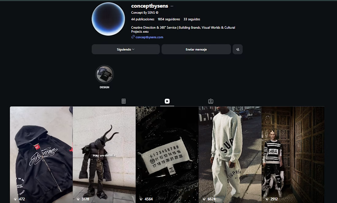
This project is focused on concept driven content and visual direction.
Here, I explored how strong aesthetics and minimal storytelling can shape a brand’s identity. Instead of relying on heavy messaging, the content is built around visuals, mood, and consistency creating a recognizable and intentional presence.
My role was to curate and develop the overall direction: selecting references, defining the visual language, and translating that into cohesive posts that feel part of the same universe.
This type of work reflects my approach to branding not just designing individual pieces, but building a clear identity that can live across social media and connect with a specific audience.


The network for creativity
Join 1.25M professional creatives like you
Connect with clients, get discovered, and run your business 100% commission-free
Creatives on Contra have earned over $150M and we are just getting started







Related posts

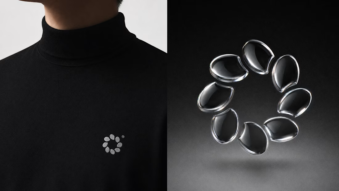
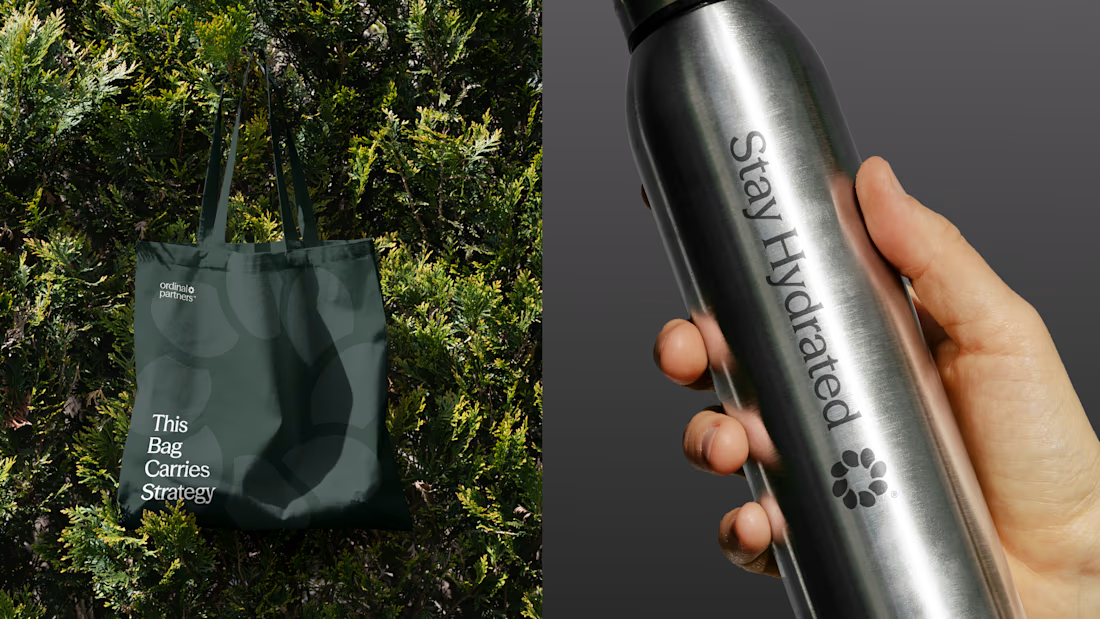
One brand, three different directions.
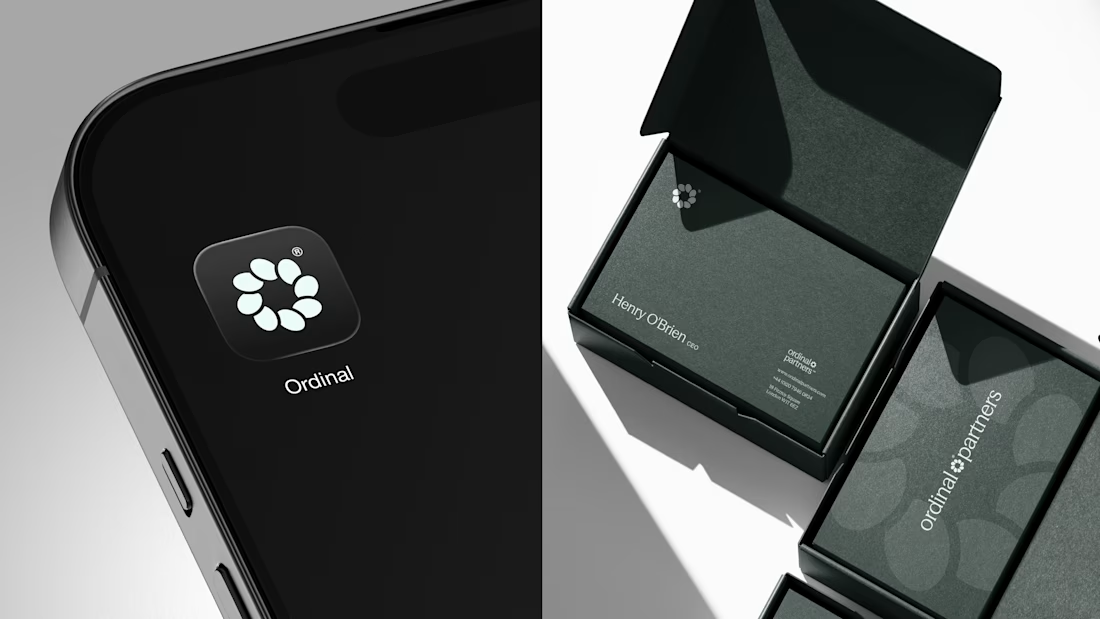
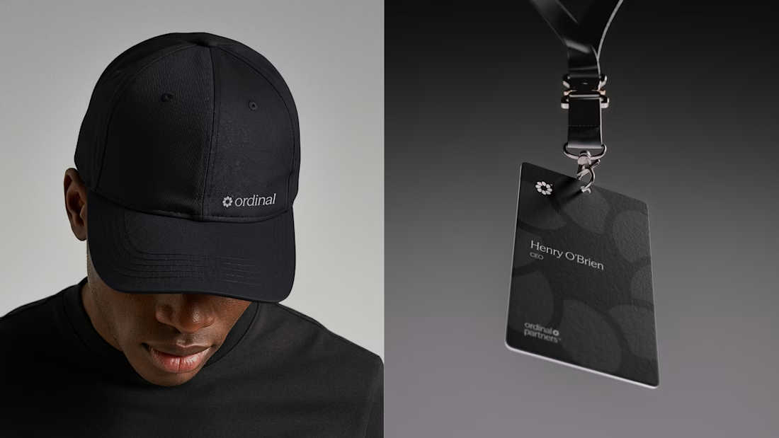
Sharing some of the logo exploration for Ordinal Partners.

Visually appealing 🔥

A useful way to evaluate a brand identity: place the business card, packaging, and social posts side by side.
Do they feel like they belong to the same business—even when the logo isn’t prominent?
That’s what I look for in a visual system. Typography creates hierarchy. Color builds recognition. Patterns and layout give the brand a character that can carry across different formats.
For business owners reviewing a new identity, ask your designer to show how it works in the places your customers will actually encounter it. Those applications can reveal more than a logo presentation alone.
Which touchpoint is hardest to keep consistent in your brand?

That's great visuals and motion graphics Great job Mohammed

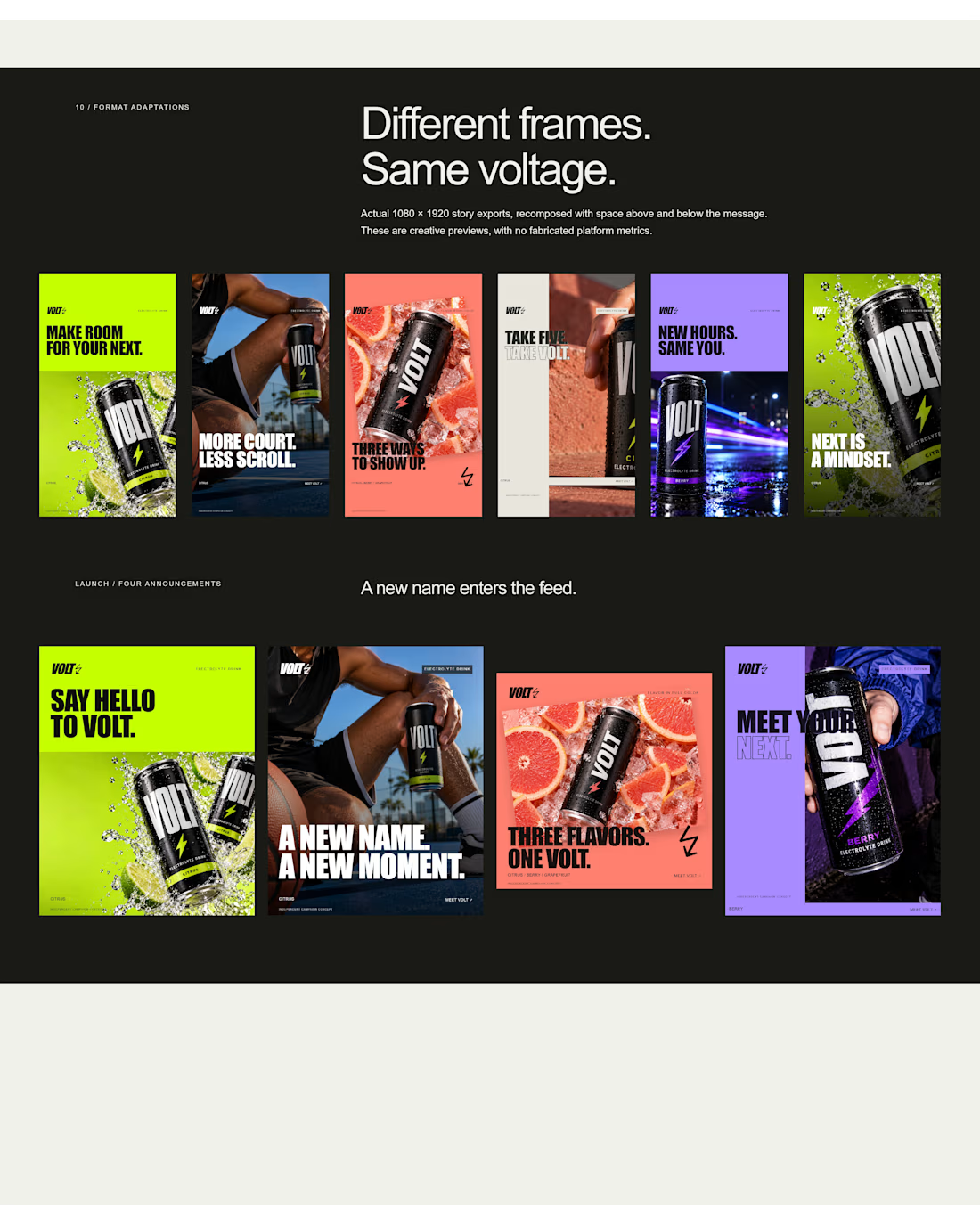
an electrolyte beverage campaign concept I created🚀👇
5 creatives. 20 static ads. One bold visual system built to stop the scroll.


This is genuinely creative! What I love most is how the design manages to stand out while still feeling intentional and well thought out. There’s something about the overall execution that naturally draws your attention and makes you want to take a closer look. It’s always...