The network for creativity
Join 1.25M professional creatives like you
Connect with clients, get discovered, and run your business 100% commission-free
Creatives on Contra have earned over $150M and we are just getting started
Back to feedPost


How I designed the NEW Waylight landing page (and fixed their brand perception).
🚨 THE PROBLEM:
Waylight is a great tool that helps creators sell on social media. But, they had outgrown their old website. It no longer matched their top-tier status in the industry.
🚨 HOW I FIXED IT:
➡️We studied competitors to see what going on.
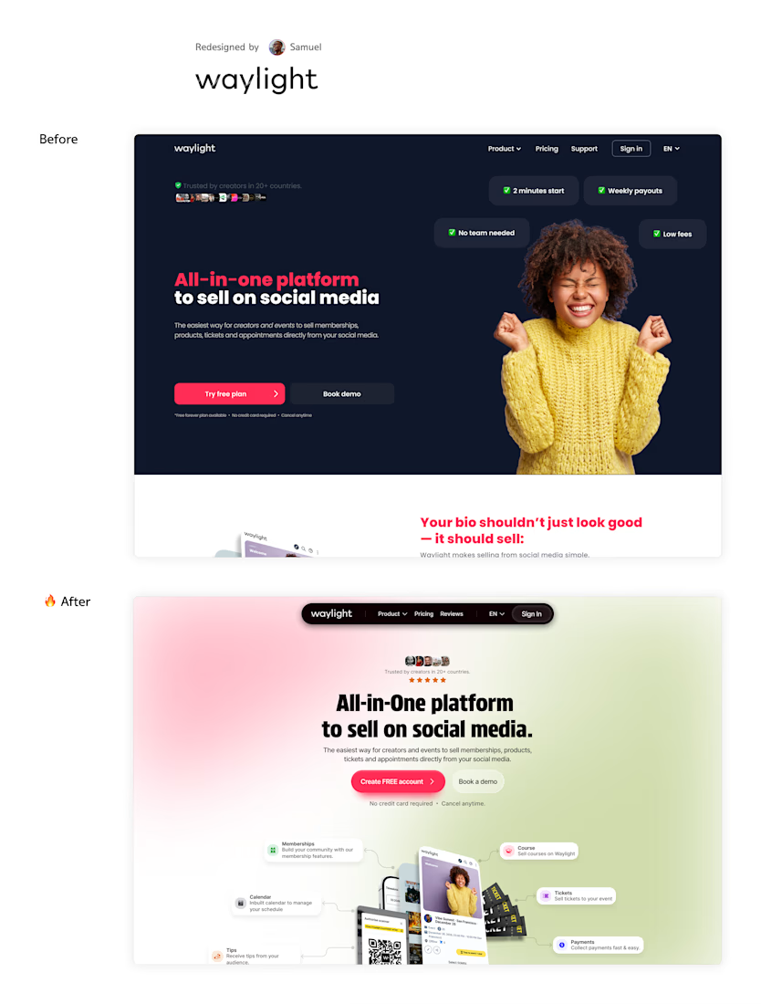
➡️After that, I changed the heavy, dark background to a bright, clean, and soft design. The site felt more modern and friendly.
➡️ I moved the actual product visual right up into the hero section. Customers can now quickly spot features like Memberships, Tickets, and Tips without scrolling.
🚨 THE RESULT:
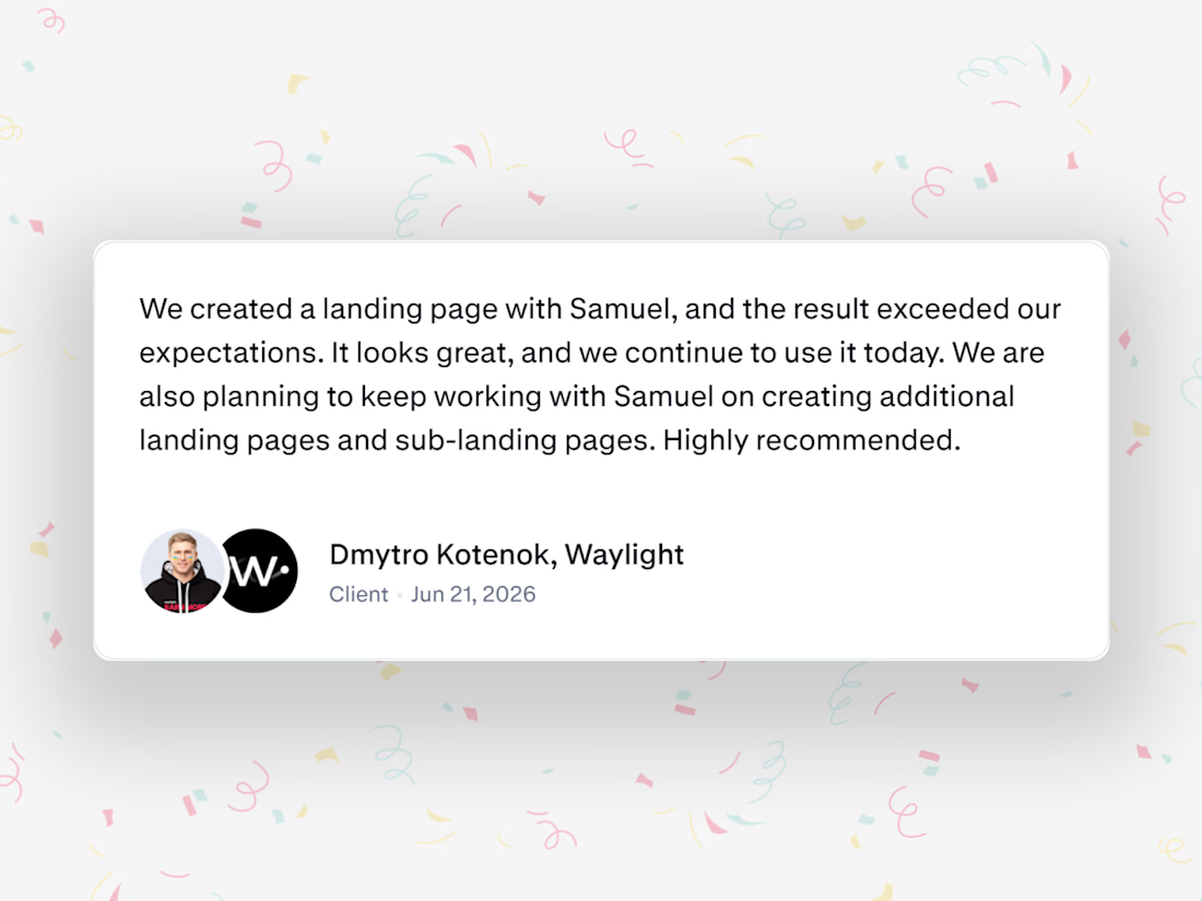
The founder, Dmytro, said the new design "exceeded our expectations."
A website should never just look pretty. It should help potential customers understand your product amongst other things.
...
PS: I help startups move their websites from custom-code over to @Framer.
You get full control back, easy system to publish blogs instantly, great built-in SEO, and a blazing-fast website - with absolutely zero coding or developers needed.
DM me 'Hi' and let's chat!
The network for creativity
Join 1.25M professional creatives like you
Connect with clients, get discovered, and run your business 100% commission-free
Creatives on Contra have earned over $150M and we are just getting started

Challenges
View all


Related posts

Designed a clean, modern, and responsive business website concept to showcase services, build trust, and help businesses attract potential customers.



Not only is the design clean, but you also did a great job making sure it works well across different devices with a responsive design.

Your Hero section has about 3 seconds to make someone care 👀
And honestly, a great one can make an ordinary website feel premium.
I created this hero section in Framer, focusing on how the right layout, typography, and visuals can set the entire vibe of a website. ✨
Check it out 👇
https://www.framer.com/marketplace/components/hero-section/


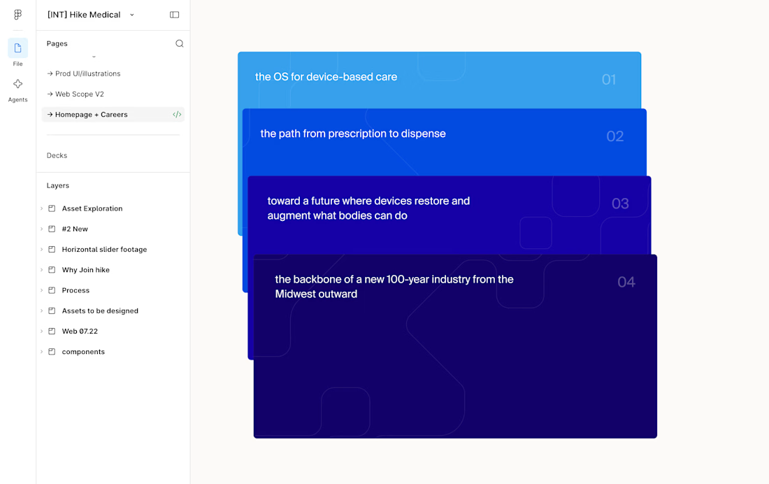
This card stack transition combining the SVG of each card to the sticky position is giving my brain really satisfying scratches 😘👌
--
I've been doing a lot more Framer developments lately where I don't do the design, I think one of the big advantages of having a strong background in design is that I can see the designers vision to translate it into the web obsessing over the details.
I.e. see Figma design screenshot in the comments how each card had the same SVG but in irregular placements, I saw it as an opportunity to perfectly align them on scroll and add a bit of a transparency reveal at the end. It feels way more intentional and ties everything together.
Design by @Iverson developed by me
Figma design handoff