The network for creativity
Join 1.25M professional creatives like you
Connect with clients, get discovered, and run your business 100% commission-free
Creatives on Contra have earned over $150M and we are just getting started
Back to feedPost

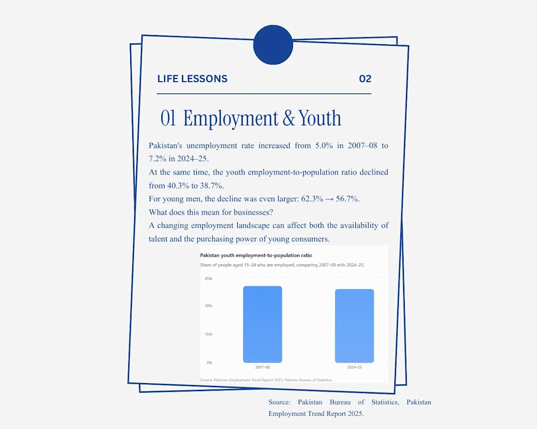
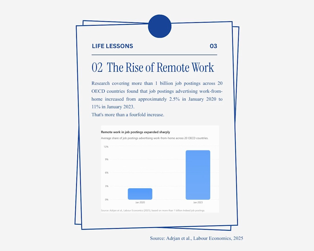
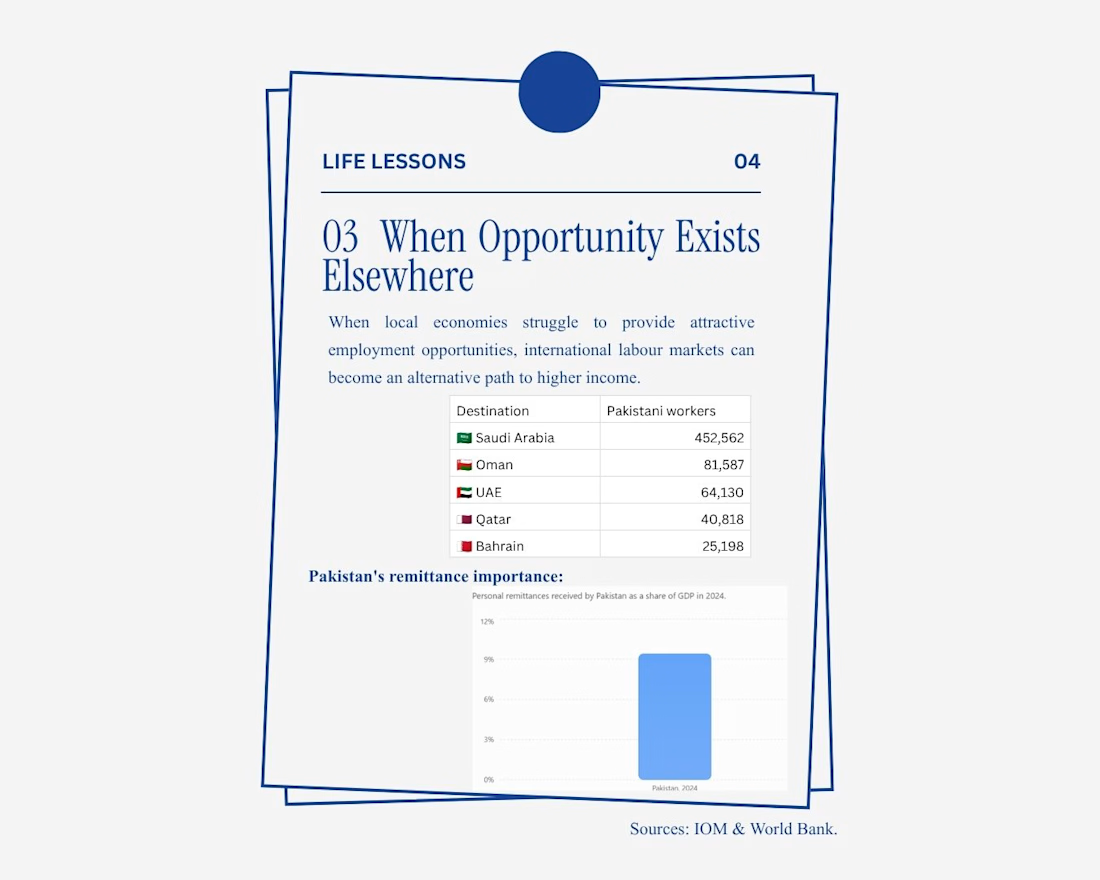
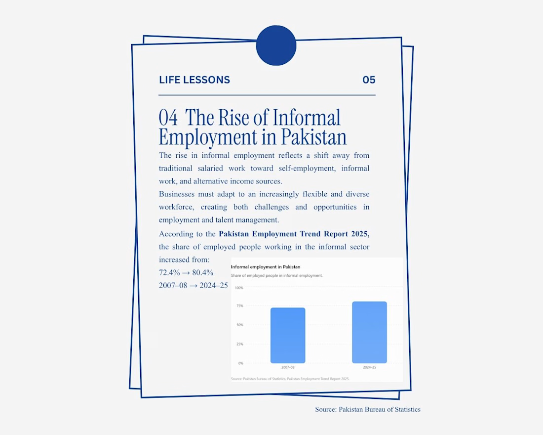
I explored the Economic element of PESTEL analysis and how changing employment patterns, remote work, migration and remittances are affecting businesses and workers.
I wanted to look beyond the usual “GDP and inflation” discussion and explore how economic conditions are actually changing the way people work and support their families.
**PESTEL Analysis: How Economic Factors Are Shaping Work & Business**
In conclusion, economic factors are reshaping how people work and how businesses find talent. As the workplace becomes increasingly digital and global,
Shouldn't businesses ask, *“Where is the talent, and how can we reach it?”*

The network for creativity
Join 1.25M professional creatives like you
Connect with clients, get discovered, and run your business 100% commission-free
Creatives on Contra have earned over $150M and we are just getting started

Challenges
View all


Related posts

𝗢𝗸𝗮𝘆, 𝗜 𝘄𝗮𝗻𝘁𝗲𝗱 𝘁𝗼 𝘀𝗲𝗲 𝗵𝗼𝘄 𝗿𝗲𝗮𝗹𝗶𝘀𝘁𝗶𝗰 𝗜 𝗰𝗼𝘂𝗹𝗱 𝗺𝗮𝗸𝗲 𝗮𝗻 𝗔𝗜 𝗨𝗚𝗖 𝘃𝗶𝗱𝗲𝗼 𝗳𝗲𝗲𝗹.👀
For this one, I went for a premium podcast-style look with natural delivery, subtle camera changes, kinetic text and supporting B-roll, instead of making it feel like the usual AI talking-head video.
The goal was simple: make AI-generated content feel like something you’d actually stop and watch.
Tell me what you think.
#AIUGC #AIVideoCreator #UGCVideo #AIVideo #VideoCreator #SocialMediaContent #UGCAds #MotionGraphics #VisualStorytelling #ContentCreator


This looks so real

I created a 30-sec AI-powered UGC ad for MELTY, a fictional ice cream brand.
This one was a bit of a challenge because getting AI-generated UGC to feel natural, from the creator’s expressions and eating motion to the product and ice cream texture takes a lot of prompting and refining.
I worked on everything from the concept and product visuals to the creator, scenes, and final video, with the goal of making it feel like a real UGC ad rather than something obviously AI-generated.
Still learning and pushing what AI can do with product advertising.
What do you think?
Want an AI-powered UGC ad for your brand or product? Send me a DM.
#AIUGC #UGCAd #AIAdvertising #AICreative #AIVideo #ProductAdvertising #UGCCreator #AIContent #FoodAdvertising #CreativeAI

cool


How far should a brand identity travel?
For UrbanBite, I explored how one visual identity could stay recognizable across different touchpoints from the core logo to takeaway cups, storefront signage, and delivery packaging.
The goal was to keep the system bold, energetic, and consistent without making every application feel identical.
This is the part of branding I enjoy most: seeing whether an identity still works when it leaves the artboard and enters the real world.
Which application feels strongest to you storefront, packaging, cup, or delivery box?

