The network for creativity
Join 1.25M professional creatives like you
Connect with clients, get discovered, and run your business 100% commission-free
Creatives on Contra have earned over $150M and we are just getting started
Back to feedPost

AI agent products can easily feel too technical, too dense, or too abstract.
Agentix explores a calmer way to explain automation: a SaaS landing page built around clear product messaging, progressive storytelling, no-code workflows, agent monitoring, cost visibility, error tracking, and measurable business impact.
The visual direction avoids the usual heavy AI SaaS look, using landscapes, open space, modular interface elements, and focused conversion moments to make the product feel more trustworthy and easier to understand.


Choosing calm landscapes and open space over the usual dark-gradient AI look is a smart trust play, because with agent products the real fear is loss of control and a busy interface only amplifies it. For me the test is whether the progressive storytelling shows what the agent...
The network for creativity
Join 1.25M professional creatives like you
Connect with clients, get discovered, and run your business 100% commission-free
Creatives on Contra have earned over $150M and we are just getting started

Challenges
View all


Related posts

💰 Finance Websites Don't Have to Feel Complicated.
When people deal with money, they want one thing first:
Trust.
For this finance landing page, we focused on creating a clean, modern experience that makes complex financial products feel simple and approachable.
✨ Clean & professional UI
📊 Clear information hierarchy
💳 Finance-focused visual language
🎯 Strong conversion-focused CTAs
📱 Responsive design
🔐 Trust-driven user experience
Because great fintech design isn't just about looking modern.
It's about making users feel confident enough to take action.
Designed by UIUX Ocean Design Agency 🌊
Need a high-converting landing page for your fintech or finance product?
📩 DM us to discuss your project.
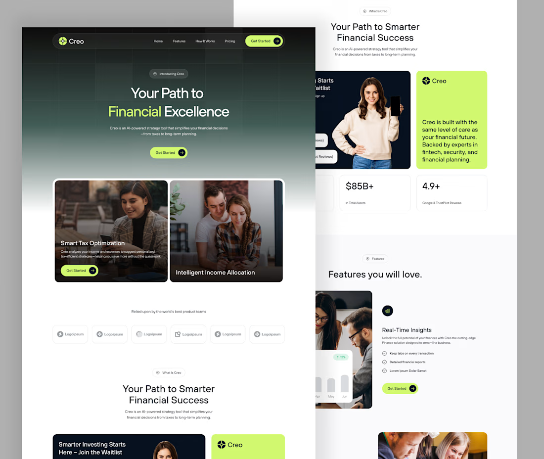


Great approach. Fintech design is all about building trust and clarity, and this direction communicates that really well.


A modern fintech branding exploration designed to create a confident, trustworthy, and premium financial identity. The project includes a distinctive visual language, refined brand direction, and engaging Instagram Story designs built to communicate financial products in a simple and visually compelling way.
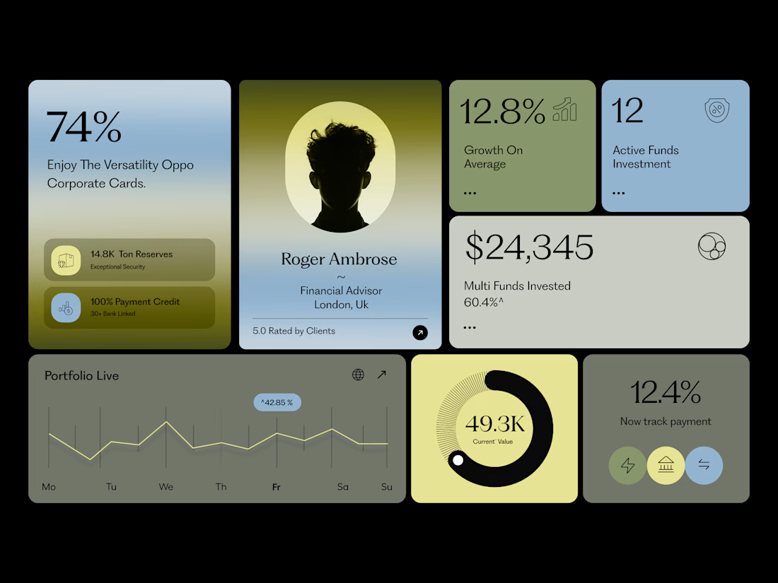

The subtle gradients behind the data cards give this fintech dashboard a highly premium, trustworthy feel.

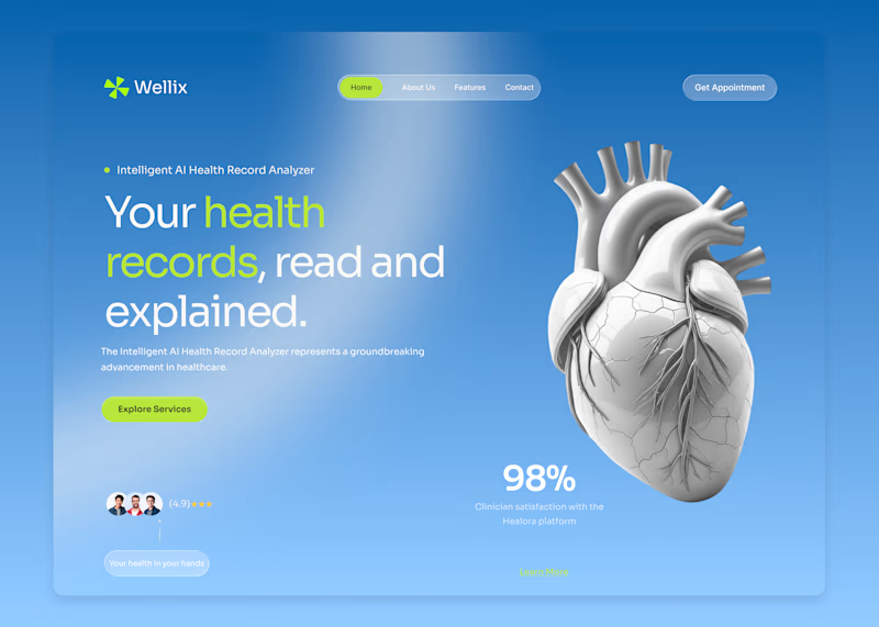
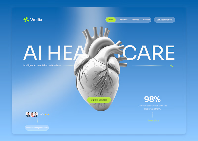
Wellix two homepage directions. Which one would you pick?
Wellix is an AI tool that reads health records and explains them in plain language lab results, scans, and charts turned into something a person can actually understand without a medical background.
Same brand, same palette, same illustration just two different ways of arranging the hero.
Which one would you go with, A or B? Drop a comment I'd like to hear which one lands better for you.
60 voted
61%
39 voted
39%
99 votes
Closed

Version. A does the job