The network for creativity
Join 1.25M professional creatives like you
Connect with clients, get discovered, and run your business 100% commission-free
Creatives on Contra have earned over $150M and we are just getting started
Back to feedPost

Aura fitness- A plant plant based approach to fitness , made in BOLT
Health apps are usually loud and cluttered. I designed Aura to be the opposite: a clean, fluid space for plant-based nutrition, Pilates, and daily habit tracking.
✨ Highlights
Intuitive Dashboard: Daily hydration, movement, and meal progress at a quick glance—no cognitive overload.
Visual Movement: Guided Pilates flows with clean breakdowns of timing, intensity, and muscle targets.
Simple Meal Prep: Scannable recipe cards with macro details and quick prep times.
Flexible Weekly Rhythm: A 7-day flow that guides seasonal wellness goals naturally.
Designed with soft neutrals and organic greens to make daily momentum feel completely effortless.


The network for creativity
Join 1.25M professional creatives like you
Connect with clients, get discovered, and run your business 100% commission-free
Creatives on Contra have earned over $150M and we are just getting started



Related posts

Rebuilt my portfolio with AI and added new case studies.
Brand, web, and product UI. All custom coded, all in one page.

One page with brand, web and product UI together is a strong move. Clients see the range without clicking around. Rebuilding mine with AI coding tools taught me the same thing: the speed lets you spend the saved time on the case study writing, which is what actually wins work.

Photographer Portfolio Website
"Capturing light, emotion, and the moments you never want to forget." That line set the tone, and the layout follows it.
The hero is one motion-blurred portrait washed in red. The photographer's name runs across the bottom in a condensed white face, so large the screen cuts it off. The photo keeps its soft focus, and the name still reads first.
Thin grid lines split the page into narrow columns, and the small copy sits justified inside them. The loose photo gets a strict structure to lean on.
A single round red button with an arrow sits right on the letters and marks where to go next.
Designed by the Hue & Machine team.
#WebDesign #Photography #PortfolioWebsite #EditorialDesign #Typography #UIDesign #ProductDesign #CreativeDirection #ResponsiveDesign #FigmaDesign


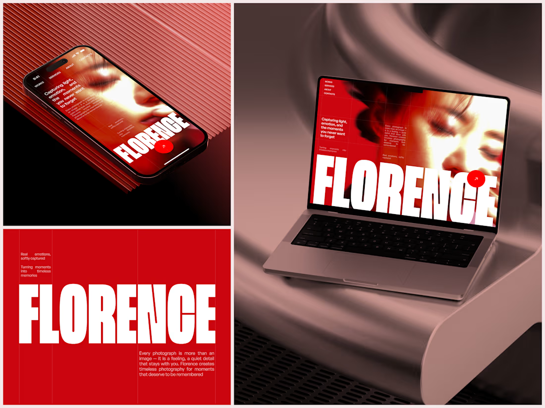

The heavy condensed white FLORENCE over the red portrait is bold, and keeping the same red across phone, laptop and type tile makes the case study read as one system. Did the red come from the photographer's own work, or was it your call?