The network for creativity
Join 1.25M professional creatives like you
Connect with clients, get discovered, and run your business 100% commission-free
Creatives on Contra have earned over $150M and we are just getting started
Back to feedPost


First full week of September, I'm putting the finishing touches on Oure, a wellness site concept sitting somewhere between Noom's confidence and Headspace's calm. Used warm earthy palette, serif style font to do the emotional heavy lifting, and a water motif built entirely through motion despite not including the use of the color blue. Dropping full build soon.


Looks great!!


the orange stripes make the page pop

Skipping blue entirely for a wellness site is a bold constraint, most brands in that space lean on it by default. What almost went the other direction before you settled on the earthy palette?
I considered going a little more muted and cool toned, but it started feeling too expected for wellness.
The network for creativity
Join 1.25M professional creatives like you
Connect with clients, get discovered, and run your business 100% commission-free
Creatives on Contra have earned over $150M and we are just getting started







Related posts


Every element feels perfectly placed! 👏

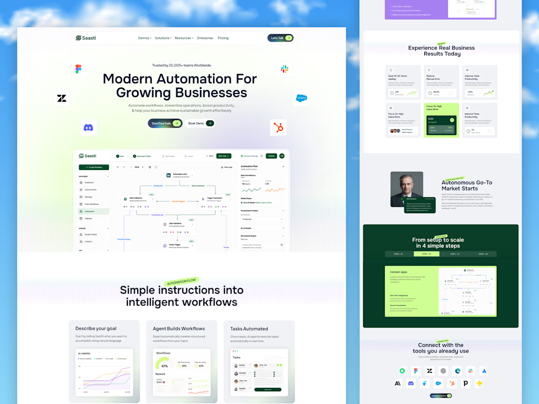
🚀 Saasti — Smart Automation for Growing Businesses
A modern SaaS website concept designed to turn complex automation into a simple, intuitive experience. With clean layouts, interactive workflow dashboards, vibrant accents, and clear messaging, every section highlights the power of smarter business operations.
✨ Modern SaaS UI/UX Design
⚡ AI-Powered Automation Experience
📊 Intuitive Workflow Dashboards
🎨 Clean, Conversion-Focused Layout
Designed by OrdainIT to bring innovation and usability together.
#SaaSDesign #UIDesign #UXDesign #AI #WebDesign #DashboardDesign #OrdainIT



Brilliant execution!

✨ A new real-world project — Astrid Mija Contti | Biotherapy & Personal Growth
I'm happy to share a project that means a lot to me: a website designed and developed in Framer for biotherapist Astrid Mija Contti, who trusted me with her project. I'm truly grateful for that trust and the opportunity to bring her vision to life. 🤍
Because this project focuses on biotherapy and personal growth, I wanted the website to feel calm, welcoming, and harmonious from the very first visit.
🪷 The lotus flower became a central part of the visual concept, symbolizing growth, rebirth, and transformation. I originally drew the lotus myself, then used ChatGPT to transform it into a 3D visual. The subtle moving effects were created with PicLumen to bring the experience to life.
Beyond the visual design, the website also features a booking system, which I developed with the assistance of ChatGPT and Codex.
This project allowed me to combine visual storytelling, thoughtful design, and AI-assisted development into a real-world experience tailored to a client's needs.
Thank you, Astrid, for your trust! 🤍
🔗 Explore the website: https://bioterapija-z-astrid-mija-contti.framer.website/
#WebDesign #UIDesign #Framer #WebDevelopment #AIAssistedDesign #RealWorldProject

Congrats on the real-world project! Calm and welcoming from the first visit is exactly what a biotherapy site needs.