
Chime Uchechi
Product Designer | UI&UX Designer
Profile in progress
Chime is building their profile!
Design Challenge 4/30
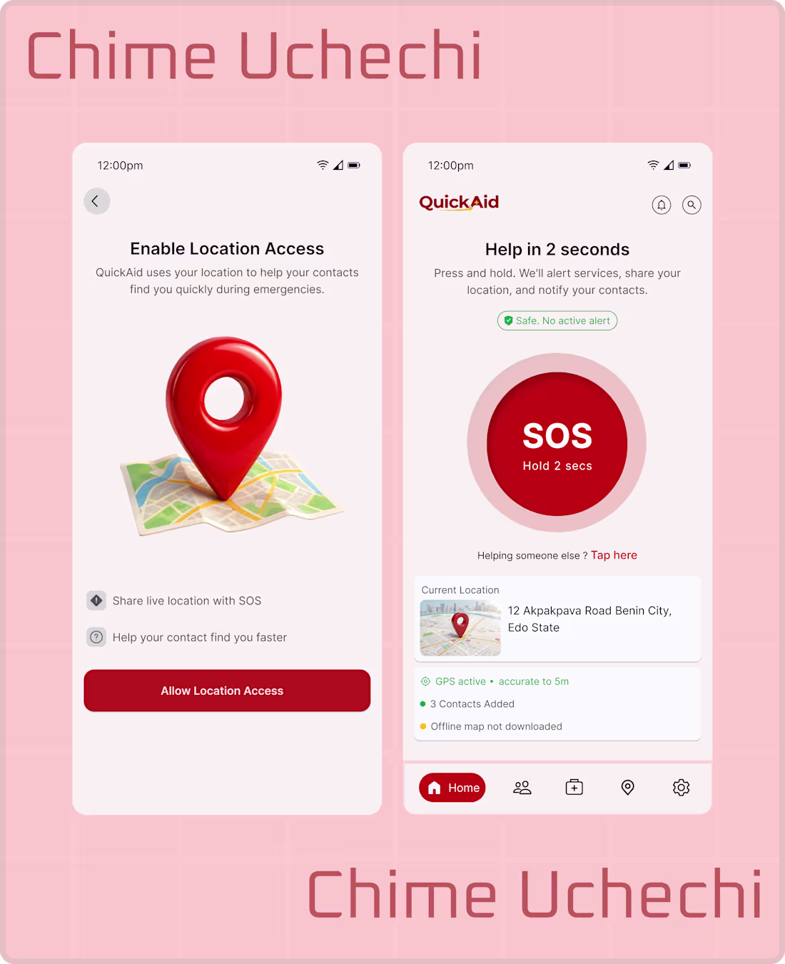
This exploration started from thinking about how chaotic real emergency situations can be.
I kept coming back to one question: how do we help someone get assistance faster when panic makes even simple actions hard?
That question led me to QuickAid — an SOS emergency app built with one clear goal: reducing response time when every second matters.
The experience is designed to stay simple. You press and hold the SOS button, then quickly choose the emergency type like medical, fire, police, or disaster. There’s also an Auto SOS option that instantly alerts emergency services and trusted contacts with no extra steps.
The app also supports live location sharing, fast access to nearby hospitals, pharmacies, police stations, and fire services, plus basic first-aid guidance for critical moments.
The focus was on removing friction, reducing confusion, and helping users act quickly without overthinking under pressure.
QuickAid is designed to make getting help more direct and reliable, because in emergencies, even a small delay can make a big difference
1
6
DESIGN CHALLENGE 3/30 🚀
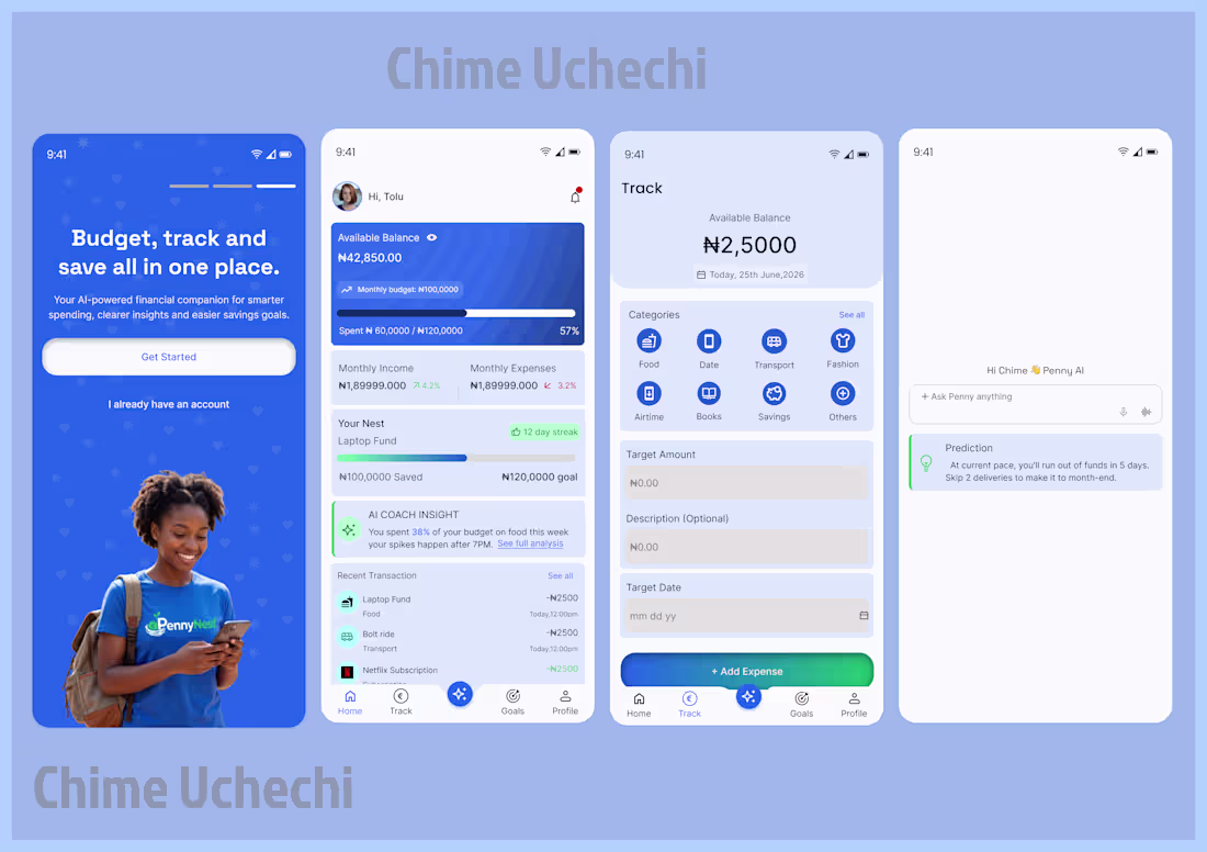
Built PennyNest — a student budgeting app that helps track expenses, set budgets, and save smarter 💰 Get AI insights, spending predictions, and savings goals.
Built for students to stop guessing where money goes.
1
11
1 of 30 Design Challenges.
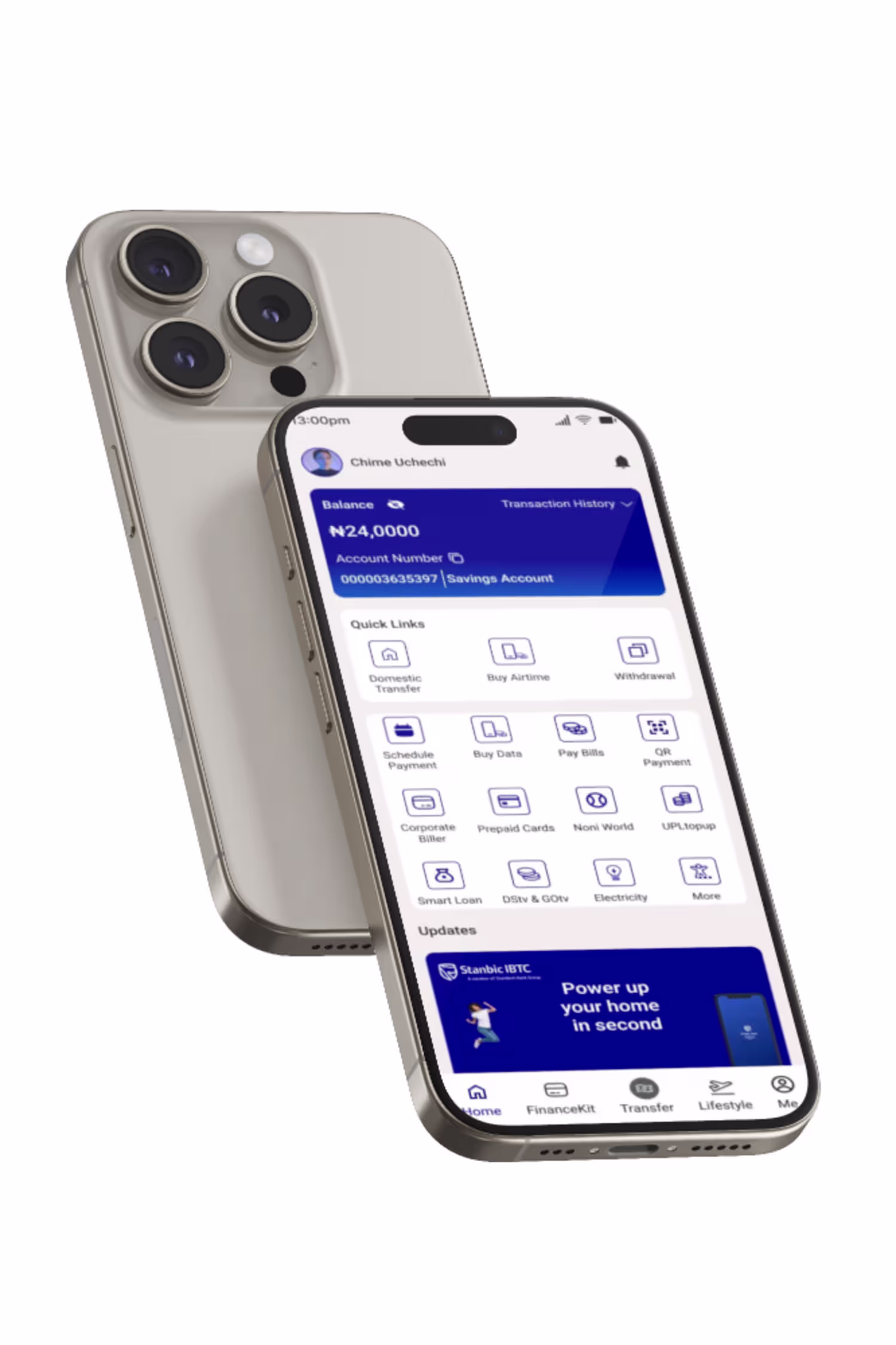
Proud to share NexaPay
A fintech UI/UX concept built for fast, seamless global payments.
No fees. Instant transfers. Smart wallet. 256-bit encryption.
Multi-currency (€ $ £). Designed for individuals, businesses & developers.
1
16
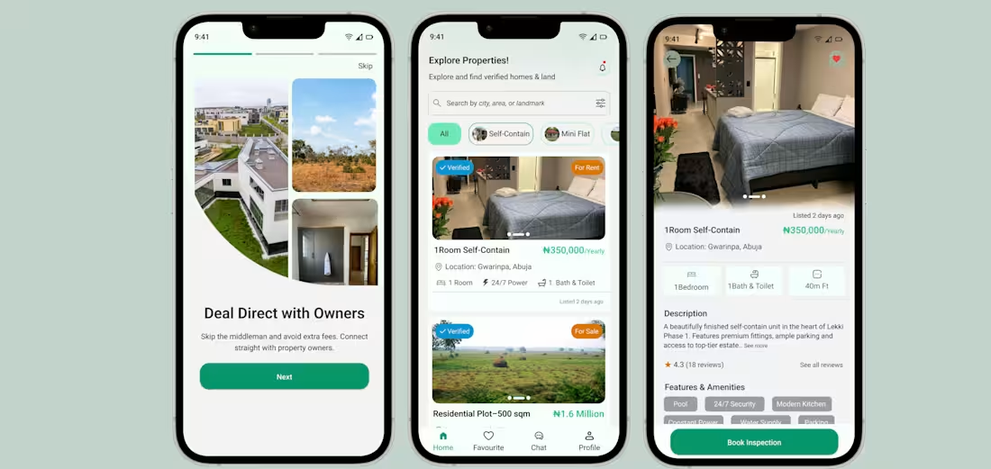
House hunting in Nigeria is a nightmare inspection fees, hidden costs, zero transparency.
So I built Bibian Nest:
✓ No hidden fees
✓ Verified users & real reviews
✓ No middlemen
✓ Clear info upfront
Simple. Transparent. Stress-free.
1
16
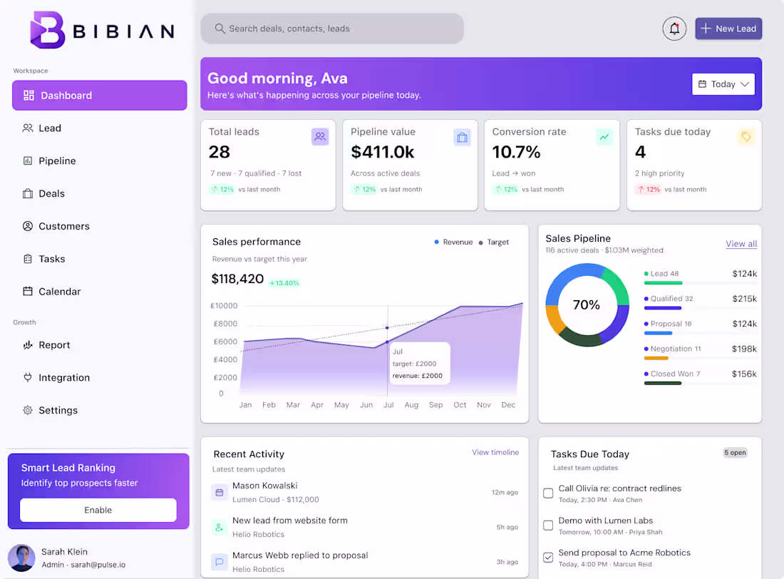
Scattered tools. Missed follow-ups. Lost revenue.
I designed Bibian CRM to fix that — customer management, task tracking, sales follow-ups, and revenue visibility. All in one place.
#UXDesign #ProductDesign #SaaS
1
32
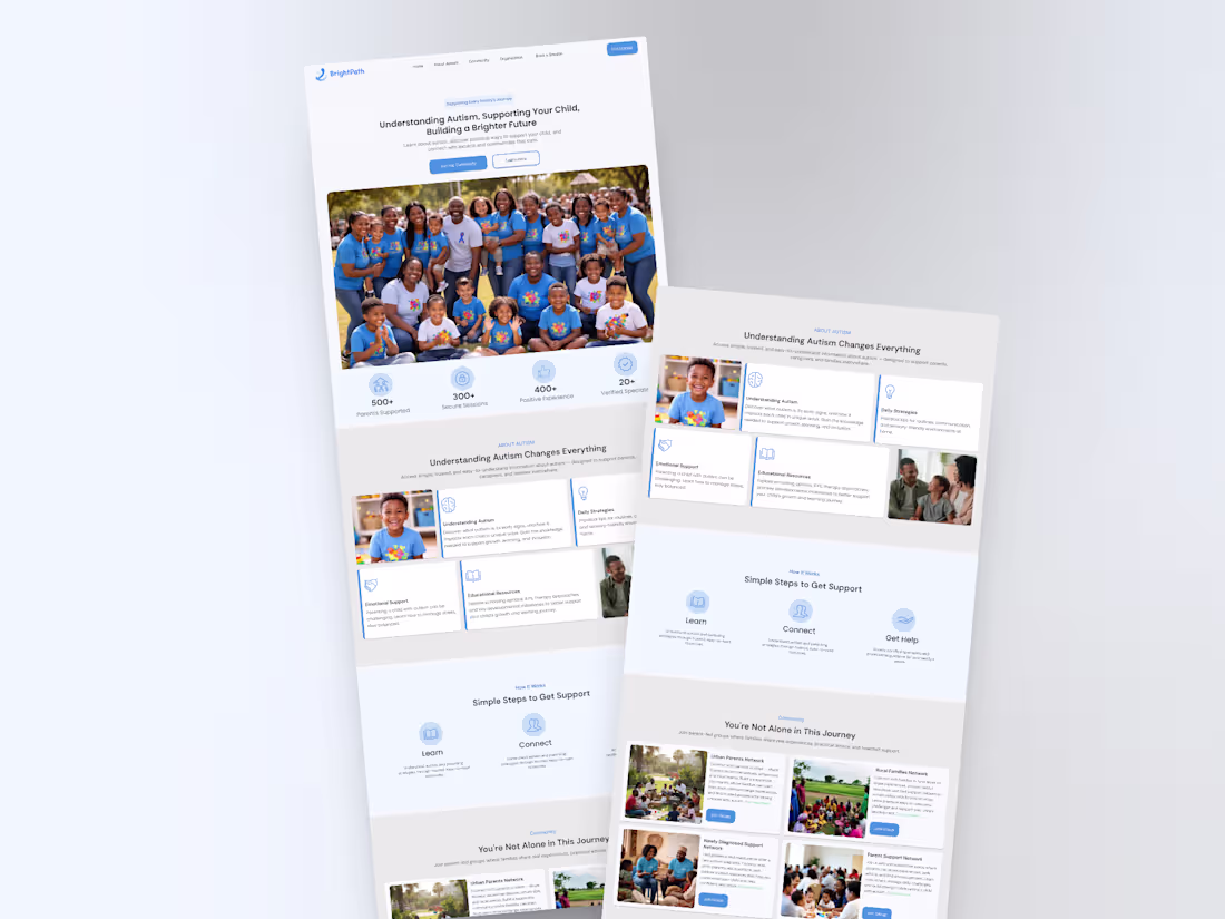
One moment of confusion revealed a bigger problem.
A child called “spiritual” was actually autistic.
That experience pushed me to design a platform that improves autism awareness, connects families to specialists, and builds support systems.
— Chime Uchechi (Product Designer)
#AutismAwareness #HealthTech #UXDesign
1
24
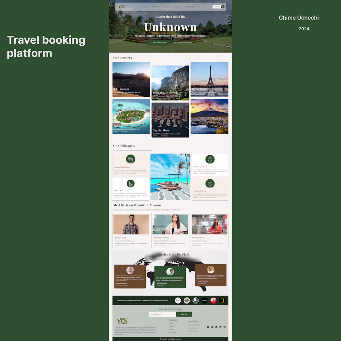
YES is a modern travel landing page designed to showcase destinations and inspire users to explore the world. It features curated travel packages and highlights trips to places like Bali, Paris, and the Swiss Alps.
1
26