
Chidi Rejoice Ifeoma
Visual Designer | Crafting Modern & Clean Brand Experiences
New to Contra
Chidi Rejoice is building their profile!

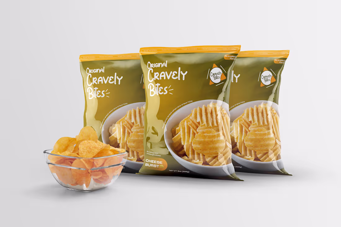
Kicking off my design uploads here with one of my favorite projects — Cravely Bites, an experiment I’ve been working on.
For this packaging, I leaned into a warm, appetizing look — something that instantly says “snack time.” The focus was on:
A bold, clean front that keeps the chips as the hero
Friendly handwritten typography to keep the brand fun and approachable
A simple, clear layout so it’s easy to spot on a shelf
The whole goal was to make the packaging feel inviting, tasty, and instantly recognizable.
Let me know what you think.
1
6