
Charde Smith Anglin
Im a web designer building beauty brands and websites.
Ready for work
Charde is ready for their next project!
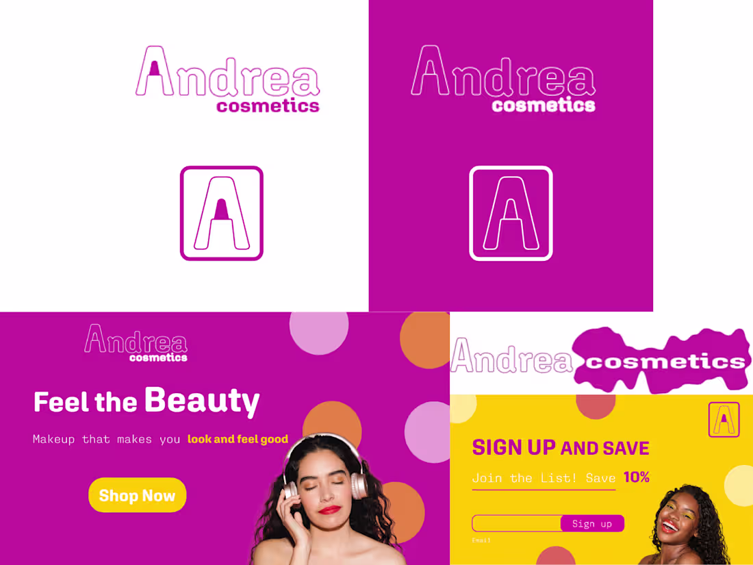
Andrea Cosmetics - Brand Identity & Landing Page Concept
Mock brand project showcasing full identity system and conversion-focused landing page design. Created entirely in Figma.
Brand Identity Designed logo system with multiple applications: primary wordmark with outlined "Andrea" typography and solid "cosmetics" lockup, icon mark (boxed "A"), and color variations (magenta on white, white on magenta). Clean, modern, geometric approach with rounded letterforms that feel approachable and youthful.
Design Approach Focused on Gen Z/millennial cosmetics market with energetic, confidence-driven messaging ("Makeup that makes you look and feel good"). Playful geometric shapes add movement without cluttering the interface. Clear visual hierarchy guides users toward conversion actions.
12
80
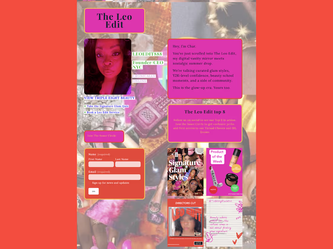
The Leo Edit - Seasonal Campaign Design
Designed a nostalgic Y2K-inspired seasonal campaign that reimagines beauty content as an elevated MySpace experience. The goal: make luxury beauty feel playful and accessible while driving Inner Circle membership and email capture.
The Aesthetic Hot pink, coral orange, and mustard yellow color palette with bold typography and handwritten elements. Organized chaos layout mimics early 2000s internet energy - badges, profile-style intros, "top 8" sections, and comment-box signups.
The Strategy Three main pages work together: Landing hero establishes "permission to play" messaging with dual CTAs. Content hub functions as a profile page with founder intro, email capture, and product callouts. Menu page organizes content with quiz integration and VIP membership push.
14
93
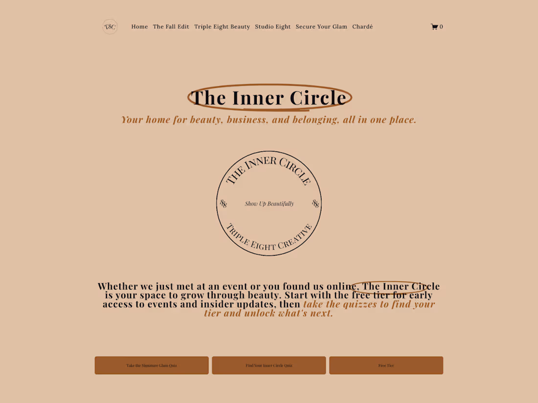
Triple Eight Creative - Website Redesign & Brand Reposition
The Challenge
In 2025, I repositioned Triple Eight Creative from a traditional beauty service business into a scalable membership model with three distinct revenue streams. The site needed to communicate this shift clearly - we're not just another makeup artist, we're building the world's first global beauty membership.
The Approach
I designed the site architecture around three core audiences: hotel partners (Room 888), corporate clients and coworking spaces (Suite 888), and beauty enthusiasts (The Inner Circle). Each needed its own clear path and conversion points.
The rebrand launched in June 2025, with a primary site restructure in November that added the full Suite 888 partnership pages.
23
146
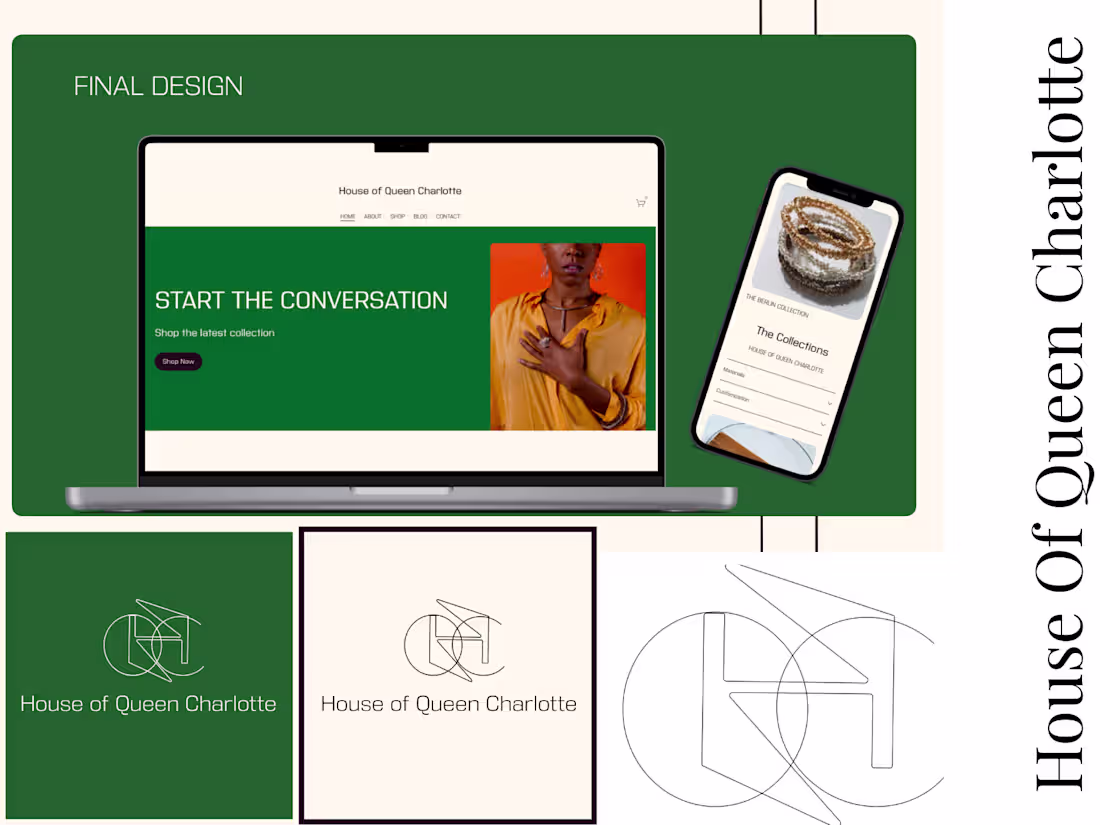
Project: House of Queen Charlotte - Brand Identity & eCommerce Launch
The Brief: House of Queen Charlotte is a Jewelry brand that needed a complete brand identity and an e-commerce presence to launch direct-to-consumer. Required sophisticated visual system that communicates luxury and heritage while remaining approachable for online shopping.
The Work:
Custom logo system with three applications (solid green, cream, line art)
Brand identity, including color palette and typography
Complete eCommerce website on Squarespace
Responsive design optimized for mobile shopping
Product page templates and site architecture
0
16