
Carolina Oros Teodori
Brand identities from scratch, illustration & motion
New to Contra
Carolina is building their profile!
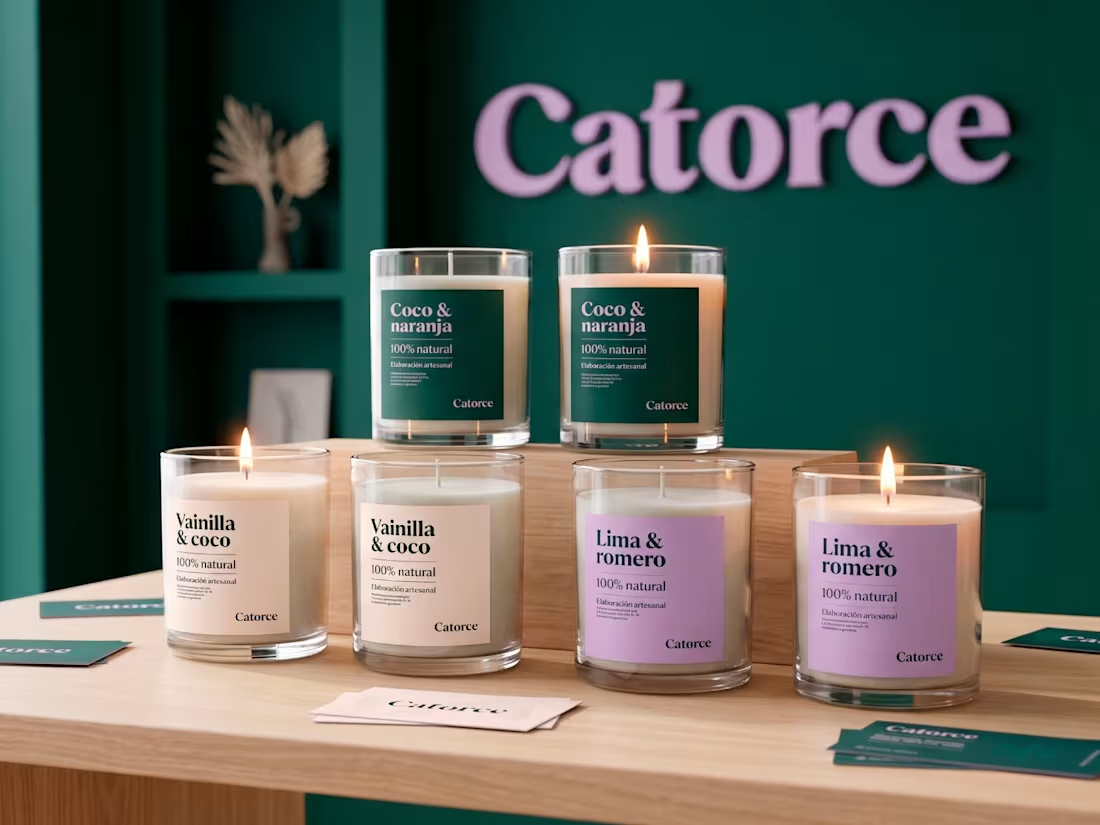
For Catorce, a brand specializing in handmade soy aromatic candles, I developed a professional and distinctive visual identity. The goal was to reflect the artisanal quality of the products while maintaining a polished and memorable aesthetic. I designed a logotype using only typography, selecting a typeface with unique morphological details that make it stand out. The color palette combines green and violet in a bold yet elegant way, enhancing the brand’s originality. Additionally, I created decorative elements to complement the logotype and designed various print materials and packaging, ensuring a cohesive and refined brand experience.
5
5
88
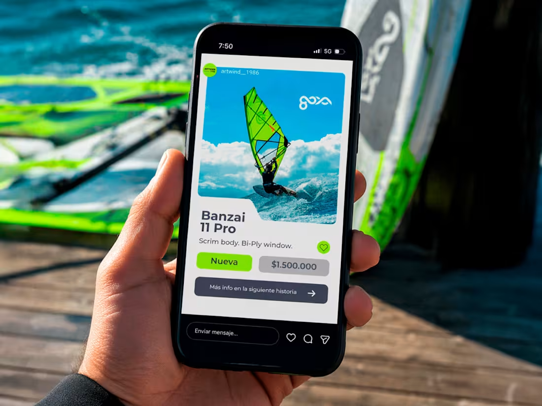
Artwind 1986 is a windsurf and action sports shop brand for which I developed a complete visual identity, including the logotype, print materials, and social media content such as stories and reels. The goal was to create a brand that feels energetic and adventurous, while still maintaining a professional and reliable tone that reflects its commitment to high-quality service. The visual system was designed to capture the spirit of extreme water sports, combining a sense of movement, freedom, and passion with a clean and structured design approach. Across all touchpoints, from printed applications to digital content, the identity reinforces Artwind’s positioning as a knowledgeable and enthusiastic brand for windsurfing and similar activities.
2
51