
Candace S
Bold Design for Mission-Led Movements
Profile in progress
Candace is building their profile!

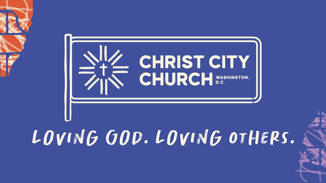
Christ City Church DC (https://www.linkedin.com/company/christcitydc/) is a neighborhood church rooted in Northeast D.C. with a deep commitment to justice, inclusivity, and community. After more than a decade with the same visual identity, they wanted a refresh that felt warmer, more approachable, and more reflective of who they are today.
For this project, I led a full brand refresh that translates Christ City’s heart into a visual system grounded in place, people, and purpose.
The creative direction started with a simple idea:
A Christ-centered foundation radiating outward into the neighborhood, the city, and the world.
Visually, that became:
• Organic, hand-drawn elements that feel human and welcoming
• Patterns inspired by D.C. street grids and metro lines
• Simple icons and illustrations referencing non-tourist local landmarks
• Warm typography and color palettes designed for accessibility and approachability
1
6

What if healthcare could function like tree canopies? 🌳 👀
I explored this idea through a mock brand project — Canopy Community Health, a fictional community clinic in Detroit. The visual identity features overlapping leaves, a humanist typeface, risograph textures, and imagery reflecting a diverse patient population.
Community health clinics often get branded as generic, low-tier, low-quality services, but care is an essential part of community building. So what if community healthcare clinics were treated like a vibrant part of the neighborhood ecosystem?
1
35