rishi raj
making things look and sound cool.
New to Contra
rishi is ready for their next project!
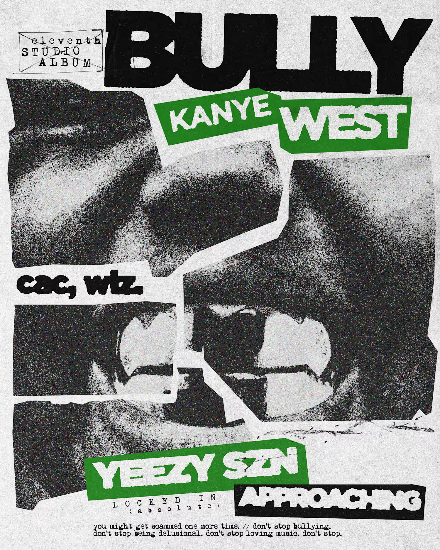
BULLY - KANYE WEST (poster)
1
18
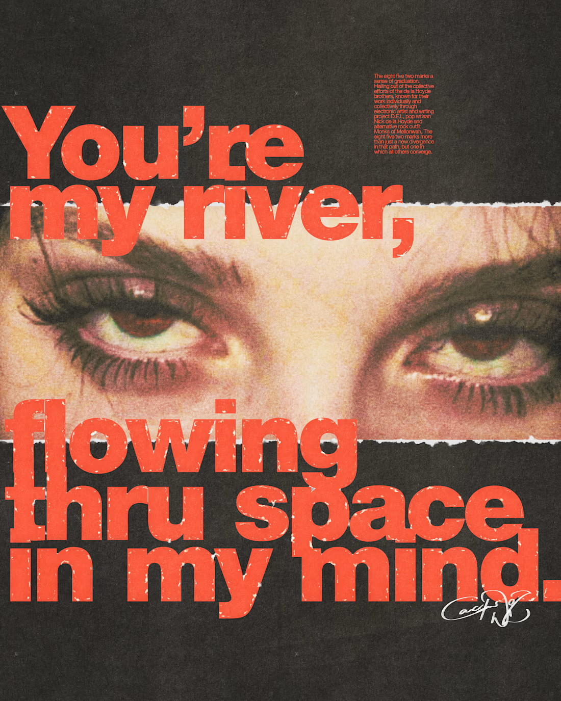
some other pieces: i made last november!
1
15
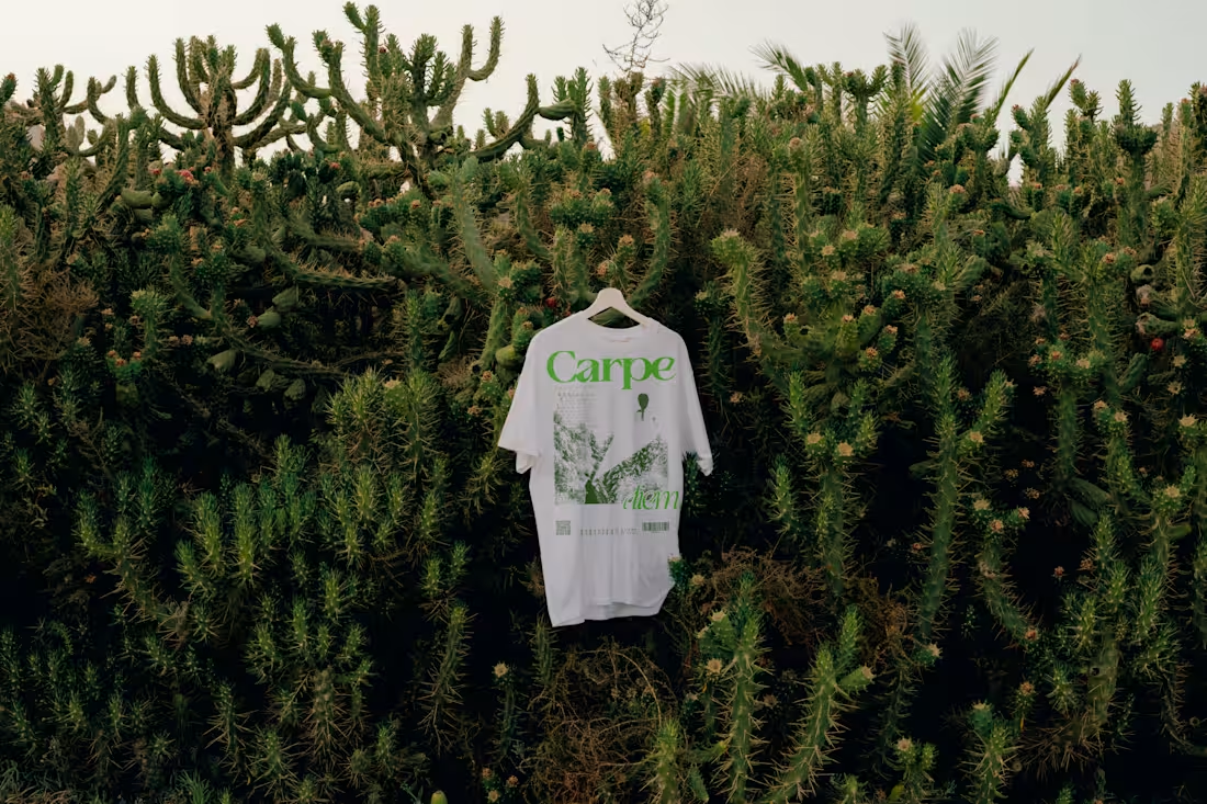
a tshirt/merch design i did, way back!!!!
2
3
40
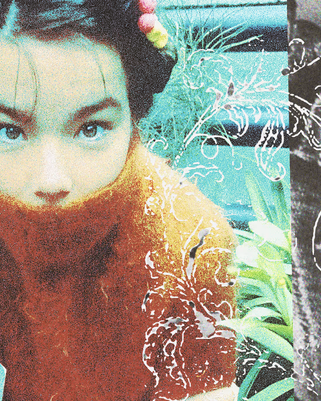
a bjork artwork i made! ;D
1
24
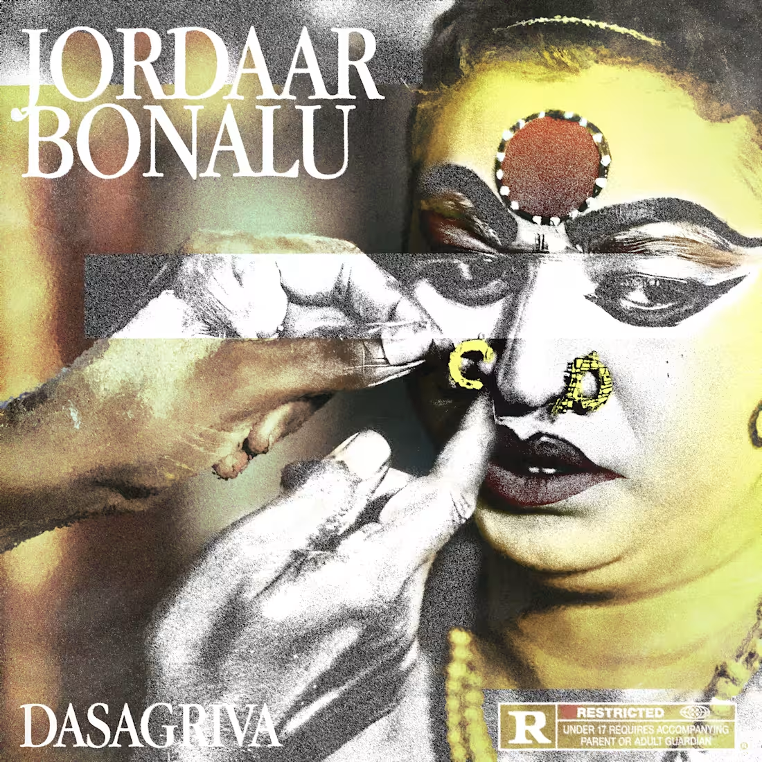
DASAGRIVA - JORDAAR BONALU
Hyderabad-based Telugu hip-hop artist, 188K YouTube subscribers, 200K monthly Spotify listeners, 137K Instagram followers.
Cover art, promotional social content, YouTube thumbnails
Full visual campaign for "Jordaar Bonalu," a track rooted in Bonalu, a Telangana folk festival honoring Goddess Mahakali. The cover centers on a Potharaju, the ritual figure who leads Bonalu processions, shown getting ready before the ceremony. That moment of preparation was the way in to the folk theme without leaning on festival imagery directly.
The visual identity uses a dark, moody palette with a bluish undertone and a red title treatment, with Dasagriva placed at the center. The color scheme was built to hold the intensity of the ritual while keeping the design distinctly modern rather than literal or documentary.
Beyond the cover, the campaign included promotional flyers and BTS edits for announcements, extending the same visual world into the rollout. A YouTube thumbnail was also designed for the music video, which became the channel's most-viewed video at 18 million views.
0
24
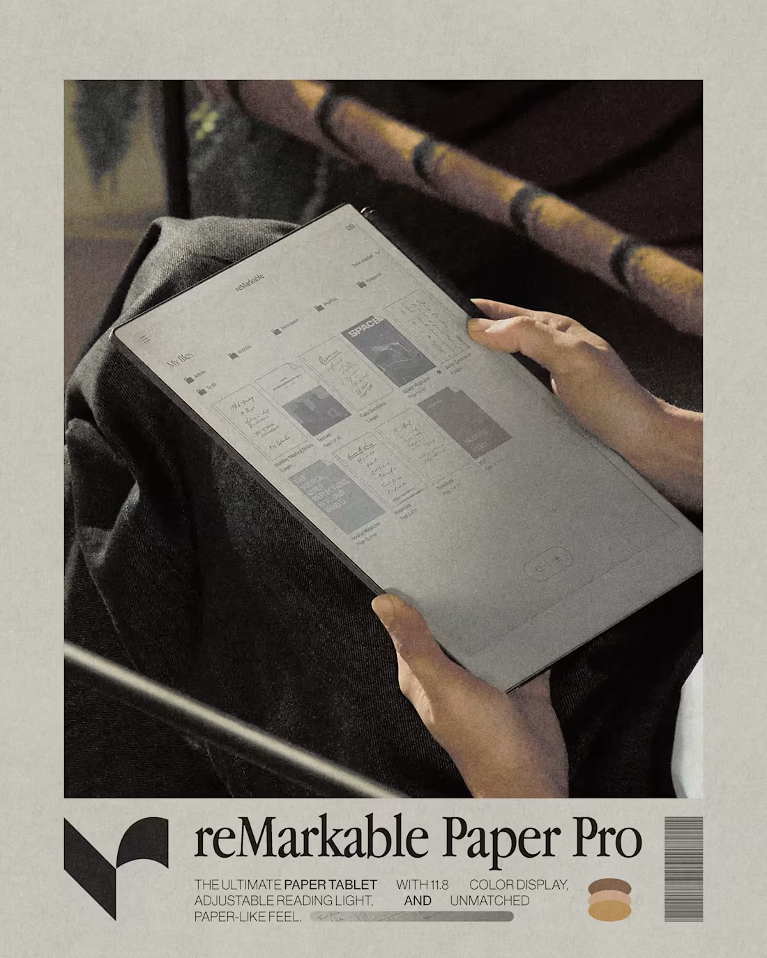
A self-initiated campaign for reMarkable, a brand whose product philosophy (bringing the feel of paper into a digital workflow) shaped the entire visual direction. A consistent paper-grain texture runs through every piece, tying the ad visuals back to the physical material the product is built around.
Layouts stay clean and structured, mirroring the calm, organized feel of the product itself rather than competing with it visually.
The set includes a hero campaign poster, a feature-focused product page layout, and a lifestyle-driven ad pairing real-world usage shots with in-app screens, all held together by the same paper-texture treatment and restrained typography.
1
31
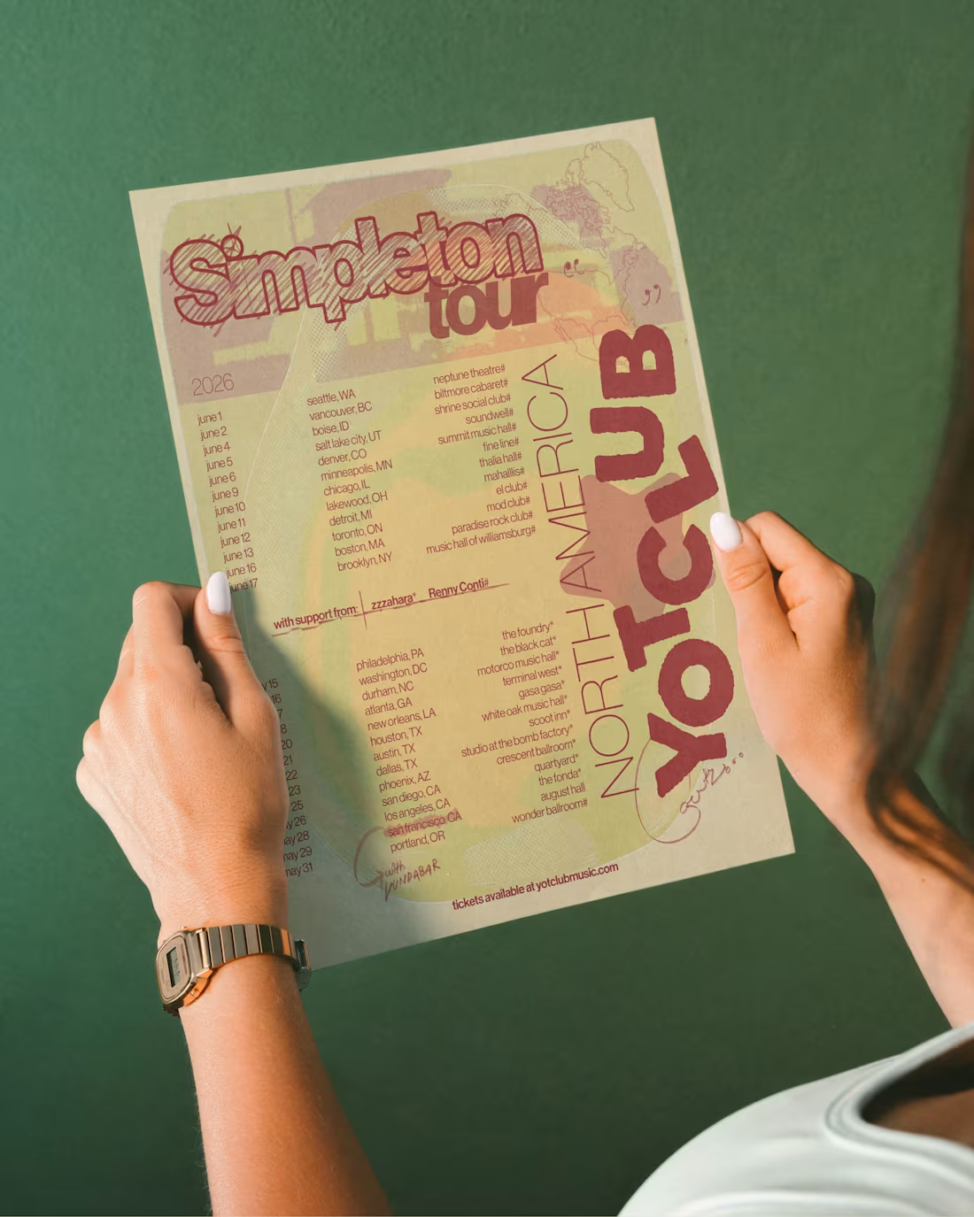
A self-initiated redesign of Yot Club's Simpleton Tour announcement, using the official dates and cities as the base and rebuilding the entire poster around a type-driven layout.
The piece leans fully on typography, letting the tour dates and city list carry the composition rather than relying on illustration or photography. The goal was to make the information itself feel like the visual, not just supporting text under a graphic.
Yot Club saw the poster, commented on it directly, and reposted it to his story. He said he loves it :D
1
33
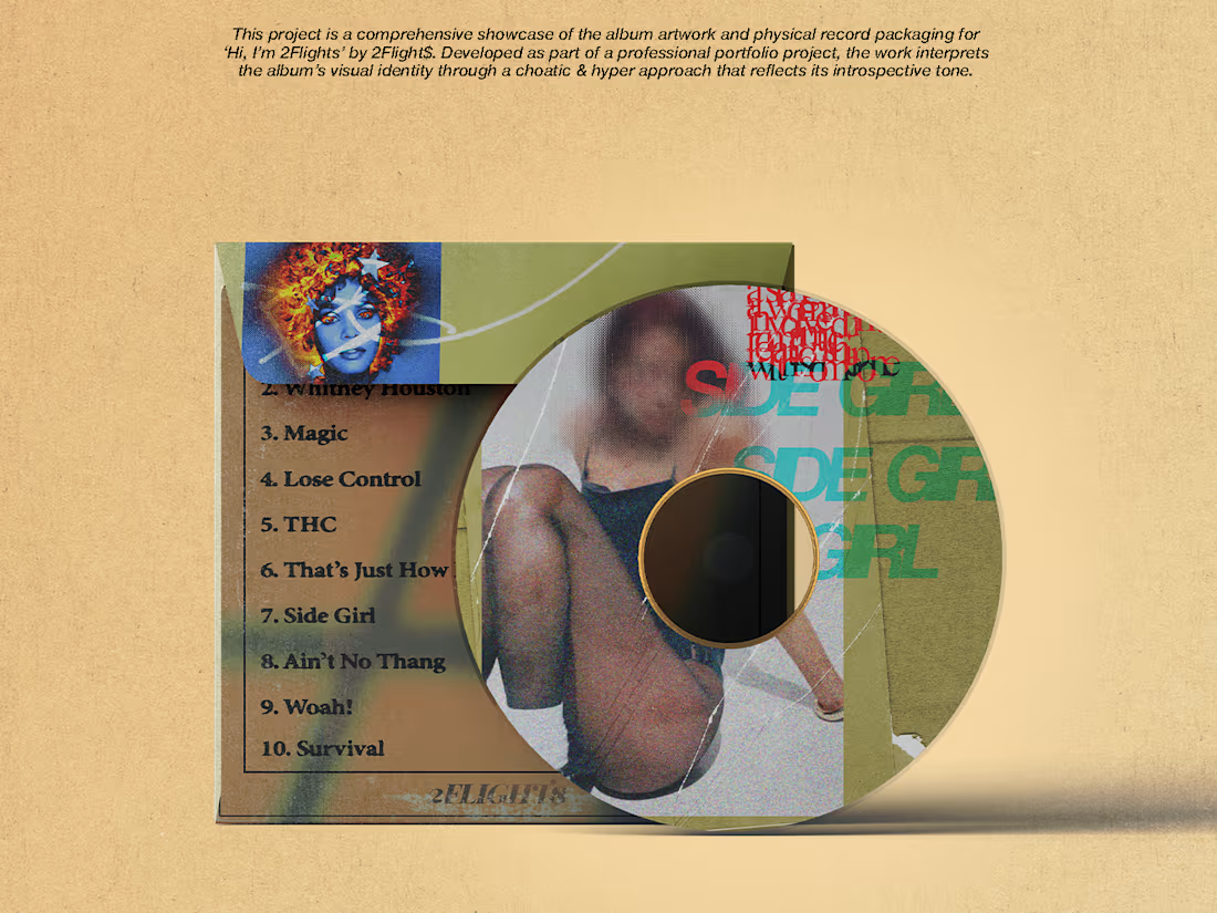
2Flight$ came in with a rough concept:
A wall with a notice board covered in flyers, styled like old newspaper cutouts. The brief was loose enough to build the whole thing from scratch, wall, board, shadows, every flyer.
First draft went over well with minimal pushback, a handful of flyers got redone and refined based on his notes, but the core concept held from the start.
Each flyer was designed individually, one per song on the project, built as its own small composition rather than a repeated template. A sketch of 2Flight$ himself sits at the center of the board, tying the whole collage back to the artist and the "Hi, I'm 2Flights" introduction the title suggests. The result is a fully illustrated, from-scratch environment rather than a single flat cover graphic, and one of the strongest pieces in the portfolio to date.
1
36