
Brylle Clarido
Brylle builds visual systems that make sense
Ready for work
Brylle is ready for their next project!
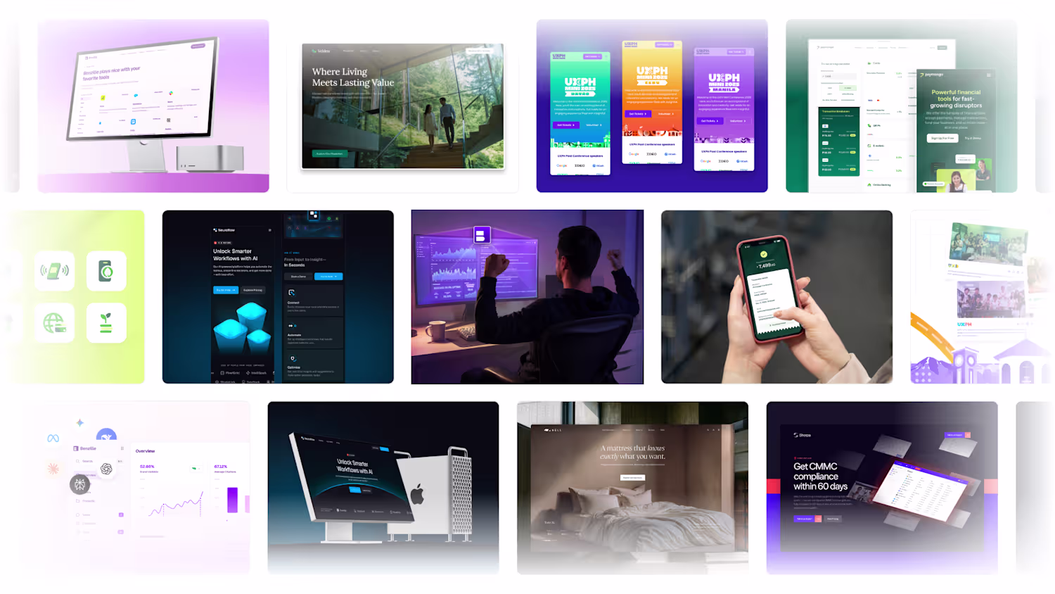
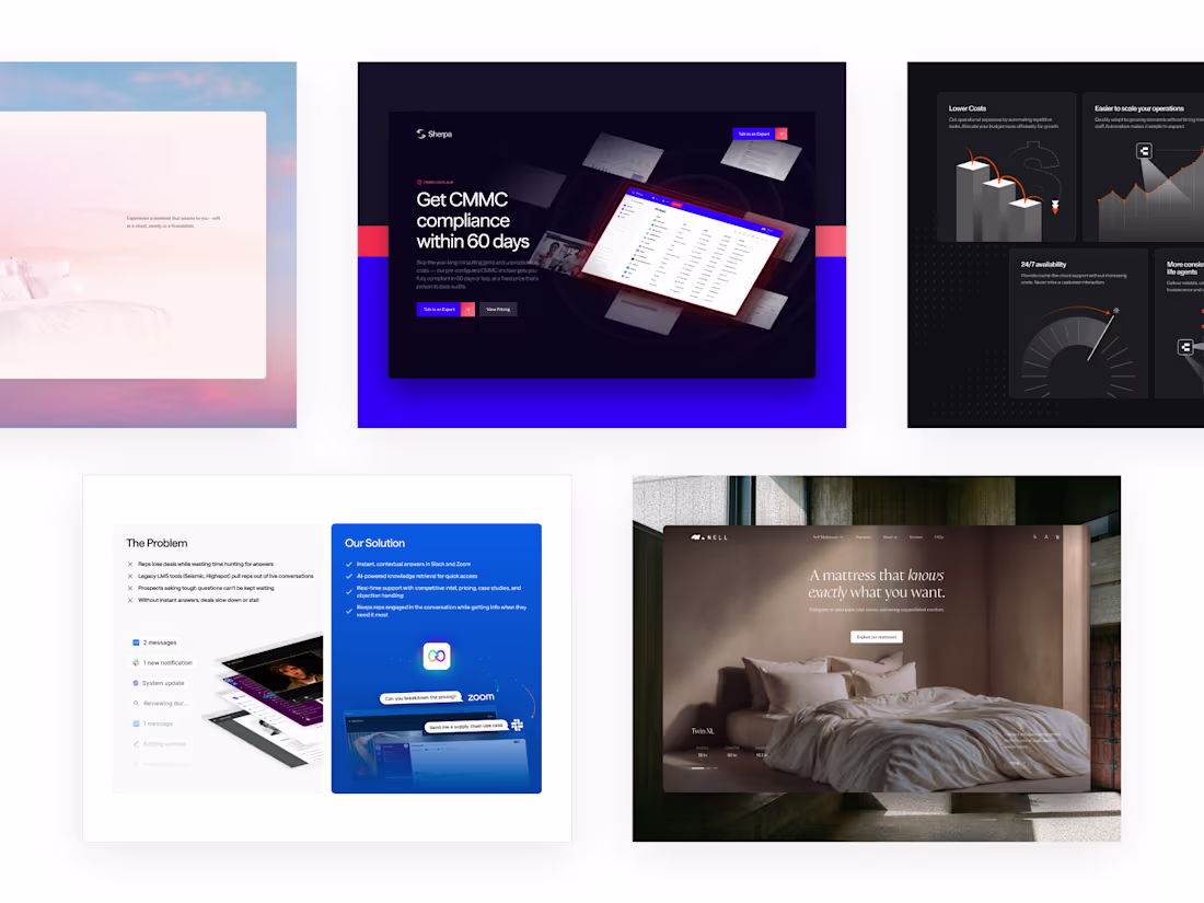
Not every project gets a case study. These are the screens, sections, and visual moments from work that didn't make the cut for a full write-up — but still held the same standard.
0
12
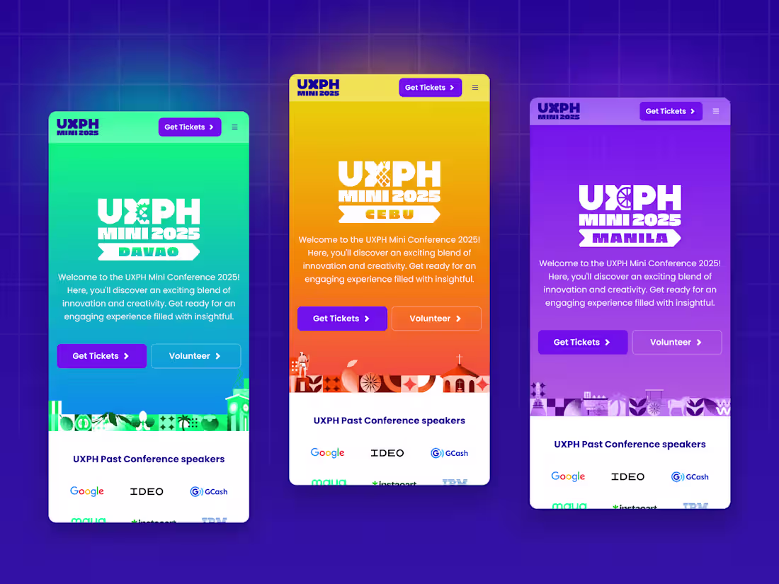
UXPH Mini 2025 was the Philippines' national design conference — a roadshow across Davao, Cebu, and Manila, built by a team of the country's top brand designers. Brylle was brought in to own the web design, working within an already-set brand direction and matching the team's pace without slowing it down. The website went live, the conference happened across three cities, and the design held all the way through.
0
32
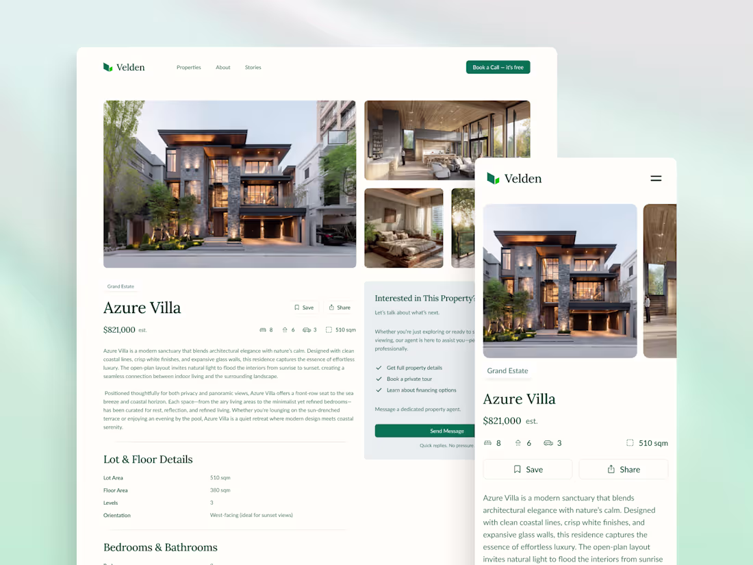
Real estate developers build with precision and intent — but rarely carry that same standard online. Velden was designed to close that gap: a website and visual system built to match the caliber of the properties it represents. Every decision, from layout to typography to spatial rhythm, was made to feel warm, aspirational, and consistent across every screen.
0
54
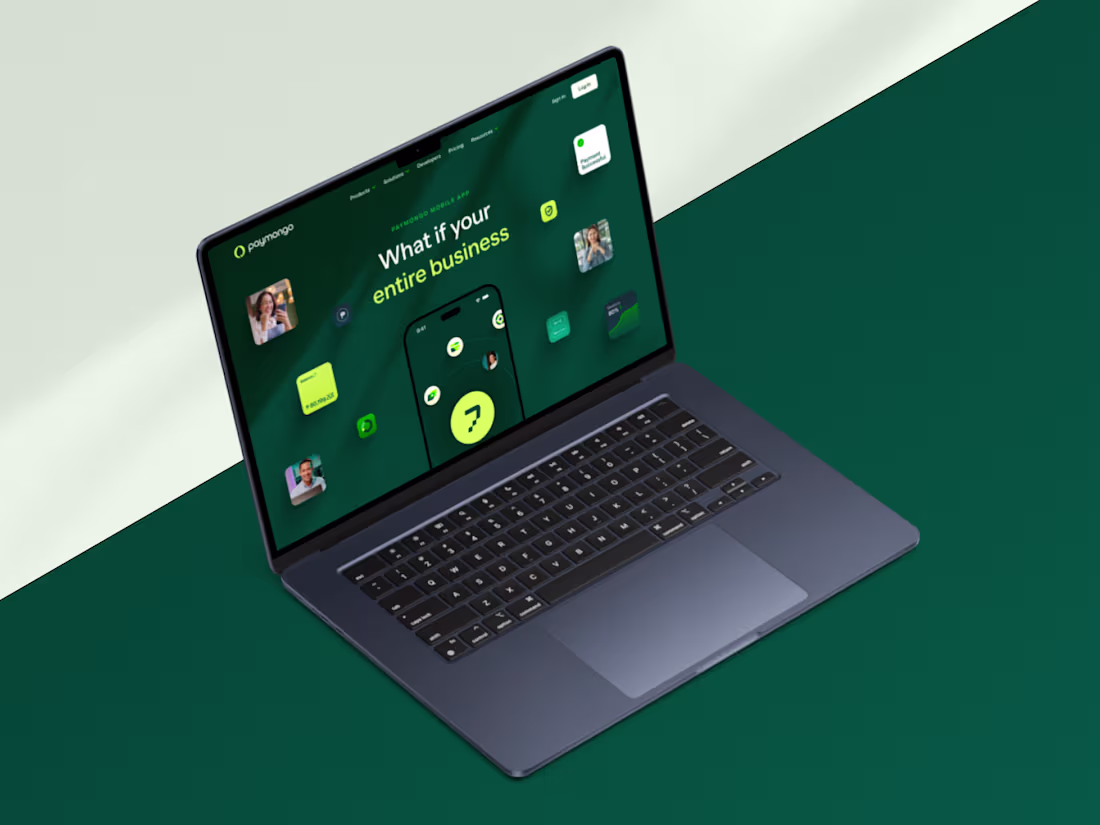
PayMongo was mid-rebrand — new direction, new products, and a sharper position in the market. The work meant delivering across marketing, pricing, and product pages without slowing down a team already in motion. Every page had to hold the same quality under the pressure of a live rebrand, which is exactly when it has to.
0
47