
Bruno Watanabe
Senior Art Director | Creation of Brand Visual Identities
Ready for work
Bruno is ready for their next project!
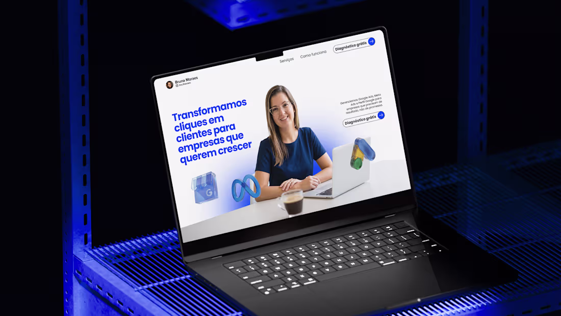
Landing Page - Bruna Moraes Tráfego Pago
1
26
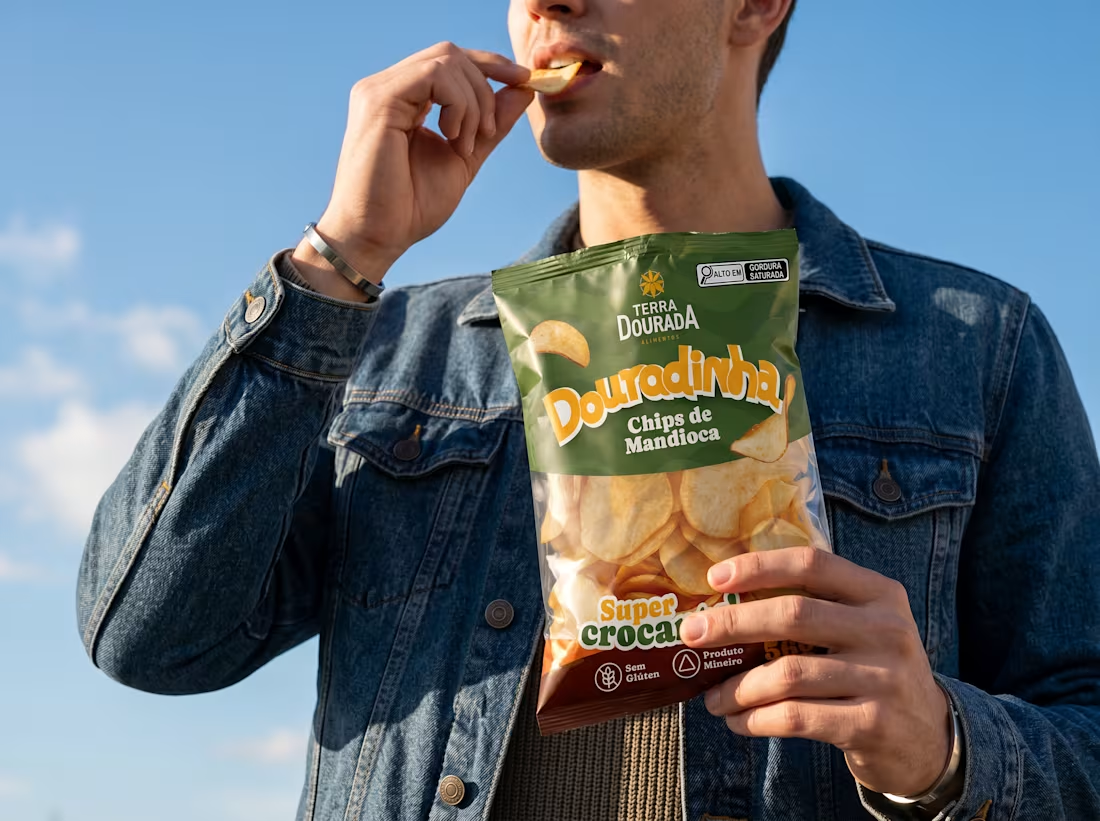
Douradinha Chips de Mandioca - Terra Dourada
0
32
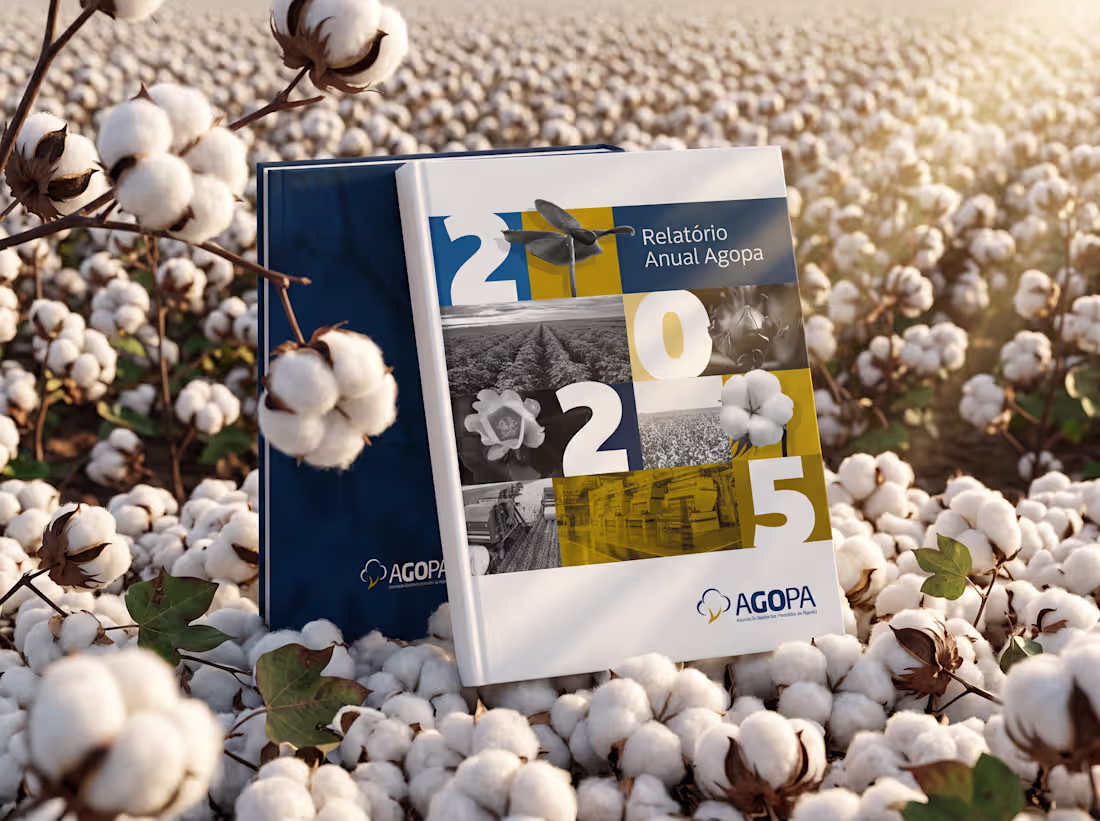
Relatório Anual 2025 - Agopa
0
35
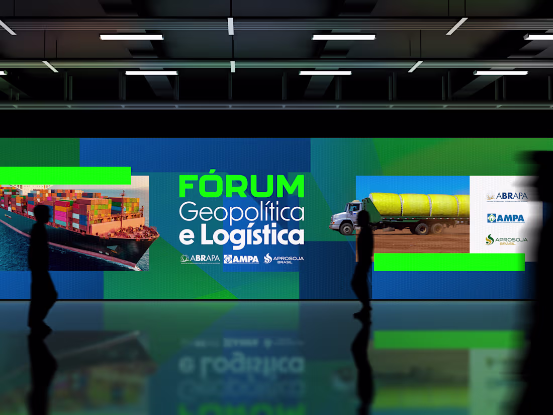
Comunicação de evento sobre a distribuição e envio de algodão brasileiro para o mundo todo. Abrapa (Associação Brasileiro de Produtores de Algodão)
1
62
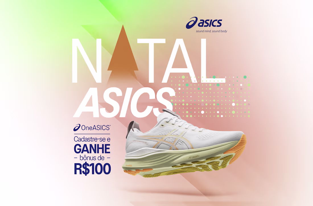
Campanha de Natal 2025 Asics Brasil. Aplicado em todas a lojas físicas do Brasil
1
72
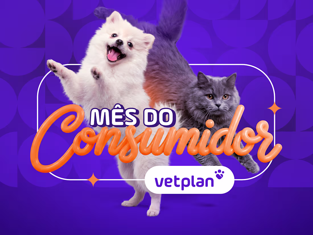
Vetplan | Retail Campaign Art Direction
Creative direction and visual design for the "Consumer Month" retail campaign. Developed a vibrant and engaging visual system to increase service adoption and strengthen brand presence across digital channels.
0
130
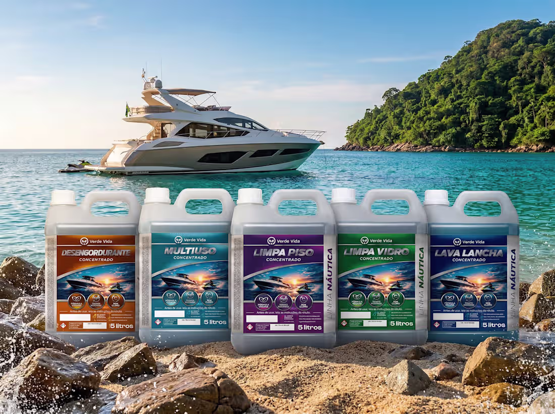
This project presents a premium packaging design line for Verde Vida, focused on nautical cleaning products.
The creative direction merges performance with a bold and dynamic visual identity inspired by the marine environment. Vibrant colors, ocean elements, and high-contrast compositions reinforce strength, efficiency, and professional-grade quality.
Each label was designed to stand out in retail environments while maintaining consistency across the product line. Strong typography, clear hierarchy, and visual cues help communicate functionality and product differentiation instantly.
The result is a cohesive and impactful brand system that conveys power, reliability, and a specialized approach to marine care.
0
126
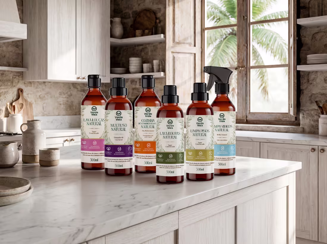
This project showcases a premium packaging design line for Verde Vida, featuring organic household cleaning products.
The creative direction combines sustainability with a clean and sophisticated visual language. Natural tones, botanical elements, and a bright kitchen environment reinforce purity, safety, and eco-conscious living.
Each label was designed to ensure clarity and shelf impact while maintaining consistency across the product range. Thoughtful color coding, elegant typography, and minimal composition help communicate function and differentiation at a glance.
The result is a cohesive brand system that conveys trust, sustainability, and a modern approach to everyday home care.
0
131
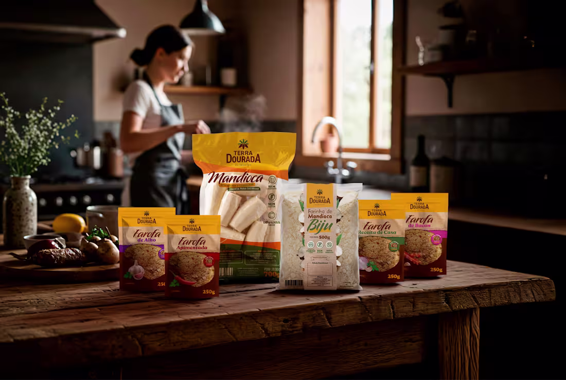
This project showcases a premium packaging design line for Terra Dourada, featuring raw cassava, seasoned farofa, and cassava flour (biju).
The creative direction blends authenticity with a modern and appetizing visual language. Warm tones, rustic textures, and a cozy kitchen setting reinforce a sense of homemade quality and tradition.
Each package was designed to stand out on the shelf while maintaining consistency across the product line. Clear hierarchy, bold typography, and rich food imagery communicate flavor and differentiation at a glance.
The result is a cohesive brand presentation that connects emotionally with consumers, evoking comfort, tradition, and everyday culinary moments.
0
132

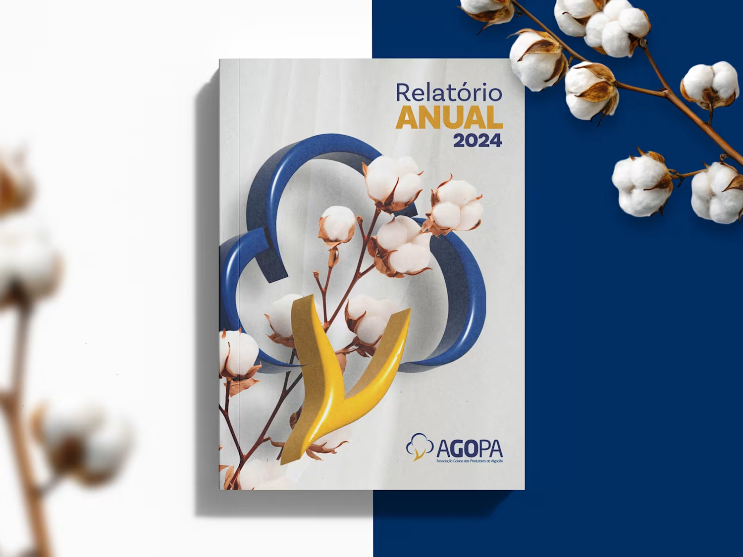
Relatório Anual 2024 - Agopa
0
1
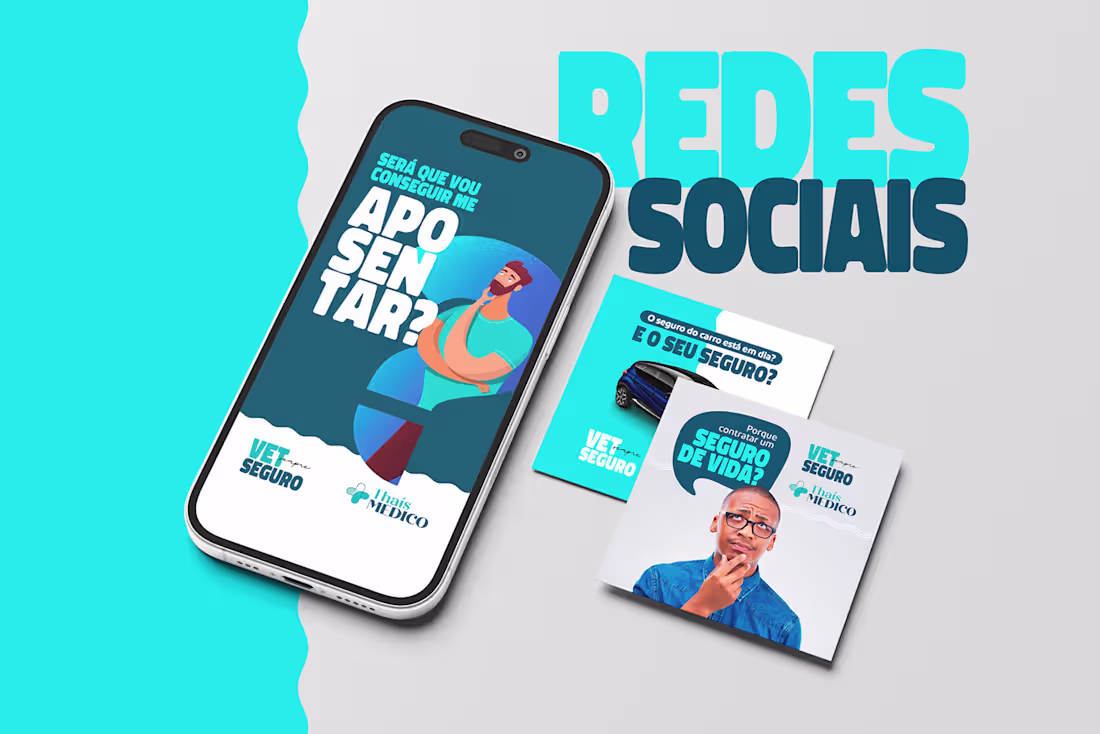
Redes Sociais - Thaís Medico
0
1
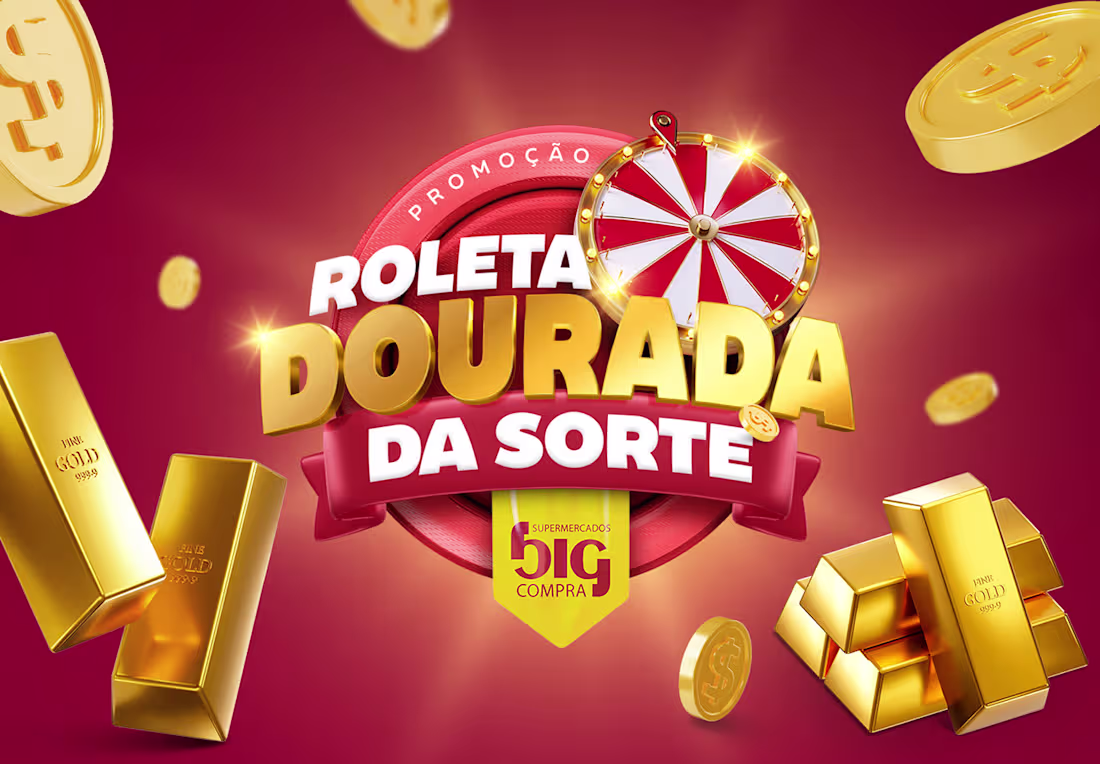
Campanha Roleta Dourada da Sorte - Big Compra
0
1
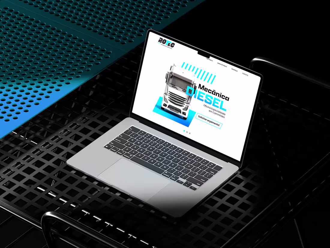
Site Rotec
0
2
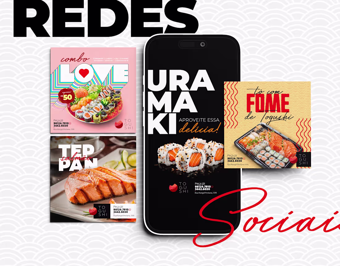
Redes Sociais - Togushi
0
1
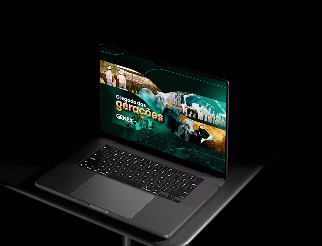
KV Institucional 2025 - Genex
0
2
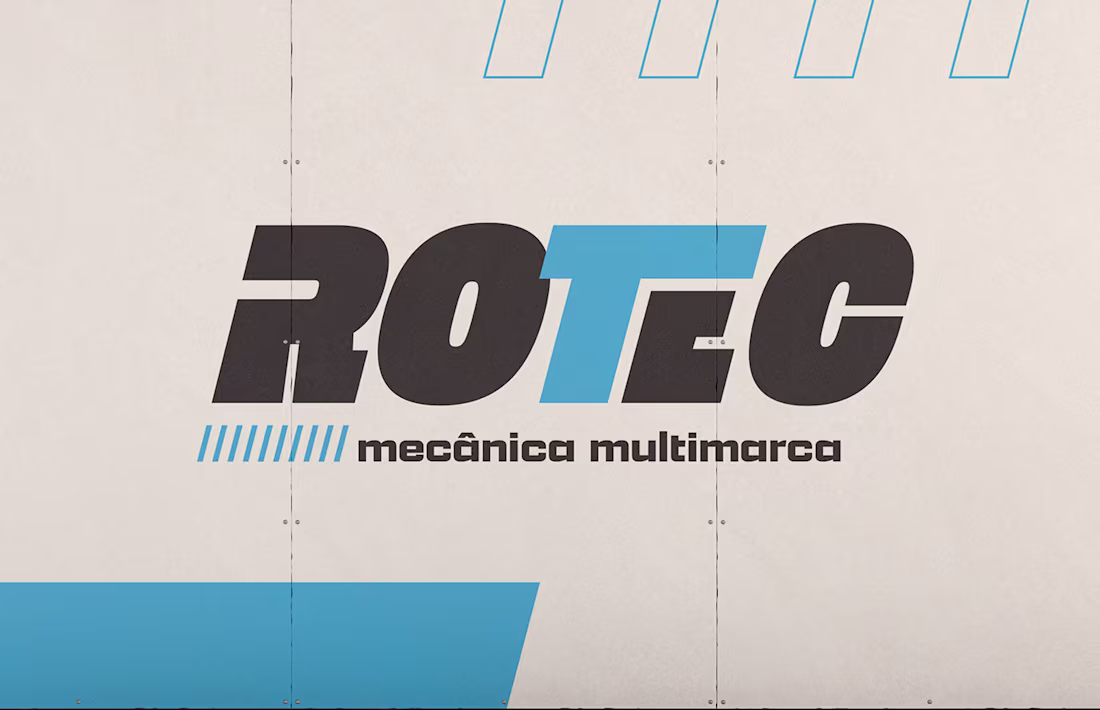
Rotec - Mecânica Multimarcas
0
1
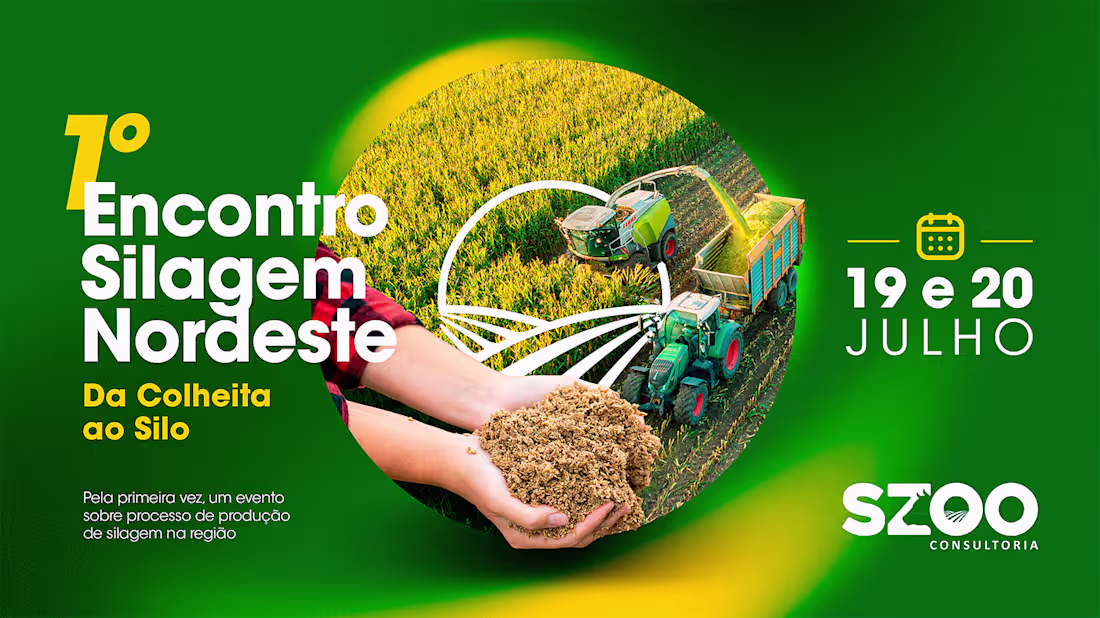
Campanha - SZOO Consultoria
0
1
Empório Perini
0
2
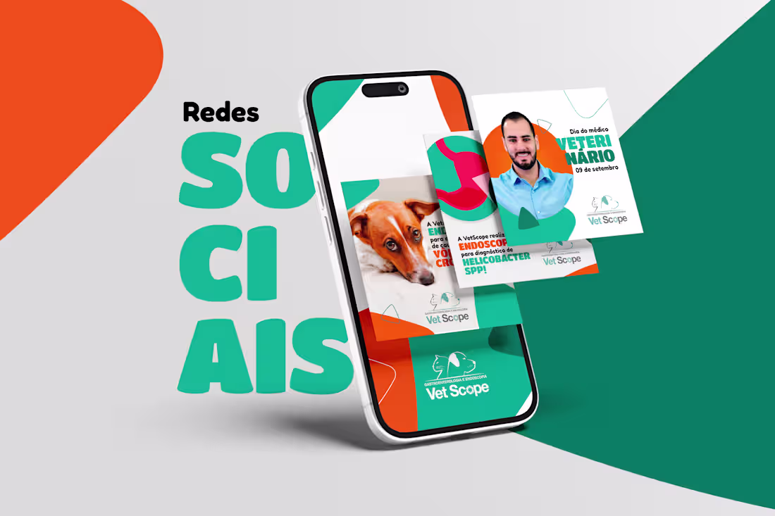
Redes Sociais - Vet Scope
0
1
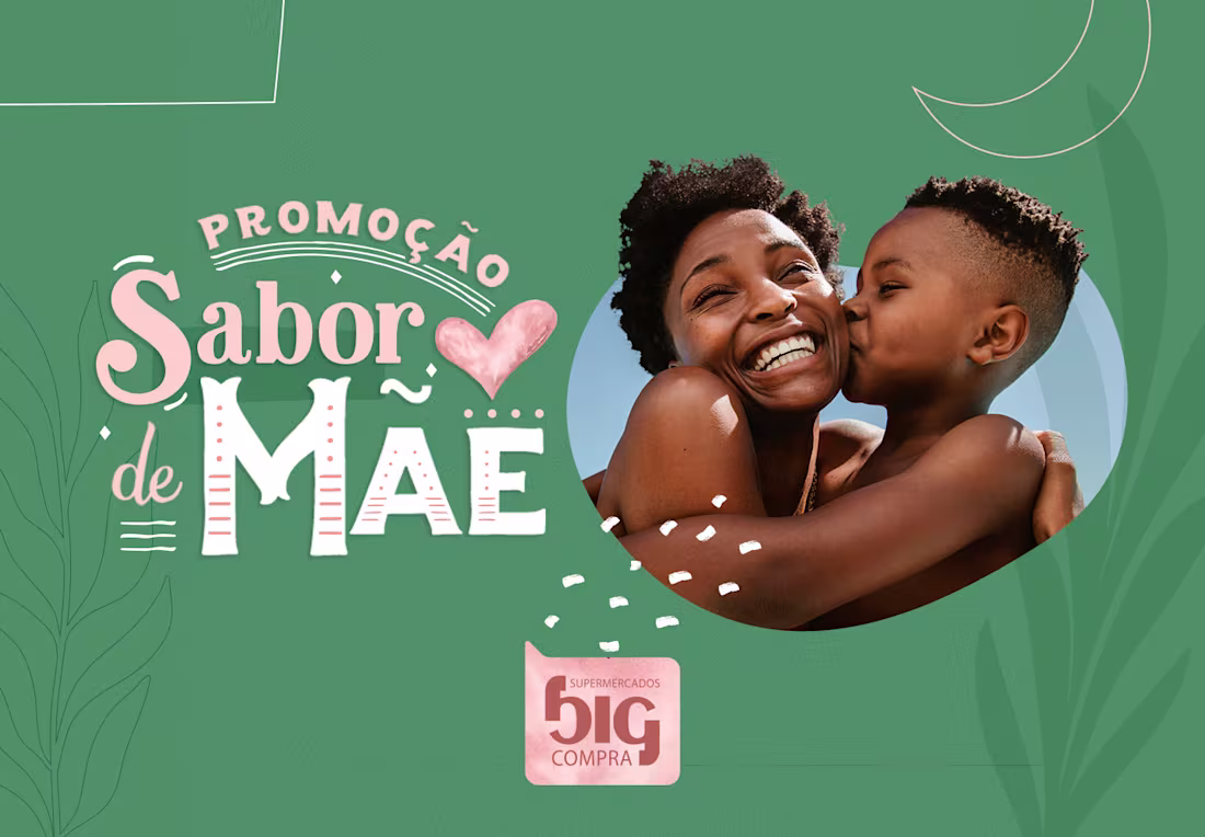
Campanha Sabor de Mãe - Big Compra
0
1
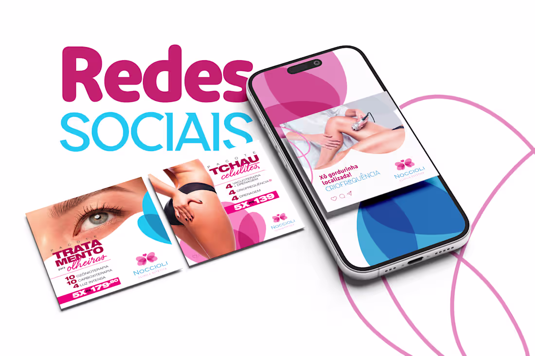
Redes Sociais - Noccioli Clínica Estética
0
1
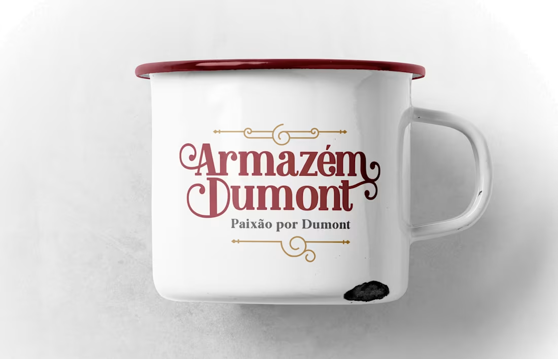
Armazém Dumont
0
2
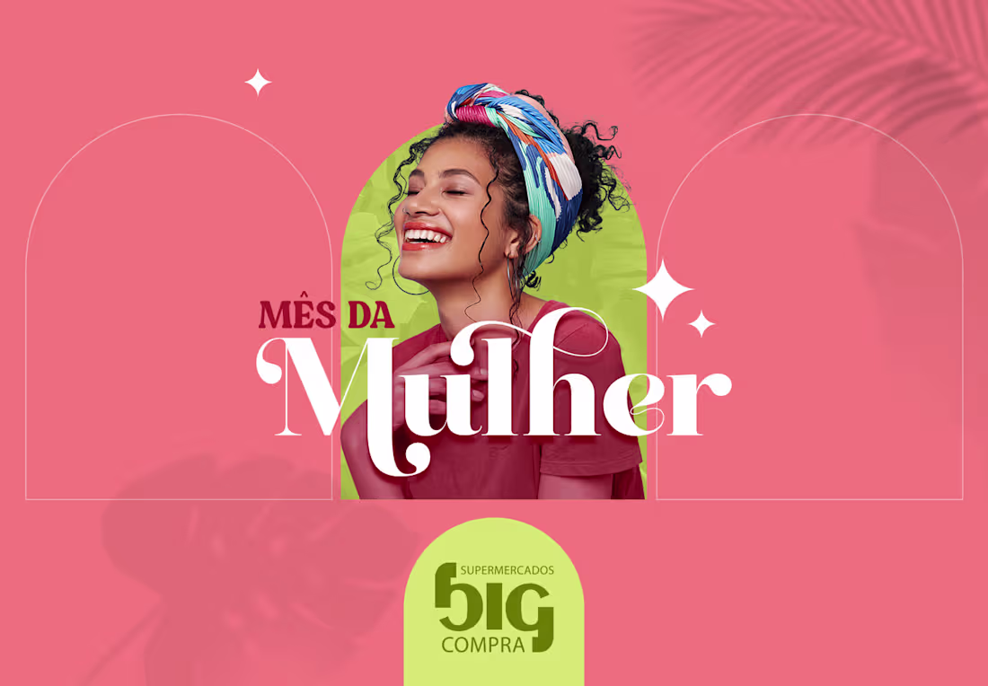
KV Mês da Mulher - Big Compra
0
1
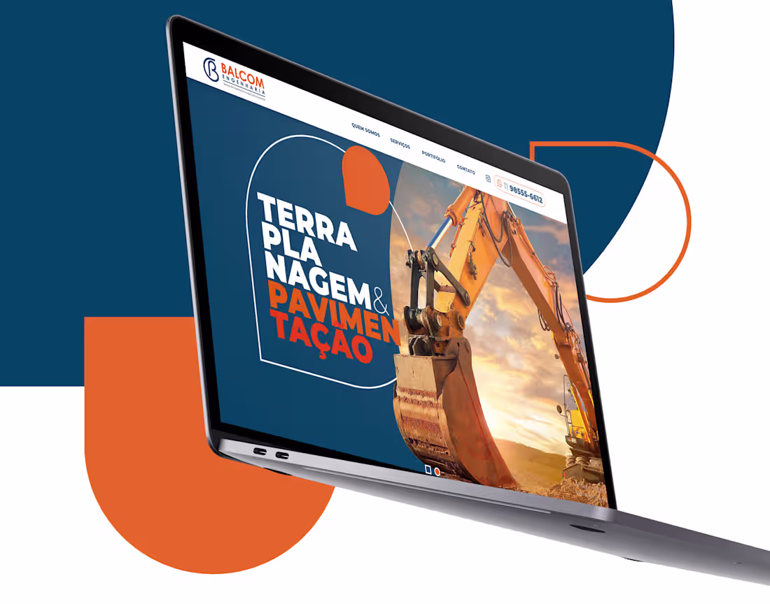
Criação Site - Balcom Engenharia
0
3
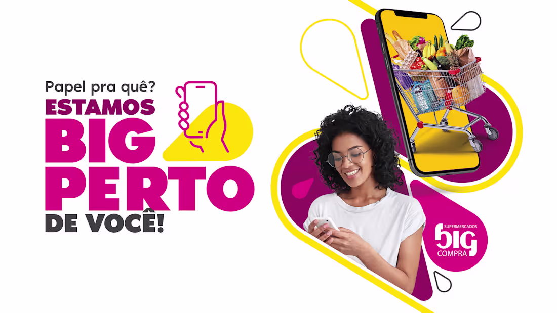
Campanha Big Compra
0
2
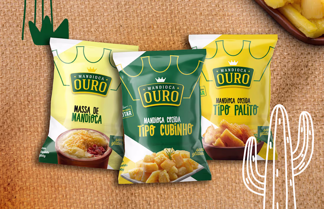
Mandioca Ouro
0
3
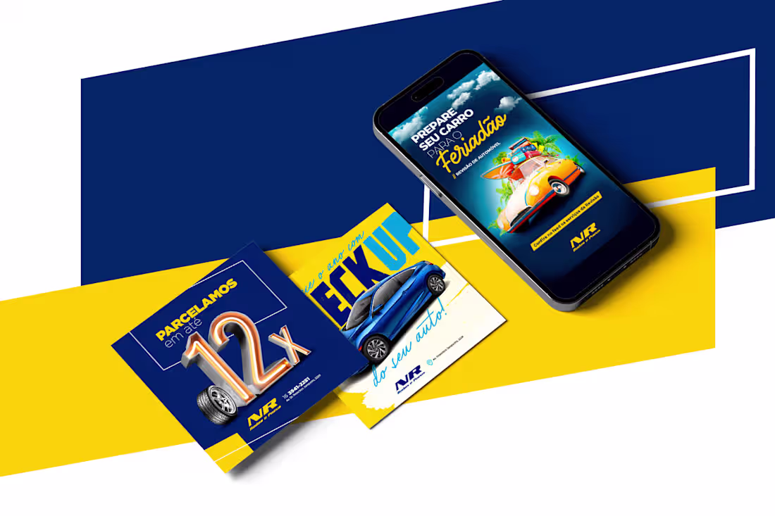
Redes Sociais - NR Rodas e Pneus
0
1
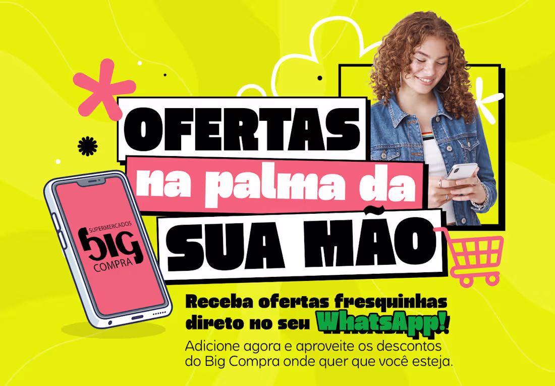
Campanha WhatsApp - Big Compra
0
0
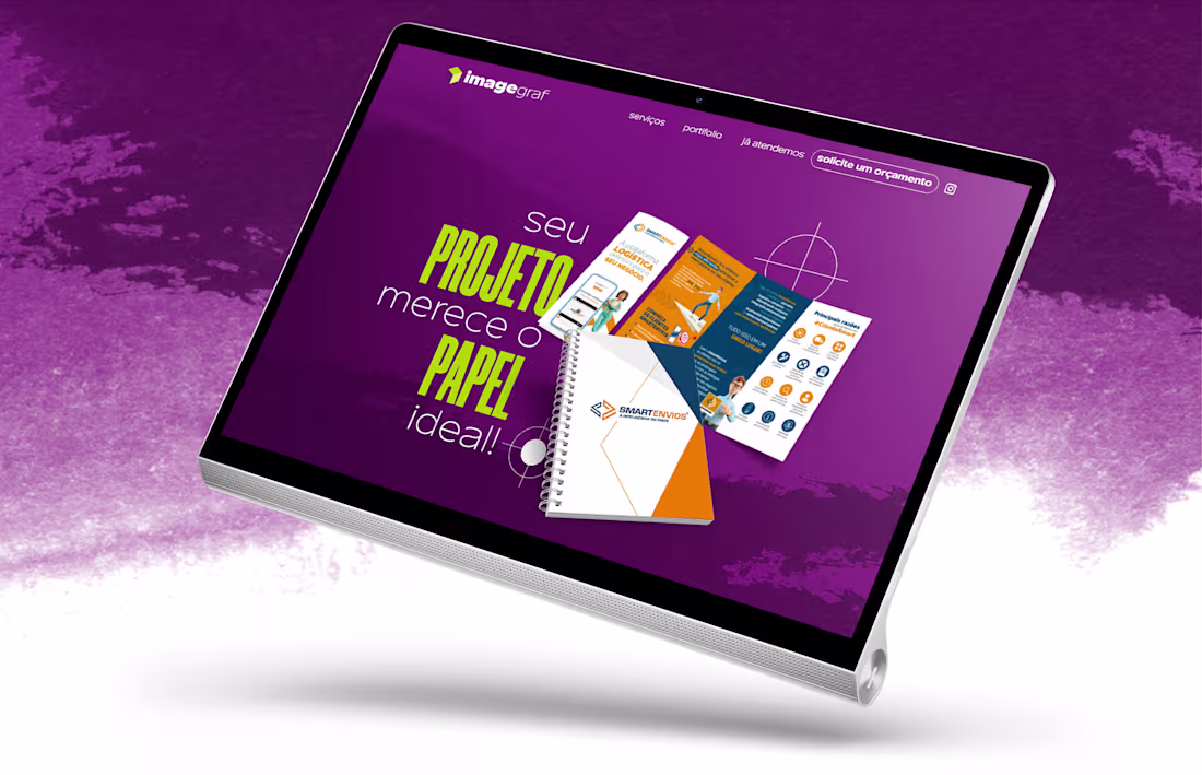
Criação Site - ImageGraf
0
2