
Bilyamin Abdullahi
Conversion-focused UI/UX designer for startups & founders.
Ready for work
Bilyamin is ready for their next project!
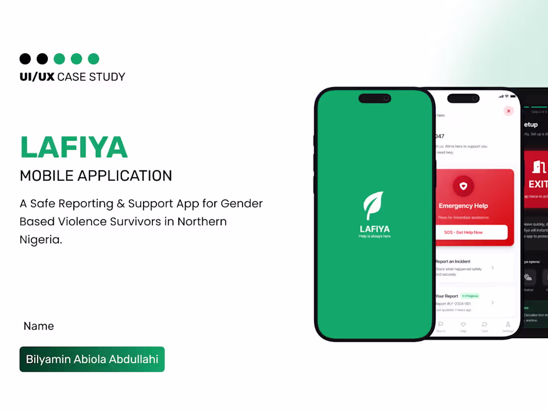
Lafiya Mobile App - Bilyamin Abiola Abdullahi
0
2
Building with AI is faster than ever.
But speed doesn’t replace clarity.
Today, founders can spin up products in days using AI.
Generate code, design screens, even structure entire apps.
But here’s what I’m seeing more often:
Products that work…
but users don’t understand them.
Because AI can build interfaces,
but it doesn’t truly design experiences.
It doesn’t:
– Think deeply about user behavior
– Balance business goals with usability
– Reduce friction across flows
– Create intuitive, conversion-focused journeys
That’s where UI/UX still matters.
The difference between a product that exists and a product that grows is how easily people can use it, trust it, and take action.
AI can help you build faster.
A UI/UX designer helps you build right.
The smartest founders right now aren’t choosing between AI and designers, they’re combining both.
Using AI for speed.
Using design for clarity, structure, and results.
That’s how you go from “we built something” to “people actually use and pay for it.”
If you’re building with AI and want your product to feel as good as it functions, let’s talk.
1
3
54
Most startups don’t lose users after sign-up.
They lose them in the first 5 seconds.
Right on the landing page, specifically the hero section.
When someone lands on your website, they’re not reading everything.
They’re scanning and asking one simple question:
“What is this, and why should I care?”
If your hero section doesn’t answer that immediately, they leave.
A lot of startups get this wrong. The headline is vague, the visuals are busy, there are too many actions competing for attention, and the value isn’t clear. The result is confusion, and confused users don’t convert.
That first impression determines everything.
If it’s unclear, your product doesn’t get a chance.
Your hero section isn’t just design, it’s your conversion engine.
1
2
55
Digital Service Mobile app - Bilyamin Abiola Abdullahi
0
1
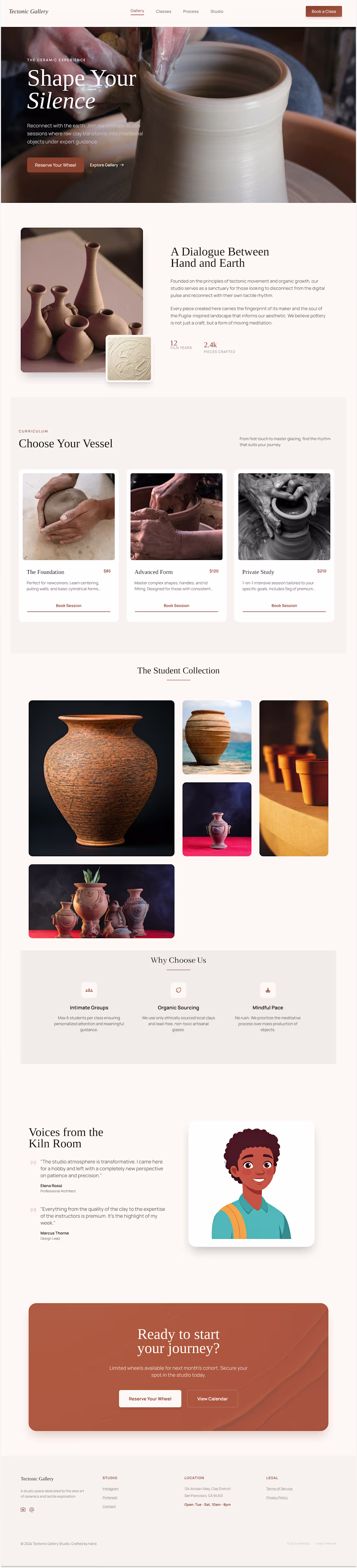
Designed a modern, earthy-themed landing page for a pottery studio offering wheel-throwing classes. The goal was to create a calm, tactile, and visually engaging experience that reflects the hands-on nature of pottery while driving class bookings. The design combines warm natural tones, clean typography, and a structured layout with a gallery showcasing real student creations to build authenticity and trust.
0
31
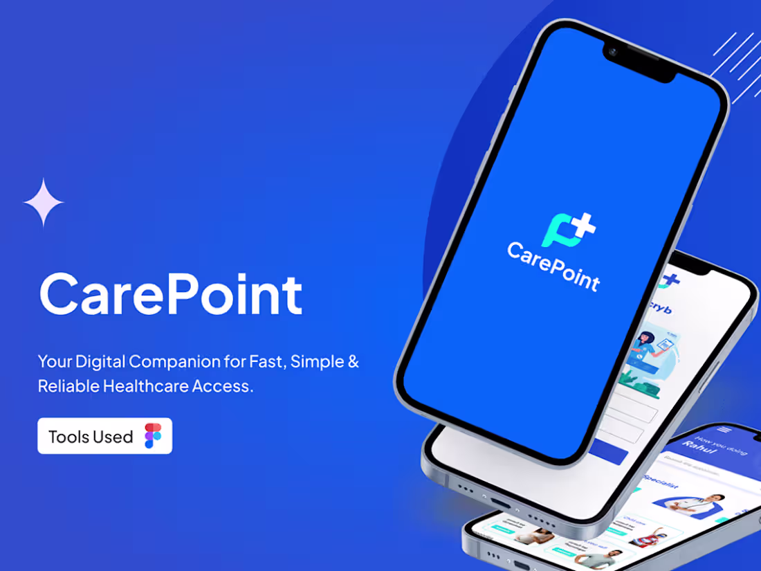
Carepoint Case study - Bilyamin Abiola Abdullahi
0
2
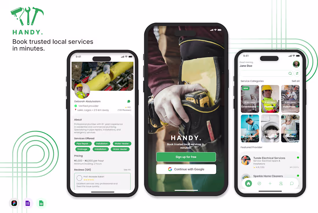
Handy is a Nigeria-focused mobile application designed to connect users with verified local service providers, including plumbers, electricians, cleaners, and technicians. Many people struggle to find reliable artisans quickly, often relying on word of mouth or unverified contacts, which leads to poor service experiences, safety concerns, and unclear pricing. Handy was created to simplify this process by offering a trusted, fast, and transparent way to book local services.
0
41