Ayesha Adnan
I design brands that look good and work even better.
New to Contra
Ayesha is building their profile!
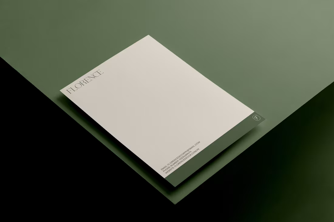
Florence is a furniture studio I rebranded into a calm, grounded home story. I built a new identity around a botanical monogram, elegant serif word mark, and a muted green palette that feels like slow mornings and sun on wood. Applied across signage, packaging and stationery so the whole experience feels curated the moment the box lands at your door.
1
1
11
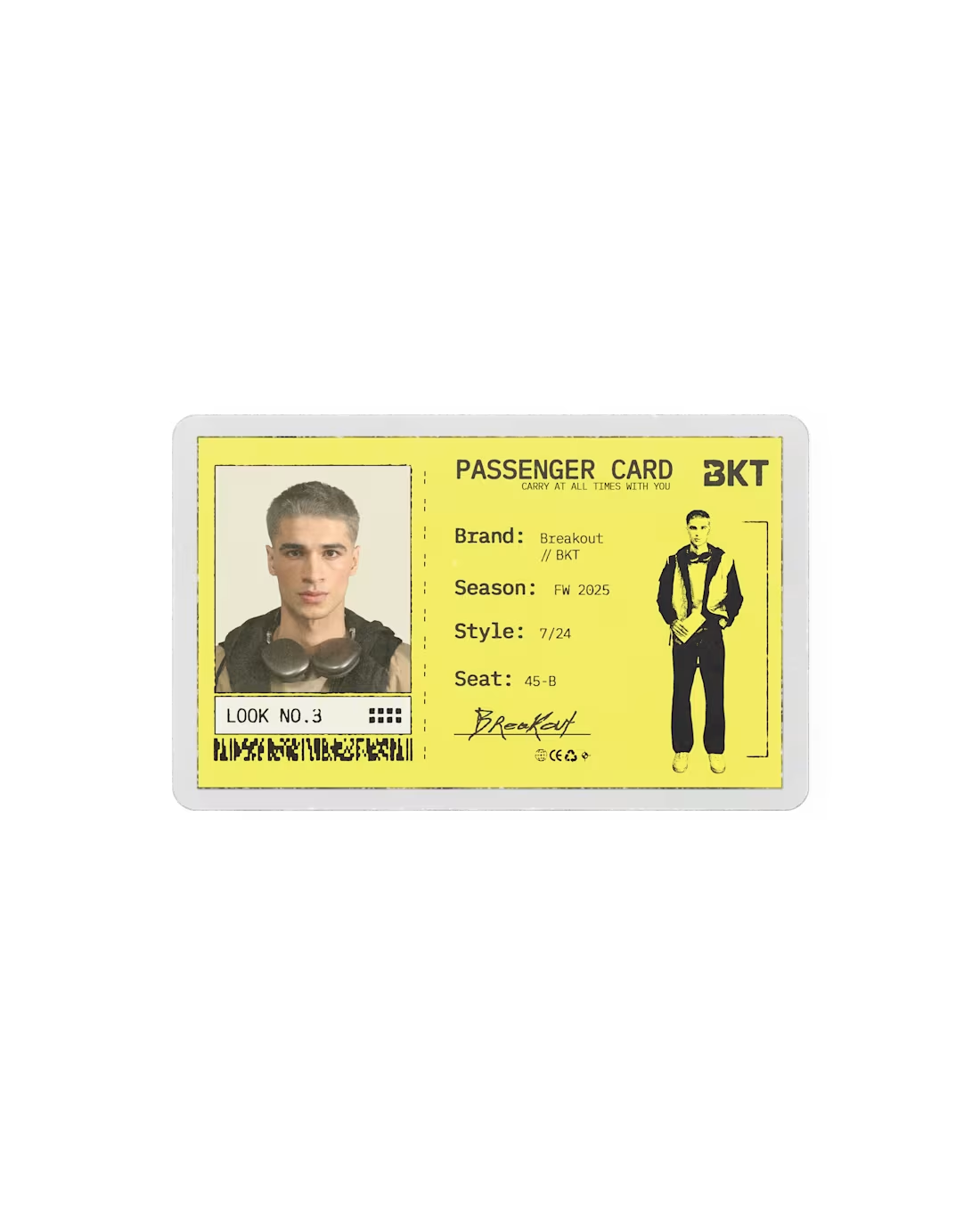
Worked on these passenger cards for BKT Airlines, a clothing drop for Pakistan-based clothing brand called breakout!! Really enjoyed this alongside the other silly stuff I designed such as boarding passes, luggage tags and a passport!
0
21
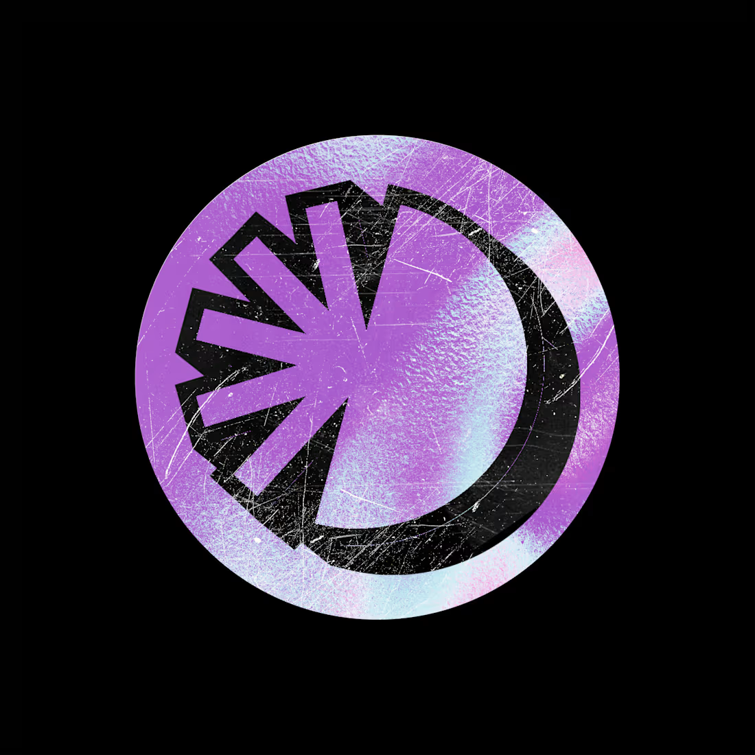
Siren’s branding plays with bold color and sharp energy. The purple and blue combo gives it a modern, future-leaning vibe that fits a music agency pushing new talent.
The burst logo feels like a spotlight switching on, which ties back to the idea of uncovering and amplifying artists. It’s simple but memorable.
The typography stays clean and confident, letting the color and icon do most of the talking. Everything across social, stationery, and merch feels consistent and fresh.
Overall, the brand looks active, youthful, and artist-first. It shows Siren as a place that lifts talent rather than just managing it.
7
18
238
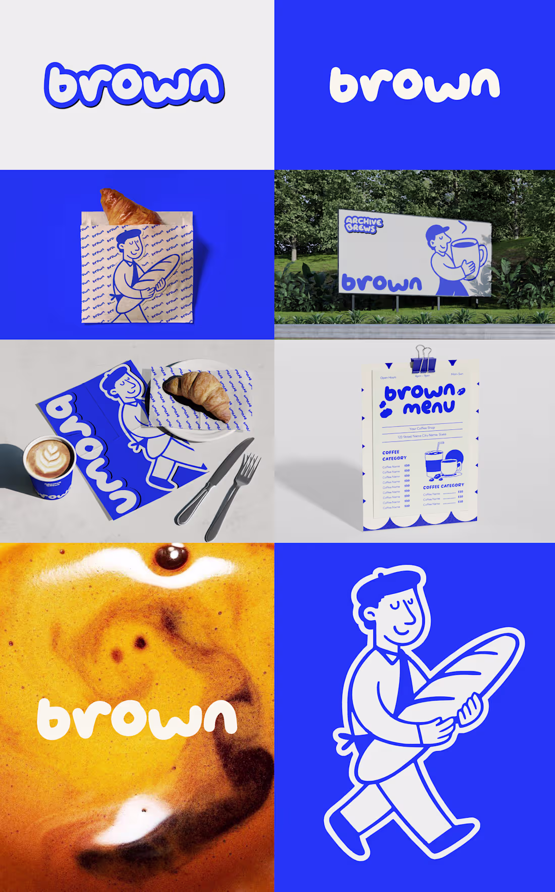
Brown feels like that one friendly cafe you wander into once and suddenly it’s your spot. The bouncy lettering has this soft, goofy confidence that makes the whole brand feel warm from the jump.
The bright blue keeps everything lively and a little cheeky, like the brand actually has a personality instead of trying too hard. The little character wandering around with bread and coffee ties the whole system together and makes the visuals feel alive instead of stiff.
The repeating patterns, simple lines, and cozy illustrations make the packaging and menus feel fun to hold and look at. It’s a brand that doesn’t pretend to be fancy. It’s just happy, playful, and super inviting in a way that makes people want to come back.
2
148
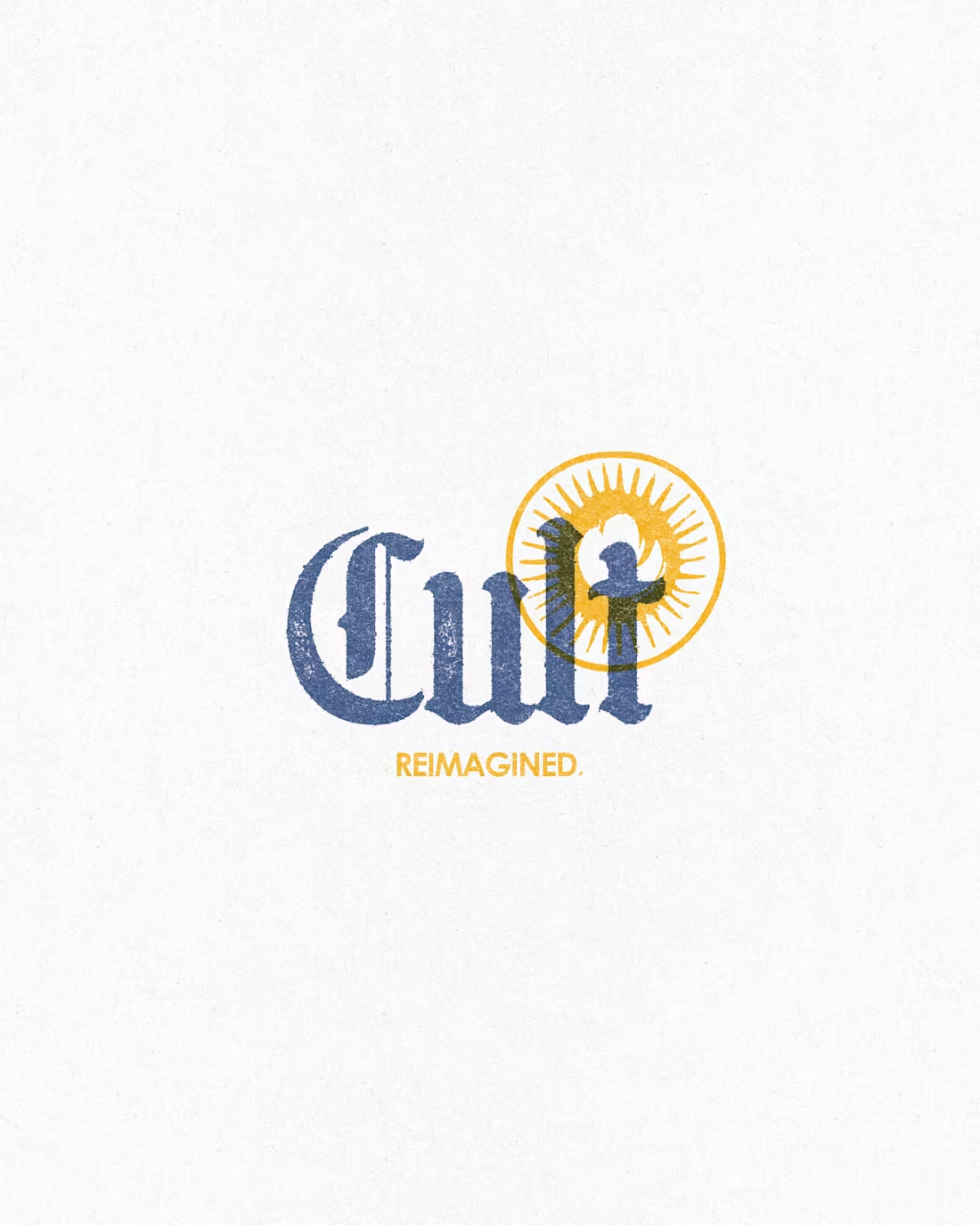
Recently worked on the rebranding of Burger Cult, re imagining the cloud kitchen with a much more grounded and back-to-roots feel.
The main design inspiration was taken from the historical side of where the cloud kitchen is located, and tools like risograph printing were also used to achieve the final packaging look.
Really happy to have pulled off such an experimental branding.
35
136
1.9K