
Atif Ullah
Product & UI/UX Designer
Profile in progress
Atif is building their profile!

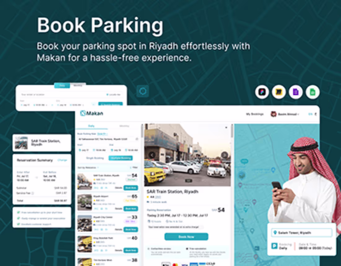
Here is my project with the Saudi Govt... Great urban mobility project...
0
13

Working on AI Healthcare Solutions Platform... Stay tuned...
0
14
I finally realized why 45% of users abandoned our Web3 onboarding. Last year, our wallet connection had 6 steps, tooltips everywhere, multiple confirmations, and security warnings at each stage. We thought we were helping. Users thought we were complicating.
So we flipped the question. Instead of asking what users should see, we asked what they wanted to accomplish. The result: 3 steps instead of 6, prompts only when needed, security built-in, not announced. The impact was huge: 25% higher completion, 30% more active users, 60% fewer support tickets.
UX is changing. Static interfaces are giving way to dynamic systems. More options are losing to better outcomes. Click here is becoming tell me what you need. The best UX is invisible, intentional, and gets out of the way. Are you designing for what users see or what they need?
0
19
Clinic Management Platform
0
1