
Iskanth Sathiyaseelan
Founder @ Athelvoid Solutions | Web & AI Automation
- 1
- Followers

Self-initiated: explain what an app is (frontend, backend, database) to non-technical viewers in under 30 seconds, with no presenter on camera.
What I did:
- Script and structure: hook → plain-English explanation → 3-step breakdown → quiz ending to drive comments
- Motion design in a matrix/tech visual style, built for 4:5 vertical feeds
- Text pacing set so every line reads on a phone in under 2 seconds
Want one for your product? I make short explainer reels that turn technical ideas into something your customers actually get.
2
30
Built a short-form ad series for my web studio, Athelvoid Solutions 🎬
The brief: make small-business owners in Malaysia stop scrolling and actually message about a website or booking system.
What I did:
→ Turned real pain points (such as lost WhatsApp orders, outdated websites, double bookings) into 12-16s story-driven Reels
→ Designed both sides of the contrast: a painfully 2004 website vs a premium, modern booking site
→ Hypnotic motion (spirals, pulse rings, iris transitions) to hold attention in the first 3 seconds
→ Built for Tiktok, Instagram and Facebook safe zones, with clear CTA at the end
Open to projects: websites, booking/order systems, and scroll-stopping ad creatives. Message me here 👋
1
42
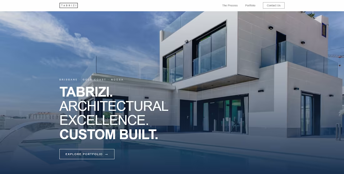
Unofficial Redesign: Modernizing E-Commerce UX/UI for a Contemporary Brand
Overview
This project is an unofficial design and development concept created to reimagine an existing Australian business website. The goal was to transform a traditional web presence into a sleek, fast, and conversion-focused digital experience.
Live Demo: tabrizi.pages.dev (http://tabrizi.pages.dev)
Role: UI/UX Design, Web Development, Deployment
Tools & Technologies: Figma, HTML5/CSS3, Modern JavaScript, Cloudflare Pages
The Challenge
The original web presence lacked visual hierarchy, struggled with mobile responsiveness, and felt dated compared to current visual standards. Essential product information and call-to-actions were lost in dense content blocks, leading to high friction for potential customers.
Key Improvements & Solution
Refined Visual Identity: Introduced a modern color palette, intentional whitespace, and crisp typography to align with a premium aesthetic.
Streamlined Navigation: Re-architected the site layout to lead visitors smoothly from the landing page to key offerings and conversion touchpoints.
Mobile-First Responsiveness: Optimized all components for fluid scaling across mobile, tablet, and desktop viewports.
Performance & Speed: Deployed via Cloudflare Pages for ultra-fast global load times and clean code delivery.
Deliverables & Scope
Interactive prototype & web implementation
Desktop & mobile UX redesign
Performance & layout optimization
1
34
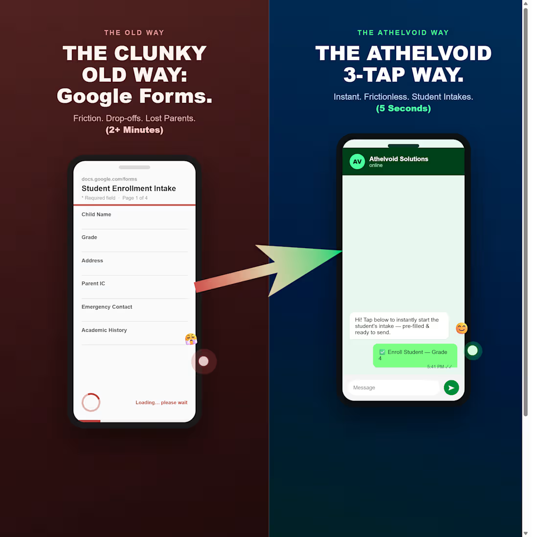
Created an Ad for tiktok to showcase how google forms are slow and outdated for tuition centre student intakes, and how I can develop a 3-Tap Way system to promote faster student intakes and parents signing up student for tuitions. Want to know more feel free to contact me below
0
39