
Bastien Joubert
Ex-Nike. I build brands, AI systems, and creative contents.
New to Contra
Bastien is ready for their next project!
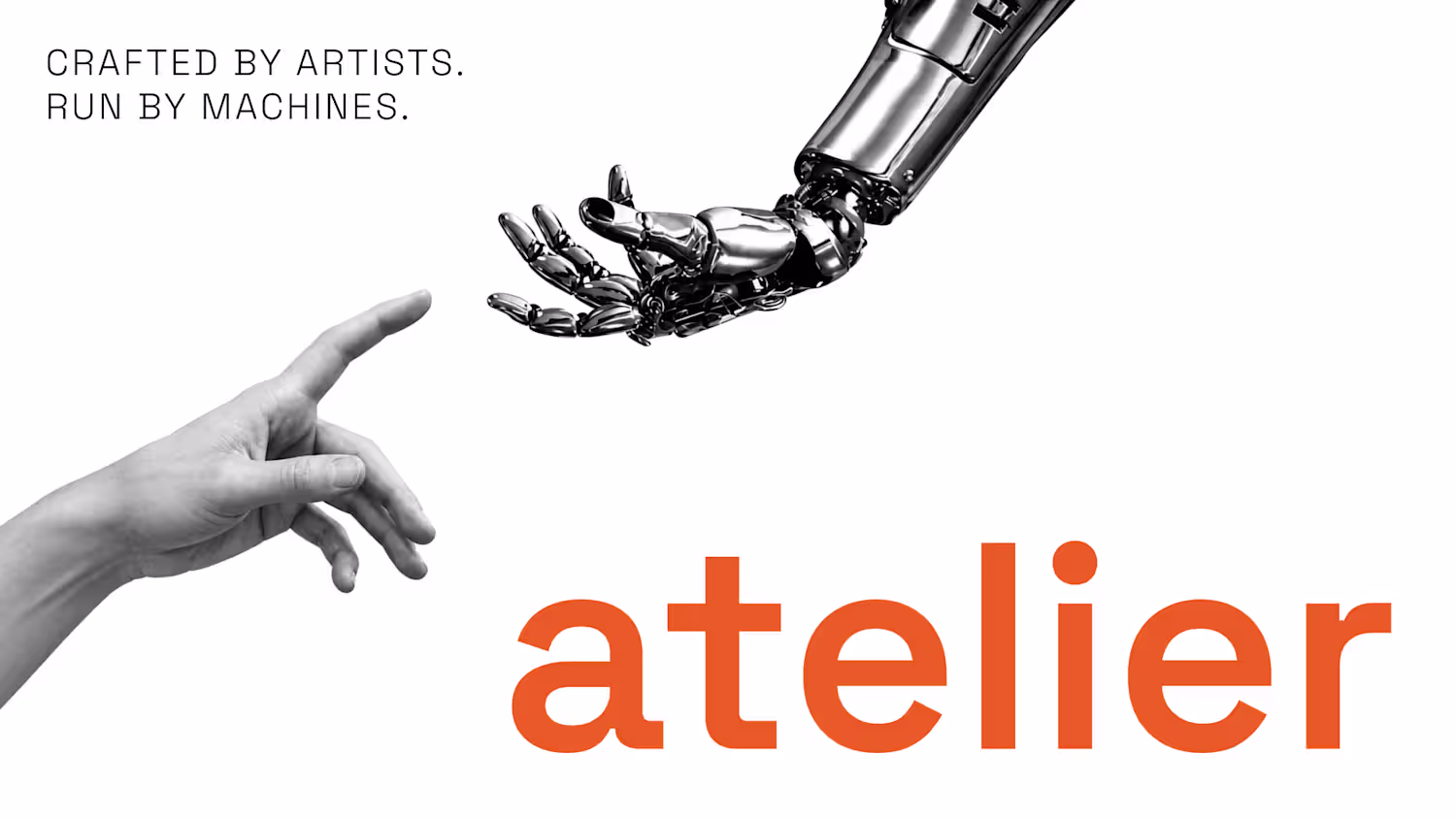
Almara Maison arrived with a name and a feeling: organic and futuristic, body and technology, ancient and now. Most wellness brands resolve that tension by choosing a side. We didn't.
The identity is built on the intelligence of living systems: fungal networks, synaptic connections, invisible structures that mirror human awareness. The wave-shaped "M" carries movement and rhythm. The "O" is time understood as cycles. Nothing decorative. Every form is a decision.
From there: full website in Antigravity with custom cursor and motion, AI-powered automations for content and communication, internal systems that let the studio scale without adding headcount.
Brand identity to live website. Two weeks.
3
6
234
Desert Technologies is a Saudi group operating across multiple sectors. When they decided to enter the solar power market, they needed something new. Not a division, not a sub-brand, but a standalone identity capable of competing on its own terms.
The brief was clear: modern, approachable, and distinct from the parent company. What wasn't given to us was the name. That was the first deliverable.
I built the naming strategy around a single tension: the relationship between ancient meaning and technological ambition. Nūrun, from the Arabic nūr, meaning divine, heatless light, gave the brand an immediate cultural depth that no competitor in the solar space could manufacture. The name earned its place before the first logo was drawn.
The visual concept followed the same logic. Rather than reaching for the obvious solar vocabulary, rays, gradients, yellows, I built the identity around restraint. The wordmark integrates the universal power symbol directly into the final letter of nūrun, embedding the product's function into the letterform itself. You don't explain it. You see it.
The color palette, warm desert terracottas against soft natural backgrounds, grounds the brand in its geographic and cultural territory without resorting to cliché. The system extends cleanly across web, social media, and physical touchpoints.
1
63
OKO Club was one of Toulon's selective nightclub: hip-hop chic meets electronic house, curated crowd, premium experience. The brief was simple: build a world from scratch.
The core concept lived in one tension: street credibility versus old-money opulence. The OKO eye: Egyptian symbolism, Greek meander seal, bronze finish — became the anchor. Not decorative. A statement. All eyes on you is both a promise to the guest and a warning to the competition.
Every visual built for two surfaces at once: the Instagram feed and the club walls: including bathroom doors designed as selfie sets.
Deliverables: logo, brand manual, color system, typography, social content architecture, environmental visuals.
1
1
80