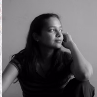
Anjali Bailwal
A Graphic Designer crafting bold, impactful visuals
New to Contra
Anjali is building their profile!
A taste of design, served fresh.
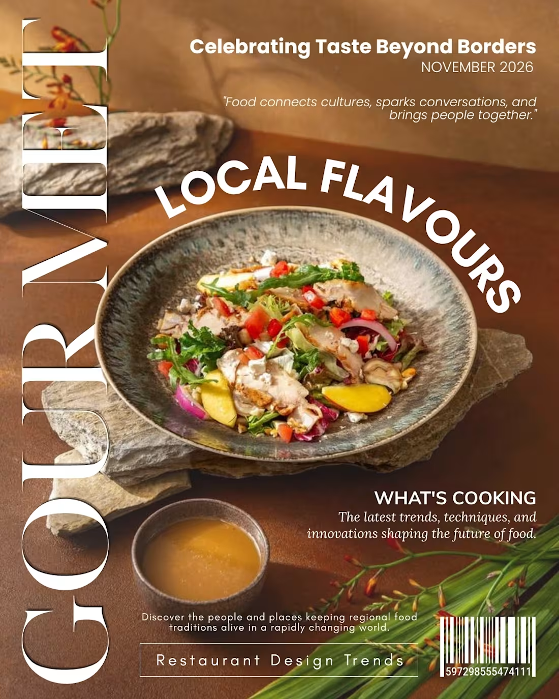
For this magazine cover concept, I explored bold typography, dynamic layouts, and editorial storytelling to create a visually engaging experience that celebrates food, culture, and creativity.
The goal? To make the design as memorable as the dish itself.
What caught your attention first the curved headline or the oversized typography?
0
4
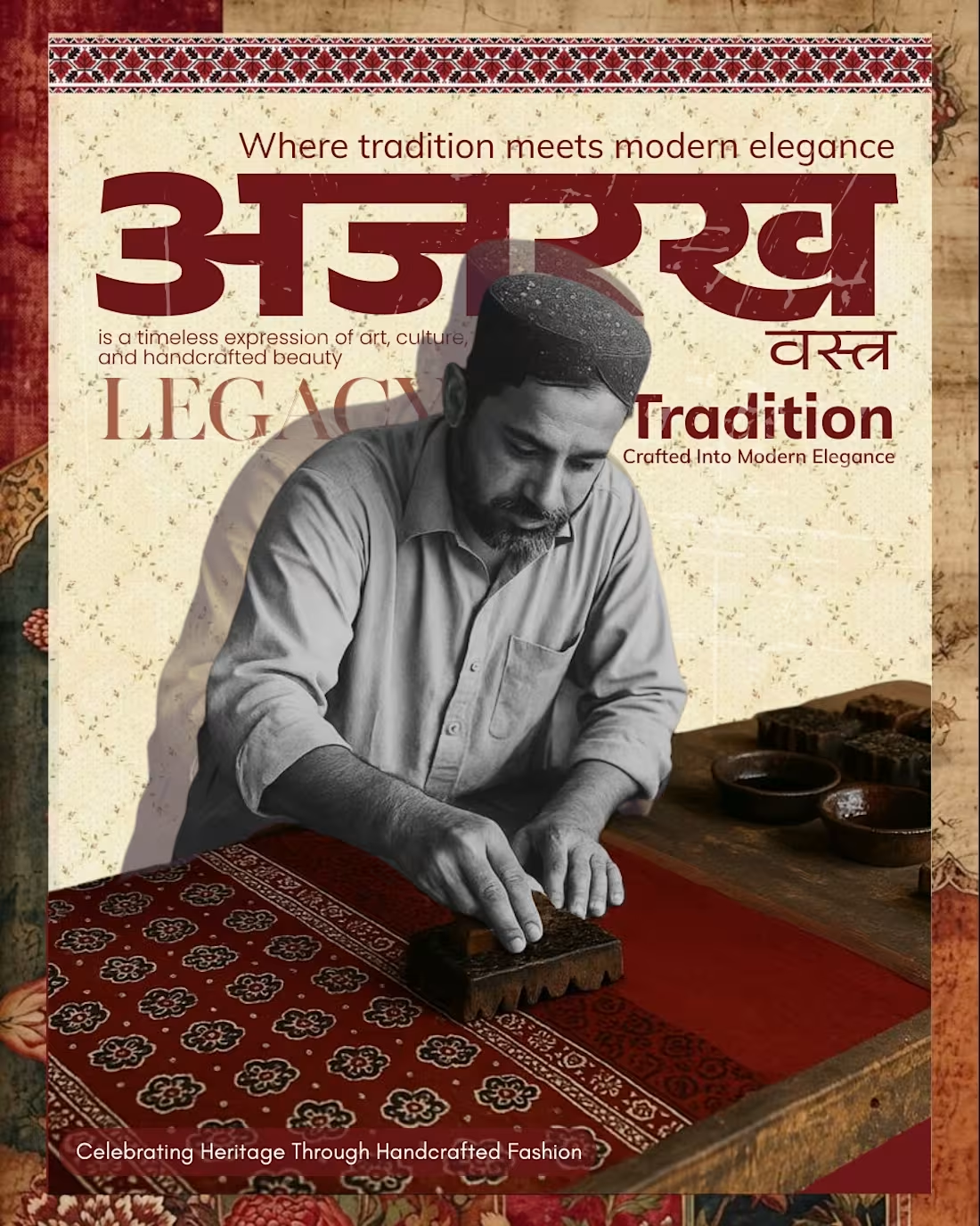
Inspired by the timeless beauty of Ajrakh, this design celebrates the artisans who preserve this centuries-old craft through dedication and skill. The earthy color palette and traditional patterns reflect the authenticity of Ajrakh, while the modern editorial layout brings a contemporary appeal. The dusty, distressed texture used in the background and over the typography was intentionally added to evoke a sense of age, heritage, and handcrafted authenticity, making the design feel like a preserved piece of cultural history.
One of the most intentional choices in this composition was presenting the artisan in black and white while keeping the Ajrakh fabric vibrant in color. This visual contrast symbolizes two powerful ideas: first, the gradual fading of traditional craftsmanship from public attention as generations change; and second, the resilience of the art itself. While the artisans and their stories may often go unnoticed, the craft continues to live on through every pattern, print, and piece created. The colored Ajrakh becomes a symbol of hope, continuity, and cultural survival showing that although the people behind the craft may fade into the background, the legacy of their art remains alive and timeless.
As a graphic designer, I chose this theme to tell the story behind the craft and create a deeper emotional connection with the audience. As an art student, it allowed me to explore the fusion of traditional cultural elements with modern visual storytelling, honoring a heritage that continues to inspire contemporary design today.
0
9
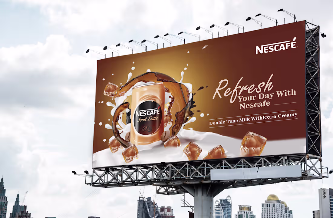
This billboard design for Nescafé Iced Latte is based on the concept of “Refreshing Indulgence on the Go,” created to instantly capture attention in a high-traffic outdoor environment. The design uses a rich coffee-brown gradient background that reflects the brand’s signature coffee identity while creating a warm and premium visual atmosphere. At the center, the product is surrounded by dynamic splashes of coffee, milk, and floating ice cubes, visually communicating freshness, creaminess, and the chilled experience of the beverage. The energetic liquid motion adds depth and movement, making the product appear vibrant and refreshing. The clean placement of the Nescafé logo strengthens brand recognition, while the elegant typography and spacious layout ensure the key message remains highly readable from a distance. The contrast between the creamy white milk splashes and deep coffee tones enhances visual impact and reinforces the product's rich flavor profile. Overall, the billboard effectively combines appetizing product visualization, strong branding, and premium aesthetics to communicate Nescafé Iced Latte as the perfect refreshing coffee drink for modern consumers seeking both taste and convenience.
0
22
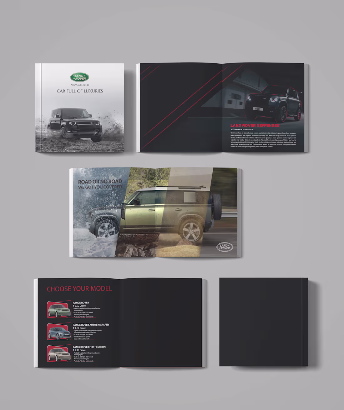
This brochure design for the Land Rover Defender is built around the concept of “Luxury Beyond Boundaries,” showcasing the vehicle as a perfect blend of premium comfort, modern engineering, and all-terrain capability. The visual identity combines a sophisticated dark color palette with bold red accents to create a sense of power, exclusivity, and performance. The cover page establishes the Defender’s rugged character through dynamic off-road imagery, while the interior spreads use dramatic lighting, strong typography, and geometric elements to emphasize its commanding presence. A multi-terrain composition highlights the vehicle’s ability to seamlessly adapt to snow, rocky landscapes, deserts, and highways, reinforcing its versatility and adventure-ready nature. The structured model selection page provides clear information hierarchy while maintaining the premium aesthetic throughout the brochure. Consistent use of black, grey, red, and white enhances readability and brand recognition, while the spacious editorial-style layout ensures the vehicle remains the focal point on every page. Overall, the design communicates Land Rover’s core values of luxury, capability, innovation, and exploration, transforming the brochure from a product catalog into a compelling lifestyle experience.
0
24
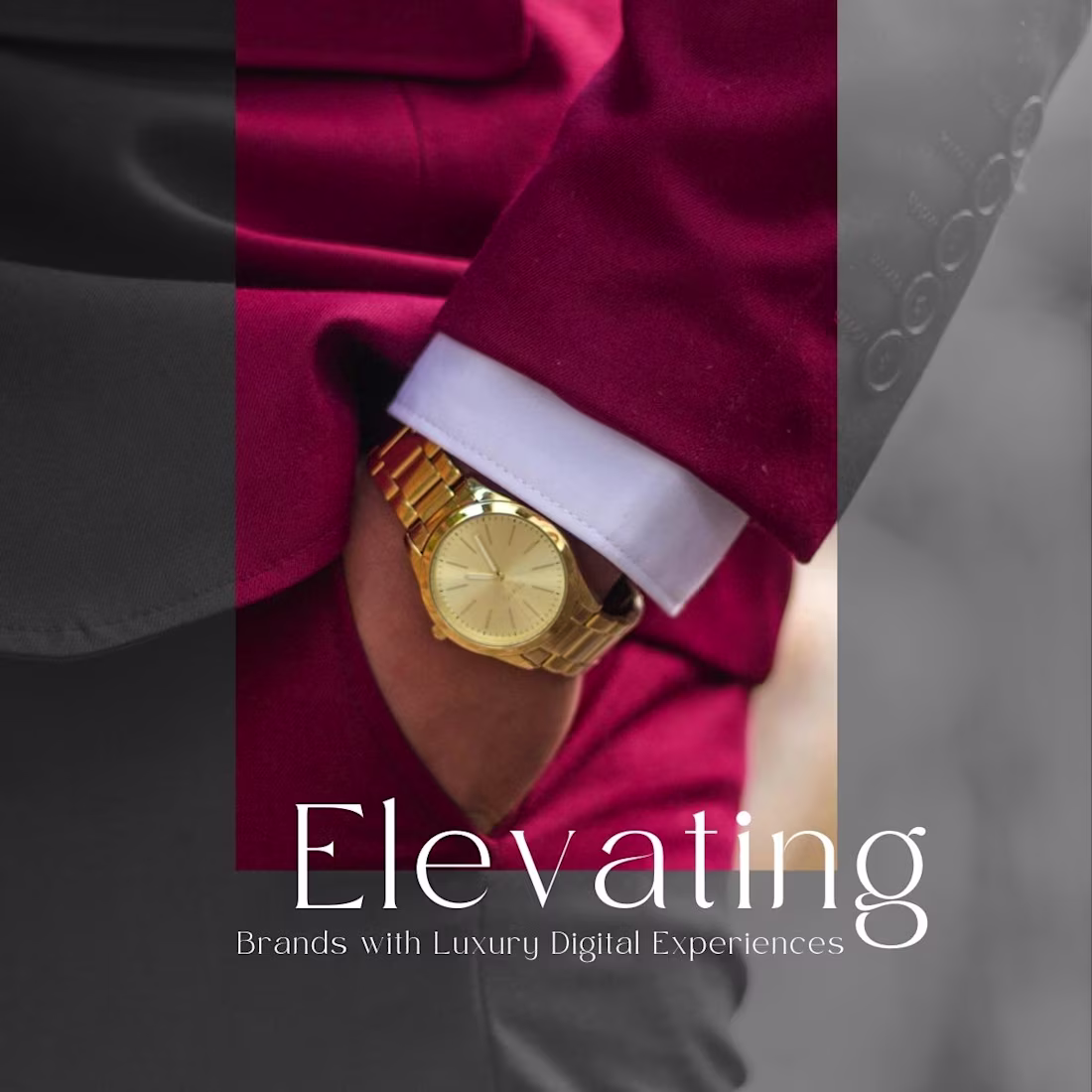
This creative is designed to communicate sophistication, exclusivity, and premium brand positioning. The close-up visual of a tailored suit paired with a gold watch symbolizes luxury, professionalism, and attention to detail qualities that reflect high-end digital experiences.
The elegant typography of “Elevating” serves as the focal point, reinforcing the idea of taking brands to a higher level. The contrast between the rich burgundy tones and monochrome background creates a refined visual hierarchy, drawing attention to the central image while maintaining a modern, luxury aesthetic.
Overall, the design conveys a sense of prestige and excellence, positioning the brand as a provider of premium digital solutions that help businesses stand out in a competitive market.
1
1
54
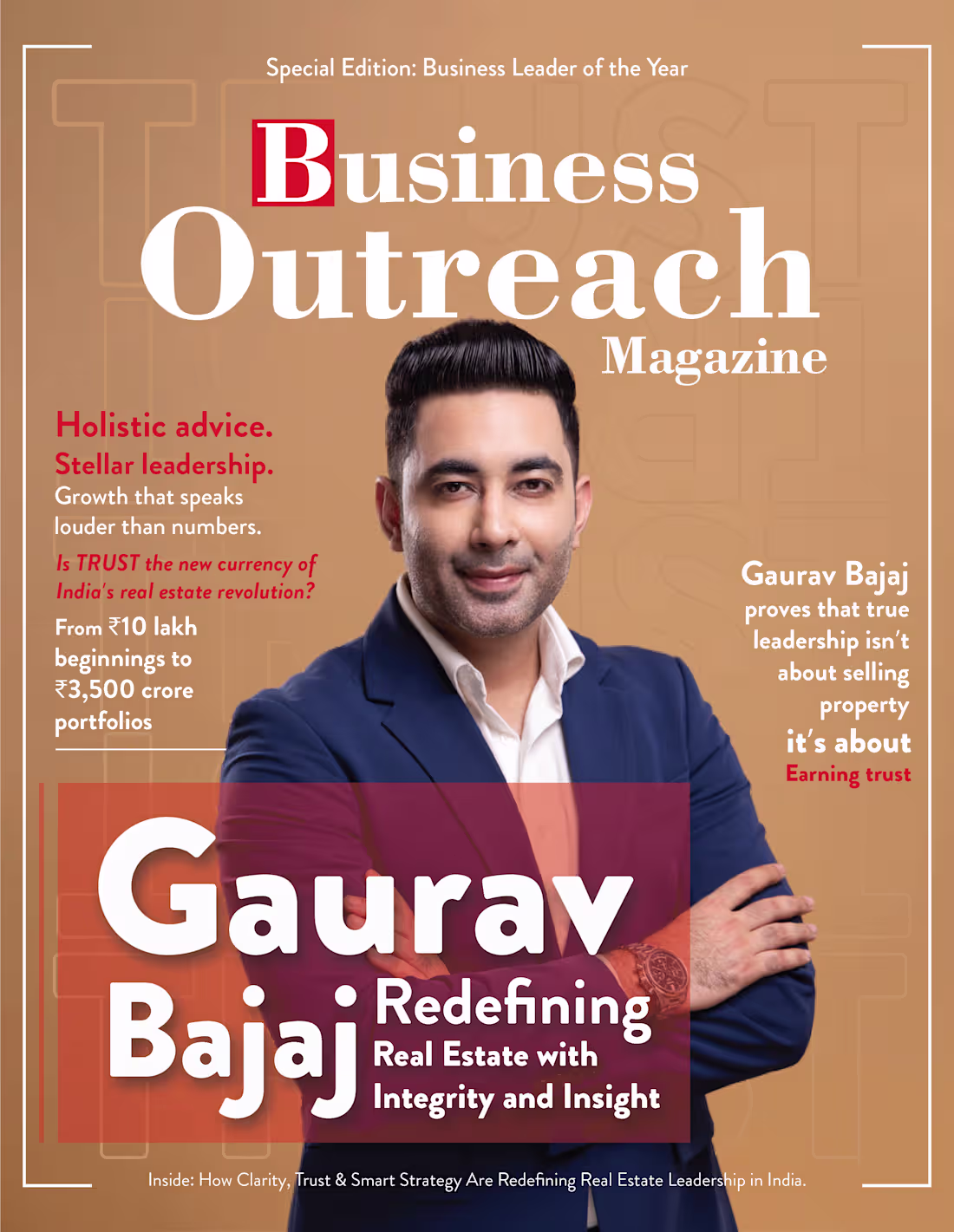
This magazine cover is designed to position Gaurav Bajaj as a visionary and trustworthy leader in the Indian real estate industry. The concept focuses on highlighting his journey, achievements, and leadership philosophy while maintaining the visual appeal of a premium business publication.
The cover features a professionally styled portrait of Gaurav Bajaj as the central focal point, immediately establishing authority, confidence, and credibility. The warm beige background creates a sophisticated and elegant look, while the contrast between white typography and red accent colors ensures strong visual hierarchy and readability.
The masthead “Business Outreach Magazine” dominates the upper section, reinforcing the publication's identity. Supporting headlines such as “Holistic advice. Stellar leadership.” and “Earning trust” provide insights into the featured story and emphasize the values that define Bajaj's leadership approach. The bold cover line, “Redefining Real Estate with Integrity and Insight,” serves as the key message, positioning him as an innovator driving positive change in the industry.
A translucent red overlay behind the main headline creates emphasis and depth, drawing attention to the feature story while complementing the magazine’s color palette. The structured layout, balanced spacing, and strategic use of typography mimic the style of leading international business magazines, enhancing professionalism and editorial authenticity.
Overall, the design successfully combines strong visual hierarchy, editorial aesthetics, and personal branding to create a compelling magazine cover that celebrates leadership, trust, and business excellence.
1
1
59
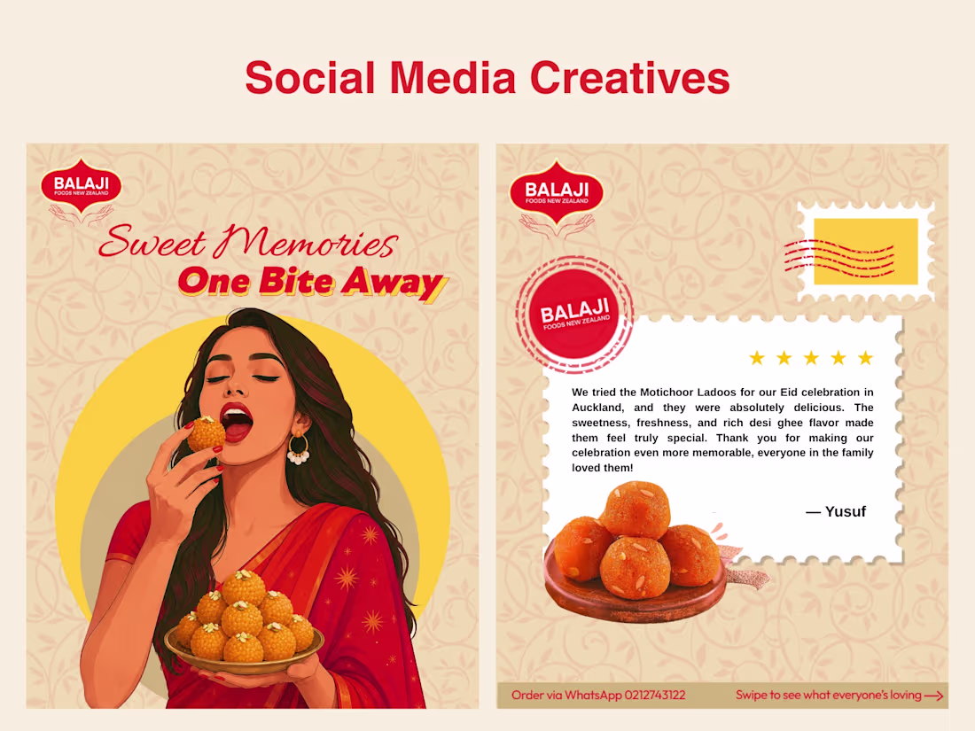
This social media creative highlights how traditional sweets can bring back cherished memories and joyful moments. The illustration of a woman enjoying a Motichoor Ladoo creates an emotional connection, while the headline “Sweet Memories, One Bite Away” reinforces the idea of nostalgia through taste.
The second creative uses a postcard-inspired testimonial design to showcase customer satisfaction and build trust. Warm festive colors, traditional patterns, and consistent branding create a visually appealing and culturally rich design. Together, the creatives promote Balaji Sweets as a brand that connects people to their traditions, celebrations, and sweet memories.
0
38
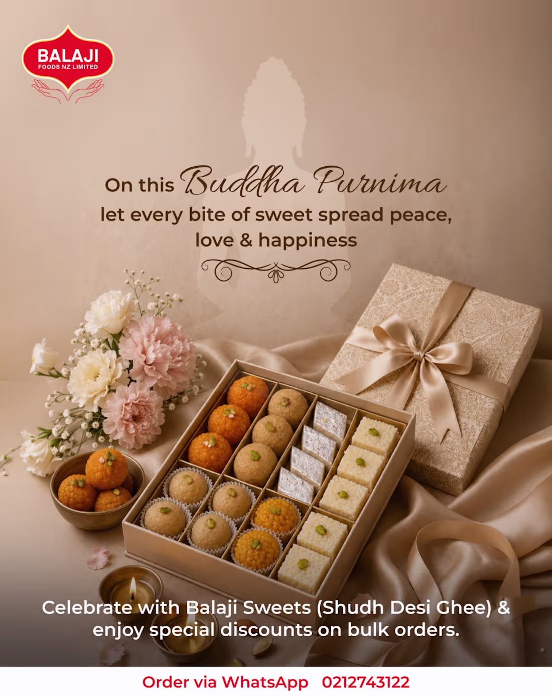
This advertisement celebrates Buddha Purnima by combining the values of peace, happiness, and togetherness with the tradition of sharing sweets. The design features a premium assortment of Balaji Sweets as the focal point, highlighting quality, craftsmanship, and festive gifting.
A subtle Buddha silhouette in the background reinforces the spiritual significance of the occasion, while the warm beige and golden color palette creates a sense of calm, elegance, and positivity. Decorative elements such as flowers, satin fabric, and a gift box enhance the luxurious feel of the composition.
The layout follows a clear visual hierarchy, with the festival message, product display, and call-to-action guiding the viewer's attention. Overall, the advertisement effectively blends tradition, spirituality, and premium branding to promote Balaji Sweets as the perfect choice for celebrating Buddha Purnima.
0
42
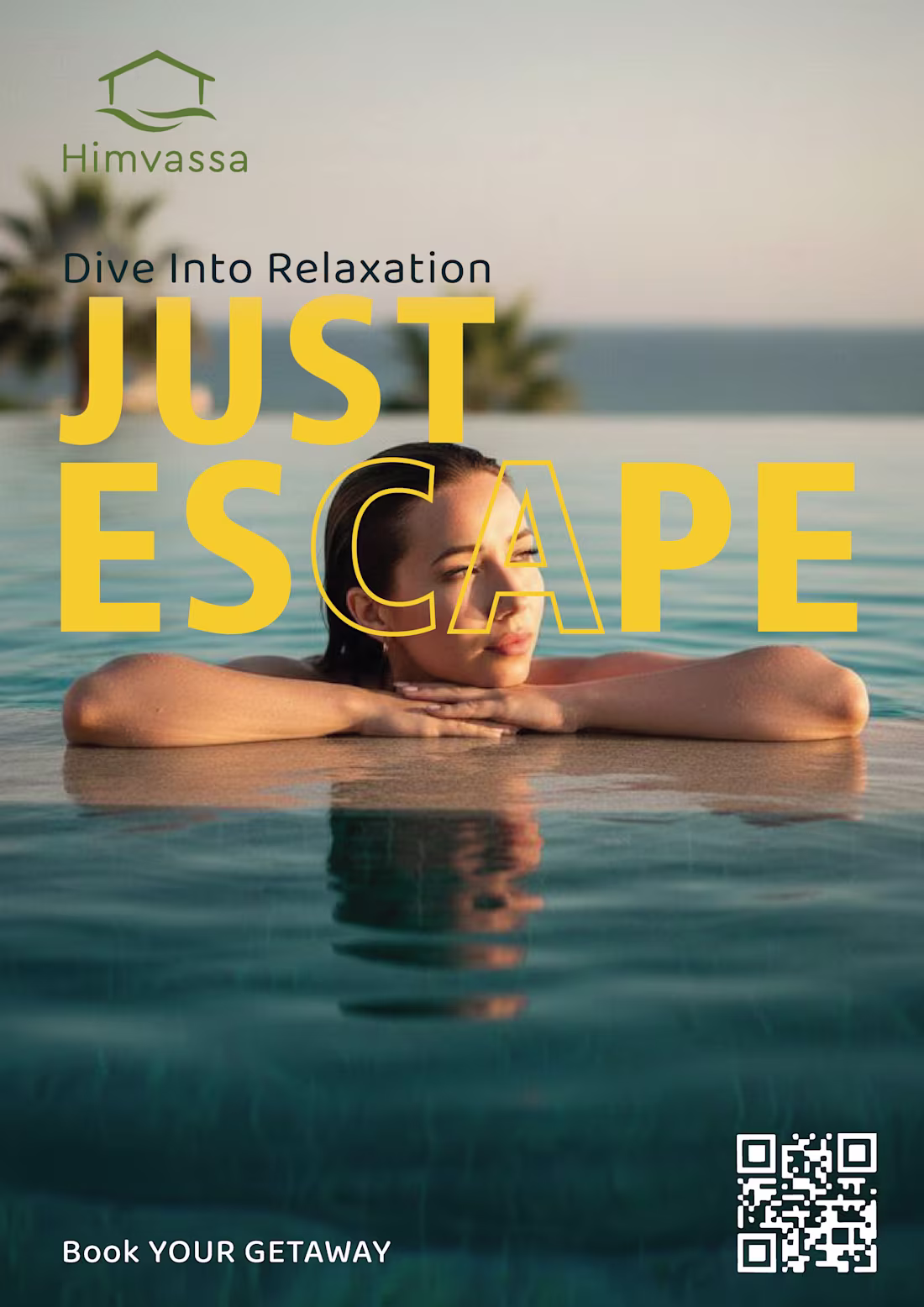
This advertisement presents Himvassa as a peaceful retreat where people can escape the stress of everyday life and experience complete relaxation. The image of a woman resting in an infinity pool creates a sense of calm, freedom, and connection with nature. The bold headline “JUST ESCAPE” immediately captures attention and reinforces the message of taking a break from routine. The outlined “CA” within the word is a deliberate design element that creates a visual pause, symbolizing a moment to slow down and unwind. The warm natural lighting and soothing colors enhance the feeling of comfort and tranquility, while the QR code and “Book Your Getaway” call-to-action encourage viewers to take the next step toward their relaxing escape.
0
38