
Anastasiia Burtova
Helping businesses and startups create high-converting UX/UI
New to Contra
Anastasiia is ready for their next project!
Brutalist Poster Design & Experimental Typography
A collection of my graphic design work. I specialize in brutalist poster design, utilizing experimental typography and high-contrast layouts. This is my core style — functional, bold, and focused on strong visual composition.
These designs reflect my approach to layout and font-based communication.
3
2
384
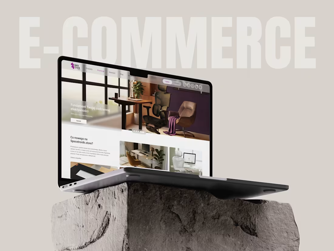
Spacetronik Store — E-commerce UX Design for Ergonomic Workspace
About this project:
The Challenge:
The brand needed to translate the complex technical benefits of ergonomic furniture into a seamless, high-converting digital shopping experience. The main goal was to help users understand the value of ergonomics for their health and guide them effortlessly to the right workstation solution.
The Solution:
Leveraging 11 years of experience in product design, I crafted an intuitive UX/UI that emphasizes ergonomics at work. I restructured the information architecture to prioritize product features like "height-adjustability" and "orthopedic support," ensuring that users feel the comfort of the product even through the screen. By implementing a clean, user-centric interface, I simplified the path from product discovery to checkout.
The Result:
A professional, conversion-focused e-commerce store that positions Spacetronik as a market leader in ergonomic solutions. The final design creates a frictionless purchasing journey that helps customers build healthier, more productive workspaces.
My Role:
UX/UI Design, Information Architecture, Visual Strategy, E-commerce Optimization.
1
256
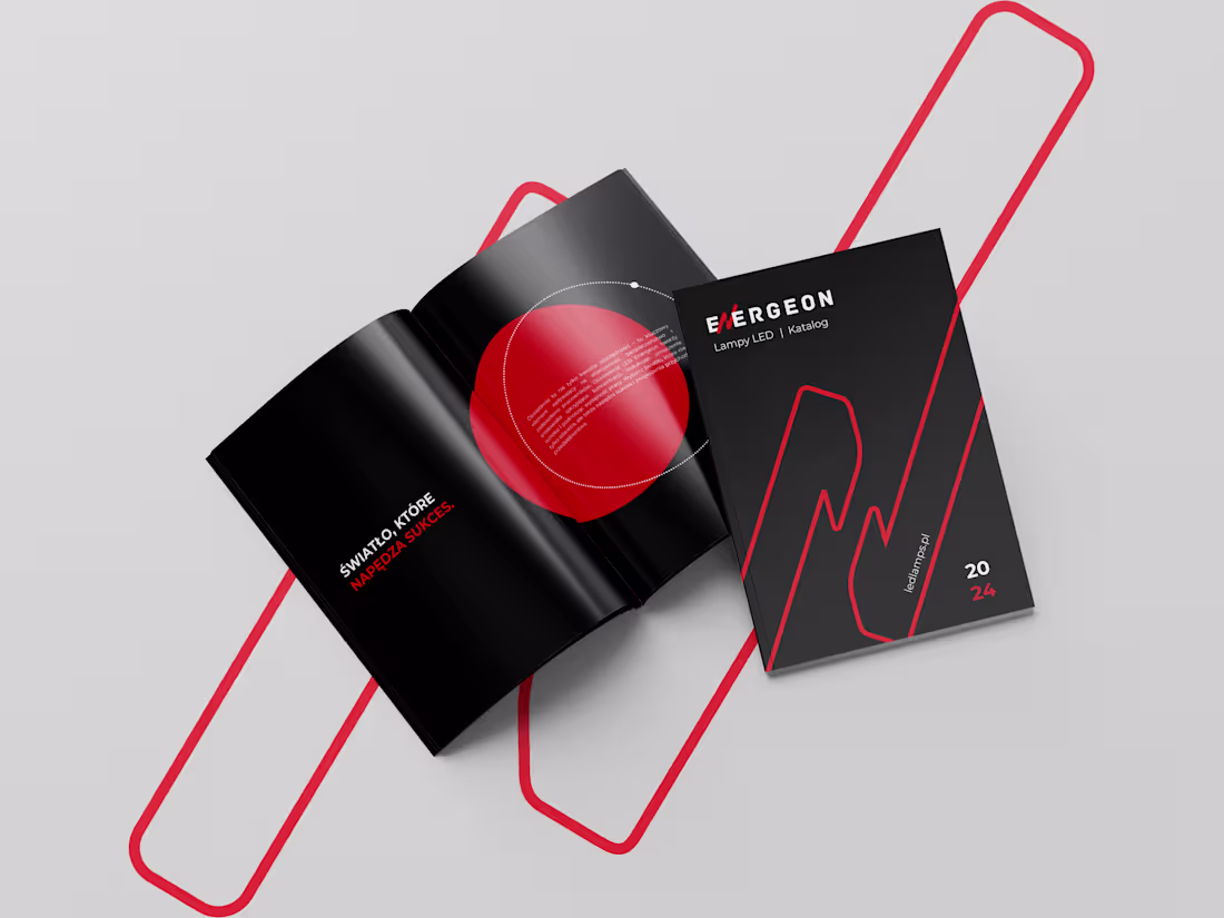
Catalog LED lamp Energeon
1
156
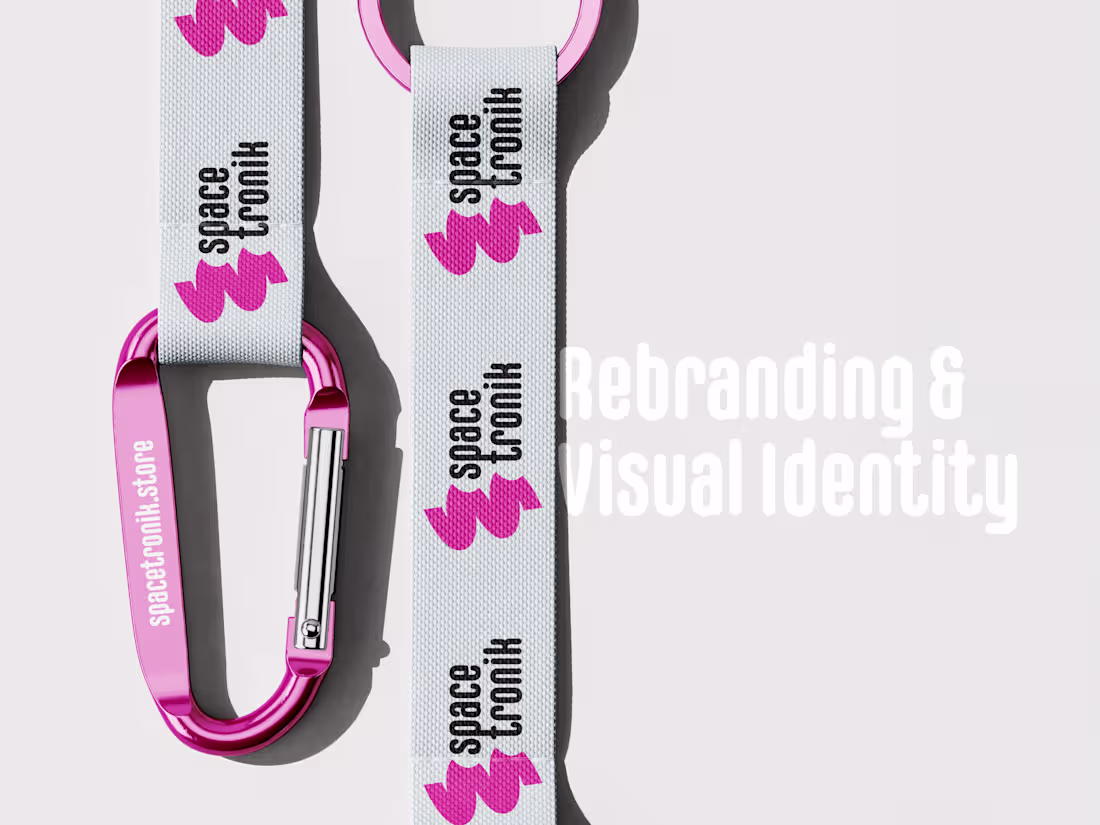
Rebranding & Visual Identity
About the Project:
Spacetronik is a rebranding project for a brand specializing in high-quality ergonomic workspace solutions. The goal of the redesign was to move away from the typical "engineering" look and give the brand character, dynamics, and a modern visual identity.
Concept:
The new logo is based on an abstract, energetic symbol that represents flexibility, movement, and an innovative approach to workspace organization. The combination of bold typography and a vibrant color palette helps the brand stand out in the e-commerce market, creating a recognizable image that is memorable at first glance.
Scope of Work:
Logo and brandmark design.
Creation of a unique brand pattern.
Selection of a modern color palette.
Development of an adaptive branding system for e-commerce and physical touchpoints.
0
178