
Anas Ali
The committee voted contra the proposed policyIf you meant C
New to Contra
Anas is building their profile!
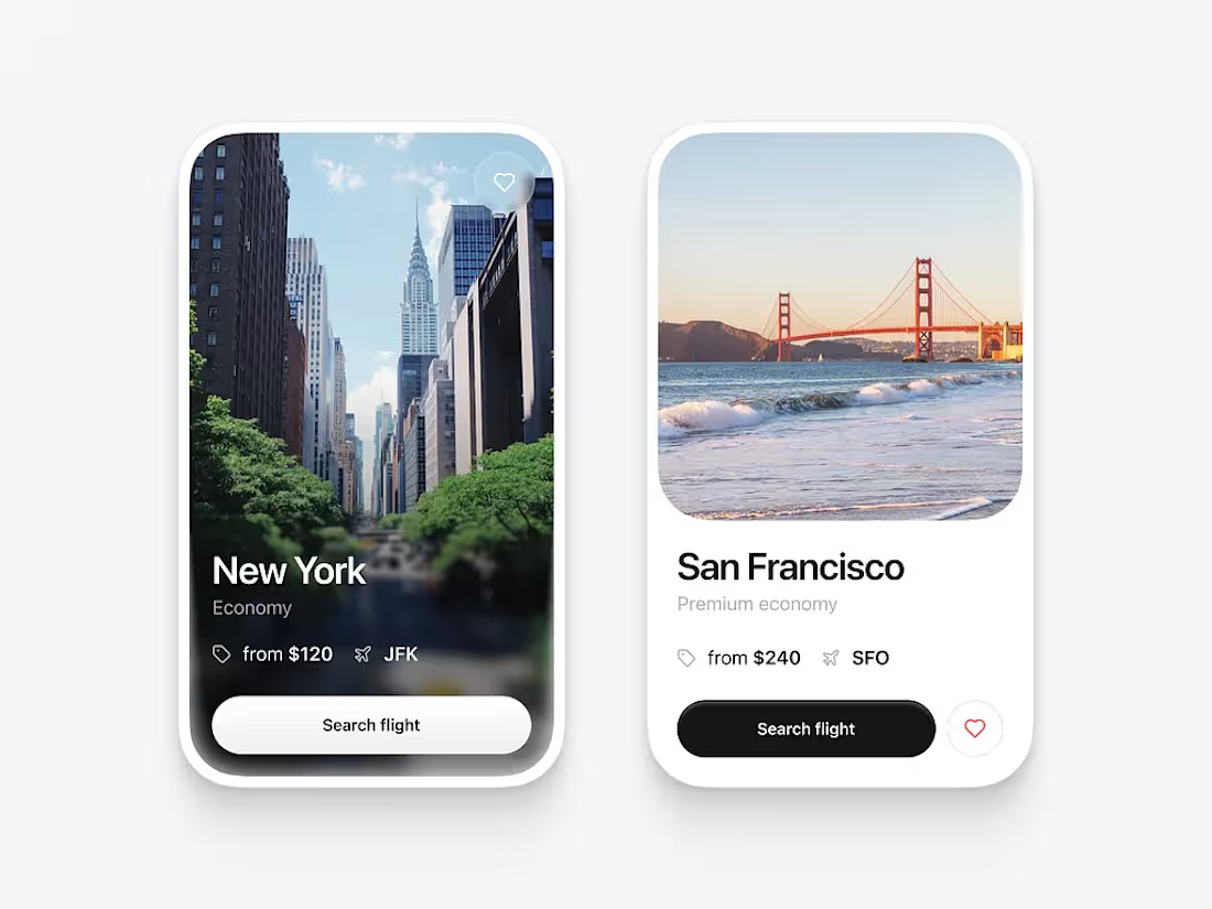
UI Design Review Needed 🎨
I designed these two flight booking cards and would love your honest feedback.
A: A full-image card with a bold, immersive travel feel.
B: A clean, minimal card focused on readability and simplicity.
Which design do you prefer and why?
I'd appreciate feedback on:
Visual appeal
Readability
Layout & spacing
Color contrast
CTA ("Search Flight") visibility
Overall user experience
If you have any suggestions for improvement, please share them. Your feedback will help me improve my UI/UX design skills.
0
9
Fraxus Innovations ka logo ek modern aur premium design ko represent karta hai. Isme upar ek stylish "F" letter bana hua hai jo overlapping ribbon-style shapes se design kiya gaya hai. Isme purple, violet, orange aur yellow gradient colors ka istemal hua hai, jo creativity, innovation, energy aur growth ko symbolize karte hain.
0
14