
Ananya Jaiswal
UI/UX Designer creating web, mobile & product experiences.
Ready for work
Ananya is ready for their next project!
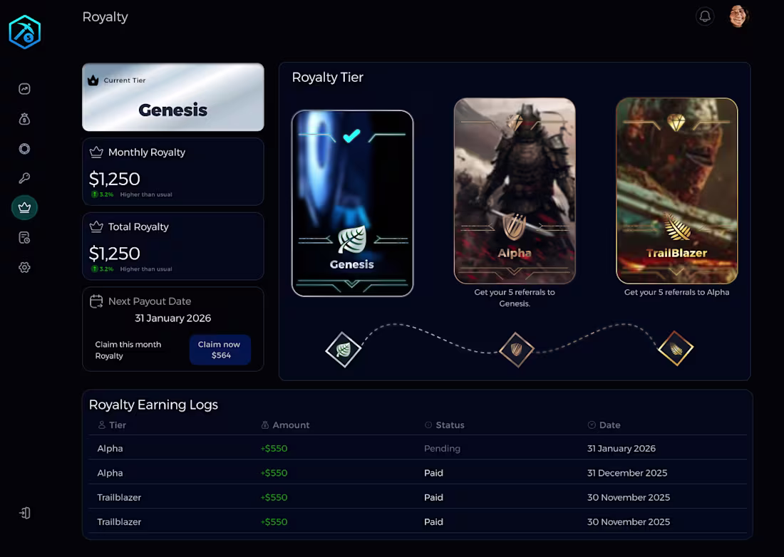
Making Complex Web3 Rewards Intuitive
Web3 and DeFi platforms often struggle with "information overload." For this project, I focused on creating a clean, high-contrast UI that makes complex reward structures easy to understand at a glance.
The Approach:
Hierarchy: Placed the "Current Tier" and "Next Payout" in high-visibility areas to reduce user anxiety.
Brand Consistency: Maintained a deep-dark aesthetic with neon accents to align with modern Web3 standards.
Status Management: Used clear visual indicators (Pending vs. Paid) to improve trust and transparency in the earning logs.
2
21
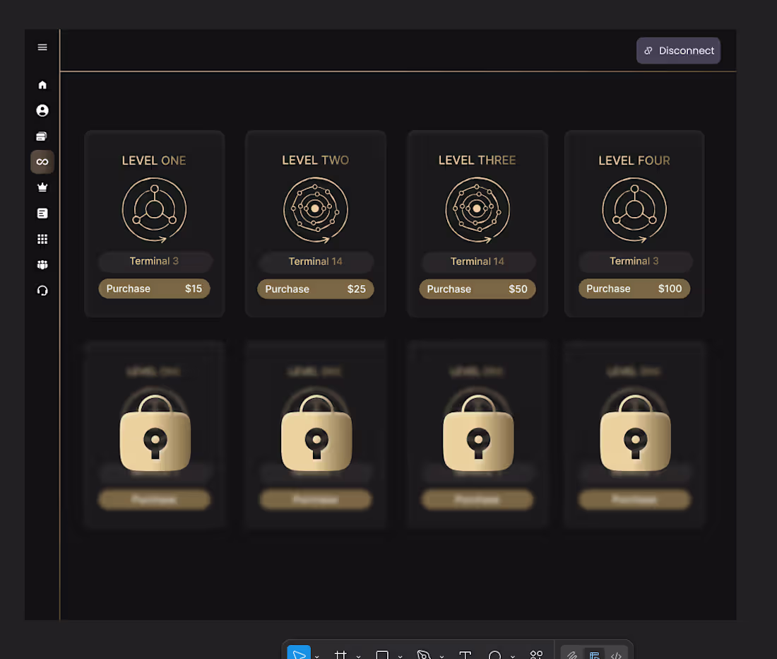
Designed a clean, gold-accented level purchase UI for a Web3 dashboard which is focused on hierarchy, clarity, and smooth upgrade flow.
1
45
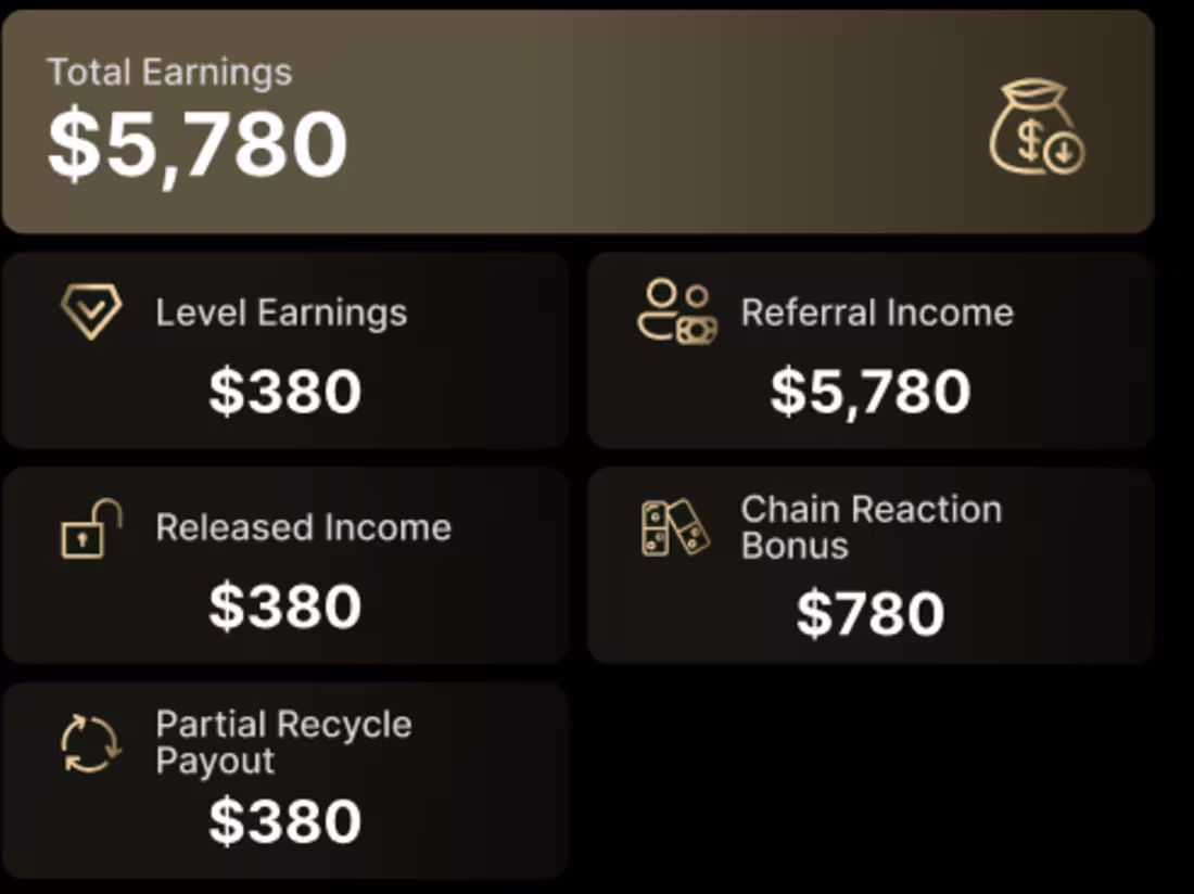
Turning numbers into insights. A clean, intuitive dashboard UI designed to make financial data effortless to understand and act on.
3
2
77
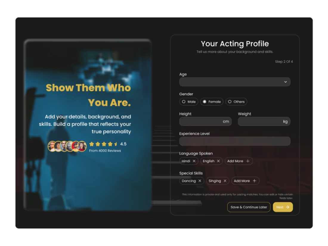
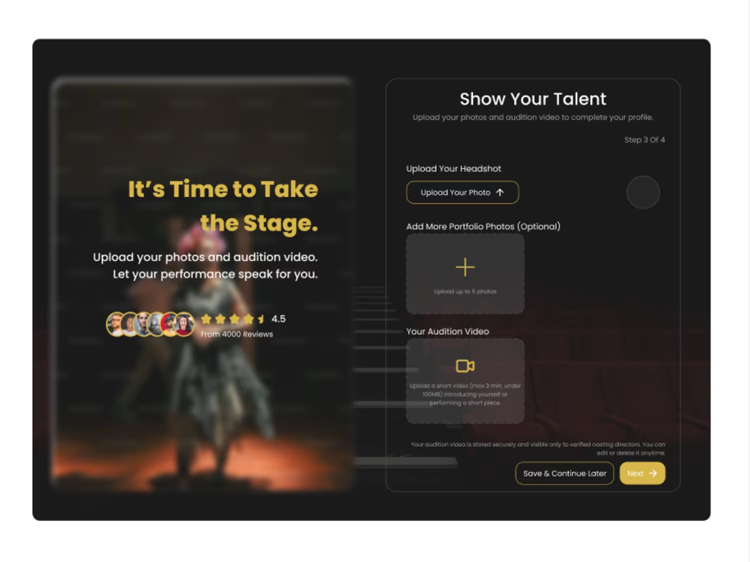
Designed a story-driven signup flow for aspiring actors, turning onboarding into a cinematic experience. 4 steps: Intro → Profile → Showcase → Finish, with motivational microcopy and video upload support. Excited to continue learning and improving!
2
31
243
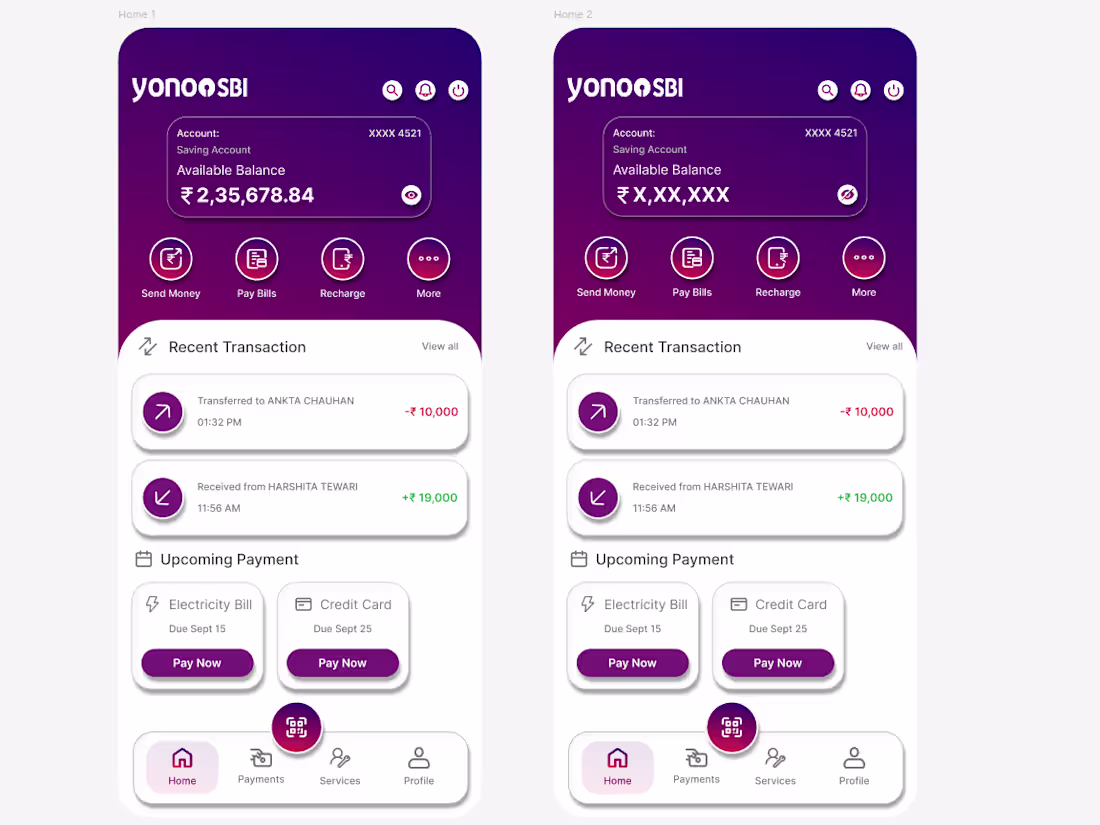
Redesigning the YONO SBI app to make banking simpler, faster, and more intuitive, focusing on hierarchy, accessibility, and visual clarity.
1
59